is a blog about design, technology and culture written by Khoi Vinh, and has been more or less continuously published since December 2000 in New York City. Khoi is currently Principal Designer at Adobe. Previously, Khoi was co-founder and CEO of Mixel (acquired in 2013), Design Director of The New York Times Online, and co-founder of the design studio Behavior, LLC. He is the author of “How They Got There: Interviews with Digital Designers About Their Careers”and “Ordering Disorder: Grid Principles for Web Design,” and was named one of Fast Company’s “fifty most influential designers in America.” Khoi lives in Crown Heights, Brooklyn with his wife and three children.
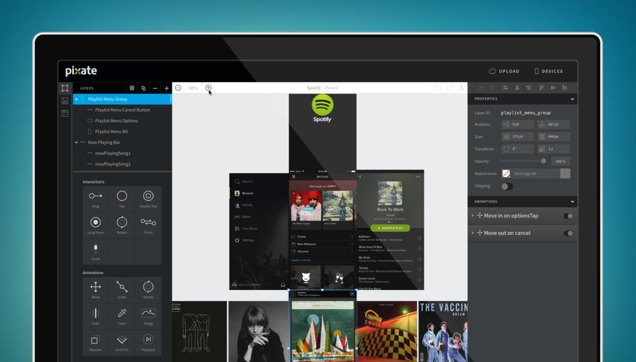
Pixate was among the first truly viable prototyping applications that caught fire in the burst of new, independently developed design tools that we saw starting just a few years ago. Its blend of ease of use and precise control over animations and transitions has been a boon to countless app designers; we used it extensively when I worked on Wildcard, and it helped our team visualize things that would have been difficult if not impossible to give form to otherwise. When Google acquired the company last year, expectations began ramping up for its future; the team started delivering on that promise late last year with a massive rewrite and many new improvements. I asked Andrew Holt, Pixate’s head of product since its independent days, about where the app is and where it’s going.
Khoi Vinh: How has Pixate’s mission changed since the company was acquired by Google?
Andrew Holt: Before we started building Pixate we asked hundreds of designers and their teams about their biggest pain points, and literally every designer we talked to was frustrated by an inability to design interactive experiences without learning to code or involving a developer. So, our mission for Pixate was to give designers the ability to visually design interactive prototypes that looked and felt completely real.
Now that Pixate has joined Google, we’re still very much invested in our original mission, but we’re also expanding our vision. Not only do we want to make designers more creative and let them push the boundaries of design on today’s mobile platforms, but we also want to expand their ability to design across many devices, and create new tools and workflows that change how designers and developers collaborate on complex interactive products.
What kinds of new tools and workflows are you building?
I can’t get into a lot of detail about what we’re working on, but it’s pretty exciting stuff. We really want to create a process that allow designers near limitless freedom of expression, while making it a lot easier to create and iterate. The current version of Pixate started down this path, but we’re going to take it a lot farther, both in how accessible it is to designers, and how creative they can ultimately be. We also want to build a workflow that ties directly into the development process, so once a design is perfect, it doesn’t take extra effort to implement.
Are you suggesting that Pixate is expanding beyond a single product into a suite of products?
That’s certainly a possibility. We want to create something that is really modular and fits into existing workflows, and that may end up being better implemented as a few different products.
I realize I can only ask you to reveal so much about your future plans, so looking back on where Pixate has been, in your view, where did it surpass expectations, and where did it fall short?
I think we were surprised by how quickly Pixate took off, and how much people were able to accomplish with it early on. Since we had so many conversations with design teams before we built anything, we knew we were solving a big problem, but we weren’t expecting so much momentum so early on. Our plans were to start with a small private beta and roll out slowly. But once we released a sneak peek publicly, the waiting list exploded, with designers from huge companies and small shops and everything in between, and we ended up releasing it a lot sooner than we originally thought we would. It was clear we were solving a really important problem for a lot of people, which was awesome.
Can you talk a bit about your experience with that early momentum?
We thought it would take a while to get the product to a place where it would be used by entire teams for real work, which is why we had a staged rollout planned. But when we put the first early version in users’ hands, we were blown away by what they did with it, and how quickly it took off inside companies. There were lots of things still in the works that we thought were must-haves or needed more polish, but it turned out there was a such a lack of existing tools for expressing interaction that our initial feature set was already a massive improvement.
We had a really exciting vision for Pixate, and the early adoption gave us a lot more feedback to add into the mix. We executed quickly and shipped a lot of great features, but looking back, I think we could have focused even more on iterating on the core toolset. In a startup, it’s always a challenge to balance features you know will make users happy with things you need to actually succeed as a business, get to the next round, etc. We did everything correctly, but we had a lot of really killer things we wanted to do that we never got to. Luckily, now that we’re at Google, we’re able to focus on a lot more at once, which is exciting.
The market seems to have changed so much since Pixate launched. What do you see when you look at the competitive landscape today?
There certainly have been a number of new design tools launched since we first entered the market. This has been great to see, since we’ve gone from designers having almost no options for expressing interactivity to having quite a few. Each tool seems to have its strengths and weaknesses, so with this profusion of tools, designers have to weigh the pros and cons based on their needs. We can’t even keep track of how many articles have come out in the last year comparing all the tools, so in a way this abundance is causing a new set of issues for design teams.
We believe the ideal toolset for designers would let them work in visual medium, but give them all of the expressivity available to a seasoned developer. There is a lot of complexity in achieving this, and I believe existing tools are only beginning to chip away at solving this problem. Both in terms of enabling designers to create really rich interactive experiences, and facilitating the collaboration between designers and developers, I think we’re still a ways off from the ultimate toolset. These challenges are really exciting, so it’s awesome to have lots of different teams tackling them and pushing each other. It’s a great time to be a designer!
How difficult will it be to achieve that perfect balance of working in a visual medium while still accessing the power of a seasoned developer? If Pixate is among the closest to that, there’s still a ways to go, or would you disagree?
This is definitely a difficult problem to solve, but also a really exciting one. We’re trying to step back and consider all the goals of a product team holistically, rather than focusing narrowly on a better way to let designers prototype motion and interaction. This broader focus increases the complexity of what we’re doing since there are so many factors to balance—goals at different stages of design, designer experience, developer experience, app complexity, adaptive layout goals, team size, etc.—but it’s also leading us to some ideas that we may not have discovered otherwise. For instance, if we consider that one of the ultimate goals of a prototype is to communicate a specification to developers, we can make more conscious design decisions to encourage useful hierarchy and structure in what a designer produces.
I think our biggest challenge is keeping the balance of expressivity and ease of use in check. It’s not terribly difficult to make a tool that is really powerful but hard to use, or a tool that has limited expressivity but easy to use. We want to get beyond providing design teams with a method of expressing ideas they already have in their head, to helping them actually come up with new experiences and create a lot of different possible solutions.
It can also be a challenge deciding when we should focus on solving problems the majority of designers face today, and when we should focus on where they might be in a few years. Being at Google is giving us more leeway to do the latter, which is really great. We’re confident we can do both, and come up with something both expressive and intuitive, but it’s certainly no small task.
How do you approach that problem of what a designer might face in a few years’ time?
I think there are two types of design challenges we need to consider: the continuous set of problems that arise with the evolution of existing screen interfaces, and those that will arise with discontinuous shifts in user interfaces.
In the first category, designers are already facing more and more challenges dealing with multiple screen sizes and devices, greater use of on-screen gestures, and an increase in app complexity. This complexity will continue to increase as more platforms and screens become available (and portability between screens becomes more ubiquitous), users become more sophisticated and more comfortable with new gestures, and the bar for building engaging experiences keeps being raised.
We’re trying to be fairly divergent in how we approach these problems, considering the entire product design workflow holistically. For instance, rather than solely focusing on the tactical problem of getting a mock out of Sketch and making it interactive, we’re considering problem areas like adaptive and responsive layout, dynamic behavior, cross-platform targets, and how designs ultimately get turned into real applications.
And the second challenge?
That is really more about being considerate of larger trends in user interfaces, and making sure the solutions we build can evolve to solve for those eventually. Voice control is already becoming more ubiquitous, and I’m sure we’ll see things like motion control, haptics, and VR begin to become more prevalent as well. In the absence of a screen, where a human is really directly interacting with an API, how might designers build new experiences? These are issues we’re considering, though less concretely for now. I’m really excited about possibilities here, and hopefully we’ll start exploring these more actively soon.
These kinds of shifts are really fundamental, and they seem to suggest that the idea of a “layout tool”—whether it’s Photoshop or Illustrator or Sketch—will soon give way to a hybrid of layout and prototyping. Not quite end-to-end, but design tools that cover a wider swath. Is that in line with your thinking?
I expect we’ll see more tools that combine layout and interaction, though visual design tools will have their place in the design process for a long time. However, there may need to be a shift towards designing the core interactive experiences first. Designers haven’t done this historically because it’s been difficult to think about these aspects without first drawing out the visual layout, but we’re finding more and more that the linear process of turning static mocks into a product can limit the creative process, missing opportunities that are only seen through interactive prototypes on a device, or worse, once the app is built.
So I think we’ll definitely start seeing tools that cover a wider range of the design process. However, I think a lot of this functionality may focus more on providing designers with a really powerful set of motion and interaction tools that let them iterate quickly on the entire experience and feel it as a user, more so than purely combining visual design and prototyping. This might result in multiple aspects of design occurring in parallel, instead of the somewhat more linear flow we see today from mockup to storyboards to prototypes.
So is Pixate built to scale to that vision?
The current Pixate model is very flexible, so we could definitely extend it a lot further. Given that we’d like to solve a broader set of problems than those on which Pixate was originally focused, we’re starting with fresh thinking, and then seeing if it makes sense to expand Pixate to match our vision. Pixate uses separate native runtimes on iOS and Android, which is really unique and powerful, but also has downsides like higher development effort, especially since we try to keep absolute parity. So we’re also evaluating new technologies and weighing the advantages.
Our focus is on building a set of tools and services that fundamentally change the way designers and their teams work together. Being at Google is giving us the freedom to focus on solving the big problems designers face today. As we work through these problems, we think it will be clear whether the right approach is to really expand on Pixate’s core model, build new tools, or a mix of both.
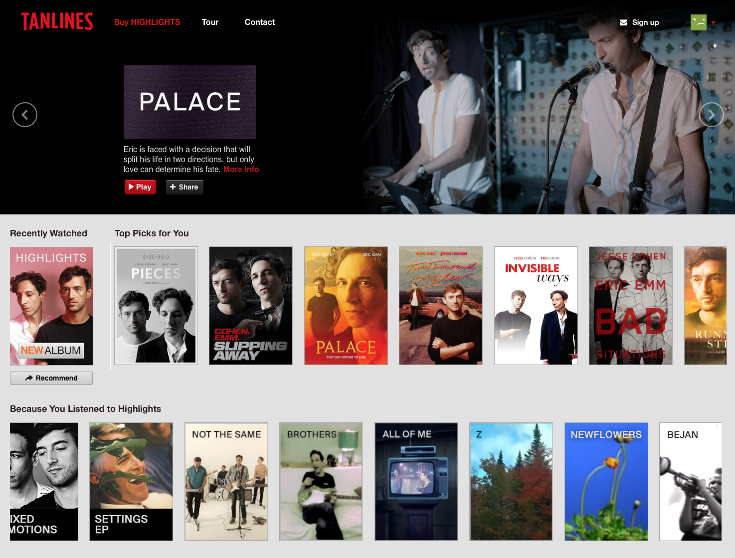
When product design becomes a cultural touchstone: to promote its second album (released last year), Brooklyn-based band Tanlines aped the Netflix web site. Each of the album’s tracks are portrayed as movie posters (featuring the band members) arrayed in the side-scrolling fashion we’re all used to browsing, and the band’s name is even rendered in the same custom typography as Netflix’s logo. I really enjoyed “Mixed Emotions,” Tanlines’ debut album a few years ago, but I admit I missed the launch of this follow-up. Going back into Spotify now to give it a listen…
Designers and clients are understandably spooked. In private, some designers speak of clients who refuse daring work. In public, they gently rue the armchair critiques that undermine months, sometimes years, of work. Others are more forthright. ‘I think the Internet and the press should shut up and allow the identities to find their audiences,’ says Paula Scher, a partner at Pentagram and the mind behind Shake Shack’s branding among many others. ‘They will ultimately determine the success and failure.’
Setting aside that surprisingly combative “get off my lawn” attitude, what this article really gets at is the current state of design criticism, at least insofar as it entails the discussion of the craft of corporate branding. In the past, before broadly public channels for airing one’s thoughts on new logos became ubiquitous, most critical assessment of this kind of work happened within the pages of trade journals. On occasion, if a logo was particularly noteworthy or egregious, awareness and debate might seep out into the public, but that was rare.
Now we have a public square for discussion of corporate identities, its bright, unsparing light can be deeply uncomfortable for a profession that for most of its history largely entailed designers and executives sending signals to other designers and executives. Part of this discomfort lies in the fact that, more so than most flavors of arts criticism, this particular public square is full of people who are both poorly equipped to constructively appraise branding and who feel more empowered than ever to pass judgment on it. That sounds derogatory, like I’m saying that the masses are not qualified to thoughtfully consider branding, but that’s not my intention at all. I state it merely as a fact; the conversation around design has changed materially in the past two decades, and nothing will return us to that state in which identities are left to their own devices to “find their audiences.”
What this underscores, though, is the idea that, more than ever, we need a solid foundation for the thoughtful consideration of design. If we’re going to have this much attention paid to new corporate identities, we need to begin building an inclusive, plainspoken framework for how we talk about new logos, new design systems, new experiences rooted in the craft of design.
A lot of that can come from having a recognized role for critics. Though many people dismiss that profession as elitist, having a class of non-practitioners dedicated to examining the ideas behind a craft is incredibly useful to engendering a robust, thoughtful public square—just look at the way critics help shape how we think about art, architecture and film.
There are of course plenty of designers who write incisively about design, but that’s not the same thing at all. To be a practicing designer makes it very difficult to avoid being compromised by the clientele you’re trying to build, or the professional networks that you’re trying to grow, all in the name of career opportunity. Writing objectively about the work of other designers you know for other companies you may want to work for one day is really difficult. What’s needed is independence, and design has a relatively paltry number of truly independent critics at all; fewer still who don’t spend most of their time talking about architecture and industrial design; and almost none who write for respected, high profile, general interest publications. If we ever want to see design turn into a truly mature art form and to have design work appreciated and critiqued in substantive fashion, we’ll need to elevate criticism to the next level.
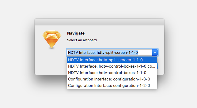
I’m continually impressed by the developer community creating plugins for Sketch. Here’s one of such forehead-slapping usefulness that it’s a wonder it’s not already standard issue on every design app: Sketch Navigator lets you quickly jump to any specific artboard without having to scan the all too easily cluttered Layers List in the app’s left-hand pane.
Just hit command-E and you get a pulldown menu with every artboard in your document—not just every artboard on the current page, but any artboard on any page within that document. From an interface and technology standpoint it’s not particularly inventive, but it effects such a profound change on the way you get around within Sketch that it almost feels like it’s rewritten the actual physics of your documents.
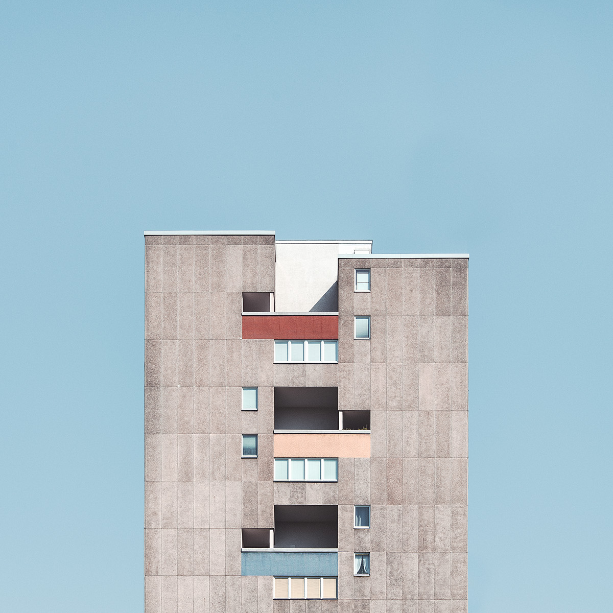
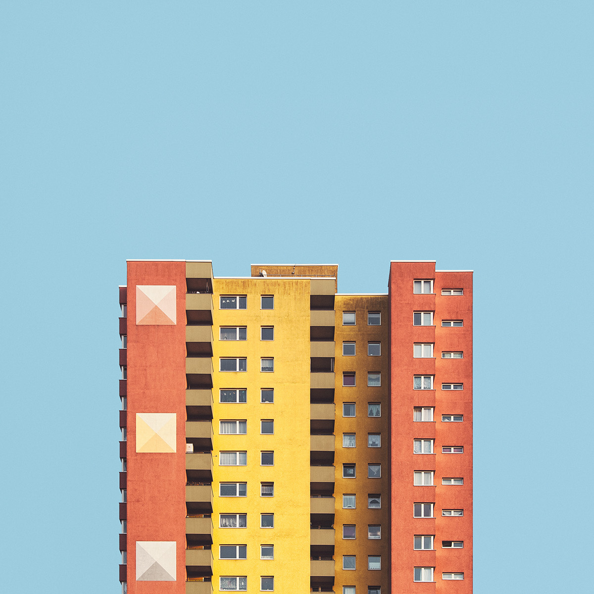
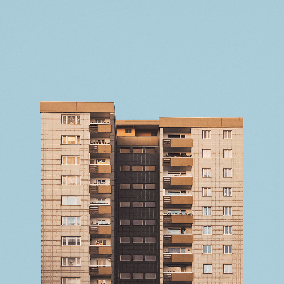
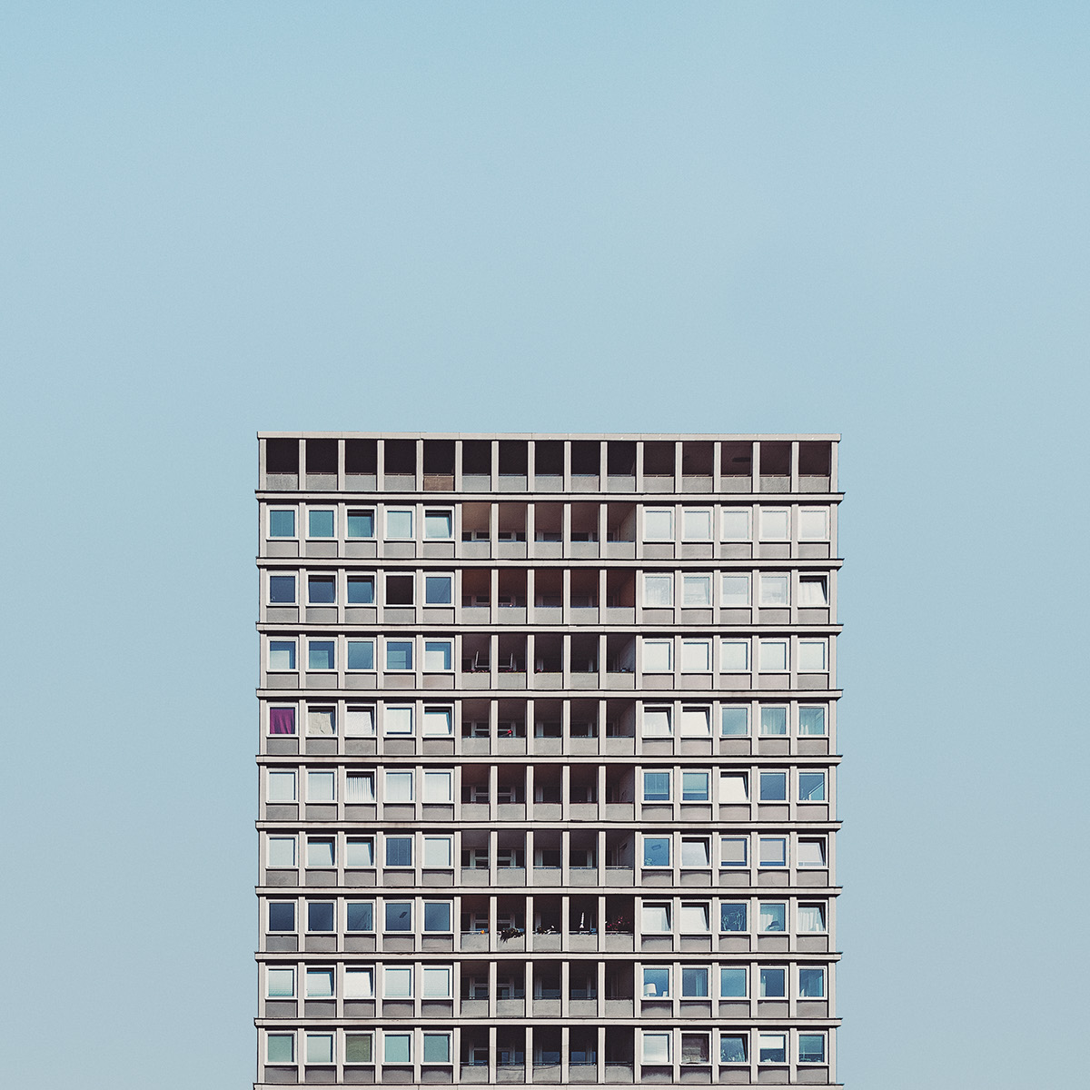
“Stacked” is a superb series of architectural images from fine art photographer Malte Brandenburg that feature beautifully flattened buildings isolated against a neutral sky. See the full project at behance.net, and find out more at maltebrandenburg.com.
Shot just seven years after the original “Star Trek” series went off the air, this amateur footage captures one of the first in what would become a long tradition of fan gatherings. You’ll see early cosplay, unaffected devotion, and even appearances from Leonard Nimoy and James Doohan (you have to wonder what was going through those actors’ heads at the time). Seen through the quaint filter of grainy, scratchy Super 8 footage, the whole event glows with earnestness and charming naïveté; it seems only distantly related to the overwrought nature of today’s super sized fan conventions.
The latest version of Bohemian Coding’s Sketch finally fixes a longstanding problem that I wrote about in this post last November: the app’s handling of type has been erratic. Mixing multiple fonts and sizes has historically produced unpredictable results. According to Bohemian Coding, that is a byproduct of the app’s reliance on OS X’s text rendering engine. Version 3.6, released just this week, sports new “typesetter” code that behaves in a manner that’s much more consistent with what designers expect from type. Hallelujah! In this Medium post, the team goes into some detail on fixing the problem:
When designers speak of setting the line height to, say, 20 pt, what they mean is they want 20 pt between the baselines, and not line fragment rectangles of 20 pt height. That makes sense because what determines the visual vertical rhythm of text is the baseline, which is much more ‘visible’ than these abstract rectangles. So how did we fix this?
In Sketch 3.6 we’re introducing a new typesetter which produces consistent baseline offsets for paragraphs with a fixed line height. To make that work we’re looking at all of the line fragments in a paragraph and choosing a baseline offset which suits them all.
The consistent baseline offset is also maintained between paragraphs, even with varying fonts, as long as they have a fixed line height. When no fixed line height is set, we use the one the font indicated, which as we saw can leave us with varying results. When you set it to fixed, you get a beautiful, predictable vertical rhythm…
How does this work with existing documents? New text layers use the consistent baseline typesetter by default and text layers created in earlier versions of Sketch can adopt the new typesetting behavior by changing the line height.
As I argued last year, Sketch is full of winning ideas, but its handling of type had been doing them a major disservice—until now. Congrats to the team for addressing this longstanding and nontrivial problem. Read the full article at medium.com.
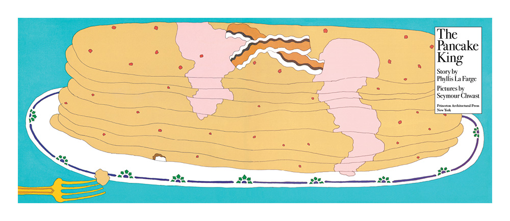
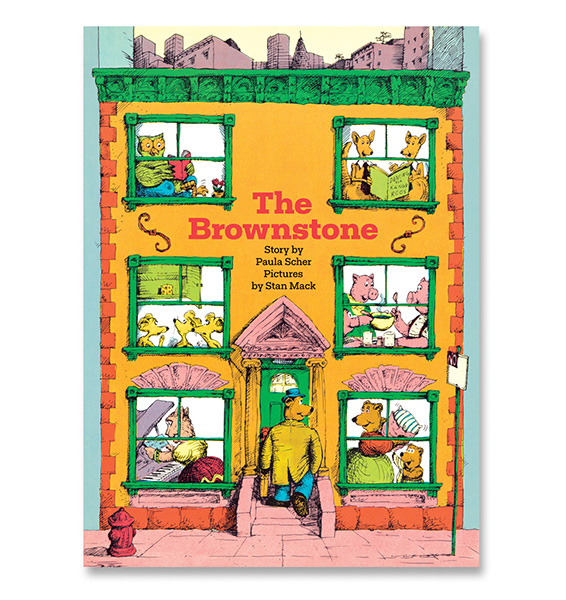
Two children’s books by Paula Scher, of Pentagram, and Seymour Chwast, of Pushpin, are back in print.
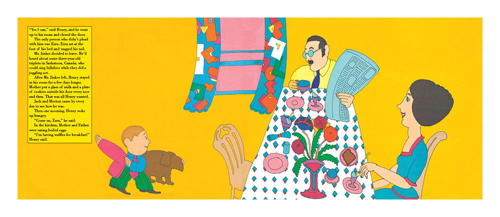
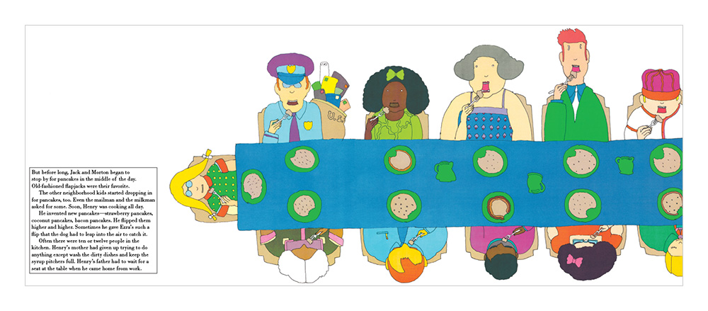
Chwast illustrated “The Pancake King” back in 1971 but it’s been out of print since the early 1980s. Princeton Architectural Press has brought it back, complete with a kid-friendly pancake recipe (with a new Chwast illustration) addendum. It’s as vibrant and lovely as ever, and is a wonderful showcase of Chwast’s signature, era-defining style.
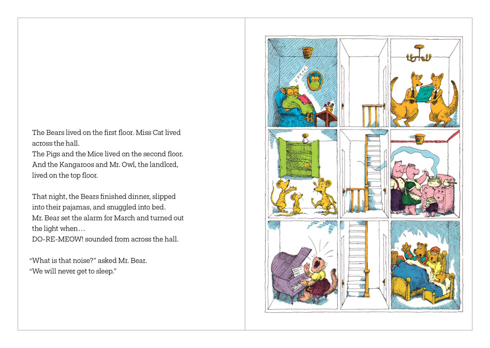
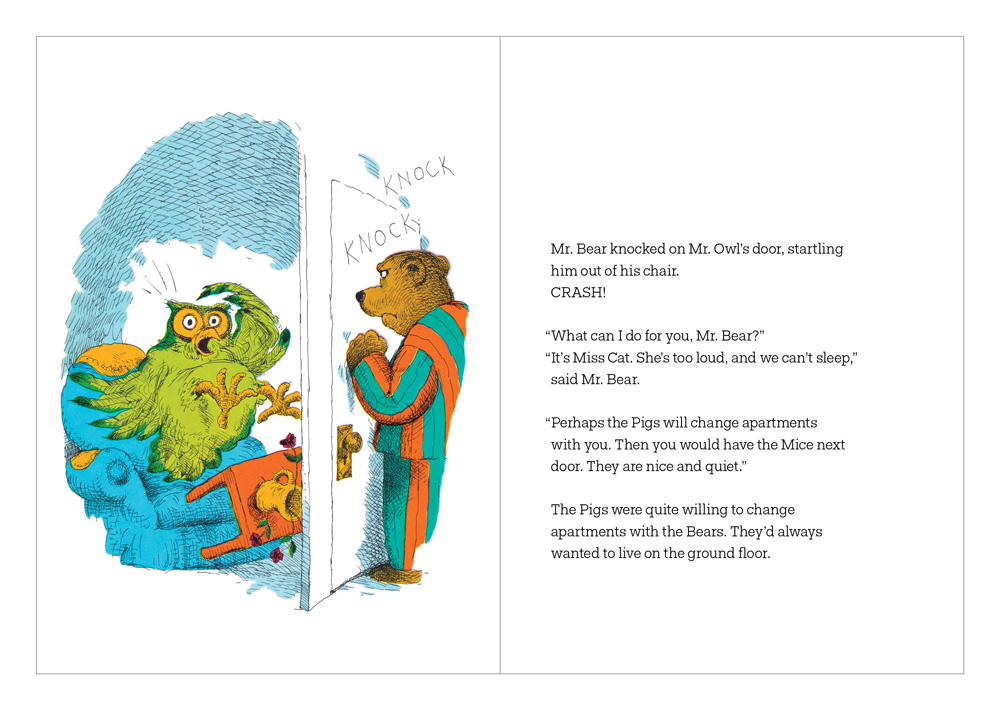
Paula Scher wrote (but did not illustrate) “The Brownstone” back in 1973. It’s a very New York-centric story of six families (cats, kangaroos, owls, mice, pigs, bears, and an owl as the landlord) living in a single browstone and what it takes for them to coexist. Most of the story is illustrated in a cutaway style that shows the tenants moving around the building.
My kids have been enjoying both books, but for several nights running they kept asking for me to re-read “The Brownstone,” sometimes repeatedly, if that tells you anything.
The peerless Paul Ford digs into the innards of Photoshop’s proprietary format, PSD:
You can read the entire specification, current as of 2013, updated on Adobe’s website. The more of it you read, the more you learn about the history of commercial software. Because Photoshop has to be backwards-compatible, and it has to deal with every kind of image imaginable, and it ultimately has to do that perfectly for millions of people.
You might think that a Photoshop file is just, like, a bunch of pixels. But not at all…
Photoshop itself is complex, it’s no secret, but its native file format is much more than just image information—both are records of what Ford calls “terrible imperatives,” years of business ambitions and user demands in code form, preserved in sedimentary fashion. And yet, as Ford acknowledges in his article, you can still open a file created in a twenty year old version of Photoshop with today’s software, seamlessly.
In spite of how good television has become, I still find it’s rare to find a show where every episode is a truly worthwhile chunk of time spent. If one season is ten or twenty episodes, at least three to five hours of it will be duds, in my experience. With those odds, and given I’m now past the age where time seems unlimited, I’d rather take my chances with movies instead. There are so many to watch. Beyond even all the great films that I haven’t seen yet—and all the great ones I’d like to re-watch—there are countless movies that I’m just curious about, that I’d like to discover for myself.
So I made a New Year’s resolution to cut out my television viewing and spend that time watching movies instead. So far, I’ve done pretty well. I went a little nuts in the beginning of January, but overall, when I look back on how I spent my time, I feel like I gained so much from watching these movies, much more than I would have had I binge-watched “The Walking Dead.” Here is a rundown.
January
“Sicario” Rewatched at home after seeing it in theaters last year.
“The Man from U.N.C.L.E.” Really had a hard time finishing this one. Completely inessential.
“The Double” I was skeptical at first because it seemed very arch, but it’s full of inventive stuff.
“The Keep” Finally got to watch this rare early Michael Mann movie, transferred from a terrible print, via Amazon. Pretty flimsy, but still has some vintage Mann elements.