is a blog about design, technology and culture written by Khoi Vinh, and has been more or less continuously published since December 2000 in New York City. Khoi is currently Principal Designer at Adobe. Previously, Khoi was co-founder and CEO of Mixel (acquired in 2013), Design Director of The New York Times Online, and co-founder of the design studio Behavior, LLC. He is the author of “How They Got There: Interviews with Digital Designers About Their Careers”and “Ordering Disorder: Grid Principles for Web Design,” and was named one of Fast Company’s “fifty most influential designers in America.” Khoi lives in Crown Heights, Brooklyn with his wife and three children.
Blurring Is the Auto-Tune of UI Design, and Other Things We Thought About While Designing Wildcard 2.0
After over six months of incredibly hard work, I’m so proud to say that today we’re releasing a brand new, completely redesigned version of Wildcard for iPhone. You can download it free right now. We’ve narrowed its focus to news and media, and my colleagues and I put a ton of time and energy into creating what we think is the best news experience in the App Store. It uses the card concept that is at the heart of everything we do at Wildcard, combined with a crackerjack editorial team that we assembled over the past six months, to create a remarkably efficient way to scan the latest news and dive into each story’s details as much or as little as you’d like—all in one place.
We also spent enormous amounts of energy creating a beautifully designed showcase for what cards can do. Here are some of my favorite details from Wildcard 2.0.
Halftones Instead of Blurs
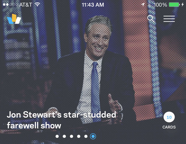
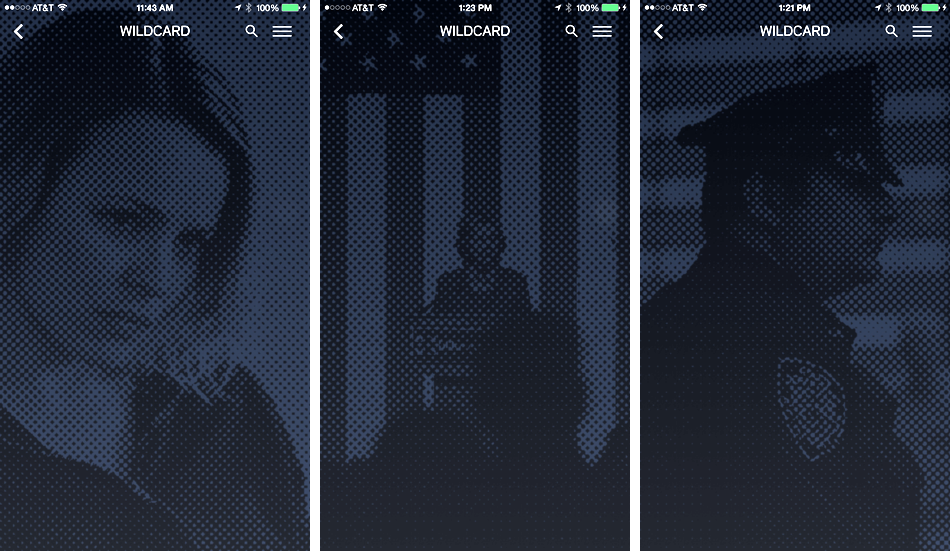
Like it says in the title of this post: blurring is the Auto-Tune of UI design. That is, it creates a pleasant enough effect, but it’s heavily overused (to put it politely). We set out to create an alternative and, given our new focus on news, decided to borrow from the print world by using a halftone effect that emulates the way photographs appear in newspapers. You’ll see it in full color in the headlines we have at the top of the app’s home screen and in monotone throughout the rest of the app. This video shows it in action, but because halftones by design tend to look seamless at smaller sizes, you should watch it full screen to see the full effect.
Unfortunately there’s no halftone function built into iOS, so we had to roll our own: each time an editor selects a photograph to use in our content management system, it is automatically processed on a custom image server that produces a halftone counterpart. Here’s a few examples.
That halftone version, which is a fairly lightweight, translucent PNG, gets downloaded to the iOS client on the fly; each time a user opens up one of our collections of cards (look for cards with circled numbers in the top right corner), the thumbnail image enlarges and is replaced by the halftone, which serves as the backdrop for that view of the collection.
Cards Are Independent of One Another and Behave Accordingly
We’ve spent a lot of time thinking about what it means for something to be a card, particularly what “physical” properties it should have. At the risk of skeuomorphism, we decided that for us one of the foundational ideas is that cards should scroll independently.
In typical scrolling views, like the Contacts app on your iPhone or even Twitter, the constituent parts of the stream all scroll together, in lock step. That makes sense because in those cases the streams are really lists; in Wildcard our stream is composed of individual cards, with each card a representation of some other form of information.
It probably would have been fine to have them all scroll in lock step like traditional streams do, but we wanted to imbue each with independent motion in order to emphasize their card-ness, as it were. If you watch this video, you’ll see how, even though they all move together, they sometimes lag one another and space opens up between them. It’s not so much a single view that you’re scrolling here as it is a series of cards.
Reading Content in Web Views Can Be Better
Embedded web views are the bane of news apps. Wildcard 2.0 has a speedy, elegant Reader-like view (we call it View as Card) but we want publishers to get their page views too. So we decided to default to an embedded web browser—but we worked hard to make it the slickest one out there.
Instead of clearing away the summary card altogether, as most do, our web view loads just beneath the card when you tap on “Read More.” This lets you keep your context until the page itself is fully loaded and ready; when it is, the card quietly transitions away. When you exit the view, the card stream comes back onto the stage, right where you left off. Being able to maintain the user’s sense of place really mitigates the interruptive nature that native apps’ web views suffer from.
Cards Carry Their Own Actions
In Wildcard 2.0 every card has its own properties that allow common actions—sharing that card and saving it to our in-app My Cards file are both available now, with more to come soon. These are activated by pressing and holding (we’re ready for Force Touch when it comes to iPhone), but power users can also press, hold and drag the card to the action they desire.
It took many, many iterations to refine this interaction; at various points in development it was either too difficult or too easy to trigger this state. We thought about creating different affordances for novices and experts, but with tons of testing, we were able to come up with a single method that could scale between them.
Splitting the Difference Between Apple’s Brand and Wildcard’s
Part of the challenge for every designer of a new iOS product is how much to adhere to Apple’s design guidelines and how much to stray from them. Our approach was to respect the spirit of the law rather than the letter of the law, so to speak, and you can see that throughout the app: the user interface elements are familiar, but not perfectly consistent with the operating system.
We veered a little further when it came time to design our home page at trywildcard.com though. Apple is pretty clear about using its App Store badge and iPhone visual assets as is, but we decided to push the envelope a bit.
On the left side of the page, we’re rotating in and out a series of news images (updated every few days and treated with our halftone effect). As the colors change there, we’re making corresponding visual changes in the App Store badge and the highlights of the iPhone. The color shifts in the phone’s photographic details in particular are subtle, but the effect visually unifies the page. This is done with just two images; the standard phone image overlaid with a translucent PNG that contains just the darkest parts of the phone image (separated out in Photoshop) and colored with CSS.
Those are just some of the many details we really sweated over while designing this app. It was hard work but also incredibly fun; at the beginning of the project we were lucky enough to get broad agreement from the team that this new version should really be a design showcase. You don’t get that kind of opportunity every day, nor do you get to work with a talented team that fully commits itself to doing that.