is a blog about design, technology and culture written by Khoi Vinh, and has been more or less continuously published since December 2000 in New York City. Khoi is currently Principal Designer at Adobe. Previously, Khoi was co-founder and CEO of Mixel (acquired in 2013), Design Director of The New York Times Online, and co-founder of the design studio Behavior, LLC. He is the author of “How They Got There: Interviews with Digital Designers About Their Careers”and “Ordering Disorder: Grid Principles for Web Design,” and was named one of Fast Company’s “fifty most influential designers in America.” Khoi lives in Crown Heights, Brooklyn with his wife and three children.
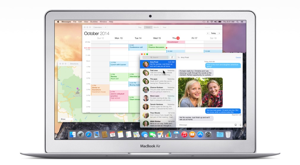
Over the weekend I installed OS X Yosemite on my MacBook Air. Its new interface, partially inspired by the dramatic aesthetic shift that its sibling made with iOS 7, will take some getting used to for me. Here are some thoughts.
Yosemite’s ambitions are evident: it aims to be a much more elegant, more sophisticated, less elaborate visual presentation than what came before it. For me, it doesn’t achieve those goals, but the groundwork is clearly there, in raw—perhaps too raw—form. In many ways, it feels very much like starting over again in the way that Mac OS X’s Aqua interface was a new start, over thirteen years ago. In those nascent stages, Aqua was never particularly beautiful, but it did make a point—it was a radically new kind of interface aesthetic that heralded a new approach to software. And the same ideas that informed later, much more successful iterations of the operating system were clearly present even then.
This is true with Yosemite, too. Spend just a bit of time with it, and you can almost picture the iterations to come, when future releases will have fully worked out the visual language and the gestalt of the interface will have cohered to a more advanced state. OS X Balboa and OS X Palisades are going to look great.
In the meantime, though, I find Yosemite lacking in polish, full of awkward decisions and unresolved tensions. Safari, in particular, seems to have trouble balancing theory—the idea that the same software on iOS and OS X should share a structurally similar user interface—with execution—its symmetrical arrangement of interface elements is not all that symmetrical in practice, and its buttons seem improvised and lacking in care. Yosemite’s icons are also surprisingly haphazard; Apple has established new paradigms for some icons, but aesthetically, there seem to be few stylistic threads connecting the rendering of these icons together. Take a look at those populating Yosemite’s Systems Preferences, where some of the renderings are reductive and others are highly detailed, and the only apparent commonality is randomness. If anything, a revised look and feel for the operating system was an opportunity to rethink the presentation of its preferences as a unified visual system, but this falls far short of that.
Some people have also been unhappy about Helvetica’s new role as the standard OS typeface, supplanting Lucida Grande. I’m a Helvetica partisan, so I’m not really in this camp; besides, Helvetica has been the standard system typeface for iOS since the beginning, and largely without complaint, so the protests in Yosemite’s case seem to be more about the shock of the new than any inherent problems with the typeface. I’ll admit though that Helvetica does not look great on non-Retina screens (of which my MacBook Air is one). More on that later.
My biggest complaint, personally, is that this fresh coat of paint does a poor job on visual contrast. Interface elements are often so light in color and/or so close to one another in color that they “bleed” into each other all the time. The effect is a blown-out look, as if a novice photographer stepped up the exposure on her camera well beyond advisability. In previous versions of OS X, it was common to use dark, sometimes hard edges to help delineate where one piece of UI ends and another one begins. Apple’s designers have seemingly restricted themselves from employing that very basic technique throughout Yosemite, or at least have sought to dial back its use significantly.
I’m told that this “edgeless” effect is mitigated on Retina screens, but since none of my Macs qualify, I have to take that on faith. If that’s the case, if Apple designed Yosemite expressly to make Retina Macs look superior to non-Retina Macs, I’m surprised. I’ve always assumed that, to a greater extent than most people realize, one of Apple’s most important benchmarks for the design of their software is, “Will it look good in the showroom?” That’s why we’ve gotten so many visually startling and aesthetically dubious effects over the years—they look great on those demo tables at the Apple Store, especially to new customers. But in this case, only a portion of Apple’s Macs are currently Retina-enabled, which means Yosemite will undercut the appeal of the rest. That seems conspicuously un-Apple like to me.
It’s been less than a week since I’ve been on Yosemite, so I hesitate to pronounce it a failure (or a success) so soon. I had a similarly negative reaction to iOS 7 at its debut, and while I still think there is a lot that’s fundamentally flawed about that operating system’s execution, I did come to appreciate the point that it was making—that the time had come for a new approach, even if not every question it raised had an answer at that moment. Maybe that will be the case with Yosemite too.