is a blog about design, technology and culture written by Khoi Vinh, and has been more or less continuously published since December 2000 in New York City. Khoi is currently Principal Designer at Adobe. Previously, Khoi was co-founder and CEO of Mixel (acquired in 2013), Design Director of The New York Times Online, and co-founder of the design studio Behavior, LLC. He is the author of “How They Got There: Interviews with Digital Designers About Their Careers”and “Ordering Disorder: Grid Principles for Web Design,” and was named one of Fast Company’s “fifty most influential designers in America.” Khoi lives in Crown Heights, Brooklyn with his wife and three children.
You can read an extensive review of iOS 9 over at Ars Technica that gives you tremendous insight into every nook and cranny of the operating system. Or you can read a single, half-baked comment about iOS 9 that I wrote right here. Is it really a choice? Here goes.
I wasn’t particularly excited about Apple’s decision to displace Helvetica Neue with San Francisco, the company’s new bespoke typeface, in this latest version of the operating system. When I installed the beta for iOS 9, seeing it everywhere felt somehow wrong, like I was holding an Android device instead. It’s no secret that I’m a deeply committed Helvetica partisan, so it was painful, in fact, to see it replaced.
But over the past weeks I’ve grown accustomed to San Francisco’s slightly more uniform characters and mildly boxier curves. The strangeness has dissipated—the new fonts seem now totally fine to me. I’m still not convinced that it’s a better solution than Helvetica Neue, but San Francisco pulls off a neat trick of being both more utilitarian and more casual at once. And I’ve started to feel an affection for it that I’ve never felt for Google’s Roboto fonts, which I regard to be its closest counterparts. Both type families are very good answers to the problem of maximizing legibility and brand distinctiveness on mobile platforms; for me, San Francisco is the more successful of the two.
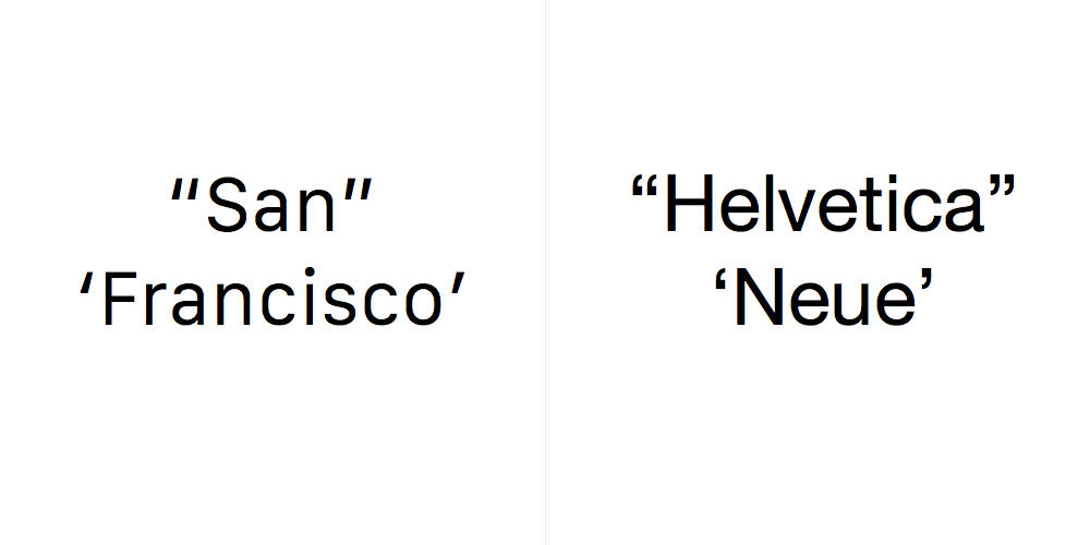
There’s one small detail that irritates me, though. Well, a few small details: the character designs for San Francisco’s opening and closing quotes are barely distinguishable from one another. The opening forms are heavier at the bottom and the closing forms are heavier at the top, but the difference is hard to detect, and both are essentially the same slanted lines. Of course, having such similar shapes for these glyphs can be a valid aesthetic choice for certain typefaces intended for certain kinds of usages. It just seems odd to me that San Francisco, which was custom designed for maximum legibility on digital devices, made this particular choice.
Comparing its quotes alongside Helvetica Neue’s quotes, I can’t help but feel that this was a misfire. Aesthetically, San Francisco’s quotes do look sharper, it’s true, but they feel colder and less thoughtful to me. Helvetica Neue’s quotes, I think it’s safe to say, are far more legible and for me much more elegant.
Of course, most things look better in Helvetica Neue to me anyway, so take that for what it’s worth.