is a blog about design, technology and culture written by Khoi Vinh, and has been more or less continuously published since December 2000 in New York City. Khoi is currently Principal Designer at Adobe. Previously, Khoi was co-founder and CEO of Mixel (acquired in 2013), Design Director of The New York Times Online, and co-founder of the design studio Behavior, LLC. He is the author of “How They Got There: Interviews with Digital Designers About Their Careers”and “Ordering Disorder: Grid Principles for Web Design,” and was named one of Fast Company’s “fifty most influential designers in America.” Khoi lives in Crown Heights, Brooklyn with his wife and three children.
Fred Levy’s Black Dogs Project photographs dark-coated canines in hopes of helping to counter black dog syndrome, a phenomenon in which black dogs are adopted at a lower rate—and euthanized at a higher rate—than dogs with lighter coats. The portraits are beautiful, ennobling and, well, humanizing.
Canine Portrait from Fred Levy’s “Black Dogs Project”+
Richard Linklater’s “Boyhood,” out now, was shot over the course of twelve years, for just several days each year, with the same cast. It begins in 2002 with its central protagonist, played by Ellar Coltrane, and follows him through high school graduation and his first day at college. Along the way, you witness time work its mutative power on the actors as they physically age before your eyes. It’s completely mundane, but also thoroughly startling.
After waiting eagerly for it for some months, I got to see it on Friday night when it opened in New York. What a wonderful film. The result is more awe-inspiring, more affecting, more moving than any CG marvel that Hollywood can muster—the true definition of movie magic.
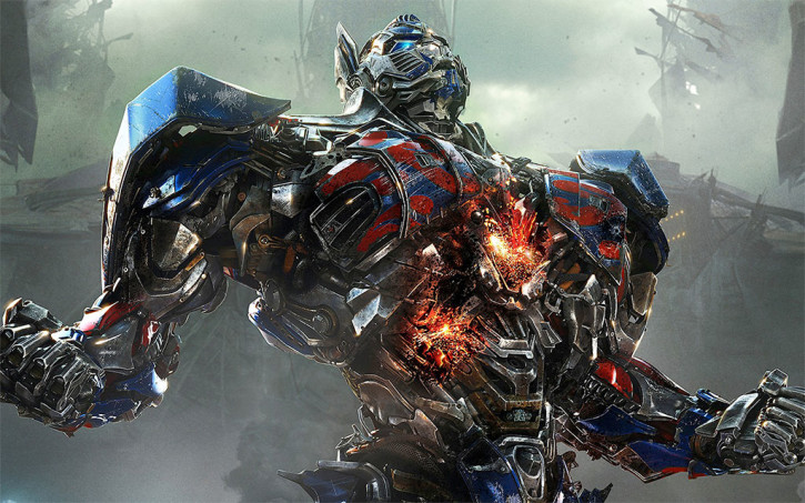
When I wrote my post “Understanding Michael Bay’s Cruel Joke,” I completely forgot that I had bookmarked this fantastic video essay about Bay’s directorial tropes from Every Frame a Painting’s Tony Zhou, posted to YouTube earlier this month. Zhou, a wonderfully literate and accessibly articulate film thinker, dissects Bay’s staging and gets at the heart of how “Bayhem”—his name for the director’s specific blend of action, choreography, cinematography and editing—is constructed. It’s a very revealing, entertaining watch.
In the end, Zhou comes to the same conclusion that many critics seem to have arrived at this month, on the occasion of Bay’s newest feature film “Transformers: Age of Extinction” and its outsized success: Michael Bay’s work is important, though probably for all the wrong reasons.
What to do about a director like Michael Bay, auteur—or perpetrator, depending on how you look at it—of blisteringly macho movies like “The Rock,” “Armageddon,” “Pain & Gain” and of course, the numbingly profitable “Transformers” series (the latest of which sold US$104 million in tickets last weekend)? If there’s a measure of critical respect in inverse proportion to box office success, then Bay stands head and shoulders above his contemporaries. He is singularly reviled and successful, and in that distinction he demands thoughtful appraisal of some kind.
Robbie Collin, chief film critic of The Telegraph, gives that a shot this week in this column. He claims, rather hyperbolically (is there any other way to talk about this director?), that Bay is not just an interesting filmmaker, but perhaps an exceptional one too.
The numbers are skyscraper high because Bay’s films are some of the few that offer a mass audience something that box sets and video games don’t: they’re awesome, in the word’s proper sense, and the cinema is where you have to see them. Like it or not, he is the most important director working in Hollywood today.
The trick to understanding Bay is not dismissing him. Any common-or-garden nitwit can, and frequently does, point a camera at girls, cars and carnage, and call it a movie. Not anyone can take those three elements and turn them into a film that can fill cinemas for weeks. Bay’s detractors often grouse that he has nothing to say: what they mean is they’ve heard what he says loud and clear, and don’t much care for it.
His films are unashamedly patriotic (heroes stand proud before fluttering Stars and Stripes), militaristic (conflict solves problems, diplomacy always fails) and materialistic (everything that’s shiny and expensive is fetishised to the point of parody). ‘When it started, America was just a handful of scrawny colonies,’ says Wahlberg’s character in ‘Pain & Gain.’ ‘Now, it’s the most buff, pumped-up country on the planet. That’s pretty rad.’
This is admittedly deeper consideration than most people have given the director’s flagrantly shallow work, but it only just scratches at that surface. Collin’s contention that Bay purveys goods that dismissive film fans find gauche has some truth to it, but it’s hardly the whole story.
You have no reason to believe anything I have to say about ThinkUp, the personal analytics tool that “gives you insights about your social networks that you can’t find anywhere else.” Its founders Anil Dash and Gina Trapani are friends of mine; they work regularly with Matt Jacobs, another close friend and my co-conspirator on Kidpost; and last year, I spent some weeks helping them design the basis for the service’s current interface. In short, I’m biased.
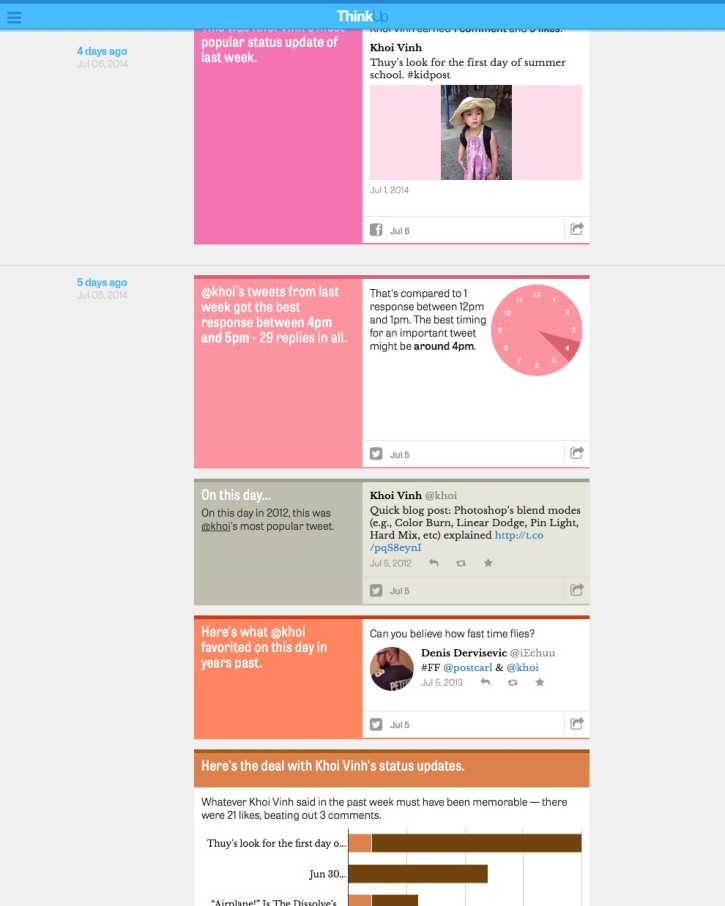
That said I am sincere when I say that each morning, when I wake up, my favorite morning email and the first one I check is my daily ThinkUp digest, which summarizes all of the insights that ThinkUp has mined for me by scanning my Twitter and Facebook accounts. I read through the email quickly and tap through to see my ThinkUp stream—which is publicly viewable, by the way, and looks like this.
There’s always something genuinely interesting there, whether it’s which of my recent tweets has the most retweets and favorites; interesting new people who have recently started following me; how many times I posted to Facebook last week (not that much; I basically just use Facebook to test Kidpost); or what my most popular tweet was two years ago. I’ve watched these insights get progressively better over the past nine months or so, too, and as the service matures I find it more and more valuable all the time.
Now, happily, ThinkUp has introduced 14-day free trials for new users—the company has always charged for the service, so the barrier to entry has been higher than most social media products. So, assuming you have every reason to doubt my endorsement, you can now find out firsthand how terrific it is. Then you can come back and tell me how right I am.
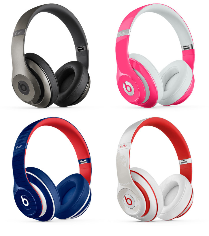
When Apple acquired Beats in the spring, there was some confusion as to why; some people didn’t understand why Apple would want to get into the premium headphones market, while others (including myself) speculated that Apple was buying into the emerging streaming music market. This afternoon I found myself looking through Beatsbydre.com, and one possible reason suddenly hit me: Beats headphones come in tons of color combinations. Here are just four.
These aren’t just four colorways, or simple variants on coloring the same materials. These are four distinctly different combinations of plastics types and manufacturing methods, some distinguished by color, others by texture, and one by some kind of screen-printed graphic.
What’s more, these are just four options. The site’s headphones page lists—just for this product category alone—some sixty different color and style combinations across five or so different models. (All of which, by the way, sell for at least $179; not bad considering earbuds are given away free as a matter of course with smartphones.)
This reminded me immediately of what I wrote wrote last month about “Wearables, Fashion and iWatch”: iWatch, if it exists, will need to be more of a fashionable good than Apple has ever created before; fashionable goods depend in part on variability in order to satisfy individualized consumer expression; and creating variability at scale is the key economic challenge of wearables. It’s very difficult to successfully produce and deliver truly variable technology goods; that’s why iPods have never come in more than four or five colors and why Apple had such a hard time creating a white iPhone on its first time trying.
It seems that the Beats team has figured this out, at least in part. Sixty different SKUs for headphones alone is a lot of items to manage, a lot of materials to source in the pipeline, a lot of shipping logistics to orchestrate. This number also shows how finely Beats has been able to parse consumer desire and to create product variations that map to them—who knew hip-hop fans would want a matte black version with a German flag-like design? Beats knew, and they’re apparently selling tons of them.
If you take a look at Beats’ headphones product catalog, it looks a lot closer to, say, the Nixon watches catalog than any catalog of technology products. Beats’ headphones, like Nixon’s watches, are oriented such that the primary selection criteria are looks and style; you’ve got to wade through those before you decide which model you want. By contrast, on Apple’s site, you’ve got to choose your model before you can choose your style—or, put another way, you choose what you want it do, first, and then you get to choose what you want it to look like.
These differences reflect fundamentally distinct ways of thinking about products, or more importantly, fundamentally distinct ways of thinking about what customers want. One path leads to a company that makes technology that (they hope) consumers will find to be fashionable; the other path leads to a company that makes fashionable goods powered by technology. Apple acquired Beats because it hopes that its future will look more like the latter than the former.
For some time there have been low-lying but persistent objections to the hamburger icon and “side drawers” as navigation conventions in mobile apps. This post by Luis Abreu makes a compelling argument for “Why and How to Avoid Hamburger Menus.” Reasons include lower discoverability (what’s out of sight is out of mind), lower efficiency (more taps and travel effort for users to access items), conflicts with platform navigation patterns (the hamburger icon is not fully native to either of the two mobile operating systems), and lack of visibility into content (it’s difficult to indicate specific kinds of activity for items hidden in a side drawer).
The hamburger icon is an imperfect user interface element, to be sure, but then there are few perfect ones out there. For many apps, it has served as a convenient place to stash unresolved software features, much like preferences used to be in desktop software. That widespread usefulness is probably at the root of this backlash; there has clearly been a lot of hamburger/side drawer abuse in the convention’s short but prolific life.
Still, I’m fond of this pattern if only because it has become widely recognized as representing the place where you can go to find an app’s miscellaneous bits. In my opinion, it’s a benefit to users to have a more or less universally recognized icon that signals profile settings, account management, push notifications and other assorted housekeeping items. These things are not always easily grouped together in a single iconic concept, nor are they the central focus of most software, so having a single target for users to hit when they go looking for those items can be a boon. It’s when primary navigation gets stashed in side drawers and obscured by the abstraction of a hamburger icon that confusion really sets in. If you ask me, it would be a shame to do away with this useful, identifiable UI convention entirely. In theory it could be salvaged by more disciplined implementation, though the reality may be that its susceptibility to abuse is so ripe that it will always be used “wrongly” more than we’d like.
This post by Taylor Davidson is a few months old, but it’s nevertheless useful as an overview of an important evolution in mobile ecosystems. Davidson writes about the current interest in deep linking—methods that allow users to tap on a link and be taken to a specific piece of content within a native app.
Deep linking is another example of how the mobile Internet experience has evolved very differently than the desktop Internet experience, in part driven by the success of mobile apps as the dominant mobile Internet experience. Cookies, originally an open specification of the web, have been replaced by proprietary identification methods owned by popular apps or mobile operating systems. Deep linking, originally a best practice, is now a specification of its own. Without the URL structure of the web, mobile app developers are forced to implement deep linking schemes to build back some of the basic functionality that the open web was originally built upon.
Relatedly, Davidson also wrote this blog post with some smart insights on card interfaces a while back:
As a design model, a card is an important evolution because it addresses the specific demands of mobile devices and interfaces very effectively. Cards combine an information design pattern with a set of gesture interaction methods (swipes, flicks) that create efficient user experiences (and perhaps, great engagement metrics). Consider cards as part of the evolution from web pages to web streams to mobile streams, refining the feed-based content model used by web and mobile sites into the potential “atomic unit of content” on mobile.
But beyond the design cue, the larger significance of cards are the architecture behind them. In the implementations of cards by Twitter, Google, Kik and others, the card does more than just deliver first-party content from an internal API, but utilizes the structured interface of a card to display data from a variety of third-parties using first-party data. For example, a Tinder card is a structured display of first-party content from Tinder, while a Twitter card is a structured display of third-party content that is served natively into the card that may also be personalized using first-party Twitter data.
These two types of cards may be thought of as “1st party card interfaces” and “3rd party card interfaces,” but however they are defined, it’s an important distinction. A Tinder card is a unit of content. A Twitter card is a platform.
Thanks to Ryan Dawidjan for supplying virtually this entire post over Slack.
This new game from Google combines the company’s signature Google Maps product with trivia questions about geography. Players answer questions like “This was the site of a 1773 tea party, which sparked the American Revolution” by moving the map pin onto Boston, say. If you get the answer wrong, the penalty is determined by how many miles off you were from where the pin should have been correctly placed.
Weird, right? I’m mystified by the motivation behind Smart Pins—does Google really need to drum up awareness of its Maps product? And if so, is an elaborate trivia game the best way to do that? Who exactly is going to come across this game and become convinced that Google Maps is the right product for them?
On the other hand, this game is a hell of a lot of fun, an elegant concept beautifully implemented. The insight to score wrong answers by miles is super smart, the kind of perfect alignment of functionality, metaphor and humor that signals real humanity in digital products. Setting aside the fact that there doesn’t seem to be a good reason for Smarty Pins to exist, the fact that it does exist is pretty great.
Apple fans like myself often criticize Google for doing things that Apple would never do, and Smarty Pins is a prime example of that. Aside from being an unfair criticism, it’s pointless. The fact that Google endeavors to produce silly things like this is on the whole a positive thing, I believe. It’s acting according to its own compass, which is what every company should be doing.