is a blog about design, technology and culture written by Khoi Vinh, and has been more or less continuously published since December 2000 in New York City. Khoi is currently Principal Designer at Adobe. Previously, Khoi was co-founder and CEO of Mixel (acquired in 2013), Design Director of The New York Times Online, and co-founder of the design studio Behavior, LLC. He is the author of “How They Got There: Interviews with Digital Designers About Their Careers”and “Ordering Disorder: Grid Principles for Web Design,” and was named one of Fast Company’s “fifty most influential designers in America.” Khoi lives in Crown Heights, Brooklyn with his wife and three children.
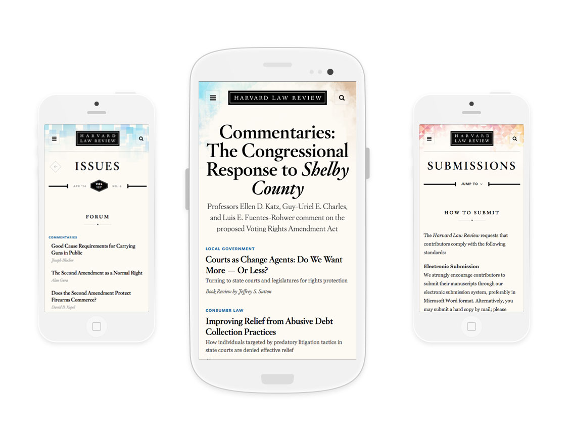
This redesign was launched about four weeks ago by Upstatement. I like the home page much, much more than the secondary pages, but overall it’s impressive work. Via Typewolf.
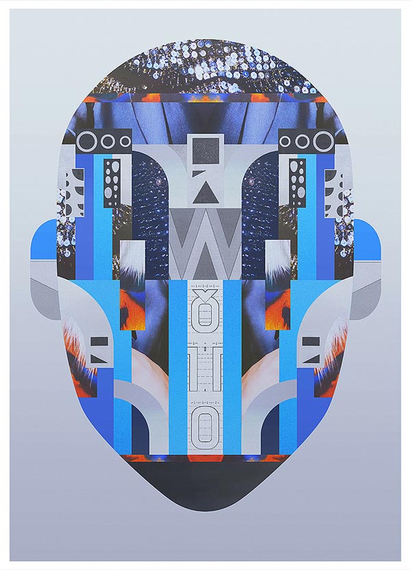
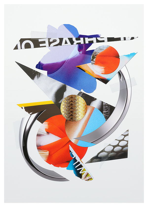
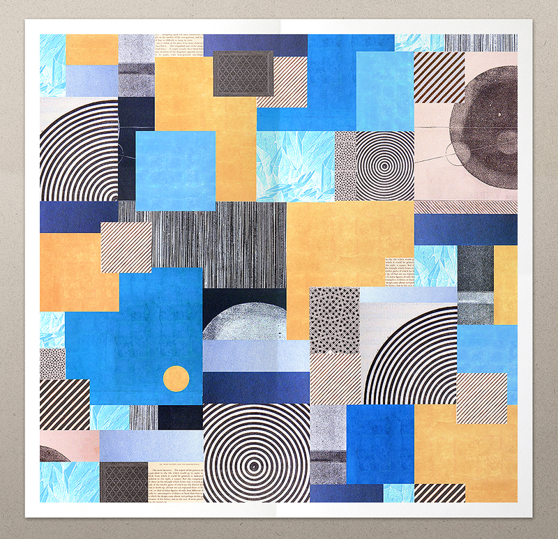
These collage-based works from New York-based illustrator Emeric Trahand, who goes by the name Takeshi, are beautiful. I’m entranced by their symmetry, and their balance of geometric forms and random images.
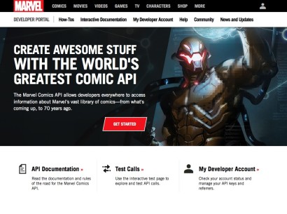
Yes, that’s what I said: a developer API for seventy years’ worth of Marvel Comics content. You can now write your own application and make use of Marvel’s countless characters, creators, series, even story arcs.
What a remarkable gift this is to kids (of all ages) with plenty of time on their hands and the wherewithal to expand upon the Marvel Universe’s fantastic patchwork of wonderful and ridiculous adventures. It would be even more amazing to be able to access the comic pages themselves, even on a panel-by-panel basis. But that’s getting greedy; even as it stands now, the potential to create genuinely interesting stuff from this data is already substantial. Hats off to the team who had the gumption to even think this would be a good idea.
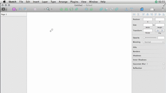
This plugin automatically creates placeholder content for design mockups within Bohemian Coding’s Sketch. Once installed, selecting a menu item will instantly generate photographic avatars, hypothetical user names and geo location data. This animation demonstrates how ridiculously easy it is to turn standard rounded rectangles into user avatars.
Also, for those wondering: there’s an obvious potential overlap between this plugin and Facebox, the pack of royalty-free user icons that I created last year with my friend Matt. He and I have been talking about adapting this plugin to utilize Facebox’s avatars and hope to have something working soon.
This excellent essay by Mills Baker questions the premium placed on designer-driven products over the past year or two. It cites Dropbox’s Carousel and Facebook’s Paper in particular for delivering high touch design solutions that have managed to achieve only poor adoption rates.
And if our best designers, ensconced in their labs with world-class teams, cannot reliably produce successful products, we should admit to ourselves that perhaps so-called ‘design science’ remains much less developed than computer science, and that we’d do well to stay humble despite our rising stature. Design’s new prominence means that design’s failures have ever-greater visibility.
To be sure, Baker’s view is a bit fatalistic; he equates a handful of high profile failures in which high profile designers figured prominently with virtual bankruptcy for the notion of design-led product development. Meanwhile, not only do countless products that are not design-driven fail every day without much notice, but plenty of design-driven products at smaller scales than Carousel and Paper actually manage to thrive.
Nevertheless, the aim of the article seems to be to offer a bit of a reality check on the dream of a technology products industry led by designers, and in that at least, it’s worthwhile. It’s also very well written. Read the article here.
The Wall Street Journal tries to make sense of the intricate, often confounding wireless service options available from the major North American carriers with this interactive calculator/wizard thingy. I wanted to call this tool “simple” but nothing about wireless plans is simple, and one look at it would belie such a label. So maybe it’s better to call it “simplifying.”
As it happens, I recently made some changes to my wireless service. After having had basically the same family plan from AT&T for a number of years, I realized that their newest plans would actually save us money, and by calling them up and switching to the “Mobile Share Value” plan, I was able to shave off about $55 a month — consistent with what this calculator tells me. The new monthly bill is still more money than I’d be paying with T-Mobile though, again according to The Journal’s calculator; I’m tempted to switch but I’m quite leery of T-Mobile’s spottier coverage.
Relatedly, when my wife decided to upgrade to a new iPhone 5s (64 GB model) recently, we decided to opt for an unlocked and contract-free phone instead of a subsidized one. It hurt a bit to pay the additional $450 up front, but after having done the math, we realized we’d be saving about $150 over the life of the contract. Plus, the phone is unlocked from day one; having jumped through AT&T’s Kafkaesque rigamarole to unlock her previous phone, I’ve come to truly appreciate the value of a phone free of carrier restrictions. I’ll probably never buy a subsidized phone again.
I wrote about the amazing mobile app Moves — billed as the “activity diary for your life” — last year and praised it immensely. For me, it was then and remains today a sterling example of software that is not only unique to the mobile experience, but transcendent because it is inherently mobile. In my write-up, I even described it as magic.
Today it was announced that Moves has been acquired by Facebook. When I heard the news, my heart sank. From where I stood, Moves had a long and fruitful life ahead of it and I was really looking forward to seeing it evolve. Now, though the company promises that it will be maintained as a standalone app, it seems unlikely to see much further development.
This is just the latest of many, many high quality acquisitions by Facebook, and while I suppose I ought to praise their good taste, I find myself feeling disappointed every time it happens. It’s hard for me to describe why, and I need to take the time (more time than I have today) to hammer out my thoughts on this in a coherent way.
For now the best I can do is to say that Facebook’s acquisitions never seem to promise something truly new and wonderful. Acquisitions aren’t going to do that every single time, of course; most of them will be about maximizing shareholder value regardless of the larger implications. But I’d like to think that truly great companies are doing something more than just generating obscene profits (or even just obscene stock prices), and that once in a while, they will put together a deal that makes everyone think, “Wow, I can’t wait to see what comes of this because it seems like it can’t help but be great.”
That’s what I thought when Apple bought Lala.com, or Amazon acquired Audible, or even when Google acquired Nest. Those were deals that made a certain sense, and promised unique outcomes that wouldn’t have been possible for either party on their own. By contrast Facebook’s acquisitions all seem to be about dominating markets or monopolizing talent — craven if justifiable business motivations. Going all the way back to their history-making purchase of Instagram, I can’t think of a single instance of Facebook acquiring another company that made me more optimistic about how the world would be different going forward. Their purchase of Moves seems no different.
I’m a big believer in the transformative power of the iPad, but there is no way that I’m buying this potty training seat with an integrated iPad stand for my twin 15-month boys:
Its official name is “The 2-in-1 iPotty with Activity Seat for iPad,” and the geniuses responsible for it are called CTA Digital. Their pitch for the iPotty reads in part:
Potty training can be a challenge for even the most patient parents and one of the biggest hurdles is gaining the child’s interest and then keeping their attention long enough to properly potty train. That’s where the iPotty comes in with its unique holder for the iPad. Many young children already love playing with their parents’ iPad, and now they can safely do so with the iPotty. It provides a fun and comfortable place to sit, while learning how to use the potty, playing apps, reading books or watching video clips.
CTA Digital also make all kinds of accessories for integrating iPads and other devices into every corner of your life.
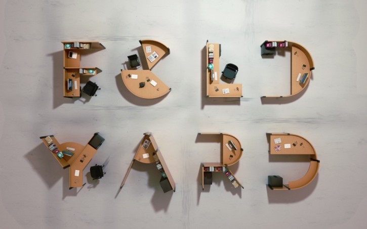
French designer Benoit Challand believes that the monotony of office cubicles can be remedied with typography. His project “Fold Yard” imagines workspaces as large-scale typographic forms. At standing or sitting height the shapes are not recognizable, but their variety theoretically breaks up the office landscape enough to please the eye. When seen from above, they reveal themselves as moderately abstracted capital letters.
These renderings are apparently computer-rendered, though they’re quite convincing. Via It’s Nice That.
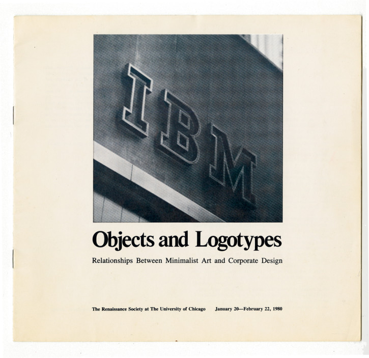
Art in America Magazine has this look back at an exhibition from 1980 that examined the striking similarities between minimalist art and corporate identity design. Titled “Objects and Logotypes: Relationships Between Minimalist Art and Corporate Design” and curated by Buzz Spector, the show juxtaposed identities for companies like the Aluminum Company of America, Chase Manhattan Bank and International Minerals & Chemical Corporation with minimalist works from artists like Donald Judd, Sol LeWitt and Carl Andre.
Spector did not intend to present these juxatpositions as a critique of either corporate design or minimalist art.
The nuanced relationship he posited between Minimal artists and the surrounding corporate culture was founded neither on gestures of ironic appropriation nor on an explicitly antagonistic position. Instead, the visual and material imprints of corporations were, in Spector’s view, inescapable conditions of aesthetic discourse in mid-20th century America. Having been exposed to the ‘ubiquitous presence… of the CBS ‘eye,’ IBM’s girder-like initials [and] the pristine mechanics of Alcoa’s ‘A,’’ Spector wrote, Minimal artists ‘assimilated the hard-core message of the successful logotype.
Nevertheless, the reaction from some members of the minimalist art community were pretty negative. Spector recounts:
I sent copies of my essay to Andre, Judd, LeWitt and [Robert] Morris. Only Morris responded, and with great hostility. He told Susanne Ghez that he would not permit the loan of his work to the project. Neither would he permit reproduction of his work. It was no coincidence, a short time later, that Castelli Gallery, which represented Morris at the time, suggested to Susanne that this project was such a bad idea that if she went ahead with it the gallery would not lend work to future Renaissance Society shows.
It’s fascinating and a little funny to think that an artist of Robert Morris’s stature would find such a comparison to graphic design so threatening that he would react with such enmity. Read the full article here.