I’m Feeling Lucky

Last week, Google announced a new feature that lets users customize Google.com with their own pictures. When I read about this, I groaned; here was another perfect example of Google peddling unbridled visual pollution in its unconscious drive to become the new Microsoft, purveyor of aesthetic misfires. I just couldn’t imagine a photograph that I’d like to see running in the background of their home page, the only truly elegant product that Google has ever designed. I mean, what would the point be?

Then Laura showed me the photo she uploaded. I stand corrected.

See the full-size image here.

Continue Reading

+

What I Said About Apple and Typography

I watched with dismay yesterday when the comment thread for my post, “Better Display, Same Typography,” a rant about Apple’s lackluster efforts in typography on all of its platforms, went a bit astray. Lots of commenters understood what I was trying to say, but many others didn’t.

Many thought I was criticizing the forthcoming iBooks for iPhone, which is understandable because the photo included in the post was of exactly that — iBooks for iPhone displaying a less-than-sterling example of typographic chops. But I wasn’t singling out iBooks, or the iOS even, so it’s my fault for not being sufficiently explicit.

What I meant was that, on all of its platforms, Apple has far from exceeded expectations it has itself set for typography. Just take one look at the Fonts panel that appears in any Cocoa app (e.g., TextEdit) to see what I mean. It hasn’t changed in nearly a decade, and it’s still far more difficult to use than it should be. (I also urge everyone to read Stephen Coles’ blog post, which I linked to, for more details on Apple’s infractions on the iPad.)

Maybe most disappointing of all, though, were the comments that asserted that no one cares about this stuff except for typographic prima donnas like myself, that it matters not one whit to the world at large. I readily admit that most people will never care whether Apple changes its ways here or not — it goes without saying that Apple more than satisfies the general public’s appetite for stellar design already — but that doesn’t mean that they should be let off the hook.

Fine typography is important; it’s a tradition that goes back for centuries, that has helped us elevate our communication and that informs our sense of self and civilization. Now, it’s true that in the midst of the digital revolution we’re living through, we may have to leave many such traditions behind, but fine typography doesn’t have to be one of them. There’s no technological or business reason why we can’t make the tools for rich typography more readily available.

In fact, we have much of what we need in place already, largely thanks to Apple: an ocean of beautifully rendered and thoughtfully constructed fonts, a desktop operating system with an audience that’s highly receptive to the craft, a mobile platform that unites visual design with hardware design, and increasingly capable displays for rendering great type. All we lack is the dedicated passion of people who are in a position to bring it all together, to carry it that last mile — or to fulfill the promise that such laudable work has established. That’s why I believe Apple should do a better job.

Continue Reading

+

Better Screen, Same Typography

Three years ago I waited in line to buy the original iPhone and I haven’t upgraded since, so I’m definitely warming up my credit card for Apple’s newly announced iPhone 4. I admit that it took some will power to sit out the subsequent releases of the iPhone 3G and the iPhone 3GS; the not-insignificant speed gains that those models brought would’ve come in really handy. Still, neither of those updates struck me as particularly impressive. They were incremental, at best, where iPhone 4 seems like a major leap forward.

Even the new phone’s screen, the so-called Retina Display, is an important development on its own. Its incredibly high concentration of pixels (326 ppi, or four times the density of previous iPhones) promises a quality of resolution that’s positively print-like, where the pixels seem to disappear to the eye and rendering of curved shapes is much smoother. The advent of higher and higher density screens like this one will continue to have some subtle but important changes on the way we practice design for digital media, eventually pushing us to work in a resolution-independent framework that’s currently foreign to most.

Continue Reading

+

The New New Typography

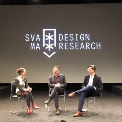
This coming Monday, I’ll have the honor of speaking at The Museum of Modern Art here in New York City as part of their PopRally event series. This particular event highlights MoMA’s current exhibition “The New Typography,” which includes a selection of seminal works from the eponymous design movement of the 1920s and 1930s. All of the pieces included in the exhibition are drawn from the personal collection of the legendary designer Jan Tschichold. Though the show is fairly small and intimate, there are some legendary and amazing selections to be seen there.

I’ll be joining Stephen Doyle of Doyle Partners, Chester Jenkins of Village, and moderator Juliet Kinchin (MoMA Curator of Architecture and Design), on stage in a conversation about typography in the twenty-first century and how it both draws upon and departs from the work of the New Typography from nearly a century ago. Needless to say, I’m very humbled. The event begins in one of the auditoriums at the museum’s main galleries on Fifty-third Street, and then continues upstairs with a private group viewing of the exhibition. I hope you can join us! Get your tickets here.

+

EW’s Must-See Must List

There’s been plenty of discussion lately about how print magazines have been swinging big and missing big on the iPad, how their attempts at translating the value of their printed pages into apps have been ill-advised or clumsy. Venture capitalist Fred Wilson sums it up best, I think, in a recent blog post in which he declares that he prefers content in a browser rather than in an app, and I tend to agree.

However, I think it’s worth pointing out that one publication, at least, has gotten it right: Time Warner’s Entertainment Weekly has a terrific app called EW’s Must List. Unexpectedly, it’s a user experience winner. It may never achieve recognition for bringing penetrating content to the app space, but in my mind it nails precisely what a print brand needs to do in order to win a share of the attention market on this platform.

Continue Reading

+

MagCulture.com/Paper

Ratings

2 of 5 stars
What’s this?

A newsprint compilation of some of the best of the excellent magazine blog’s many posts published over the past four years. MagCulture author Jeremy Leslie explains, “The great thing about blogging is the instantaneous nature of content publication, but the flip side is that the content disappears quickly too, becoming buried below the latest posts. This will help you dig out some of those posts.”

While I really enjoy MagCulture, and I think Jeremy is a very talented, very smart and very nice guy, I must confess that I have no idea what I’d do with this if I were to buy it. It seems like it’s almost a book, but its folded broadsheet-style format seems difficult to store. Anyway, it looks great.

+