is a blog about design, technology and culture written by Khoi Vinh, and has been more or less continuously published since December 2000 in New York City. Khoi is currently Principal Designer at Adobe. Previously, Khoi was co-founder and CEO of Mixel (acquired in 2013), Design Director of The New York Times Online, and co-founder of the design studio Behavior, LLC. He is the author of “How They Got There: Interviews with Digital Designers About Their Careers”and “Ordering Disorder: Grid Principles for Web Design,” and was named one of Fast Company’s “fifty most influential designers in America.” Khoi lives in Crown Heights, Brooklyn with his wife and three children.
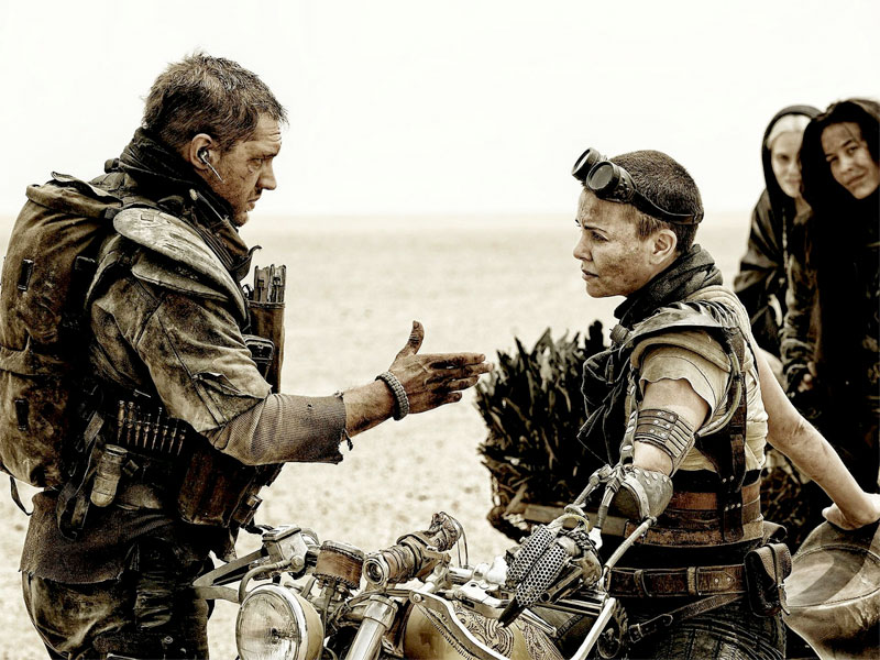
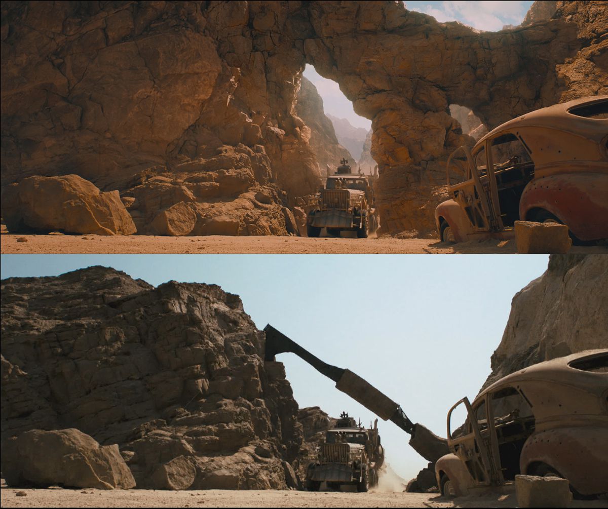
Director George Miller’s unexpectedly fantastic “Mad Max: Fury Road” has been touted as a triumph of so-called “practical” visual effects over CG, but that’s not exactly the whole story. In this extensive article on the effects work in the film, visual effects supervisor Andy Williams says:
I’ve been joking recently about how the film has been promoted as being a live action stunt driven film—which it is. But also how there’s so little CGI in the film. The reality is that there’s 2,000 VFX shots in the film. A very large number of those shots are very simple clean-ups and fixes and wire removals and painting out tire tracks from previous shots, but there are a big number of big VFX shots as well.
Actually, the way I think about it is that Miller’s film demonstrates a new maturity in the hybridization of practical and computer generated effects, one in which both disciplines are respected. The net result is so much more satisfying than most films that lean so heavily towards one or the other end of the spectrum because “Fury Road” audiences simply can’t tell what’s computer-generated and what’s not, so seamless is the result. Put another way, everything was believable. That’s what you want in movies, right?
The article underscores this dynamic by detailing many of these VFX pieces and comparing the original plates (i.e., what was captured in camera) with the final shots, enhanced with supplemental computer visualization and color grading. A few of these are not surprising, e.g., Charlize Theron’s prosthetic forearm, but others are quite revealing. The whole article is fascinating and doubly entertaining as yet another opportunity to think about how tremendously awesome this movie was. Go see it if you haven’t seen it yet, and then read the full article at fxguide.com.
During the mini tour of New York design teams that I conducted several weeks back, one of the things that came up often was that most designers manage their work files through Dropbox, and not through ostensibly more sophisticated version control systems. Dropbox’s high quality synching and near ubiquity have improved life dramatically for design teams of all sizes, but it still strikes me as remarkably archaic. Any time you find yourself manually naming, renaming or moving around files—anytime you find yourself staring at a directory structure—you’re doing a job that the computer should be doing for you.
I have little doubt that even the folks at Dropbox would agree with this. They’ve effectively admitted as much with a number of their software projects and acquisitions, particularly the version control system Pixelapse, which joined Dropbox earlier this year and seems destined to be integrated into the core Dropbox service next year. That integration may eventually change the way designers work, but it’s not exactly true that Pixelapse was winning hearts and minds in vast numbers before the acquisition. Not a single designer I spoke with mentioned it.
As much as smart passive management of design assets and working files seems inevitable, I don’t hear a tremendous amount of clamor for it. Maybe we’re all just set in our ways, but people seem at least resigned, and more likely just plain comfortable with managing their files. It may not be what future workflows are built around, but for working designers, the future is hypothetical, and Dropbox works today.
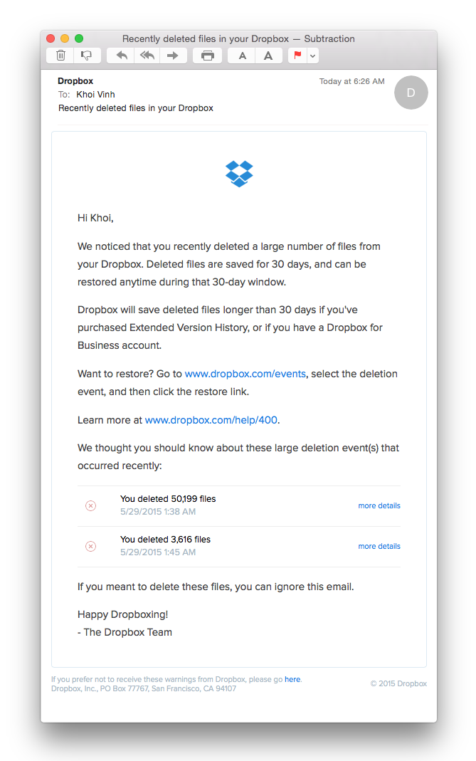
What’s more, Dropbox does a superb job of making today work well for nearly everyone. I was reminded of this after deleting two huge directories from my Dropbox last night. When I woke up this morning, this email was waiting for me in my inbox:
For me, this handy note underscored the continued relevancy of Dropbox’s file hierarchy-centric worldview. Even in an age when the biggest operating systems in the world actively eschew file hierarchies, Dropbox is thriving—its service matters deeply to countless users. Why? In part it’s because the company works hard at making file hierarchies useful, that they focus on the outcomes of file management and not just on the files and folders.
We think of Dropbox as a service for synching our directories, but the real value they bring is in applying a level of thoughtfulness that no one really applied to files before. A lot of that is part and parcel with storing this stuff in the cloud, which affords many user benefits—including availability of one’s files to countless third-party apps. But a lot of it is very particular to Dropbox’s superb design of the user experience. Even as the clock is surely ticking for file management—I can’t imagine we’ll still be navigating directory structures in a decade, or even in five years—the company proves that attention to real user problems matters more than aging interaction models. This highly considerate, well-timed and pitch perfect email attests to that; and as it happens, I did change my mind this morning and decided to restore those directories I had deleted.
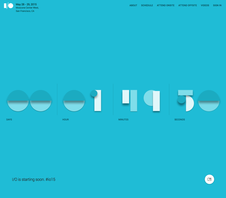
I’m more of an admirer of Google’s Material Design than a true fan, but I have to admit that the company is commendably dogged in its ambitions to become a leader in design. Their products started out looking defiantly ugly, struggled their way towards respectability, and now seem poised to achieve a distinctive aesthetic that’s all their own. This may not happen for a year or two yet, or it may happen later today, when Google’s annual I/O developer conference kicks off, if the countdown page on the event’s site is any indication:
The style of this counter is, if not wholly unique, at least very particular to the visual language that the company has been nurturing for the past year or two. Though the styling is novel, it nevertheless looks unmistakably like a Google production, something extrapolated from their specific values and priorities, and not like something derived from ideas borrowed from elsewhere. That’s good design.
Peter-Paul Koch, who describes himself as a mobile platform strategist, wrote this excellent appraisal of the state of web apps, which for years have been getting more and more complicated in order to match the richness of apps written expressly for iOS, Android, etc.
The web cannot emulate native perfectly, and it never will. Native apps talk directly to the operating system, while web apps talk to the browser, which talks to the OS. Thus there’s an extra layer web apps have to pass, and that makes them slightly slower and coarser than native apps. This problem is unsolvable.
Still, we web developers have spent the last six years in denial. Our working assumption has been that all web sites should be app-like, and therefore tooled up to the hilt. The web’s universal, right? Then it’s also the perfect medium for users performing complex tasks, right?
Wrong. I think.
Emulating native leads to bad UX (or, at least, a UX that’s clearly a sub-optimal copy of native UX), and to underperforming websites because of all the libraries and frameworks we think we need.
Koch cites news publishers particularly for creating unnecessarily complex web apps in order to shore up their businesses. It’s an incisive and compelling argument, and I recommend it. Read the full article at quirksmode.org.
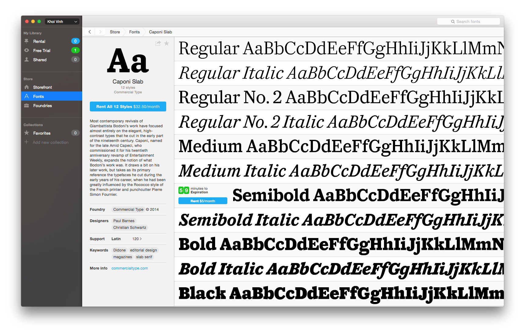
If Typekit dragged the type industry into the daylight of the modern Web, then the brand new Fontstand aims to finish the job of modernizing it. This new service allows, for the first time, on-the-fly trial and rental of quality fonts from foundries such as Commercial Type, Process Type Foundry, Type Together and a small but significant coterie of others. Install Fontstand’s Mac app and you have instant access to its full catalog; it takes just a click of the mouse to try any font for free for an hour, rent it for a month at just 10% of its retail price, or rent-to-own it over the course of twelve months.
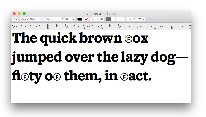
Everything works just as you’d expect—mostly. As soon as you access a font for trial it loads into your system and is available to any program, instantly and without hassle. In my preliminary testing, after the one-hour trial period ends the font is actually still available to running processes, but not to new ones. For example, I had loaded Commercial Type’s Caponi Slab and created a text block inside a Photoshop document; when the hour was up I was still able to create new text blocks in new files within Photoshop, but not within other apps that hadn’t been using Caponi Slab during that time.
Also, in trial mode the capital F character is replaced with a Fontstand icon, as shown below. (Also notice that the fi ligature works.)
That’s a small inconvenience to bear in exchange for a tremendous luxury that designers have wanted for years: the ability to give new fonts a spin quickly without making a purchase commitment. It’s an innovation that has seemed inevitable from the moment that cloud-based delivery of design assets became viable, but it’s taken this scrappy company from The Netherlands—who claim that they are “strictly independent from any existing large corporate entity on the font market”—to bring it to life. I sincerely wish them well—they’ve shown that creating this kind of product is possible; now they’ve got to show type designers around the world that it’s a viable business, too.
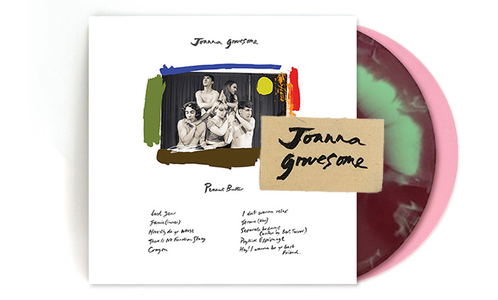
Joanna Gruesome is not a person but a band from Wales, and their just-released second record (titled “Peanut Butter,” okay whatever) clocks in at just twenty-two minutes. Allowing for commercials, that’s basically a sit-com’s worth of your time, but it will yield you much more pleasure than any episode of “The Great Bang Theory” because it’s fantastic, a remarkably solid if explosive mix of punky pluck and dreampop melodicism. I’m a sucker for this stuff, I admit, but who can resist when it’s this good? Here’s the third track from the record, the thoroughly winning “Honestly Do Yr Worst.”
You can find “Peanut Butter” on Spotify, but they’re an indie band released on an indie label, so if you want to offer maximum support, buy direct from slumberlandrecords.com.
This is the second installment in my ongoing series highlighting interesting job openings for designers. (See the first one on Toca Boca’s opening for a design director here.) This spotlight focuses on the social news site Digg, which in its hey day was a breakthrough hub for news discovery that drove tremendous traffic. By the time Betaworks Studio purchased the company in 2012, traffic and engagement had declined so precipitously that its top ten was rife with low quality links like “The Top 10 Clubs in Denver.” Since that time, a smart, dedicated team in New York has been able to revive the brand so that it is once again a compelling source of fascinating links. I asked Digg’s Michael Young about their opening for a product designer.
What makes this job a great opportunity for a product designer?
Digg exists in a pretty unique place outside of typical media or social experiences. We’re in a position to really innovate on how people find and share great content. We’ve got a super-talented engineering team, massive amount of data to work with, and some big problems that we’re trying to solve. We’re not looking for someone to just optimize some minor parts of the experience. A really well-rounded designer will be able to come in and make a big impact here.
How does design figure into where Digg is headed?
Design has been really key to reinventing the Digg brand and it’s going to be even more important going forward. When we took Digg over and relaunched in 2012, our goal was to distill the brand down to its essence and make it better. We combined excellent curation with clean, straightforward design to deliver the best stories on the web. We’re building on that foundation now with some ambitious new products. The challenge is to continue to make the Digg experience feel simple and intuitive. Beyond just great visual design, that’s going to require being more user-focused in our design process and do more user-testing.
What relationship will this product designer have with the rest of the team?
We’re a highly collaborative team, and this design role is a real lynchpin to the whole Digg organization. A product designer has to balance our business goals, our engineering challenges, the insight we have from our data, the needs of our users and translate all that into an elegant design. It also just has to be a product that’s fun to use! I think it comes down to this: more than anyone else on the team, a product designer on our team has to be the one that sees things through the eyes of the user and keeps the team focused on making a great experience for them.
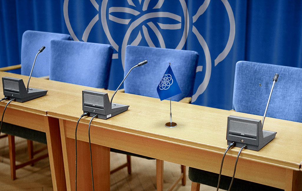
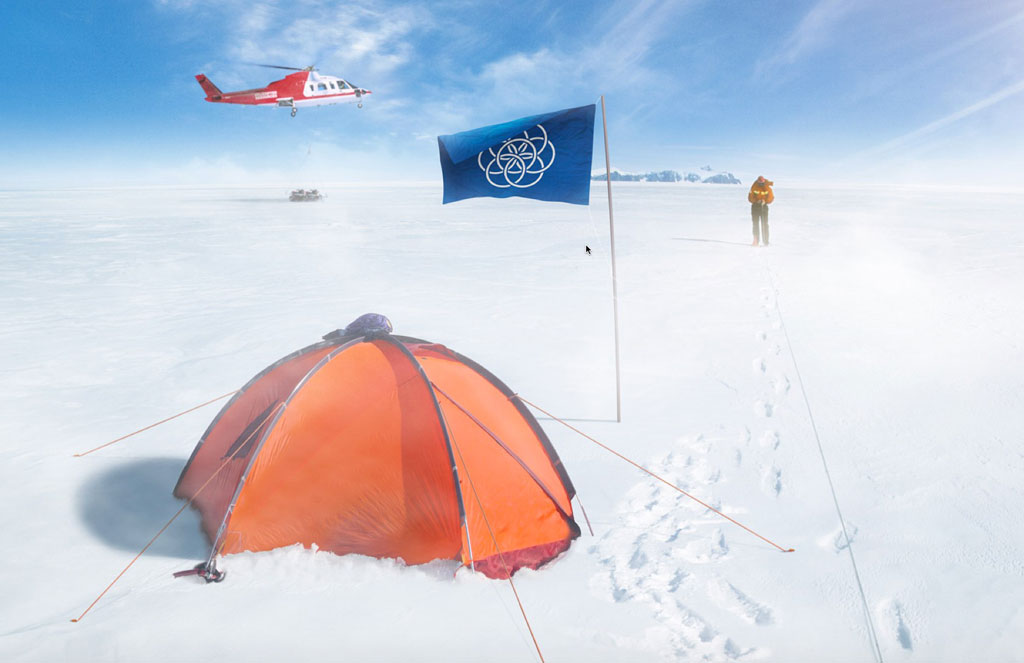
Swedish designer Oskar Pernefeldt’s graduation project for the Beckmans College of Design is an impressively professional proposal for a single flag to represent the entirety of the world we live on. His design for the flag is smart and quite plausible, but the reasoning he puts forth for it, outlined in the video above, is where his thinking truly shines. That, and the numerous immaculately realized renderings of the flag in hypothetical uses.
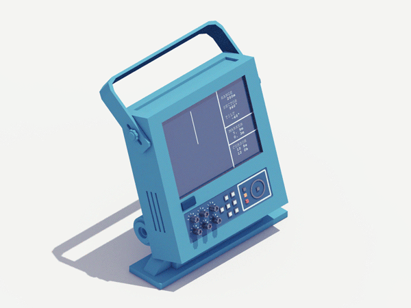
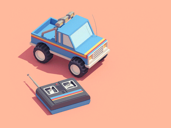
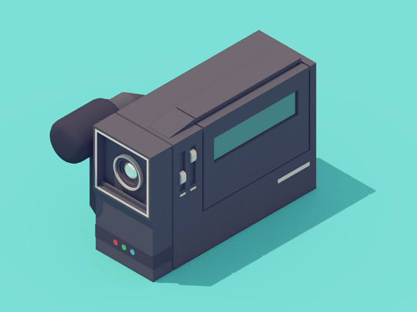
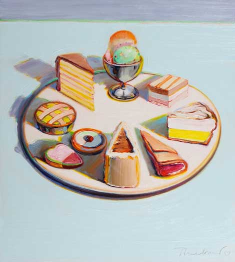
Various devices charmingly rendered in isometric views by Guillaume Kurkdjian, who also produces a Tumblr of weekly animated GIFs. Though they’re focused on very different subject matter, are executed in an entirely different medium, and are animated instead of static, their warm color palettes and understated presentation remind me of the work of painter Wayne Thiebaud. Here’s one example.
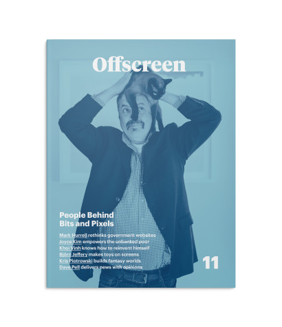
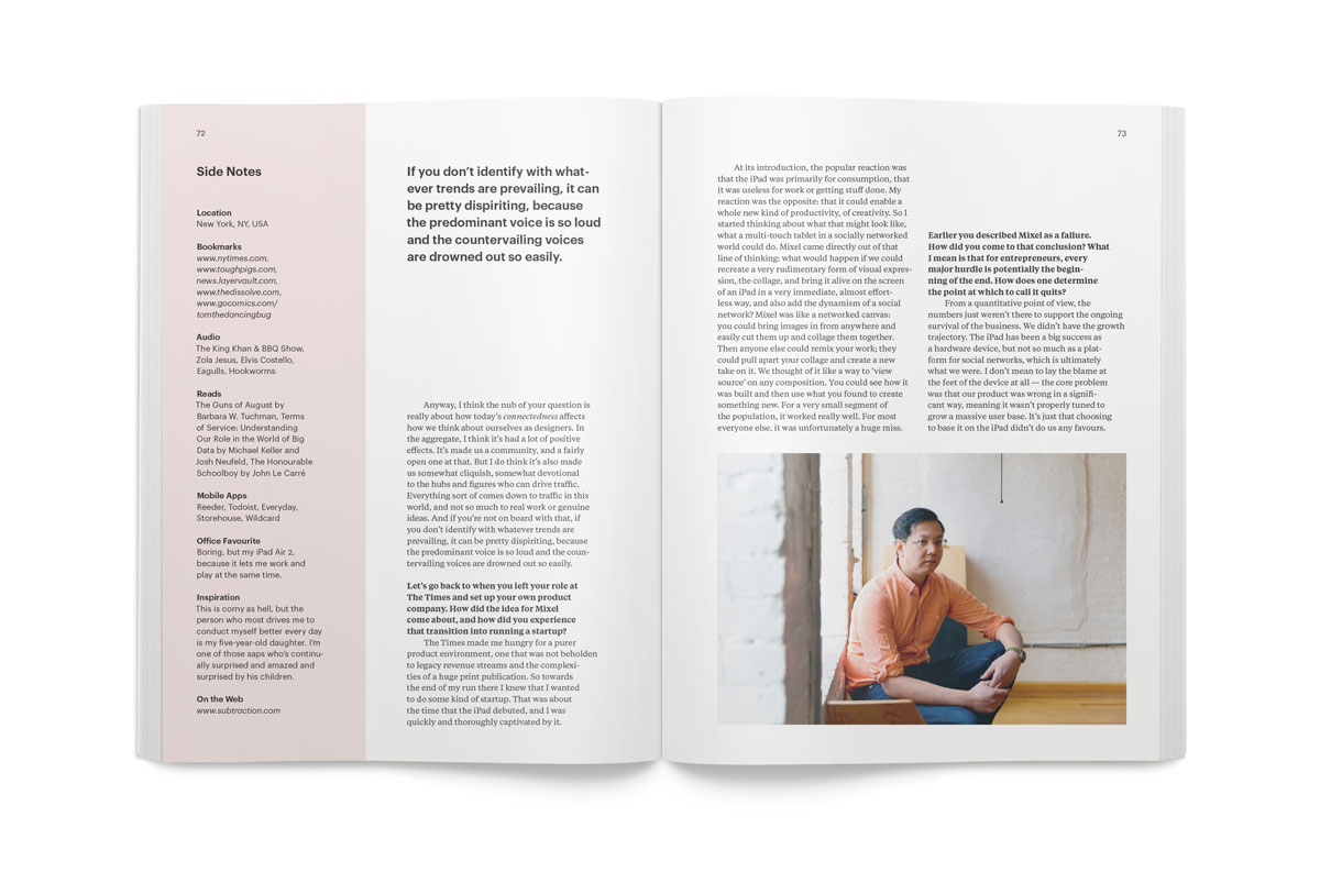
Kai Brach’s Offscreen, the defiantly print-based magazine “about the people behind bits and pixels” has just announced its eleventh issue, which includes an extensive interview with yours truly. I initially demurred when Brach asked to me to take part, but after we exchanged some emails, I relented when he assured me that it would be a substantive exchange, not just a breezy overview of my various projects and jobs. The end result is one of the most honest interviews I’ve given, I believe.
You can get your copy or subscribe to receive this and future issues—if you’ve never seen Offscreen in person, you should know that to hold one in your hands is to experience almost viscerally the enormous passion and detail that Brach invests into every detail of the production.