is a blog about design, technology and culture written by Khoi Vinh, and has been more or less continuously published since December 2000 in New York City. Khoi is currently Principal Designer at Adobe. Previously, Khoi was co-founder and CEO of Mixel (acquired in 2013), Design Director of The New York Times Online, and co-founder of the design studio Behavior, LLC. He is the author of “How They Got There: Interviews with Digital Designers About Their Careers”and “Ordering Disorder: Grid Principles for Web Design,” and was named one of Fast Company’s “fifty most influential designers in America.” Khoi lives in Crown Heights, Brooklyn with his wife and three children.
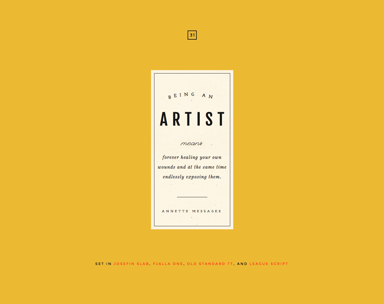
Each day for one hundred days, designer Do-hee Kim is designing and coding a creative showcase for two or more Google Fonts. This is the kind of project that many designers set out to create for themselves, but they often fall short on developing the actual content they’re designing with. Kim appears to be using self-initiated bits of text, at least some of them seemingly autobiographical, and the results are pretty entertaining. She’s currently on day thirty-one; I’m looking forward to seeing how the rest of them turn out.
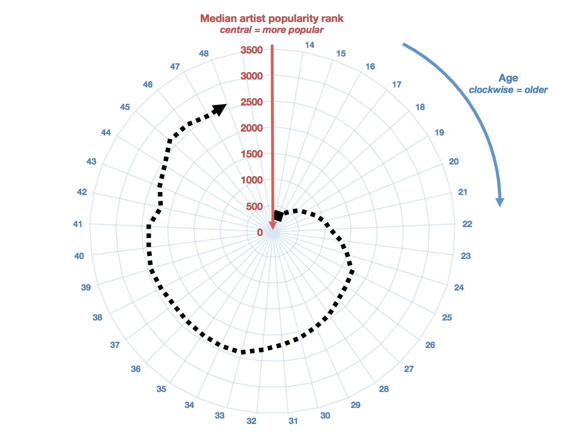
…while teens’ music taste is dominated by incredibly popular music, this proportion drops steadily through peoples’ 20s, before their tastes ‘mature’ in their early 30s.
…men and women listen similarly in their teens, but after that, men’s mainstream music listening decreases much faster than it does for women.
…at any age, people with children (inferred from listening habits) listen to a smaller amounts of currently-popular music than the average listener of that age.
Kalia visualizes the data with this slightly obscure but nevertheless very interesting graphic, which shows that by the time a user has entered his or her thirties, their musical tastes have drifted pretty far from the mainstream.
The point about how listening habits change when people become parents is particularly interesting to me for a couple of reasons. First, I initially thought that I was exempt from this pattern because even as a father I still invest a significant amount of energy into finding and listening to new bands and new music. However, it’s clear to me that the pattern Kalia articulates fits me to a T; the last time I was really conversant in the Billboard Top 40 was in my teens; nowadays I haven’t the slightest interest, in part because with three kids and so little free time, I can only justify listening to the things that truly interest me: my favorite albums from the 1980s and 1990s and new, contemporary acts that carry forward some of those bands’ same ideas and approaches.
Moreover, it’s worth noting how Kalia is able to determine whether and when a Spotify user becomes a parent. There’s certainly nowhere on your Spotify profile where you’d indicate that you have children, but that matters little because you effectively signal your parenthood through your music selections. When you start listening to large amounts of children’s music, it’s a reliable indicator that a child has entered your life. I bet it never occurred to most people that that kind of insight could be derived just from their Spotify usage. That’s the power of big data, for better or worse.
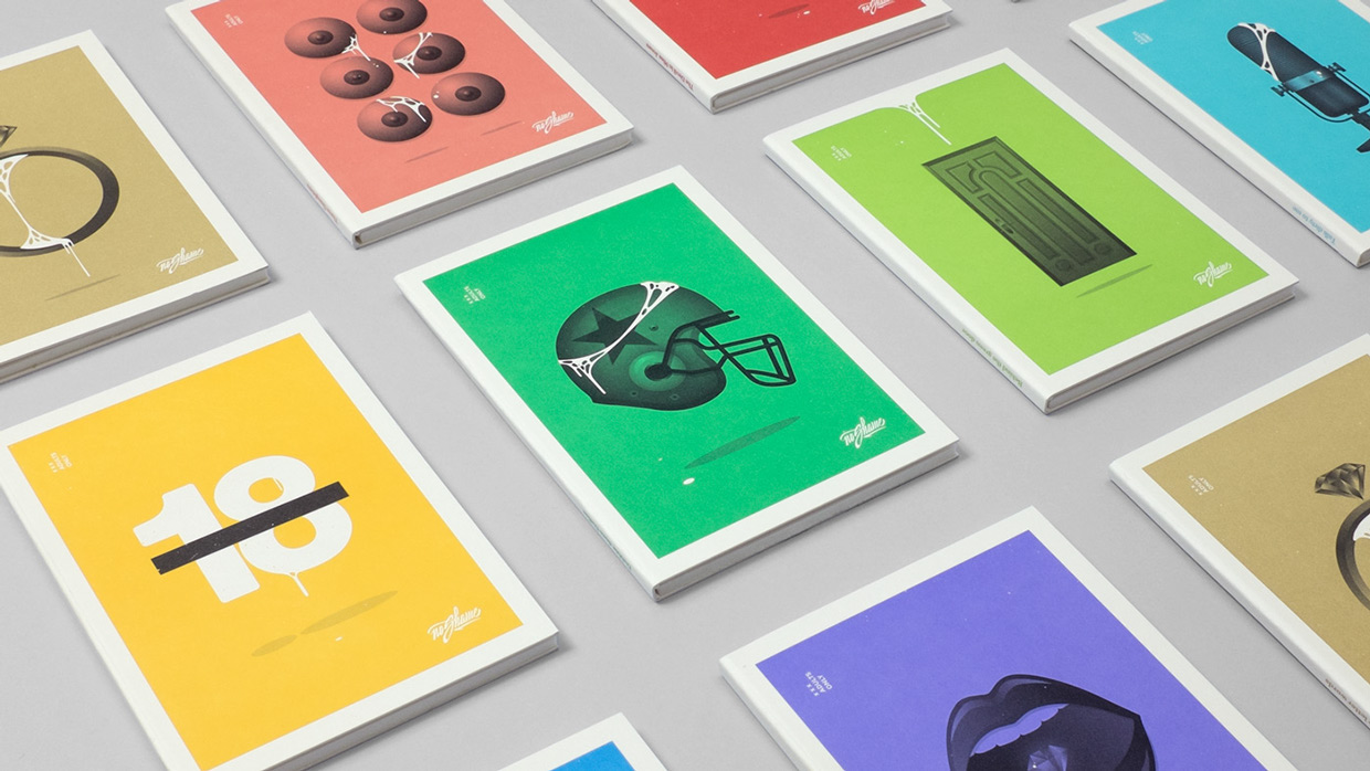
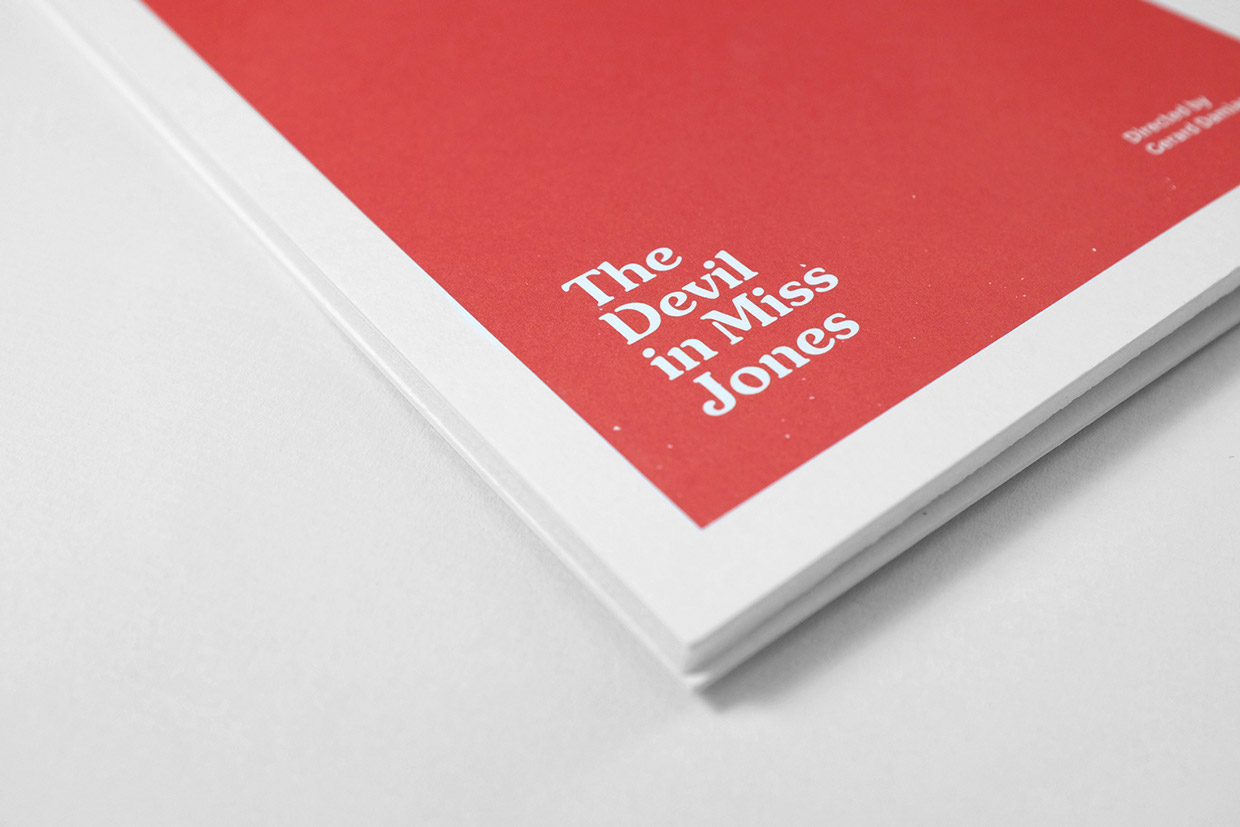
Advertising and design agency Lola and design studio Tata&Friends, both based in Spain, created this incongruously—maybe even inappropriately—elegant package for ten “iconic” porn movies. I asked them over email what inspired the project and their answer was simply: “The boundaries of shame.” I’ll leave it to others to parse the semantics, but it’s hard not to argue that the end product, of which they produced just one hundred copies, is beautiful.
See the full project at behance.net—you’ll have to login, as the project is restricted for its adult content.
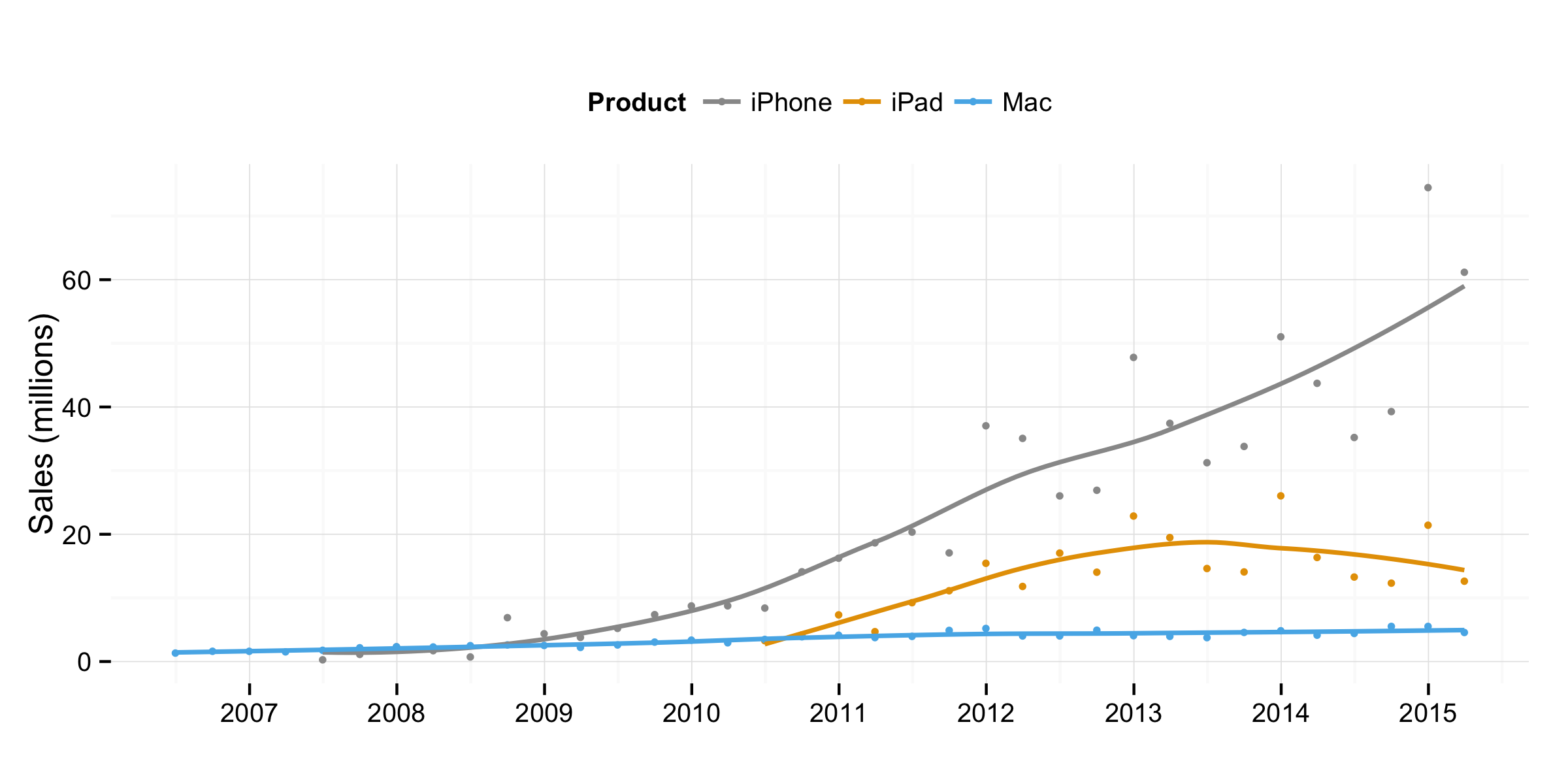
Quarterly sales data for Apple Macs, iPhones, and iPads by Kieran Healy.
When Apple released their quarterly estimates earlier in the week, the thing that stood out for me immediately was the revelation that iPad sales declined about 23% from the same quarter last year. Later in the week, two blog posts, one from Dr. Drang and one from Kieran Healy, applied some statistical expertise to show more clearly the nature of iPad sales’ downward trajectory over its five year life span. Dr. Drang wrote:
I think this way of presenting the data makes the iPad’s situation much clearer. Sales are not ‘flattening,’ nor are they ‘flat.’ They were flat in 2013, but now they’re going down, and they have been for a year. What’s most interesting to me is how the upward trend, still very strong in 2012, just stopped dead in 2013. This is something you can’t see—or at least I can’t see it—in the graphs of raw data.
To me this confirms a situation that I speculated on last year, when the latest iPad models were just released and Apple was conspicuously quiet about discussing their sales performance. It may be premature to declare that the iPad market is fully in decline—it’s still very young and as many Apple writers have said, it’s still a massive business. But it’s clear that the numbers are no longer pointing up.
There’s no definitive explanation for why this is the case yet, but the most likely arguments are, first, that these devices have a longer natural upgrade cycle, or, less optimistically, that people just don’t feel that they’re essential enough to keep buying.
To me, the central issue is whether Apple is functioning as an effective steward for the iPad as a platform. Are they creating the right conditions for it to succeed? Are they innovating iPad technology, both hardware and software, quickly and aggressively enough? Is Apple setting the stage for must-have software on the iPad?
More practically, you could ask: are developers getting what they need in order to create breakout software specific to the iPad? Have we seen iPad-specific apps that are so compelling that consumers feel that they must own iPads in order to use them?
Sadly, for most people the answer to these questions would probably be “no,” and I think that’s the heart of the problem here. I still believe that there is so much potential in the iPad and I hope that Apple does too; if they do, they will need to demonstrate that belief in a more emphatic way in the near future.
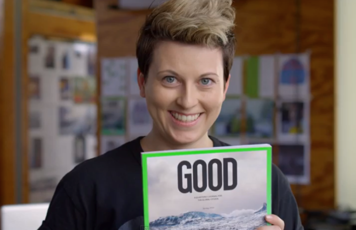
This video shows German-born, California-based graphic designer Nicole Jacek using Adobe Comp CC to design a cover for Good Magazine. Jacek begins the project with her iPad on a flight, right on her tray table (with room to spare), and then, back at her desk, sends the work to her desktop, where it opens up in InDesign automatically (no hunting for the document through a file hierarchy). All of the objects and text that Comp CC prepared are live and native to InDesign (had she chosen to send to Illustrator or Photoshop instead they would be native to those apps), so she’s able to seamlessly move into production. This is not a case where the process has been simplified for dramatic effect; Comp CC really works like this.
After a long spell of mostly sticking to my desk, lately I’ve found myself doing demos again at various speaking engagements, meetups and workshops, showing off both Wildcard and Adobe Comp CC. Going on the road and making presentations at various offices and conference rooms was something I used to do quite a bit, back in my days in the design services business, and in some ways I’m surprised by what has changed technologically—and what hasn’t.
Ten or fifteen years ago I used to tote around a portable projector in order to be absolutely sure that I would be able to project what I had to show. It was a bit of a pain, but at that point in time advancements in projector technology had reduced the size and weight of those devices just enough so that they were only minimally annoying to carry around. Plus, placing my faith in whatever audio-visual setup might be resident wherever I went to actually function for me was a sure ticket to a botched meeting.
Near the end of the last decade, though, as the price of LCD screens dropped dramatically, you could begin to rely on almost every place of business having a flat-screen screen TV. At that point it became a matter of making sure I had the right dongles or adapters with me so that I could hook up my laptop or portable device to the screen via a cable. That was an improvement, but if I was caught without the right dongle, I was out of luck, and I cringe to recall how many replacement dongles I’ve had to buy at the last minute when I hadn’t packed the right one.
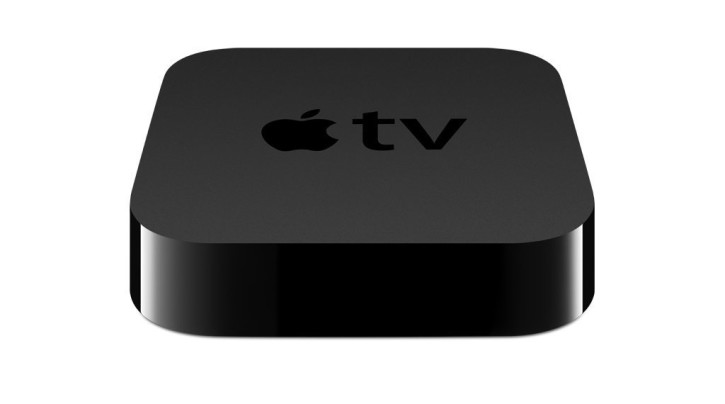
These days, I almost never need to bring a dongle with me at all, because most modern offices have supplemented their flat screens with Apple TV devices which allow me to AirPlay from laptop or iOS device right to the screen. In fact, I’m shocked at how many offices have these Apple TVs today; they’re clearly a significant if little discussed part of whatever revenue Apple has derived from the product line. (I’ve also never seen an equivalent Android device.) AirPlay isn’t perfect, but it works much more often than not, and for the most part it’s a joy to use.
On the whole, the situation has improved, and yet it seemingly hasn’t at all. Whether I was hooking up a projector in the old days or whether I’m using AirPlay today, it almost never fails that the first five to fifteen minutes of any meeting is spent just dealing with audio-visual setup. These days that could mean getting on a wi-fi network (or on the right one), trying to switch the source or input on the TV, finding the right cable or dongle when AirPlay isn’t available, making a Skype or Hangouts connection so that the presentation can be viewed remotely, or some other technical snafu that usually requires the resident IT expert to visit the room. Whatever the details, it happens almost like clockwork; guests are shown to a conference room, introductions are made and hands are shaken, and then a ridiculous technical fumbling ensues.
It’s very, very rare that I’ve ever seen anyone walk in off the street and start projecting straight away, without a hitch. I shudder to think of what the aggregate value of all those five- or ten-minute segments truly is—it must run into the billions of dollars. What’s amazing to me is that this is an area that has undoubtedly progressed—AirPlay is clearly a massive improvement over bring-your-own-projector—and yet it’s still so inefficient and almost primitive. Surely there’s a technological solution to this, and maybe even a business in it too, but I have to wonder if this is one of those things that will never change. No matter how sophisticated or clever we think we are or can be, as soon as we resolve today’s technological hurdles, we’ll create new ones for ourselves. One day soon we might finally make AirPlay universal and seamless, but then we’ll be faced with getting everyone’s Oculus headsets synced up or tuned in or whatever, too. Can’t wait.
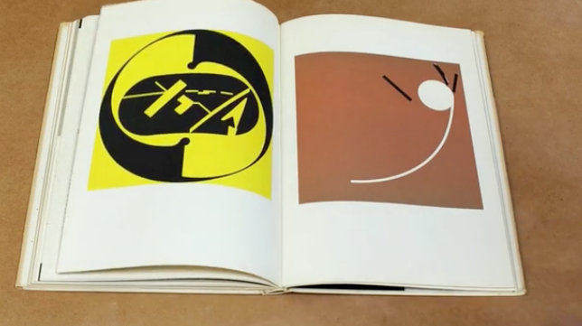
This Kickstarter campaign aims to print a facsimile edition of Czech-born design giant Ladislav Sutnar’s long out of print “Visual Design in Action,” bringing it to contemporary audiences again. Long considered one of the most beautiful books on modern graphic design, it was written and designed by Sutnar and published over fifty years ago. I backed it immediately.
The campaign is just getting under way today at kickstarter.com.
I’m of the mind that Marvel’s incredibly successful string of comic book movies is both popularly overestimated and critically under-appreciated. On the one hand, though they’re generally entertaining and highly adroit at fan service, they’re not particularly well-made movies. They’re loud and dumb and generally lacking in artistry and any ambition other than making the biggest possible ka-ching sound at the box office.
On the other hand, as I’ve said in the past, super-hero movies are the new Westerns and films noir. That is, they’re populist entertainments that say more about our current condition than their contemporary critics credit them for, and they’re likely to receive much greater appreciation given the passage of time. For example, it may be a decade or two longer before the level of condescension in Anthony Lane’s review of “Avengers: Age of Ultron” can be seen for what it is: lazy criticism. Lane writes in his first paragraph:
Who is Ultron? What is he? I went into ‘Avengers: Age of Ultron’ not knowing whether the name referred to a man, a concept, or a laundry powder, and I came out none the wiser. All I can tell you is that it speaks in the voice of James Spader, and that it can’t make up its humongous mind whether to save the world or to trash it. (This is a Marvel movie, so the third option—simply leaving the world to get on with its daily business, in its own sweet and shambling way—is not on the table.) To start with, Ultron seems to be a computer program, and at one point it even squares off against another computer program—a ball of sparky golden light versus a ball of sparky blue light, bobbing and spitting at each other, without a human in sight. Maybe one day all movies will look like that.
I have yet to see this movie (it opens in the U.S. later this week), and I’m honestly not incredibly enthusiastic about its prospects. Still, it’s hard to imagine a review for a film of any other genre starting with the critic boasting that he or she knows nothing about the source material. In fact, critics often go to great lengths in their writing to make it clear to readers that they’re deeply familiar with the books from which adaptations are derived, with the authors’ bodies of work, with the historical context for the work, etc. That’s part of the critic’s job—to understand the material, to consider more than what’s on the screen. Lane’s offhanded braggadocio is frankly irresponsible, and I can’t wait for it to be a thing of the past.
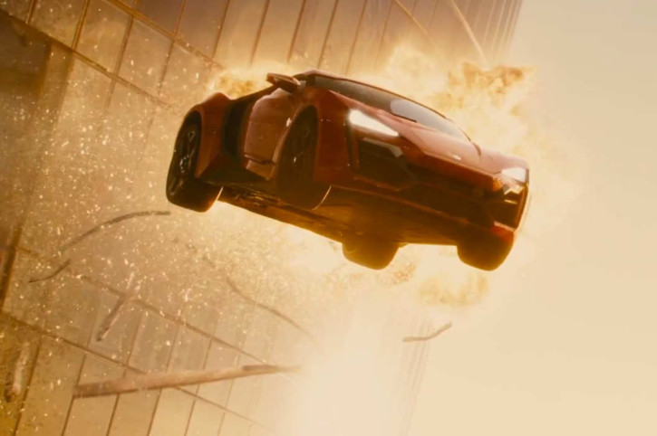
I had my say about the “Fast & Furious” franchise earlier this month, before the latest installment, “Furious 7” bowed in theaters. (I saw it on opening weekend and it was as over-the-top and enjoyable as I had hoped.) I thought that was about as much “Fast & Furious” as this blog would ever really need, but yesterday I ran across this excellent critical appraisal of the full series (so far) by Jesse Hassenger at The A.V. Club. Hassenger traces the series’ evolution from a small scale street racing flick into an outsized omnibus for continually escalating action film tropes. He delivers some fascinating observations, including the franchise’s preoccupation with automobiles as aircraft, and the often homoerotic undercurrents that anchor it throughout. I found these passages in particular to make for a very canny assessment of the unique nature of the franchise’s entertainment value:
But beyond succeeding as robust action entertainment in their own right, one of the most amazing aspects of latter-day ‘Fast & Furious’ movies is the way they manage to work omni-directionally. Watching, say, ‘Fast Five’ doesn’t just goad excitement for future sequels; it actually manages to improve the movies that precede it, too…
In a way, the existence of the lesser Fast movies (which is to say, parts two through four) has become crucial to the franchise’s mystique. It’s easier to appreciate the way the later movies abandon the mission of the first when ‘2 Fast 2 Furious’ and ‘Tokyo Drift’ are there to show off the potential pitfalls of sticking to that formula. The less essential sequels also ease the backstory burden from the later films. Movies five, six, and seven have plenty of dopey scenes where characters stand around discussing family, loyalty, family, riding and/or dying for one last/totally not last time, and family, but there’s also a degree of trust that the audience knows these characters and their history—or doesn’t care and will get the gist anyway. The relentless march of the sequels, then, manages to sell aspects of the earlier movies that didn’t work that well at the time.
Read the full essay at avclub.com. And I promise not to write about these movies again.
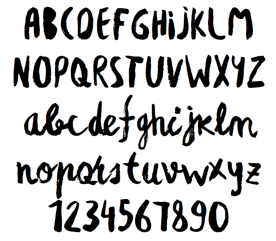
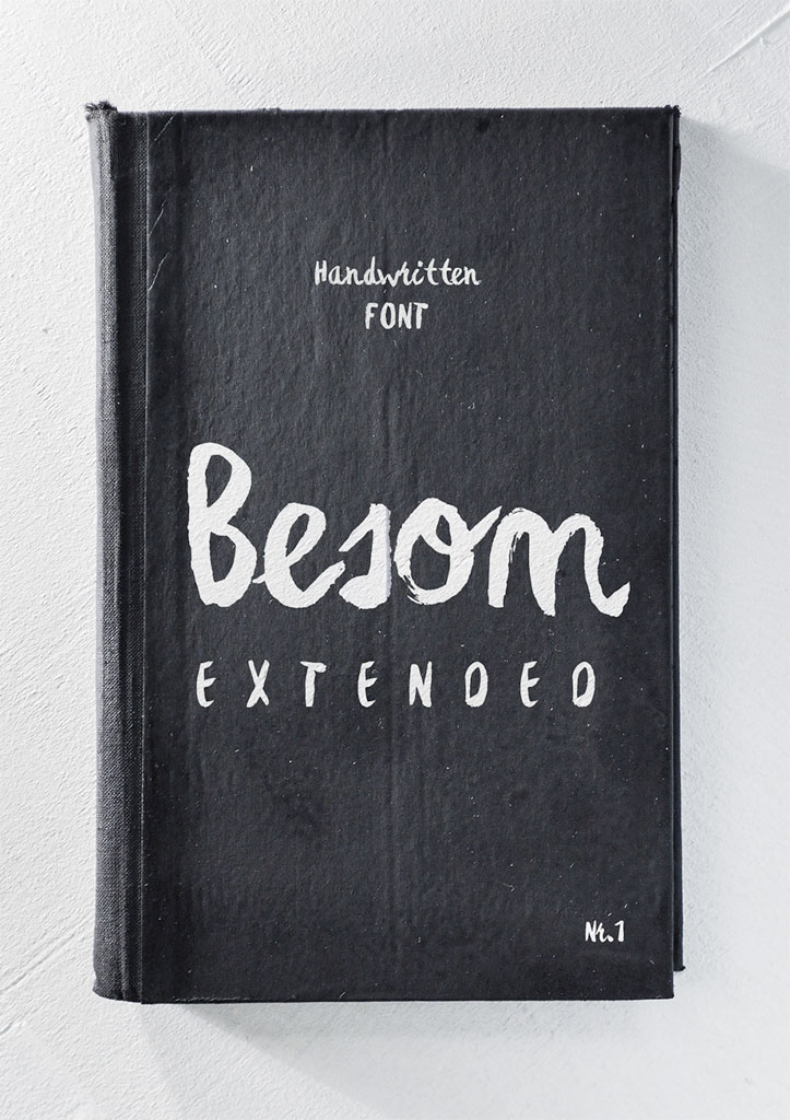
This hand-drawn brush lettering font was designed (painted) by designer Krisjanis Mezulis of RIT Creative in Latvia. The letterforms themselves are spontaneous and handsome, but I was really taken with the way RIT presents the typeface’s specimens—as an extension of emphatically worked strokes of paint on a canvas, or as exquisitely tactile lettering on a worn, buckram bound book. It’s some of the most attractive marketing for a typeface I can recall seeing.
Besom Extended contains 340 characters and is available for just US$4.95 at ritcreative.com.