is a blog about design, technology and culture written by Khoi Vinh, and has been more or less continuously published since December 2000 in New York City. Khoi is currently Principal Designer at Adobe. Previously, Khoi was co-founder and CEO of Mixel (acquired in 2013), Design Director of The New York Times Online, and co-founder of the design studio Behavior, LLC. He is the author of “How They Got There: Interviews with Digital Designers About Their Careers”and “Ordering Disorder: Grid Principles for Web Design,” and was named one of Fast Company’s “fifty most influential designers in America.” Khoi lives in Crown Heights, Brooklyn with his wife and three children.
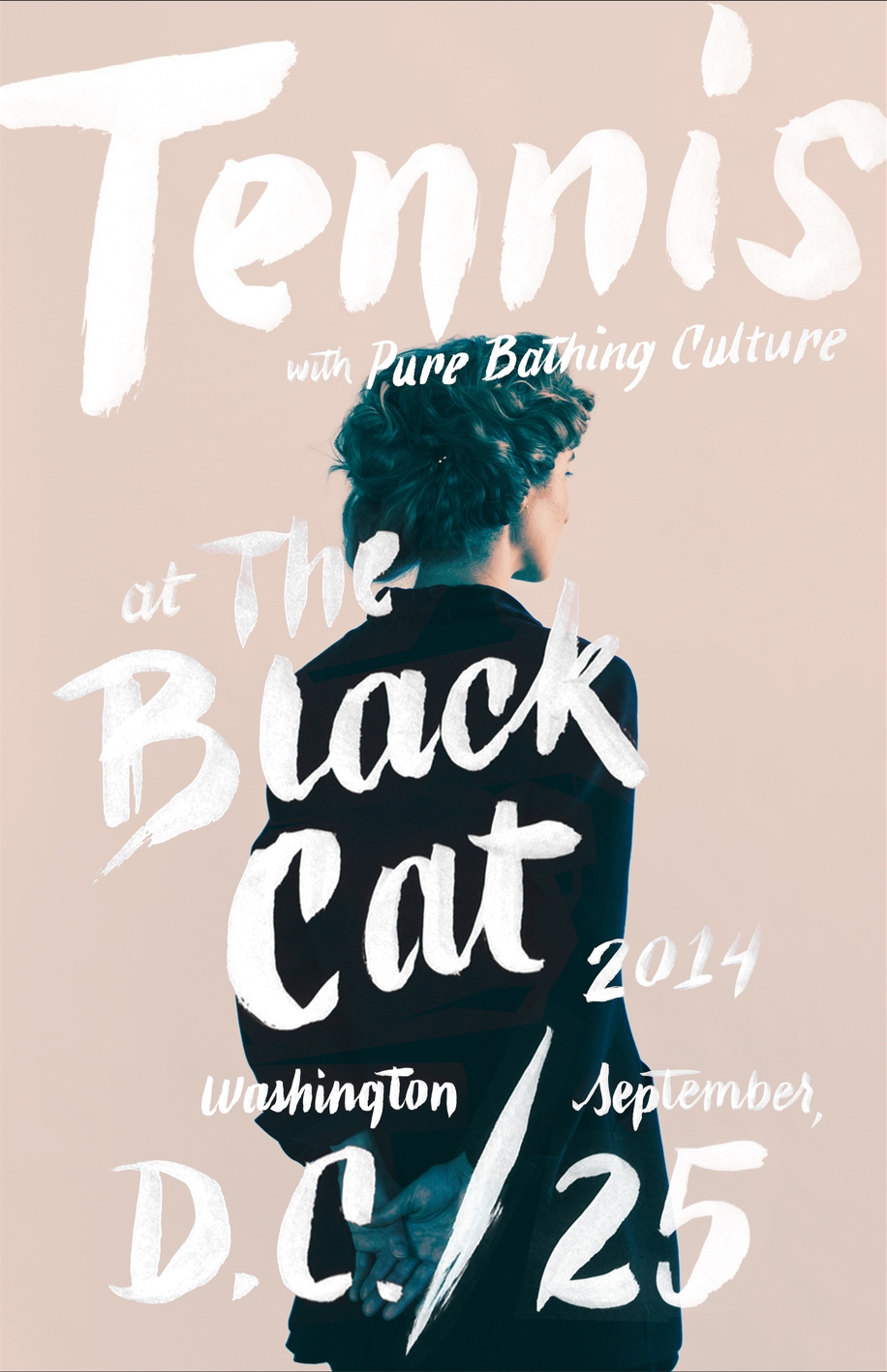
These three stunning posters for the indie band Tennis were created by type designer Kyle Read with imagery from photographer Luca Venter. Read’s work is understated and perhaps a bit precious, but undeniably beautiful. See more of it at of his studio and type foundry Badson.
This morning I got a link to download something at WeTransfer, as I do every once in a while. I don’t spend much time thinking about that service, so I was surprised today to see how sophisticated their advertising integration is. They have a deal with stock photo service Shutterstock, which runs various loops of ambient video behind WeTransfer’s lightweight interface—I captured a segment of it here. It’s a superb balance of commerce and utility, though admittedly it’s probably not suited for every advertiser. Still, if more online advertising were this tasteful, it’d be a whole different ballgame.
Always be launching, that’s my motto. Over the past six months I’ve been lucky enough to bring several of my projects to fruition. Back in November, we launched Wildcard for iPhone, the world’s first browser for cards. Just before the holidays, Kidpost, the family photo sharing tool I’ve been working on with friends, ended its public beta and officially launched to the public. Earlier this month, I released my book How They Got There: Interviews with Digital Designers About Their Careers. And yesterday, my collaboration with Adobe, Comp CC, an iPad app for design exploration, debuted in the App Store. Whew.
I have a one or two additional projects in the works, too, but all of these started life about eighteen months ago, in the late summer and early fall of 2013, when I closed the final chapter on my startup, Mixel. For the first time in many years, I was finally able to indulge multiple interests at once. It’s been tremendous fun, but not always easy, especially while raising three kids and maintaining a healthy personal life with my wife.
Along the way I’ve used lots of tools and techniques to juggle all of these projects, but if I had to name one that has been absolutely indispensable along the way, it would be Todoist, my to-do manager of choice. I’m already on record as a fan; in 2013 I wrote about it in this blog post, marking roughly six years as a user. Another two years later and I’m only using it more than I was then. Every workday morning I sit down with Todoist on my Mac, and throughout the day I add things to it on my iPhone, iPad or Android devices. It’s an absolutely essential part of how I work.
All of which is to say that Doist, the amazing company behind the software, is launching Todoist 10 for iOS today. The new version is slicker, smarter and more capable, but in keeping with its history, it’s still exceedingly simple, intuitive and deferential to users’ needs. I’ve been beta testing it for several weeks and its been a seamless transition from the previous versions—it’s just like it was before, but better. As always, Todoist is free to start using; you may actually find the free tier to be so compelling that you may never need the premium version, but I’m so passionate about this software I pay for it anyway, because I never want it to go away. Try it for yourself at todoist.com.
Last October, on stage at the annual Adobe Max conference, I debuted a collaboration between Adobe and myself called Project LayUp, a new iPad app for designers. Today, that app officially launches in the App Store under a new name: Adobe Comp CC. Read the company’s official release for the app is here.
Adobe describes Comp CC as a “lightweight composition app [that] lets you quickly wireframe ideas for print, web, and mobile using actual assets.” Our goal has been to create a truly tablet-native tool for designers to explore creative layout ideas. It’s not a desktop tool that has been ported to the iPad or a replica of real world art materials, but a wholly different approach to turbo-charging creativity that builds on what the iPad is uniquely suited for: gesture-based input; super-smart, automated saving so that you don’t have to manage files or versions; seamless integration with existing design workflows; and a laser-like focus on making you faster at expressing your design ideas.
Everything that I demoed last fall ships today and more. You can see app in its shipping form showcased in this video, prepared by the Adobe marketing team. It’s a great overview of how the app works, though had it been left to me, I might have deemphasized the stylus that you see being used; Comp CC works great with a stylus but it was conceived to work every bit as powerfully with just your finger.
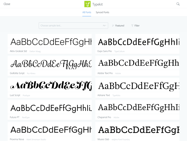
There are two major improvements over the original announcement that are worth pointing out. First: Typekit support is far more robust than we had initially anticipated. Our original intention was to support only the fonts that users had chosen to sync ahead of time through the Typekit site. Though limiting, even that level of impromptu access to new fonts would be a win, we figured—getting your preferred fonts on these devices has historically been a major point of friction. But what ships today is even better that what we set out to do; Comp CC is the first implementation of the full Typekit catalog, completely optimized for touch and fully embedded for easy access. That alone exponentializes the value of the iPad as a creative tool, if you ask me. Here’s the interface for selecting fonts from Typekit on the fly.
Adobe Comp CC is the first app to include full access to the complete Typekit catalog, optimized for touch.
Next up: Comp CC’s drawing gestures, which form the heart of the app, are much more extensive and capable than originally promised. Not only can you draw primitive shapes and text objects, but you can also draw rounded image objects, rectangles with chamfered corners, polygons, paragraphs of text, lines of text and headlines. Each option requires its own gesture, of course, so to make it easier to master this simple language, the app combines a rich help system that shows up just at the right time, along with a really slick animated gesture cheat sheet. It looks and works like this:
Seeing Adobe Comp CC launch is a big deal for me. The app represents many huge lessons that I learned painfully from Mixel, the social collage app that I built for iPad several years ago, as well as a lot of incredibly smart, ingenious ideas from the folks at Adobe. Our collaboration has been deeply rewarding, and I couldn’t be prouder of what’s launching today. My thanks to Scott Belsky, Renaun Erickson, Eric Snowden, Mathieu Badimon, Phil Baudoin, Teresa Crotty (and her phenomenal engineering team), Will Eisley and the rest of the amazing team at Adobe for bringing this idea to life.
You can get the app right now; it works best with a full subscription to Adobe’s Creative Cloud service, but it also works with a free, basic level Creative Cloud membership, which includes 2GB of complementary storage for file syncing and sharing. Give it a try and let me know what you think.
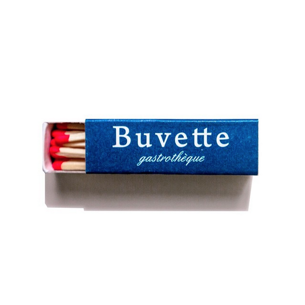
A photo from the Instagram account @matchbookdiaries.
Over at The New Yorker, architecture and design writer Alexandra Lange writes about the phenomenon of Instagram accounts that capture design ephemera like matchbooks, clothing labels, postage stamps, machine badges and more.
These examples of tiny graphic-design ephemera are brought to our full attention in obsessive, single-serving Instagram accounts. This is not the Instagram of artistically arranged purse contents or filtered selfies but one that more closely resembles the olden days of Tumblr, when people, archives, and institutions realized that they could add their humble masterpieces into the digital image river that people look at every day.
Lange points to a number of these wonderful accounts in the article. It’s a nice piece that draws attention to how social media is in many ways an opportunity for the easily overlooked artifacts of the design trade to shine. It’s not clear to me whether the article is exclusive to the Web site or if the editors think highly enough of the subject matter to include it in the printed magazine itself.
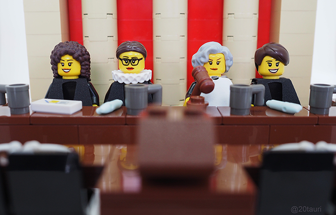
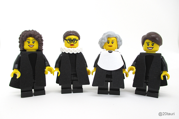
This is a homebrewed proposal from editor Maia Weinstock for a set of LEGO toys based on the female justices of the U.S. Supreme Court: Sandra Day O’Connor, Ruth Bader Ginsburg, Sonia Sotomayor and Elena Kagan. Weinstock submitted the idea to LEGO, but it was rejected in accordance with the company’s rule against politics or political symbols. Weinstock then penned this open letter appeal.
I hesitate to post this here because in general I don’t endorse my generation’s excessive devotion to the Star Wars franchise. I enjoy the original films and characters, but the nearly religious devotion that they inspire in others is lost on me. That said, this short tribute to Star Wars from animator Paul “OtaKing” Johnson is a stunning piece of work. It imagines a Star Wars film in the mold of 1980s-style Japanese anime works like the Macross series, and its interpretation is pitch perfect.
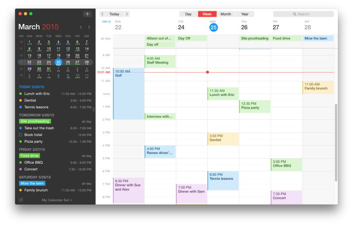
For the past few weeks I’ve been using beta versions of Flexbit’s Fantastical 2. It sports a handsome new interface with a dark left pane that flanks a light reworking of the standard iCal day/week/month/year view. There’s also a natural language engine for freeform creation of new events—these are becoming standard for calendar software, but Fantastical uses a clever animation to visually parse your words as you enter them.
My actual calendar data is powered by Google Apps, and Fantastical has synced with that service almost perfectly—I did catch one bug where it wasn’t saving an event’s location data, but the Flexbits team was incredibly responsive in working with me to diagnose the problem and correct it on their end.
When it comes to mail, contacts and calendars, I’m less adventurous than a lot of folks and generally stick to Apple’s stock applications. I just haven’t found that much benefit from the alternatives I’ve tried, but after a few weeks of Fantastical I was surprised that I was still sticking with it. It’s an elegant, almost seamless replacement for Apple’s calendar.
Fantastical 2 is in the App Store starting today. More at flexibits.com.
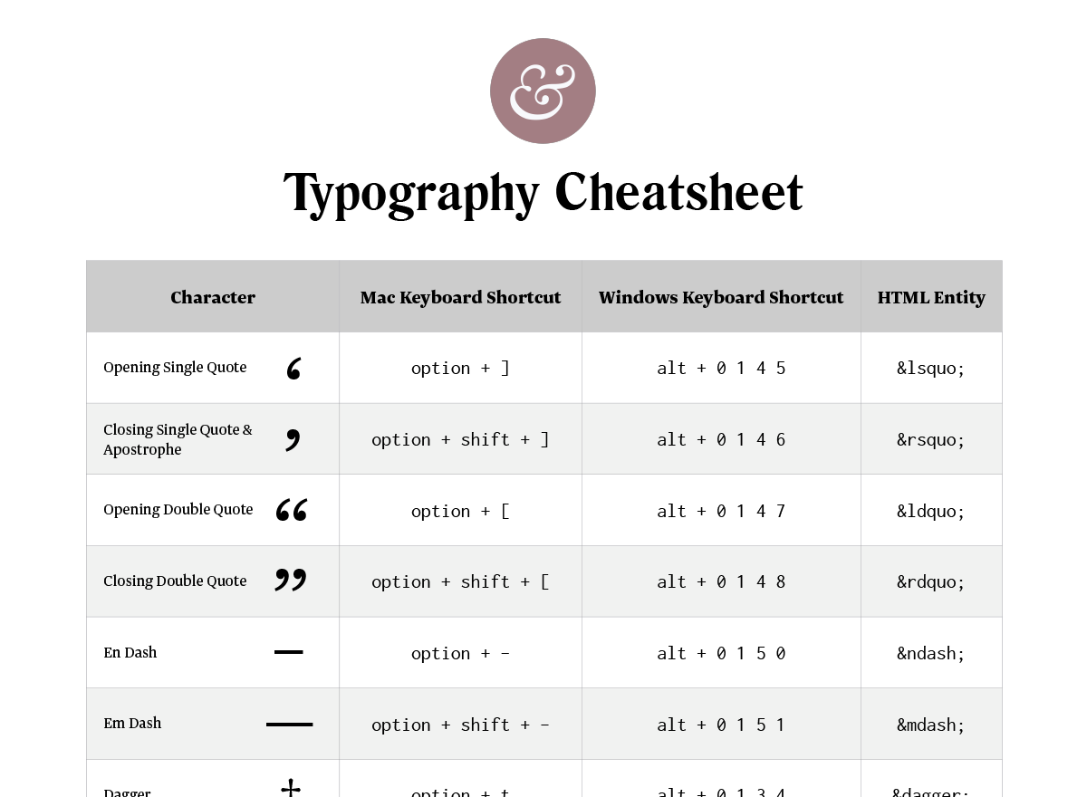
Jeremiah Shoaf put a ton of work into assembling this comprehensive single-page overview of most everything you need to know to get the finer points of typography right—including keyboard shortcuts for Mac and Windows, HTML entities, FAQs about when to use certain characters, and even a downloadable, 1-page PDF that you can print out as a handy reference. It’s a wonderful, meticulously prepared resource, and it’s free. Send Jeremiah a note to thank him.
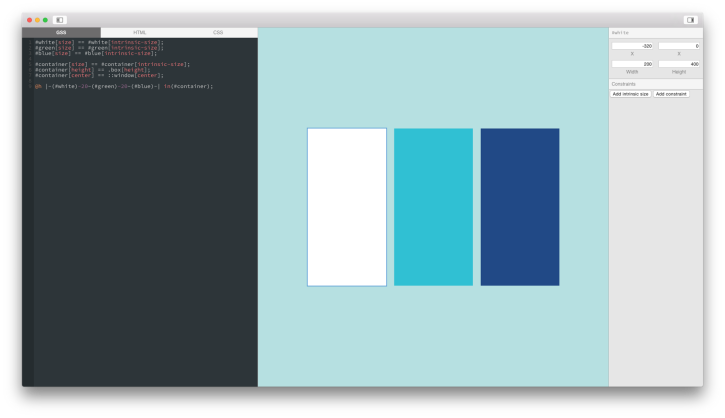
This project from designer Alasdair Monk is intriguing. Bind takes as its premise the idea that the design tools we have today suffer for their inability to support truly robust collaboration. Where developers benefit from rich technical ecosystems optimized for multiple contributors to any given project, the software that designers use is essentially isolated and oriented to a single user at a time. ”Designing together” is essentially impossible, he argues.
The root of this problem is version control. Git just doesn’t work for our binary files that our tools create. If you move a single pixel in a Sketch document and commit the change to Git, it acts as if you’ve created a whole new file and can’t discern the change you’ve made. There’s other problems as well, most of these tools allow us to layout an interface but only with a fixed, bitmap representation. We can’t easily try them out and see how they feel without coding them up into prototypes.
Monk’s solution is Bind, a project that he is developing that prioritizes versioning as a core use case. It’s also purpose built for user interface design; it’s native to the desktop (i.e., does not live in a browser); and it has at its core Grid Style Sheets, an alternative approach to the presentation of layout elements.
A screenshot from a recent development build of Bind, by Alasdair Monk
There’s no release for Bind yet but Monk’s notion of re-examining the design workflow on a holistic level is an excellent one. And he’s correct to identify version control as the crux of the problem. As the demise of LayerVault sadly demonstrated, version control for designers is a very difficult nut to crack, especially at scale. What works for one team rarely works for another team, whether as a result of fundamental incompatibilities in production methods or broad disinterest on the part of most designers for conforming to someone else’s way of organizing things.
At its heart though this should be a problem that’s within the realm of technology to fix—there are limits to what technology can solve, but software can surely fix problems that arise from using other software. The question is finding the right approach.
Or rather, the question is whether there are enough people like Monk interested in finding the right approach. The LayerVault team tried to solve this at the storage layer; they allowed designers to continue using their preferred tools but changed up the way work is stored. Bind apparently tries to solve it at the authoring layer; it changes the design tool for maximum compatibility with Git. To my knowledge, no one has yet tried to solve the problem at the file layer; a universal wrapper to which any application can write that stores its version control in a rich metadata file. For each of these layers there are innumerable possible approaches and variants. It will likely take several more attempts like LayerVault and Bind for us to find the right solution.