is a blog about design, technology and culture written by Khoi Vinh, and has been more or less continuously published since December 2000 in New York City. Khoi is currently Principal Designer at Adobe. Previously, Khoi was co-founder and CEO of Mixel (acquired in 2013), Design Director of The New York Times Online, and co-founder of the design studio Behavior, LLC. He is the author of “How They Got There: Interviews with Digital Designers About Their Careers”and “Ordering Disorder: Grid Principles for Web Design,” and was named one of Fast Company’s “fifty most influential designers in America.” Khoi lives in Crown Heights, Brooklyn with his wife and three children.
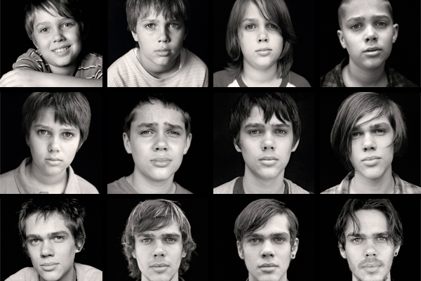
Maybe it’s just because I’m a father of young children, but when I read this story earlier this week I couldn’t get it out of my mind. It’s not new; it actually keys off of a book written in 2008 by Howard Chudacoff called “Children at Play: An American History .” Chudacoff, a cultural historian at Brown University, wrote about the evolution in thinking about how children should occupy their free time.
…During the second half of the 20th century, Chudacoff argues, play changed radically. Instead of spending their time in autonomous shifting make-believe, children were supplied with ever more specific toys for play and predetermined scripts. Essentially, instead of playing pirate with a tree branch they played Star Wars with a toy light saber. Chudacoff calls this the commercialization and co-optation of child’s play—a trend which begins to shrink the size of children’s imaginative space…
Clearly the way that children spend their time has changed. Here’s the issue: A growing number of psychologists believe that these changes in what children do has also changed kids’ cognitive and emotional development.
It turns out that all that time spent playing make-believe actually helped children develop a critical cognitive skill called executive function. Executive function has a number of different elements, but a central one is the ability to self-regulate. Kids with good self-regulation are able to control their emotions and behavior, resist impulses, and exert self-control and discipline.
Folks, I’m nearing the finish line in preparing my book “How They Got There: Interviews With Digital Designers About Their Careers” for sale. Last week I applied the final round of changes from my eagle-eyed editor, Sue Apfelbaum, put the finishing touches on a marketing page for the book (which will replace the teaser page you see at howtheygotthere.us), and I’m now taking care of a few final details getting the actual product ready for sale next week.
Mockup of my book (just a mockup—the book itself is available in PDF, iBooks and Kindle formats only)
I’ve also created a PDF sample of the book—basically the first thirty pages (of about two-hundred and fifty). This includes the foreword, written by my friend Liz Danzico, chair of the MFA Interaction Design program, my author’s preface, and the first of the fourteen in-depth interviews. As the interviews are all ordered alphabetically, this first one is with Dribbble co-founder Dan Cederholm. Dan offered some terrific insights into the evolution of his career and how Dribbble evolved from an idea into a business, and how it all relates back to his first career aspiration: playing in a rock band.
So here’s the deal: next week I will release this sneak peek of the book—for free—to anyone who has signed up for the mailing list at howtheygotthere.us before midnight next Monday, 2 March. Signing up for the list gets you the sneak peek. Of course, it also gets you a discount for the book, about 30% off the price when it goes on sale. So rush on over and sign up now!
To be clear, though I argued on Monday that it did not deserve the best picture Oscar, I still enjoyed Alejandro G. Iñárritu’s “Birdman.” I also enjoyed this promotional video from its studio, Fox Searchlight: a satirical commercial for an action figure version of the Birdman character, produced in the style of such commercials from the 1980s and 1990s. I found it about as clever as the movie itself, in fact.
Last fall my colleagues at Wildcard and I released Wildcard for iPhone, the first browser that lets you experience a different kind of mobile web, one that uses the card metaphor—fast, native, interactively rich—instead of the page metaphor. We’re continuing to evolve Wildcard for iPhone and have some really exciting things in development, but we think of our mission as broader than any one app. We want to effect a sea change in the way the mobile Internet works, and that means that we have to work on a number of fronts to spread the gospel about cards, so to speak.
Today we’re announcing another of these initiatives: the Wildcard SDK for iOS. This is a free toolset that lets third-party developers bring cards into their own native iOS apps quickly and easily. Once implemented, the SDK transforms hyperlinks that users might exchange in, say, a messaging app into fully functional, interactive, performant cards, and it does so on the fly, automatically. To emphasize: this happens in the context of the developer’s own app—the user is not taken anywhere else and engagement is not interrupted. The cards can appear in an elegant overlay or even directly in situ with the app’s original user interface, where they can be customized to blend into the look and feel seamlessly.
This short demonstration video illustrates the concept:
The SDK is available starting today at trywildcard.com/sdk. You can also read more about it in this blog post. If you’re an iOS developer, I encourage you to give it a try.
In a thoughtful essay at The Dissolve about last night’s Oscar ceremony, writer Jen Chaney reflects on the the best picture trophy going to “Birdman” instead of “Boyhood”:
Yes, as some predicted (not me), Alejandro G. Iñárritu’s one-shot take on artistic integrity and raging narcissism was named the best picture of 2014 over Richard Linklater’s far more low-key but equally inventive ‘Boyhood.’ This immediately prompted some disappointed commentary on social media, as well as another manifesto of sorts from Slate’s Dan Kois, who published, just minutes after the Oscar ceremony ended, a piece that accused the Academy of totally blowing it by not honoring ‘Boyhood.’ ‘This one’s an epochal Oscar travesty,’ Kois wrote. ‘This one hurts.’
While I must admit that there was some delicious irony in watching a woman, Patricia Arquette, win the single Academy Award for a film called ‘Boyhood,’ and then devote a portion of her acceptance speech to advocating for gender equality, I have to agree with Kois. Epochal travesty may be a bit much, but I completely agree that this one does indeed hurt.
Chaney goes on to describe how this miscarriage of justice is actually “pure Linklater” in a journey-is-the-reward kind of way. It’s an incisive point, and worth reading. (See the full article at thedissolve.com.) I largely agree, though I still find myself tremendously disappointed by the outcome.
I try my best to ignore the inanity that is the Oscars, but it’s difficult not to pay some mind to one of the highest profile platforms anywhere for articulating what is valued in cinema. A best picture or best director nod is more than simply an honorific; it’s a reflection of the things that the Hollywood establishment, so to speak, thinks are important.
In this case, in an apparent face-off between one picture that tries to chronicle the quotidian beauty of childhood and another picture that is at its heart an exercise in what Chaney correctly characterizes as “raging narcissism,” the message is pretty disheartening. I actually enjoyed “Birdman”; it’s an extremely well-made and bracingly entertaining film. It’s also heavy-handed, a thematic mess, and sadly preoccupied with a very small, exclusive segment of the population and their esoteric privileges. Somewhat self-importantly and incoherently it asks, “What kind of films do you want?” The answer, from the Academy of Motion Picture Arts and Sciences, seems to be, “More films about people like us here at the Academy of Motion Picture Arts and Sciences.” That’s depressing.
This simple, striking video from filmmaker Nacho Guzman for the electronic band Opale is a demonstration of the power of lighting to alter our perception. A single light source rotates around actress Stella Stocker’s face and continually, dramatically alters her appearance. The effect is an homage to Henri-Georges Clouzot’s unfinished 1964 film “L’Enfer.”
For some months, The New York Times has been readying a “relaunch” of its Sunday magazine, and in this column editor Jake Silverstein talks about its impending debut, this weekend:
We have used the hammer and the tongs but perhaps not the blowtorch; we sought to manufacture a magazine that would be unusual, surprising and original but not wholly unfamiliar. It would be a clear descendant of its line. This magazine is 119 years old; nearly four million people read it in print every weekend. It did not need to be dismantled, sawed into pieces or drilled full of holes. Instead, we have set out to honor the shape of the magazine as it has been, while creating something that will, we hope, strike you as a version you have never read before.
I’m looking forward to seeing what they do with it, especially what the Magazine’s talented design director, Gail Bichler, has cooked up for its presentation. She and her staff have commissioned new, bespoke typefaces as well as a subtle but in my opinion quite wonderful redrawing of the Magazine’s logo, seen here with the original on top and the new one below it. The Magazine has long been a showcase for some truly superb editorial design, and I have no doubt that the current team will continue the tradition.
What I’m less sure of is whether they can get me interested in the Magazine’s journalism again. I’m a regular, devoted reader of The Times’ daily reporting, but I almost never bother with its Magazine pieces. More often than not, I find them much shallower than I expect from Times writers who have been given the room to write at length about ostensibly interesting subjects. For me, the Magazine’s articles generally pale in comparison with the thoughtfulness and extensively researched quality I find at The New Yorker or other “thinking” magazines. Given the amount of reading material that crosses my desk in a given week, the Sunday Magazine almost always loses out.
It’s also true that part of my objection owes to the fact that I find the magazine format less than enthralling these days. With few exceptions, it’s my experience that magazines generally can’t justify why all of a given issue’s content is bundled together, why I need to bother with the obvious filler that so often consumes the “front of the book,” and why so many long format stories are as long as they are. It’s not that I think that blog posts and Medium articles are sufficient intellectual sustenance for the modern mind. Rather I find that between the plethora of worthwhile reading material available on the Internet from independent sources and the sheer number of quality books out there that I haven’t yet read, the very idea of magazines seems less compelling to me than ever before.
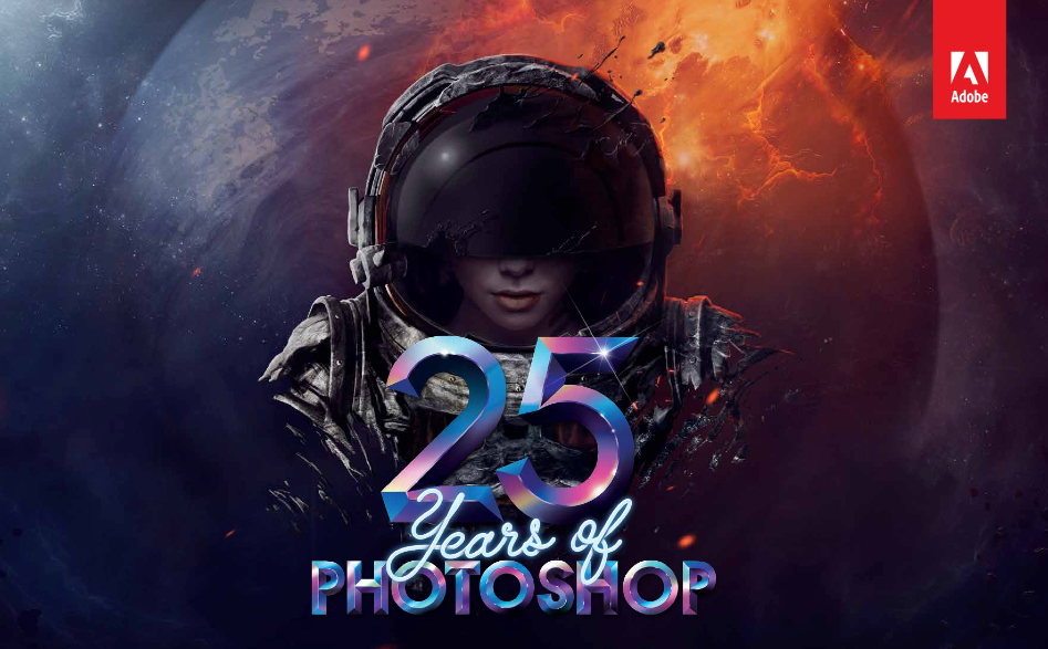
Amazingly, Photoshop is twenty-five years old. Adobe is celebrating that quarter century of manipulating our understanding of reality with a micro site honoring the software’s illustrious past. It includes this commemorative video featuring Aerosmith performing “Dream On,” below. As the video demonstrates, Photoshop is responsible, on the one hand, for some amazing strides forward in our ability to give visual form to the expansive human imagination, as well as, on the other hand, some egregious aesthetic crimes that future generations may never forgive us for.
Twenty-five years is an amazing achievement, and Photoshop seems sure to be one of those cultural landmarks that will endure in the history books. Congratulations to everyone who participated in this phenomenon.
This set of twenty-three replacement icons for OS X Yosemite was designed by two high school-age aspiring designers. They can be downloaded for free, and Sketch source files are available for US$5.
I’m not entirely sure if these were a class project, or if the designers were actually in high school or what, as the information provided is pretty thin. Still, I found the designs to be refreshingly unpretentious and lightweight; they’re not reinventions of the original Yosemite icons as much as adjustments of them. Nice work, kids.