Terms of Service: A Comic about Privacy

“Terms of Service”

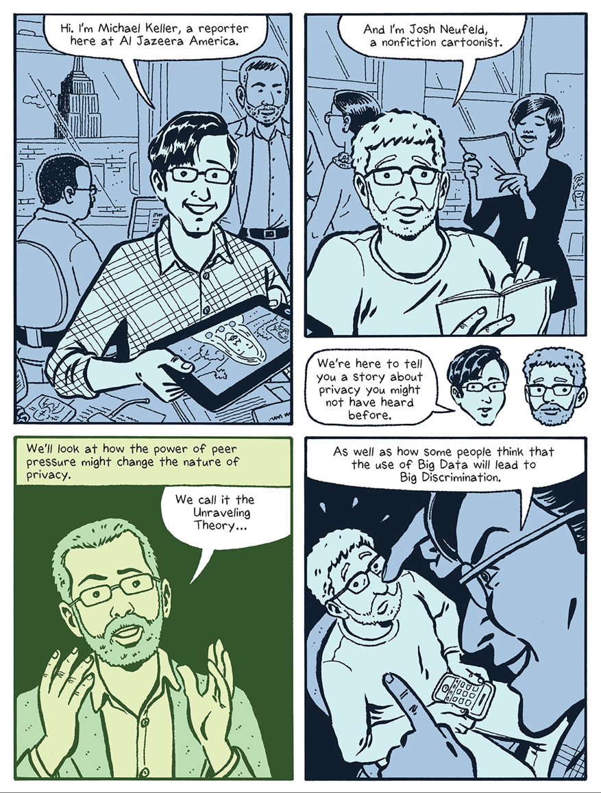
I haven’t yet read this so I can’t vouch for the content, but at first blush it looks terrific. Al Jazeera America reporter Michael Keller and non-fiction cartoonist Josh Neufeld created this digital comic book about the implications of living in the era of Big Data. In their introduction, they talk about the double-edged sword of being able to collect and analyze data almost instantaneously, how it can help us influence our own behavior for the better (curbing how much takeout food we eat, for example), or turn that data into tools that can be used against us.

Big companies are collecting and using this information too. This can be good or bad. Maybe we start making better choices about the food we eat and the money we spend. Or maybe an insurance company decides to increase its rate or even terminate a policy because it projects we’ll have diabetes in 18 months.

We believe many folks want to learn more about these issues but are turned off by often dense and jargon-laden coverage.

So we made a comic!

“Terms of Service” can be read in your browser at aljazeera.com. The site also has links to download it directly or acquire it (for free) through Google Play or the App Store. (Via Faisal.)

+

Warby Parker Year in Review

Warby Parker Year in Review

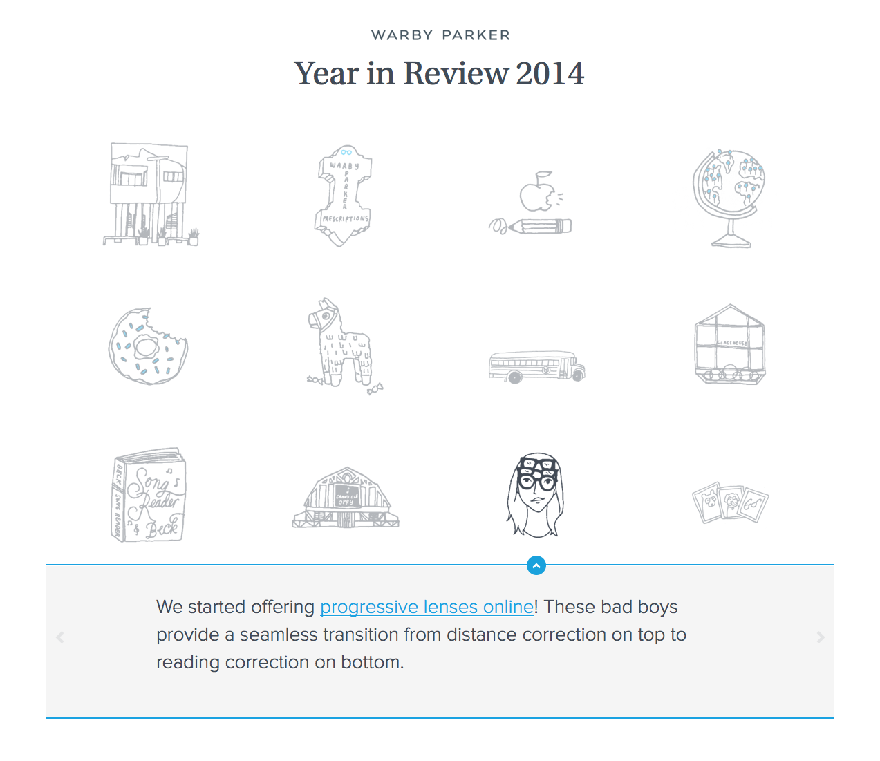
Online vision retailer Warby Parker produced this delightfully simple Year in Review for 2014. It highlights the company’s notable events and achievements from last year with two dozen pleasingly casual illustrations; click on each to reveal details and links. It’s very charming and engaging without looking like the company had to invest a disproportionate amount of effort to pull it off. It’s also very much in keeping with one of the very best brands to emerge from the online retailing space in the past decade. Kudos to the team.

See it at warbyparker.com.

+

Reactions to Touch ID from a Guy Who Just Got It Recently

Touch ID

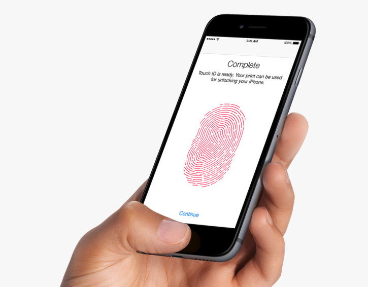
Back in October, when I upgraded from the original iPhone 5 to my new iPhone 6 Plus, I entered the world of Touch ID for the first time. What a revelation. When it works, it’s a superb, almost magical experience—I want it for all of my devices, and for my desktop, too. When it works.

At first, I was perturbed by the fact that, once Touch ID is activated, you have to use it every time you want to unlock your phone. With previous models, I liked to set a long time interval before my passcode would be required to unlock my phone. That’s not entirely secure, I know, but I lock and unlock my phone so many times during the day that entering my passcode each time was a drag.

Over time though, I found Touch ID seemed to somehow get better at recognizing my thumbprint. I freely admit that might be my imagination, but I sincerely do believe that a month or so after having the phone, I was able to unlock it with Touch ID much more easily than before. Sometimes it worked so well that merely touching the phone’s home button instantly unlocked it when I only meant to just turn the screen on to see what notifications had arrived.

Then the weather got cold here in New York—very, very cold. Over the past few days I’ve found that Touch ID has gotten worse again. Now Touch ID frequently fails for me; I try it and I try it, and ultimately I have to enter my passcode in order to unlock the device.

My theory is that perhaps with the colder temperatures and heated indoor environments my skin is getting dryer, which is making my prints less conducive to Touch ID. This is consistent with my experience after washing my hands: when they’re dry and free of oil, Touch ID fails, and I have to lick a fingertip quickly to return some natural oil to the print, and then Touch ID works great again. However, a colleague says that he finds that the exact opposite to be true for him; when his fingers are dry it works better, and when they’re even the least bit wet, it fails. All the same, he agrees that the cold weather has made Touch ID much more problematic for him, too.

I learned today that you can actually “overtrain” Touch ID so that it is more tolerant of variations in your thumb presses. I tried it, but it didn’t help. Hopefully the weather will warm up around here soon, because this almost makes me want to turn off Touch ID altogether.

+

The Search for General Tso

It’s an open secret that most of the items found on Chinese restaurant menus in America are not in fact Chinese. The most famous and popular of them, General Tso’s chicken, isn’t really even a dish that a real guy named General Tso created. This documentary, which was produced in part by a former colleague of mine, Jennifer 8. Lee, takes that fact as a jumping off point to examine the cultural gap between Chinese culture and cooking and America’s long-standing, bizarrely inaccurate ideas of Chinese culture and cooking. It’s playing in select theaters now and available everywhere via video on demand.

More information at thesearchforgeneraltso.com.

+

My New Book Is Called “How They Got There”

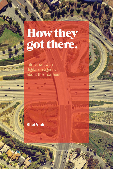
I’ve been working for many months on a new book, and it’s just about ready. It’s called “How They Got There: Interviews With Digital Designers About Their Careers.” You can sign up to be notified as soon as it’s ready at this web site—if you do you’ll even get an early bird discount on the purchase price. Here’s the cover.

“How They Got There” Cover

Hopefully, the title of the book gives you a good idea what it’s about, but to elaborate a little: it features fourteen interviews that I conducted with designers of prominence—many of the names will be familiar to readers of this blog, while others are up and comers or have built fantastic careers outside of the main spotlight. I talked to studio designers, agency designers, startup designers, designer entrepreneurs—I worked hard to get a diversity of folks who have done meaningful work “online” in recent history. Here’s the full list:

  • Dan Cederholm of Dribbble
  • Alex Cornell of Firespotter Labs
  • Nicholas Felton of Daytum
  • Agnieszka Gasparska of Kiss Me I’m Polish
  • Cemre Güngör of Branch
  • Erika Hall of Mule
  • Naz Hamid of Weightshift
  • Karen McGrane of Bond Art + Science
  • Wilson Miner of The Factory
  • Jill Nussbaum of The Barbarian Group
  • Evan Sharp of Pinterest
  • Geoff Teehan of Teehan + Lax
  • Justin Van Slembrouck of Digg
  • Marcos Weskamp of Flipboard

You can read terrific profiles of many of these folks elsewhere, but the conversations that I conducted with them are both narrower and more in-depth. They focus squarely on how these folks discovered their callings in the design profession, how they got their first big breaks, how they put together successful careers in digital media. There are some wonderful, insightful, brilliant, hilarious and amazing stories captured here.

Basically, this is the book that I wish that I could have had handy when I was just starting out, when I was trying to figure out how to get from A to B career-wise. Even better, what I found when I was writing it was that the conversations were so interesting that I felt newly inspired myself. I think you’ll feel similarly.

I’m putting the finishing touches on it now and it should be ready within a few weeks. The book is self-published and will be digital only, at least for now. So go sign up for the list and be among the first to read “How They Got There” when it comes out—at a discount, too. I’ll be writing more about it here on this blog soon, too!

+

Northern Lights in 4K

I really enjoyed this gorgeous video of the aurora borealis as shot just a few days ago with Sony Alpha 7S digital camera. Its footage of the Murphy Dome area near Fairbanks, Alaska at night is ghostly and surreal, and the northern lights themselves are incredibly vivid—like something rendered with computer graphics, except more real and more awe-inspiring.

+

Wildcard and WordPress

Wildcard Plugin for WordPress

Today my colleague Max Bulger announced a new Wildcard plugin for WordPress that effectively publishes the content of your WordPress blog into our native iOS app. I previously did this for Subtraction.com using somewhat manual means (and leveraging the fact that I work at Wildcard), but this new plugin makes the process much more straightforward, and removes the requirement that you have to, like, know someone at the company to get this done.

This plugin is a part of a big initiative you’ll see this year that Wildcard is undertaking to help brands, publishers and merchants of all different sizes transform their content into cards and push those cards into our app. For WordPress, particularly, it’s a big step forward in demonstrating the viability of a “third way” for mobile publishing. As Max puts it:

We believe there is a false dichotomy facing WordPress publishers: make the significant investment in developing a native application (or many, if you consider Android and iOS fragmentation), or be content with merely publishing to the mobile web while native app usage continues to skyrocket…We believe that cards represent a third possibility for mobile publishing that combines the best of both worlds. They provide app-like user experience with the share-ability of a link or web page. Wildcard is dedicated to making it easier to publish cards, and easier for bloggers to transition from the web to mobile. Distributing content via cards makes it easier for WordPress users to focus on what matters: their content.

You can grab the plugin at wordpress.org, and read more about it at blog.trywildcard.com.

+

Where Design Annuals Came From

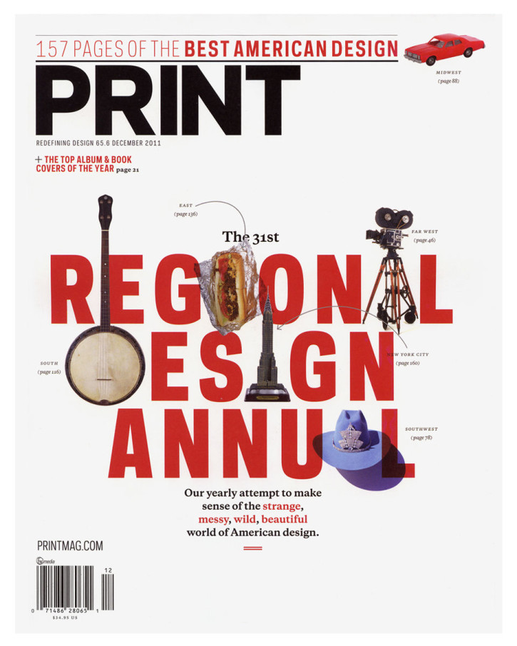
Print Regional Design Annual

Over at Print, Steven Heller tells the story of how graphic design annuals, those yearly compilations of the best work in various niches of the profession, came to be. He applies his customarily thorough historical knowledge in tracing the form’s evolution, and dates the prestige that annuals bestowed upon featured designers to as far back as the 1920s.

The annual tome or brochure was a sample book of current trends, and selection was an honor but also served as a calling card for more (and hopefully higher-priced) assignments. Although the annuals were primarily used within the profession to showcase old and new designers, they were increasingly used as validation for clients, too.

In the late 1920s, certificates were bestowed on ‘winners’ of the competitions, which were framed on walls of honor in most agencies and studios. The annual show and its offshoots became so prestigious that medals and ribbons were soon created to distinguish the good from the better from the best.

However, the article only tells part of the story, in my opinion. By the late 20th Century, annuals were a kind of business to themselves—several design magazines made as much money off of the enormous fees that entrants would pay for consideration in an annual as they did off of subscriptions and advertisements. What’s more, the judging process for entries, at least in my experience as a sometime judge, was often less than rigorous, perhaps as a function of also being incredibly laborious—imagine how difficult it can be to maintain high levels of scrutiny when you’re faced with manually evaluating hundreds if not thousands of design samples, most of which are depressingly trite. Design annuals persist today, but thankfully they seem well past their peak in terms of influence, thanks in no small part to the Internet. I stopped reading them many years ago, and don’t miss them.

Read the full article at printmag.com.

+

BrydgeAir Keyboard

BrydgeAir

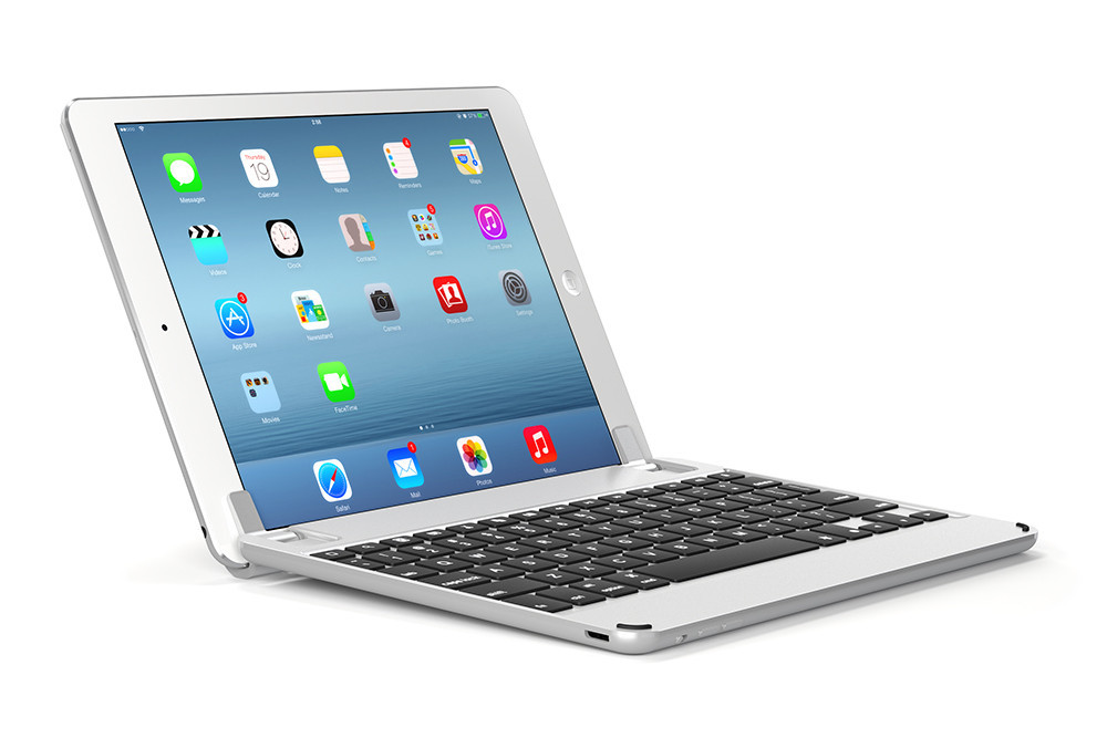
I’ve bought my fair share of keyboards for mobile computers—I’m old enough to have purchased one for my Palm V back in the day. Each time I buy one I think that they’ll unleash a new era of on-the-go productivity for me, but that never turns out to be the case. Still, I’m tempted by this beautifully designed and apparently well-reviewed BrydgeAir keyboard for iPad. It’s pricey at US$169, but it’s the first keyboard for iPad that I’ve seen that legitimately looks like it let me use the iPad in many instances where I’d normally need my MacBook Air.

+

Suggestions for Apple’s 2015

The approach of a new year is a time for optimism. For instance, I’m optimistic that Apple will undertake a number of projects in 2015 that I’ve been hoping they would address for a long, long time, but have repeatedly neglected. These are mostly housekeeping, fixer-upper type projects. They’re unlikely to move the needle on the company’s bottom line, but they would make at least some of their extremely loyal customers very happy. Here’s my short list.

iTunes Match 2.0

Storing your songs in the cloud with iTunes Match has a number of advantages over streaming services like Spotify, particularly if you own obscure music and/or you’re invested in the idea of curating a collection that you can really feel like you own. In most other aspects, though, iTunes Match is painfully second-rate in comparison to the Spotifys of the world. It’s slow to start up, it’s prone to erroneous file duplications, and it’s far buggier than it really should be for a world class cloud service. The whole thing needs to be refactored and overhauled on the backend to significantly improve reliability, and the front-end needs some attention as well.

Apple ID 2.0

If you do any kind of tech support for less savvy members of your family, you’ll likely have discovered that some of them are the owners of not just one but several Apple IDs, having created additional accounts unwittingly or out of frustration at lost passwords, etc. In their current state, these Apple IDs are immutable; they can’t be combined or consolidated, nor can the purchases made under each of them be transferred among one another. This inflexible nature is a continual point of friction for loads of novice users and it desperately needs to be remedied.

Fully Mobilize Apple.com

Some of Apple’s own web site looks and works great on an iPhone. But if you dig very far, you’ll quickly find that not all of it does—knowledge base articles in particular are a random affair. This one should be easy.

Redesign Get Info, Font and Color panels on OS X

Earlier in the month I wrote about one proposal for a new Get Info design. As an incidental piece of UI furniture, it’s been long neglected, as have the Font and Color panels—all of these have been practically untouched since the dawn of Mac OS X, more than a decade ago. It’s time to to modernize them.

Fork iOS for iPad

Unlike the projects above, this one could positively affect Apple’s bottom line: as I wrote in October, I believe that the iPad is at a crossroads. Its growth has stalled, and it’s failed to serve as a launching pad for transformative new software experiences and businesses the way its older sibling the iPhone has. What the iPad needs now is unique reasons for being—something that may be difficult to achieve while it remains in lockstep with the iPhone. Forking the operating system so that a dedicated team can focus exclusively on improvements that benefit the iPad solely could provide the right opportunity to open up new vistas for the device.

The likelihood of that last project is extremely low, but in truth most of these are long shots. One thing I’ve realized over the years is that Apple’s ability to focus on new initiatives with laser-like focus is of a piece with its inability to cover tremendous breadth. Which is to say, the company, for all its size and success, can really only focus on a few things at a time. That’s for better or worse—largely for better, but in these cases, regrettably for worse. Still, fingers crossed for 2015.

+