is a blog about design, technology and culture written by Khoi Vinh, and has been more or less continuously published since December 2000 in New York City. Khoi is currently Principal Designer at Adobe. Previously, Khoi was co-founder and CEO of Mixel (acquired in 2013), Design Director of The New York Times Online, and co-founder of the design studio Behavior, LLC. He is the author of “How They Got There: Interviews with Digital Designers About Their Careers”and “Ordering Disorder: Grid Principles for Web Design,” and was named one of Fast Company’s “fifty most influential designers in America.” Khoi lives in Crown Heights, Brooklyn with his wife and three children.
A new series from Kirby Ferguson, the prolific video essayist behind the fantastic series “Everything Is a Remix.” Released episodically as new installments are completed, “This Is Not a Conspiracy Theory” examines “the quest to understand the hidden forces shaping our lives.”
The first episode is free, but a US$15 subscription is required to view the subsequent six episodes—as well as to access the eighty-minute film that will be edited from the series at completion. This is a very interesting way to crowdfund a project, as Ferguson intends to incorporate audience feedback into the course of the series as it progresses.
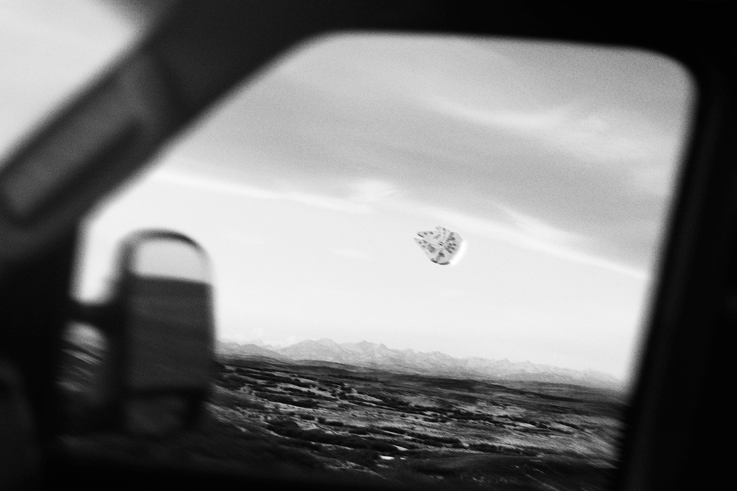
Heretically, I always roll my eyes a bit when grown adults express their excessive affection for the “Star Wars” franchise. I like the original trilogy fine, but I just find my generation’s preoccupation with it to be a little absurd, especially when articulated as elaborate homages on the Internet. Nevertheless, once in a while, a “Star Wars” project catches my eye and really impresses me, like these manipulated photographs from Thomas Dagg. With great skill and abundant good taste, he’s seamlessly inserted familiar creatures, props and spacecraft from the films into mundane everyday scenes. Some of the compositions are so subtle you really need to hunt for the “Star Wars” reference, which happens to render them quietly hilarious at the same time.
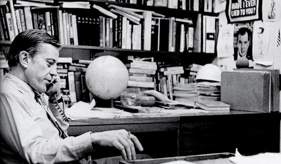
David Remnick’s eulogy for the great Ben Bradlee, the former executive editor of The Washington Post who oversaw its Pentagon Papers and Watergate chapters, and who died Tuesday at ninety-three, is an aptly magnificent remembrance for a magnificent titan of the last century. It’s short but it’s full of pithy, illuminating anecdotes about Bradlee as a force of nature, a paragon of a media age the likes of which we may never see again. This bit was my favorite:
Bradlee was, by today’s standards, unchallengeable, and he was expert in the art of florid dismissal. His secretary, Debbie Regan, was, in turn, careful to reflect precisely his language when transcribing his dictation. One day, Regan approached the house grammarian, an editor named Tom Lippman, and admitted that she was perplexed. ‘Look, I have to ask you something,’ she said. ‘Is ‘dickhead’ one word or two?’
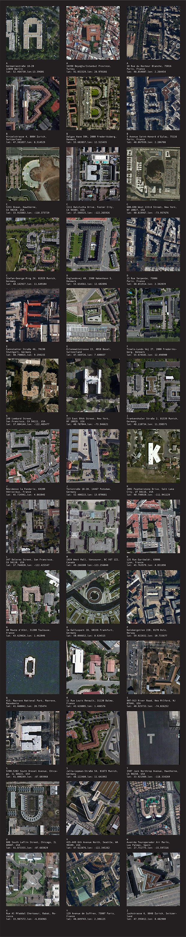
This Kickstarter project aims to create “the first map and typeface of the earth” from satellite imagery that happens to form familiar letterforms. If funded, project creators Benedikt Groß and Joey Lee intend to create a set of computer vision-driven tools and a database that will automatically identify characters—much more ambitious than I had assumed. Here is a sample data set of the kind of result they’ll generate.
Currently the project is less than $1,500 from its funding goal. Find out more at Kickstarter.
Over the weekend I installed OS X Yosemite on my MacBook Air. Its new interface, partially inspired by the dramatic aesthetic shift that its sibling made with iOS 7, will take some getting used to for me. Here are some thoughts.
Yosemite’s ambitions are evident: it aims to be a much more elegant, more sophisticated, less elaborate visual presentation than what came before it. For me, it doesn’t achieve those goals, but the groundwork is clearly there, in raw—perhaps too raw—form. In many ways, it feels very much like starting over again in the way that Mac OS X’s Aqua interface was a new start, over thirteen years ago. In those nascent stages, Aqua was never particularly beautiful, but it did make a point—it was a radically new kind of interface aesthetic that heralded a new approach to software. And the same ideas that informed later, much more successful iterations of the operating system were clearly present even then.
This is true with Yosemite, too. Spend just a bit of time with it, and you can almost picture the iterations to come, when future releases will have fully worked out the visual language and the gestalt of the interface will have cohered to a more advanced state. OS X Balboa and OS X Palisades are going to look great.
In the meantime, though, I find Yosemite lacking in polish, full of awkward decisions and unresolved tensions. Safari, in particular, seems to have trouble balancing theory—the idea that the same software on iOS and OS X should share a structurally similar user interface—with execution—its symmetrical arrangement of interface elements is not all that symmetrical in practice, and its buttons seem improvised and lacking in care. Yosemite’s icons are also surprisingly haphazard; Apple has established new paradigms for some icons, but aesthetically, there seem to be few stylistic threads connecting the rendering of these icons together. Take a look at those populating Yosemite’s Systems Preferences, where some of the renderings are reductive and others are highly detailed, and the only apparent commonality is randomness. If anything, a revised look and feel for the operating system was an opportunity to rethink the presentation of its preferences as a unified visual system, but this falls far short of that.
Some people have also been unhappy about Helvetica’s new role as the standard OS typeface, supplanting Lucida Grande. I’m a Helvetica partisan, so I’m not really in this camp; besides, Helvetica has been the standard system typeface for iOS since the beginning, and largely without complaint, so the protests in Yosemite’s case seem to be more about the shock of the new than any inherent problems with the typeface. I’ll admit though that Helvetica does not look great on non-Retina screens (of which my MacBook Air is one). More on that later.
My biggest complaint, personally, is that this fresh coat of paint does a poor job on visual contrast. Interface elements are often so light in color and/or so close to one another in color that they “bleed” into each other all the time. The effect is a blown-out look, as if a novice photographer stepped up the exposure on her camera well beyond advisability. In previous versions of OS X, it was common to use dark, sometimes hard edges to help delineate where one piece of UI ends and another one begins. Apple’s designers have seemingly restricted themselves from employing that very basic technique throughout Yosemite, or at least have sought to dial back its use significantly.
I’m told that this “edgeless” effect is mitigated on Retina screens, but since none of my Macs qualify, I have to take that on faith. If that’s the case, if Apple designed Yosemite expressly to make Retina Macs look superior to non-Retina Macs, I’m surprised. I’ve always assumed that, to a greater extent than most people realize, one of Apple’s most important benchmarks for the design of their software is, “Will it look good in the showroom?” That’s why we’ve gotten so many visually startling and aesthetically dubious effects over the years—they look great on those demo tables at the Apple Store, especially to new customers. But in this case, only a portion of Apple’s Macs are currently Retina-enabled, which means Yosemite will undercut the appeal of the rest. That seems conspicuously un-Apple like to me.
It’s been less than a week since I’ve been on Yosemite, so I hesitate to pronounce it a failure (or a success) so soon. I had a similarly negative reaction to iOS 7 at its debut, and while I still think there is a lot that’s fundamentally flawed about that operating system’s execution, I did come to appreciate the point that it was making—that the time had come for a new approach, even if not every question it raised had an answer at that moment. Maybe that will be the case with Yosemite too.
We didn’t get a new Apple TV during last week’s Apple event, but it’s not like those of us who were waiting impatiently for it aren’t going to keep waiting. I suspect that what’s holding up a major update to this product line isn’t hardware or software, but the complexity of navigating the endless jungle of legal agreements that makes today’s technology-in-the-living room experience so difficult and user-unfriendly. It’s not unlike the wireless industry pre-2007; if we suppose that it’s Apple’s goal to bring iPhone-like change to an industry that practically thrives on adding friction to the consumer experience, getting licenses and agreements sorted out is probably their biggest challenge.
Meanwhile, Time Warner Cable subscribers might find an entertaining diversion in the Fan TV, which a friend just pointed out to me today. It’s a set-top box, apparently designed by Yves Behar, that aims to bring cohesion to video-on-demand and streaming services. Its most conspicuous feature is its remote control, which you can see in the image above. It has zero buttons (or just one button, depending on how you look at it) and is gesture-based. The demo video looks very compelling, and features a not-bad-at-all-looking onscreen user interface that I would be eager to get my hands on, but alas I’m a Cablevision subscriber. Find out more at fan.tv.
Here is Elizabeth Morris, frontwoman of Australian and English indie band Allo Darlin’, performing two songs from her band’s recently released, third full-length album, “We Come from the Same Place.”
I found Allo Darlin’s first, eponymous record a real pleasure. Their second, “Europe,” was also enjoyable but somehow not quite as gripping. So I was a bit circumspect when approaching this new one; a band’s third full-length album is often the milestone that reveals whether or not their talent can go the distance. Moreover, Allo Darlin’ trade in a willfully anachronistic, sometimes overly precious genre of pop that can easily slip from charming into cloying, especially when artists run out of ideas and attempt to skate by on style.
Twenty-some plays through the album later, I can attest that the band fell into none of these traps. “We Come from the Same Place” is remarkably solid, incredibly hooky, and surprisingly immersive. Morris’s songwriting craft is at a new high. It’s denser and more assured, less reliant than ever on cuteness without losing its trademark diary-like lyrics. It’s a truly great record and I can’t stop playing it.
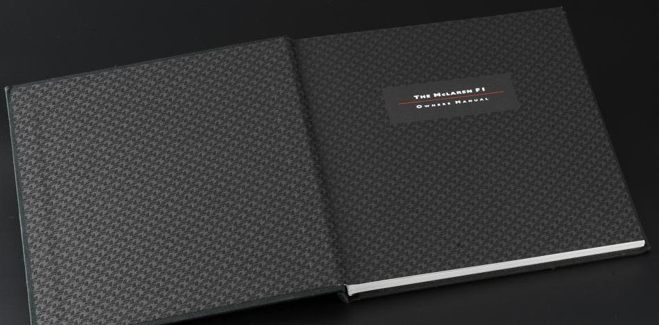
This charming video features reflections from McLaren Design Operations Manager Mark Roberts on his experience illustrating the elaborate owner’s manual for the McLaren F1. I drive a Kia, so obviously I know nothing about luxury sportscars, but this one from the 1990s is apparently fondly remembered. It’s very endearing to hear Roberts talk about the joy he took in executing these technical illustrations, and even how he managed to fit in a lot of personal touches—like a Bob Dylan reference—into a kind of work that is typically considered impersonal.
Here’s a look at the manual itself, which is quite impressive, maybe even intimidating.
Less than two hundred of these were ever printed, so they’ve naturally become highly desirable for collectors at the Venn intersection of design enthusiasts, the highly affluent, and people who just want what they want when they want it. If that’s you, you can acquire one here.
Back in August I tackled the question “What is a card?,” and noted that Twitter is starting to add more interactively rich cards to its platform. Today, Twitter announced that they are rolling out another card type: audio cards, starting with SoundCloud. When any tweet includes a link to SoundCloud content, official Twitter clients will let you play the audio directly within the tweet. On iPhone it looks like this:
Bit by bit, the web is becoming cardified. By this time next year I expect that cards will be much, much more prevalent, and more capable, too. If this concept is still new to you, be sure to read my primer.
Did you know that a 13,000 square mile area crossing West Virginia and Virginia is a congressionally mandated “radio quiet zone” in which wireless technologies like cellular service and wi-fi are forbidden—and that there are people actually living there happily? It’s true, according to Ripley’s Believe It or—I mean, according to National Geographic.