is a blog about design, technology and culture written by Khoi Vinh, and has been more or less continuously published since December 2000 in New York City. Khoi is currently Principal Designer at Adobe. Previously, Khoi was co-founder and CEO of Mixel (acquired in 2013), Design Director of The New York Times Online, and co-founder of the design studio Behavior, LLC. He is the author of “How They Got There: Interviews with Digital Designers About Their Careers”and “Ordering Disorder: Grid Principles for Web Design,” and was named one of Fast Company’s “fifty most influential designers in America.” Khoi lives in Crown Heights, Brooklyn with his wife and three children.
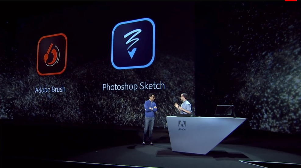
I’m at Adobe Max 2014 in Los Angeles today where Adobe has made a slew of product announcements, including several new and reworked mobile apps. The company has apparently doubled-down on its cloud- and mobile-first strategy, with lots of new features and services designed to bridge workflows from phone, tablet and desktop seamlessly.
TechCrunch has a rundown of the announcements in this article, and if you like you can watch this morning’s impressively produced, jam-packed, longish keynote address, which includes live demos of many of the features. Also, designer Dan Mall has a nice overview of one of the key new services, Creative Cloud libraries, which lets you store your project assets in the cloud and access them from any Creative Cloud-connected app.
Notice that I didn’t say “any Adobe app” there, because Adobe’s Creative SDK is now letting several third-party apps integrate with the CC ecosystem, including Fifty-three’s popular Paper app for iPad. That bit was rather underplayed amidst all of the content delivered onstage during the keynote, but for my money it represents a huge step forward for Adobe. This is one of the strongest signals yet that it’s a new day for that company, as I wrote earlier in the year. If nothing else, Adobe is actively making things more and more interesting in the creative space, rather than just standing in place and throwing its weight around listlessly, as it has sometimes been guilty of doing in the past.
Tomorrow afternoon I’ll present the app that I’ve been working on with the Adobe team all year, and I’ll post some notes on it here later in the week.
Last week Jerry Seinfeld won a Clio Award—according to Wikipedia, “the world’s most recognizable international advertising awards” and delivered an shockingly unconventional acceptance speech about the meaninglessness of awards, advertising and achievement. It’s probably the most incisive bit I’ve ever seen from Seinfeld, and almost assuredly the most honest awards acceptance speech ever delivered.
Tomorrow I’ll be flying to Los Angeles to attend this year’s Adobe MAX conference, which runs through the 8th. If you’re attending please say hello—and join me late in the day on Tuesday when I’ll be taking part in the “MAX Sneak Peeks” session (hosted by Joseph Gordon-Levitt!). I’ll have a few minutes on stage to preview a new product that I’ve been collaborating on with the Adobe team for the better part of this year. I can’t say too much about it now, except to reveal that it builds directly on a lot of the things I’ve learned over the past few years about the intersection of mobile and creativity. I’m really excited about it, and after the announcement on Tuesday I’ll write more about it here.
It’s been several years since I’ve been in L.A., even though I have family who live just an hour south in Orange County. If all goes according to plan, I’ll be joining some friends of mine for a 10-mile walk through parts of L.A. as part of that day’s CicLAvia events. If you’re in L.A. on Sunday and feel like joining the walk, send me a tweet and I’ll look for you!
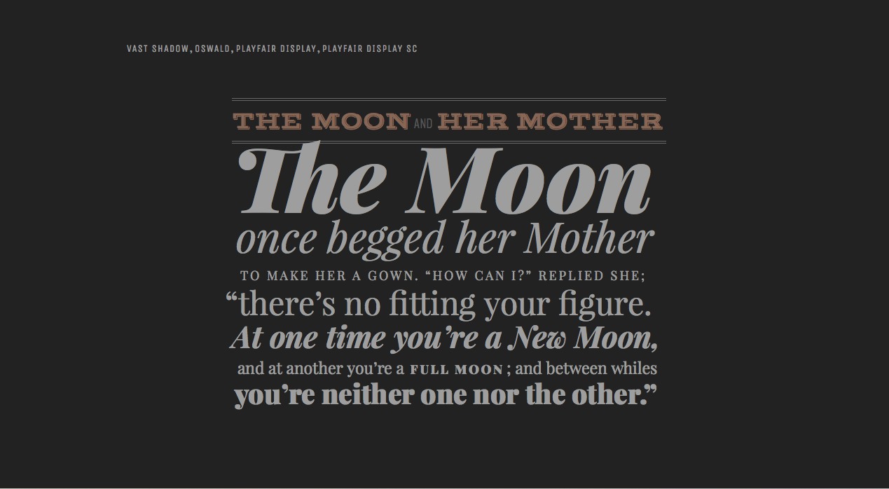
This single-page project from designer Phoebe E. shows what can be done with Google Fonts—Google’s cache of suspiciously free, largely useless but occasionally worthwhile typefaces for Web usage. It uses hand-picked tales from “Æsop’s Fables” to showcase what can be done with the gems hidden among Google’s catalog—all you need is an above-average ability to make type looks fantastic. The entire page is impressively designed, even without considering the limitations of its source. Here is one excerpt:
For what it’s worth, Subtraction.com uses Libre Baskerville from Google Fonts. See the full project here.
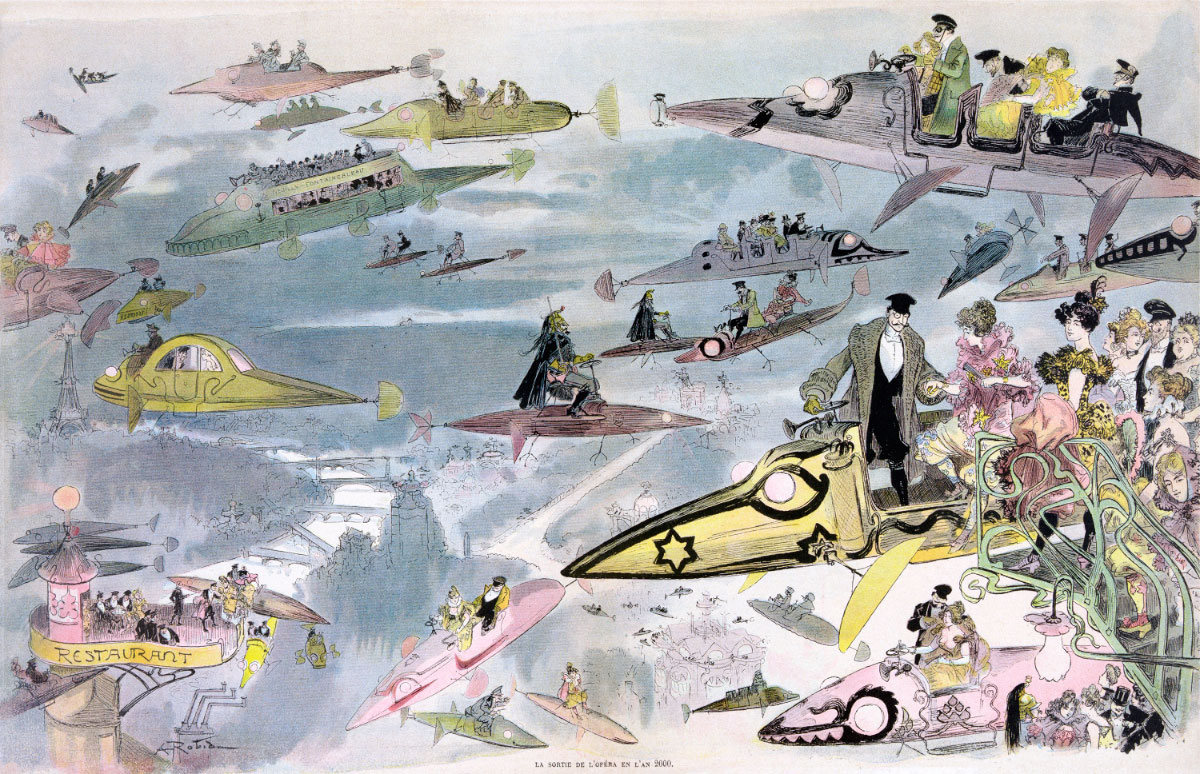
I didn’t realize that Chris Wild’s Retronaut, hands down the best running retrospective of yesteryear on the Internet, has moved to Mashable, but apparently that’s the case. Its archives to date can still be seen at retronaut.com, but Wild is now a part of the Mashable editorial team, and henceforth will be posting unearthed time capsules like the one below, a late-19th Century vision of what it would be like to leave the opera in the year 2000, exclusively to that site.
This engraving is the work of French illustrator and writer Albert Robida; I find it completely captivating. It’s rendered with a wonderful, delicately colored palette that I would like to ape for a design project of my own. And its ornate, art nouveau-inflected conception of how technology would evolve is charmingly naïve (but also strikingly accurate in its prediction of the way 21st Century pop culture would think about the hybridization of history, culture and science fiction; this image could pass for a modern day example of Continental steampunk). It shows that when people think about the future, they usually just imagine how the world will change around them, and not so much how they will change themselves. In that way, it perfectly demonstrates Christopher Frayling’s axiom that “All science fiction is about the year that it’s written.”
Wild calls out many details from it in this article.
From the Department of Putting My Money Where My Mouth Is: this site now supports Twitter cards. This basically means that I’ve added a bit of meta information to each post so that if a link to that post appears in any tweet, that tweet will automatically attach a “rich” preview of the content. When viewed in Twitter (or rather on Twitter’s Web site or within any of Twitter’s official apps), you’ll see the post’s headline, its accompanying image, and the first few lines of the text. Here’s an example:
Twitter’s implementation of the card metaphor is a little bit confusing. The entire tweet itself looks like a card, but the actual card—as defined by Twitter’s own specifications—is actually the part that appears below the time and date stamp, between the two gray horizontal rules. (I’d be very eager to see Twitter’s design language reconciled with its card language.)
Adding support for Twitter cards is not particularly hard, especially if, like me, you use WordPress. The JM Twitter Cards plugin makes the process pretty straightforward. I recommend it. Cards make for a richer presence for your content in Twitter, and purportedly increase engagement.
There’s a secondary benefit to enabling Twitter cards on your site: it makes getting your cards into Wildcard very simple. This is a bit of a cheat, as Wildcard is still not available to the public, but that will change pretty soon. Get ready!
Read more about cards in my post from August: “What Is a Card?”
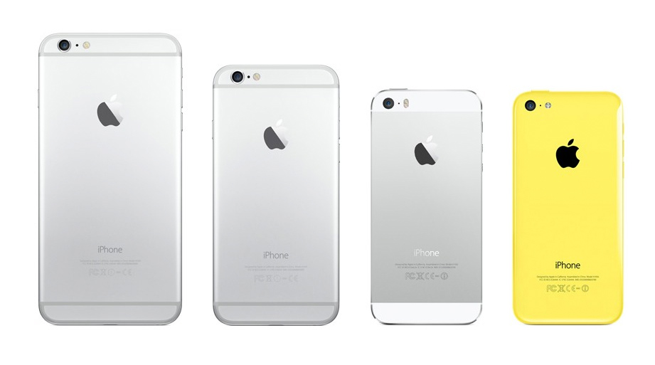
This is kind of a tough exercise, but look at the image above, which displays every currently shipping iPhone, and try if you can to momentarily disregard the size of each, as well as their respective technical specifications. If you can pull that off, then ask yourself which of these four models looks the newest, the most sophisticated, the best designed?
If like me you answered the third from the left, the iPhone 5s, then you understand the quandary I’ve been facing since the newest models were announced a few weeks ago. I’m ready for an upgrade but, aesthetically speaking, neither the iPhone 6 nor the iPhone 6 Plus strike me as upgrades from my aging iPhone 5.
That line, which debuted in 2012, still looks fresh and exciting today, still looks like a significant improvement over every other phone on the market, even the ones that have debuted in the intervening two years—including its would-be successors. The iPhone 5’s lines are sophisticated and modern; each bevel or corner or detail seems unique, well considered and essential. I still marvel at its beauty when I hold it in my hands.
By contrast, the iPhone 6’s form seems uninspired, harkening back to the dated-looking forms of the original iPhone, and barely managing to distinguish itself from the countless other phones that have since aped that look. This lack of inspiration is particularly evident on its backside, where plastic antenna runners unimaginatively mar the clean metallic surface, or where the camera protrudes out from that surface, making it effectively impossible to lay the phone perfectly flat except on its face.
These are surprisingly conspicuous misjudgments from a team with a long, nearly unbroken string of iconic industrial design successes. In some ways, they suggest a conflicted design process, perhaps one riddled with ambivalence over these new models’ frankly absurd screen sizes. What exactly happened? We’ll never know until Jonathan Ive writes his memoirs, I suppose.
But I think that feeling of creative flinching is what bothers me so much about the iPhone 6 and the iPhone 6 Plus. If there’s a single thread that runs through nearly every piece of Apple hardware, it’s conviction, the sense that its designers believed with every fiber of their being that the form factor they delivered was the result of countless correct choices that, in totality, add up to the best and only choice for giving shape to that particular product. Apple hardware has always looked utterly convincing because they have always been brimming with conviction.
Looking at these two iPhone 6 models, I can’t truly bring myself to believe that that’s the case. These models look competent, maybe even elegant, but they don’t look like they represent the very best that Apple can do. Others may feel differently, but that disconnect has left me surprisingly unenthusiastic about the prospect of owning one.
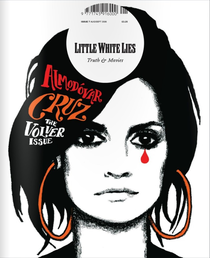
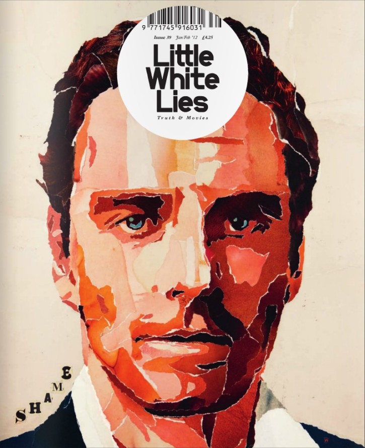
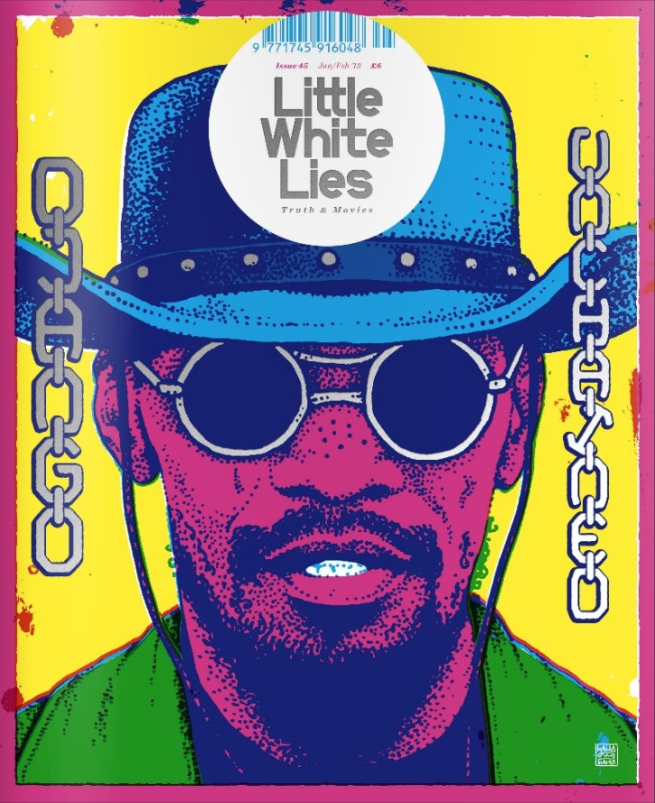
For almost a decade, the London magazine Little White Lies has been doing some wonderful stuff at the intersection of film, publishing and design. Its covers alone are a marvel; each one features a heavily stylized, head on portrait of an actor or actress, who is the ostensible subject of that issue. They’ve even generously showcased many of their back issues over at Issuu for free online perusing.
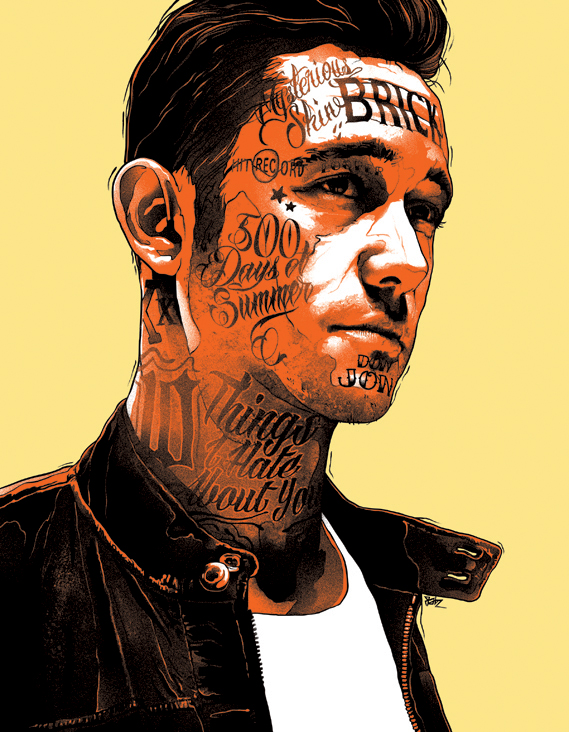
Now the publication is also putting out a new book, “What I Love About the Movies: An Illustrated Compendium.” It culls candid interviews with actors and filmmakers from the magazine’s past issues, including Francis Ford Coppola, the Coen Brothers, Spike Jonez, Steve McQueen, Ryan Gosling, Helen Mirren, Carey Mulligan and others. The illustrations in this volume are even more stylized. Here are a few samples.
Mia Wasikowska by Eleanor TaylorJoseph Gordon-Levitt by GabzSpike Jonez, by Christopher De Lorenzo
Creative Review has more images and information on the book over at this post. You can buy the book here.
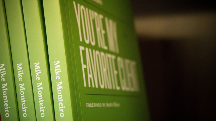
Designer Mike Monteiro, co-founder of Mule Design and owner of a Twitter account, has just written his second book: “You’re My Favorite Client.” It’s out tomorrow from A Book Apart, but unlike the many other design- and development-centric titles from that publisher, this book’s primary audience isn’t designers, but clients. Monteiro has written a how-to guide for design buyers on how to work with designers, how to get the best work out of designers, and how to have a mutually beneficial relationship with designers. Monteiro answered a few questions about the book for me over email.
This book has a very unorthodox tone—the second line is an expletive! Why did you take this tack?
It’s not an unorthodox tone for me. I write like I talk. And I’ve generally always had better results being myself when I write and when I speak and when I deal with clients. Obviously, I read the room and know how much to pull back. I wouldn’t curse in front of your mom, for instance.
But let’s be honest. Having a designer hand you a book about “how to be a client” is a loaded interaction. It could totally blow up in your face. And that’s why the book is titled what it is. The title is meant to get past that awkward interaction. It’s a happy title. Then I need to get you to read the thing. 87% of design books go unread. (Not yours, Khoi. I promise.) So I needed to engage people from the start. And no one expects a design book to be written by a sailor. If I can get them to read the first paragraph they’ll read the whole book.
Also, be fair. The third line is a compliment. I think it’s obvious from the onset that I’m on the client’s side.
Have you always been “on the client’s side”? That’s not the default mindset of most designers, at least starting out.
At the risk of gross generalization, I think designers typically spend the first ten years of their career hoping nobody finds out they’re an impostor, the next ten years thinking they’re hot shit, and the decade after developing empathy for the people they work for.
The beginning of my career was spent in fear. Just making sure people believed I could do the job. And freaked out they’d discover I actually couldn’t. It’s really hard to be on somebody else’s side when you’re trying to protect your own skin.
To be on the clients’ side you need to be comfortable enough in your own skin to realize you actually know a few things, and comfortable enough to admit the things you don’t know (which will always be the longer list).
I think one of the turning points is to realize that clients were just as nervous as I was. The don’t do this design stuff every day. And they hire us to guide them through it and to make decisions for them. And our role is to help them achieve a goal.
How do you minimize a client’s nervousness, especially if you’re still not completely comfortable in your own skin?
Oh, you can’t. You have to get comfortable with yourself and with your role before you can handle anybody else’s nerves.
Here’s the thing: these people hired you because they believed you could solve their problem. So they believe in you. And it’s your job as a designer to reaffirm that decision every time you’re in front of them. Being comfortable in your own skin is part of the job. Because if you’re not, you’re letting your clients down. Confidence is crucial to the job, and you’re being paid to be confident.
I’ve met a lot of designers for whom that lack of confidence is almost an affectation. And it’s stupid. If I’m a client, why would I write a US$100,000 check to someone who doesn’t act like they deserve it? When I write that check I want to know I’m writing it to someone who looks like they know what they’re doing.
Is that something that you’ve intuited from working with clients for many years, or did you interview some of them as primary research for the book?
Think of it this way. Remember back in the day before smart phones and GPS when, if you got lost and didn’t have a map, you actually had to pull over and ask for directions? Who are you more likely to trust? The person who immediately points down the road and says “Three blocks that way, then make a left” or the one who stares at the sky and says “Ummmmm, let’s see…” That guy may eventually give you the exact same directions, but that initial ummmmm makes you hesitate. And if you’re a designer each ummmmmm that comes out of your mouth can cost you $10k in revenue.
I’ve been doing the primary research for this book for 20 years. I deal with clients every day and I see what works and doesn’t work and I’ve screwed up more times than I’d like to think about. But every lesson in that book is field tested. This book has zero percent theory in it. It was written on a factory floor.
I think what I meant to ask was whether you talked to any of your clients about this book as you were working on it, and if you learned anything new in that process? Or if any of them read the final draft and had surprising feedback.
Yeah. I interviewed a few clients when I was doing research for the book. I asked them what it was like searching for a designer and working with a designer. I asked them what information they wish they’d had. The most surprising thing was the stuff we take most for granted, the day to day. When we talk about the design process we tend to get a little up in the trees about it. We talk goals, outcomes, the importance of collaboration. And that stuff is critical. But the clients I talked to also wanted to know about who visits who, protocol around who to send email to, what a presentation looks like.
It’s like when you’re looking for a hotel on Trip Advisor. All the marketing copy in the world about luxury and comfort can’t beat a photo of the toilet. You wanna know the toilet is up to spec.
And yes, I had those same clients review an early draft of the book. Their feedback wasn’t surprising so much as they suddenly came up with more they wanted to read. I honestly, couldn’t have written this without their input. I wanted to make sure I was writing a book for clients, and not designers. (Not that designers won’t get something out of it. They will.) But it needs to answer questions clients have.
It’s actually surprising that the idea of writing a design book for clients is something new, but it really is. I can imagine similar books for engineers, for product managers, for editors. Is it too much to infer that your point of you view is that maybe we’ve had enough design books written for designers, and we need to start writing about design for new audiences?
Christ no. We need to do the work, not write about it. Which is obviously ironic because here I am pimping a book. But the reason I wrote the first book was because I was annoyed it didn’t exist. There was nothing out there about how to do the job in a professional setting and design schools do a pathetic job of teaching that. If they do it at all. And I was tired of hiring all of these people who’d paid a ton of money to get a design education and they had no idea how to actually set up and maintain a professional practice. Design education is terrible.
I wrote “You’re My Favorite Client” when I found out that designers were giving Design Is a Job to their clients. Which is a terrible idea. They were passing the responsibility on to the people who were paying them. So I wrote the book they could actually hand to clients. The books work together. One for each side of the relationship. Crazy that no one’s written a book for clients.
I’m all for writing about design for new audiences, but if we’re gonna educate anybody about design we should start with designers.
So you mentioned above that designers will still get something out of this book—what exactly?
They’ll know what clients expect from them.
I love designers with all my heart. And everything I do is geared towards getting them to be better at their chosen career. And to understand the power of what we do. Design fucking rocks. We take shit that isn’t working as well as it could be, or that people are having trouble with, and we figure out how to make it better. That’s a pretty awesome job.
And we do this job for hire. The people with the problems hire the people who can solve the problems. And I’m trying to shine a little light on that exchange. So everybody works together better, gets the most out of it, and solves as many problems as they can. Because they’re piling up.
“You’re My Favorite Client” is available starting tomorrow from A Book Apart.