is a blog about design, technology and culture written by Khoi Vinh, and has been more or less continuously published since December 2000 in New York City. Khoi is currently Principal Designer at Adobe. Previously, Khoi was co-founder and CEO of Mixel (acquired in 2013), Design Director of The New York Times Online, and co-founder of the design studio Behavior, LLC. He is the author of “How They Got There: Interviews with Digital Designers About Their Careers”and “Ordering Disorder: Grid Principles for Web Design,” and was named one of Fast Company’s “fifty most influential designers in America.” Khoi lives in Crown Heights, Brooklyn with his wife and three children.
Technology has made the creation and distribution of images so cheap today that it’s amazing what can be had for almost nothing. You can now buy stock photography for as little as one dollar per image over at the newish Dollar Photo Club. There are some caveats: the selection is not vast, the quality is somewhat uneven, and currently you must “apply” for a membership which then costs ten dollars a month. Some will grouse at the pricing, but I remember a time when a single stock photo of no particular greatness might still cost as much as twelve months’ worth of Dollar Photo Club.
If even a dollar is too much for you, you can turn to one of the mushrooming number of free stock photography sites, where the parties responsible—agencies and photographers, mostly—have turned their images into loss leaders for publicity. The best known such destination is probably Unsplash which has earned a reputation for a variety of attractive photographic styles that generally don’t have the stagey, saccharine sheen of standard stock catalogs. Also in this vein are Picography, Superfamous, Gratisography and Little Visuals. These sites are all presented in a blog-like single stream, but Magdeleine organizes photos from several different sources (including some of the above) into themes and even provides a search engine that can sort by color. Again, all free.
There is good stuff to be had on all of these sites, especially if you are in the market for photos with shallow depth of field, tastefully toned color palettes, and a preponderance of “authentic” visual textures: antique wood, thick glass, weathered brick, and maybe some flannel here and there. And don’t forget the vintage cameras and modern laptops, which are freely mixed together as if they were the most natural pairing in the world.
Actually, if that kind of imagery is what floats your boat, the newest of these sites that I’ve come across is probably the best of them all: the aptly named Startup Stock Photos. That site’s images, one of which I’ve excerpted below, are crisply composed and aesthetically impeccable. They also represent the emergent homogeneity of this new chapter in stock photography, where everything is cheap or free and looks like it was either shot inside, nearby, or by an employee of a Brooklyn farm-to-table restaurant.
UpdateThe Stocks brings together a lot of these sources and a few more in one elegant location, courtesy of the folks at Panda.
The company’s mission is to help filmmakers and studios navigate the Ratings Board’s decidedly opaque, frequently bewildering and intermittently infuriating process for assigning films G, PG, PG-13, R or NC-17 ratings in the U.S. market—essentially deciding each film’s financial fate and therefore deciding what consumers get to watch. The complaints against the Ratings Board are many—Kirby Dick’s 2006 film “This Film Is Not Yet Rated” offers a compelling indictment—but maybe the worst thing about it is that its methods are kept secret. In interviews, the Film Advisors founders unabashedly tout their knowledge of these restricted practices, which naturally they are willing to divulge to paying clients.
Imagine a similar body operating with similar impunity—but rating books instead of films. And imagine that the books that they assign certain ratings were effectively barred from sale at major book retailers. The notion seems antithetical to everything we believe about free speech. But it exists in film, and not only that, veterans like Film Advisors are putting themselves in the position to financially benefit from the whole warped scenario.
English band Eagulls’ self-titled debut is one of my favorite records of the year. It recalls the disjointed, frigid howls of post-punk Britain. Here is the band covering The Stone Roses’ glorious “I Wanna Be Adored,” an anthem from an altogether different period in British music; in its time this song was the sound of the wall being torn down between rock and dance music. In their rendition, Eagulls practically play it backwards, making it sound as if they were building that same wall back up again.
One of the first “grown-up” things I remember learning as a teenager is that maps are never unbiased, that they always represent the predilections of their cartographers—or their cartographers’ sponsors. You can’t create a flat map without distorting proportions and thereby misrepresenting the relative sizes of continents and countries, for instance, and even globes imply an “up” and “down” that is more a reflection of politics than physics. This clip from “The West Wing”—which is typically didactic but nevertheless amusing—runs through some of the inherent problems in the Mercator projection map that we’re all familiar with.
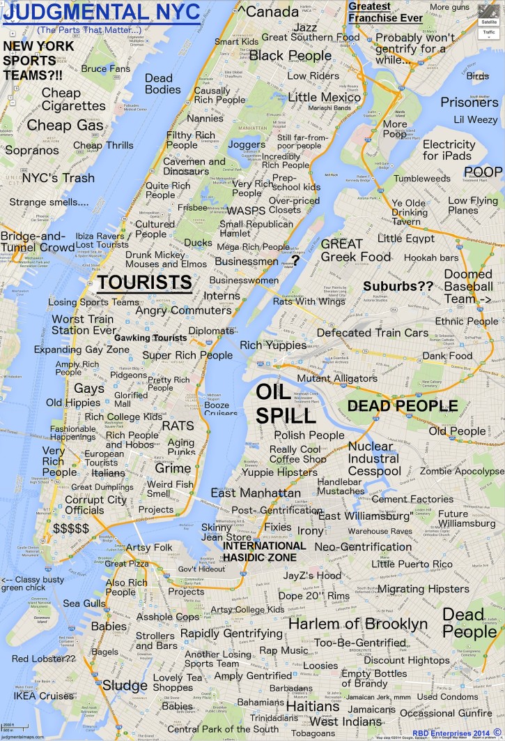
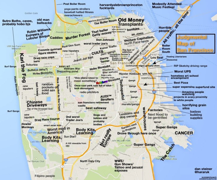
All of which, aside from making me sound smart, is meant as a setup for Judgmental Maps a collection of crowdsourced charts of American cities that have been marked up with frank labeling as to who lives where and what can be found there. Many readers of this blog will be especially interested in the entries for New York City and San Francisco:
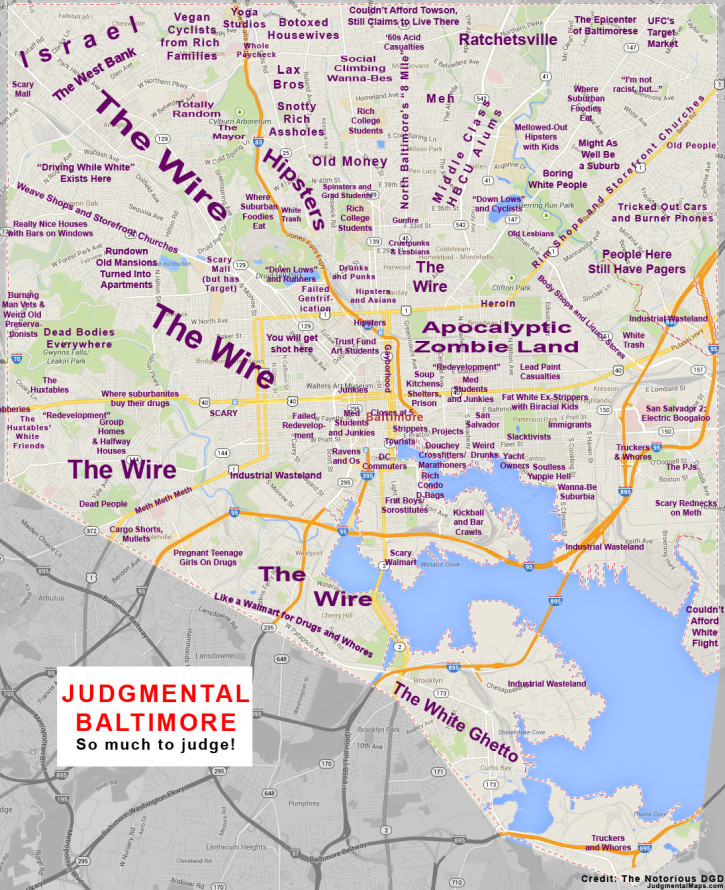
I found the interpretation of Baltimore pretty hilarious, too, especially the way it reflects how most white collar people living outside that city have come to think about what can be found there:
Writing in The Washington Post today, Justin Levitt, a professor at the Loyola University Law School, discusses the results of his comprehensive study of votes cast in U.S. elections over the last fourteen years. Out of over a billion votes cast in local, state and national elections, Levitt found just thirty-one cases of voter impersonation—the kind of fraud that the current vogue for voter ID laws aims to catch. Helpfully, he details each case in this article, though he warns that not all of them have been thoroughly investigated and so some are likely to be debunked, further reducing an already vanishingly small number.
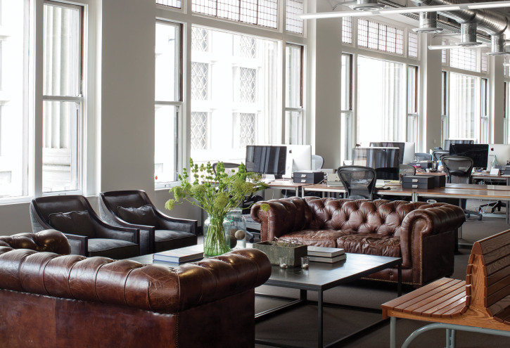
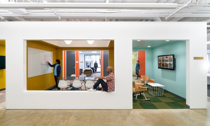
This site showcases photos of the beautiful, extravagant, occasionally surprising office spaces of tech and startup companies around the world (though mostly in New York and San Francisco).
Officelovin’ reflects the fact that this category of business seems to emphasize the exquisiteness of its interior spaces as badges of pride; in a different era, successful companies used to erect skyscrapers as monuments to their success. Is there a single technology company’s structure that’s of any architectural note? The exception, I suppose, will be Norman Foster’s forthcoming new Apple campus, though its plans have hardly won universal praise.
This is the wonderful poster for director Florian Habicht’s documentary about some combination of the longstanding Britpop band Pulp, the 2012 culmination of its two year world tour, and many of the denizens of the band’s hometown of Sheffield, England. Few other bands would consent to a poster like this, and while I haven’t seen the movie, I bet the film will be equally idiosyncratic. Pitchfork wrote about it earlier in the year. The film is currently on a U.S. screening tour; it plays tonight in Manhattan and tomorrow night in Brooklyn.
Musician Jarvis Cocker once quipped about the Internet, “I don’t know what it is, but I know it’s very important.” I sort of feel the same way about the technology industry in China, which is growing at a massive rate and breaking all kinds of records.
Today I took a closer look at leading Chinese juggernaut Xiaomi, which has very quickly become the most consequential smartphone maker in the world’s largest smartphone market, and has also taken a lot of flack for blatantly copying Apple. Their MIUI variant on the Android operating system is particularly interesting.
The notion of forking Android has always sounded like a mess to me, but Xiaomi have apparently had a lot of success with it by instituting weekly updates to MIUI which have captivated their customers, who eagerly await each new release. The video for the upcoming MIUI version 5 showcases an operating system that, while short on innovation, is heavy on elegant transitions and animations. There is some nice stuff in here.
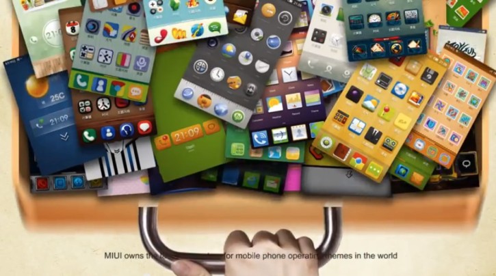
On the other hand, Xiaomi’s video explainer for “What is MIUI?” reveals something that’s likely closer to the reality of MIUI as one would find it in the wild: an OS that puts a premium on configurability at the expense of elegance, and UI skins that looks typically horrific. The most telling image is almost literally a junk drawer full of terrible user interface themes.
In its second quarter, Xiaomi shipped 15 million phones in China, a performance which soundly beat Android powerhouse Samsung and more than tripled Xiaomi’s own shipments from the same period last year. That’s a rapidly growing population of software consumers actively using an interface that most of us in the West have never touched. I don’t know what this means, but I know it’s very important.
From this past Sunday’s episode of John Oliver’s “Last Week Tonight,” a rant on the surging popularity of native advertising as a revenue model for content publishers and news organizations.
This is not necessarily on par with Oliver’s best work, but I did find it to be a startlingly effective splash of cold water thrown onto the changing face of publishing. We’ve all been looking for solutions to the industry’s continual cascade of woes for so long that the idea of doing away with the divide between editorial and advertising has, over time, come to seem natural, and not at all a big deal. Oliver reminds us that it’s just the opposite.
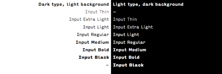
This is very interesting. Input is a family of fonts designed expressly for writing code by David Jonathan Ross. The full family includes both monospaced and proportional fonts in a variety of widths, weights, and styles all optimized to improve the coding experience.
Unlike most proportional designs, these fonts adopt the helpful attributes of a monospaced design—generous spacing, large punctuation, easily distinguishable characters—while allowing each character to take up the space that it needs.
The proportional styles provide a more comfortable alternative to the monospaced fonts used for everything from text composition to correspondence to code. The capitals get wider so they can feel at home with the lowercase. The Bold weight gets wider so it can feel at home with the Regular. The Condensed styles can work together alongside the Normal width, and the Serif can provide an alternative texture to the Sans.