is a blog about design, technology and culture written by Khoi Vinh, and has been more or less continuously published since December 2000 in New York City. Khoi is currently Principal Designer at Adobe. Previously, Khoi was co-founder and CEO of Mixel (acquired in 2013), Design Director of The New York Times Online, and co-founder of the design studio Behavior, LLC. He is the author of “How They Got There: Interviews with Digital Designers About Their Careers”and “Ordering Disorder: Grid Principles for Web Design,” and was named one of Fast Company’s “fifty most influential designers in America.” Khoi lives in Crown Heights, Brooklyn with his wife and three children.
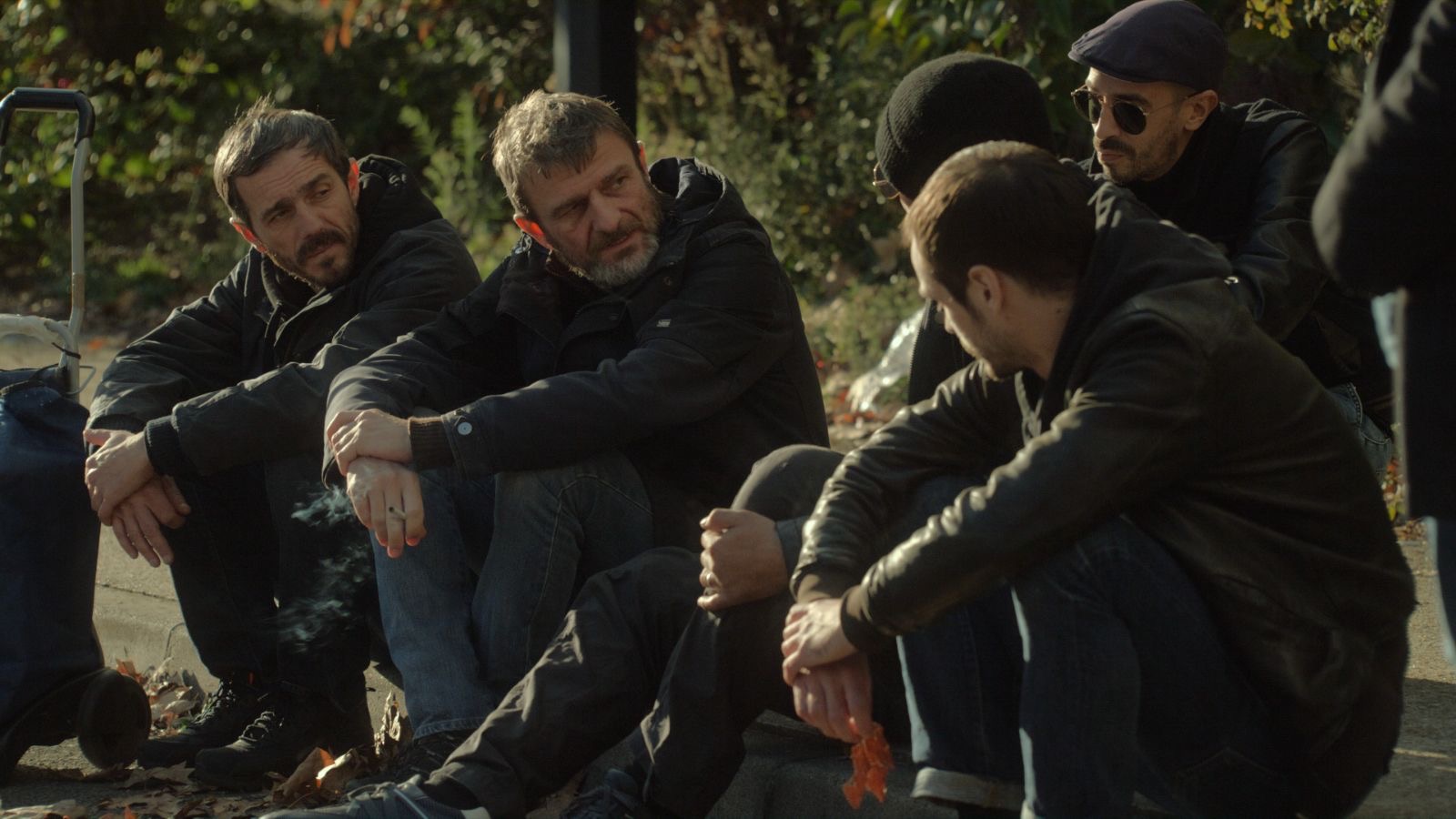
Sometimes the best movie experiences are the ones that you go into with few expectations, or maybe even with a bit of reluctance. On a cold, incredibly rainy night in March, the kind of evening where staying warm and dry sounds even better than going to see a movie, my wife and I somehow roused ourselves to trek all the way from Brooklyn to the Upper West Side of Manhattan to see a screening of “The Temple Woods Gang.” This 2022 noir from Franco-Algerian director Rabah Ameur-Zaïmeche was being shown as part of a festival of recent French movies at Film at Lincoln Center, and we went at the suggestion of some friends, not really knowing anything about it.
Ameur-Zaïmeche’s film is a sobering story of a misfit band of losers from a Parisian housing project who conspire to rob what turns out to be an incredibly dangerous victim, and the backlash that ensues. It’s told with bracing, efficient skill, with little to no exposition in the dialogue, and barebones audio—there’s no score to speak of. If you eat up this kind of raw, minimalist filmmaking, and I do, then this is for you. At the same time, it’s also humanist and contemplative; the director takes long detours from the plot to linger on quiet moments like an aria at a funeral, a racehorse and jockey rounding the track, an antagonist dancing along with a club deejay, and more—these add a real poetry to the violent proceedings. Superb stuff and totally worth the cold temperatures and downpour.
On a different night when I did stay home, my family and I watched Mamoru Hosoda’s 2012 anime film “Wolf Children.” I’d seen it before and remembered liking it, though it was only on this second watch that I realized what a masterpiece this fantastical story about a young mother raising two werewolves is. For context I’ll offer a hot take on anime: most of it bores me, even the work of Studio Ghibli. Maybe especially the work of Studio Ghibli, which I find to be visually spectacular but thematically tiresome and egregiously incompetent when it comes to character development. Yes, I said it! Anyway, Hosoda’s work, for me, inverts Ghibli’s formula of huge spectacle and thinly drawn characters; what “Wolf Children” offers instead is eloquently dimensional protagonists set against a backdrop of quotidian imagery that’s drawn with such precise, loving care that it becomes fantastical in a way you never knew the world around us could be. That’s the kind of animation magic that resonates for me, even if there’s not a cat-bus in sight.
Roundup
Here’s the full list of all sixteen movies I watched in March. This is the latest in my monthly round-ups of movies I’ve been watching. You can also see everything I watched in February, in January, and summaries of everything I watched in 2023, 2022, 2021, 2020, 2019, 2018, 2017, and 2016. Also, you can always keep up with what I’m watching by following me on Letterboxd—where I’m also writing tons of capsule reviews.
“Dune: Part Two” (2024) ★★★★½ First of three times seeing it in a month.
“Friedkin Uncut” (2018) ★★ Despite lots of original interview footage of its subject, this documentary about the life and career of William Friedkin, one of the greatest directors of modern cinema, is not as interesting as the man or his work.
“Night Falls on Manhattan” (1996) ★★★★ An underappreciated gem from Sidney Lumet about how a debacle of a police manhunt reverberates through pre-Giuliani New York.
“Mad Max: Fury Road” (2015) ★★★★★ Rewatched. This movie is nine years old already and it’s still a miracle, but its scant CG effects are just starting to show their age.
“The Temple Woods Gang” (2022) ★★★★ Steadfastly minimal yet also ardently humanist story of small time criminals in a Parisian banlieue who get in over their heads.
“Dune: Part Two” (2024) ★★★★½ Rewatched. Second viewing confirmed it for me: this is an honest-to-goodness masterpiece, not just for its spectacle but for the way it peoples its fantastical landscape landscape with authentic, dimensional human characters.
“Beverly Hills Ninja” (1997) ★½ Director Dennis Dugan must’ve had to work extra hard to deliver this film with so much incompetence that it manages to blot out all of Chris Farley’s comic radiance.
“Ready Player One” (2018) ★★ A gigantic misfire from Steven Spielberg that’s so bad it really made me wonder how the director got so far off track.
“Amanda” (2022) ★★★½ This is a genial, American-style indie movie—except that this time the conspicuously quirky, child-like adult at its center is, unexpectedly, a young woman living in the bourgeois Italian countryside.
“Mishima: A Life in Four Chapters” (1985) ★★★★ A beautiful, abstractly constructed biopic of Japanese writer Yukio Mishima from the master of stories about disturbed men with a code, Paul Schrader.
“Indiana Jones and the Dial of Destiny” (2023) ★ For the rest of their lives, everyone involved in this will have to live with that fact that they were involved with this.
“Dune: Part Two” (2024) ★★★★½ Rewatched. Even on the third viewing, this gets better and better.
“Dune” (2021) ★★★★ Rewatched. Revisited this with my daughter as she got ready to see the sequel.
“Wolf Children” (2012) ★★★★ Rewatched. A sparkling, soulful fantasy about coping with otherness that surprised me the first time and that I felt even more profoundly on this second viewing. It also confirmed for me that I actually can enjoy anime—it usually bores me to tears—or at least I can when it’s as thoughtful about character development as this one is.
“Mirai” (2018) ★★★½ From the same director: an anime “Where the Wild Things Are” for the 21st Century. Loaded with gorgeously precise, quotidian imagery that comes alive and enters the realm of the fantastical through sheer storytelling, underpinned by deep reserves of empathy for the inner lives of young children.
As the title suggests, Denis Villeneuve’s “Dune: Part Two” is really the climactic second half of the original book. So it benefits from comprising all of the biggest, most dramatic set pieces that naturally fall into the second half of most novels. It’s scaled up and larger than “Part One”; its action is more sweeping and it gives you the satisfaction of (more or less) resolving the actual storyline that ended on a cliffhanger in its predecessor.
If you show up at the theater—an IMAX theater, ideally—expecting to see operatic space intrigue, enormous spacecraft, towering explosions and people riding the backs of building-sized sand worms, you get all of this, in spades. Villeneuve is among the most gifted directors working today, and everything he delivers here is in the ninety-ninth percentile of the smartest and more impactful blockbuster filmmaking of the past several decades.
But the movie that the director fashions from author Frank Herbert’s original, already ornate architecture is also much deeper and more complex than both its predecessor and, surprisingly, the source material. Villeneuve makes a series of key choices that decouple his movie from the book, finding ingenious ways to both simplify the many, many ideas packed into Herbert’s prose while also fleshing others out with his uncommon ingenuity and insight.
Primarily, he confronts more directly and much less sentimentally than one would expect the question of the white savior trope at the heart of the narrative. His movie does more than just pay lip service to the subtextual quandary of whether we, with our buckets of popcorn and giant-sized sodas, should really be rooting for Timothée Chalamet’s Paul Atreides, a western-coded white male who ostensibly rescues a third world-coded population?
The script that Villeneuve cowrote with Jon Spaihts tweaks the book’s twists and turns to offer a more honest truth about the devil’s bargain that the protagonist strikes in order to achieve victory. One of its key methods is to refactor Zendaya’s Chani, elevating the character from a fundamentally inert “girlfriend” role into a much more crucial element of the story. In this conception, Chani becomes a unique kind of audience surrogate. Not in the common sense of that role, where a naïve or uninitiated character allows a movie’s script to basically explain the rules of the world to them and, by extension, to those of us watching. Rather, Chani is a beacon for 21st century filmgoers’ skepticism of not just that white savior trope, but also of the kind of cult of personality that fuels the rise of Chalamet’s character. Chani is objective, protesting and vocal as events unfold with ominous undertones, and Zendaya, to my surprise, delivers a rivetingly convincing performance. With every line reading, every penetrating stare or glance, she communicates a richly conflicted interiority that propels the counterstory forward. It’s a remarkable performance that I didn’t appreciate for its full artfulness and effectiveness until my second viewing. Yes, I saw it a second time, and it won’t be the last time.
It’s worth pointing out how significant it is that such complicated performances and ideas are at the heart of what’s shaping up to be a sizable box office hit. In his weekly box office analysis newsletter FranchisRE, David A. Gross comments on the recent string of disappointing super-hero releases in the context of the success of “Dune: Part Two”:
With a few exceptions (Star Wars, Avatar), superheroes surpassed science fiction in popularity during their dominant run. In their heyday, superheroes would have scoffed at vulnerable human characters like these. Superheroes don’t need gizmos on their nose to survive. They can fly through any atmospheric conditions. They can do whatever they want. They’re omnipotent.
But look what’s happening now. Audiences are connecting with these human, vulnerable faces, while superheroes have grown self-absorbed and detached. ‘Dune’ is leading with its humanity, while superheroes are having a hard time holding on to theirs.”
I’m a huge fan of Gross’s sentiment, but I’m not ready to declare victory just yet. Even if, inspired by “Dune,” studios suddenly start greenlighting a series of pensive, complex, people-centered science fiction epics, how do you replicate the once-in-a-generation talent of Denis Villeneuve? Still, we can always hope for better movies because once in a while, as with this one, we actually get them.
Roundup
Here’s the full list of all twelve movies I watched in February. (Technically I first saw “Dune: Part Two” on the first day of March, but I’m sneaking it into this post.) This is the latest in my monthly roundups of movies I’ve been watching. You can also see everything I watched in January, and summaries of everything I watched in 2023, 2022, 2021, 2020, 2019, 2018, 2017, and 2016. Also, you can always keep up with what I’m watching by following me on Letterboxd—where I’m also writing tons of capsule reviews.
“The Goonies” (1985) ★½ This inane, Spielbergian kids adventure includes a tremendous amount of shouting and is tonally all over the place—but some people adore it, for some reason. I don’t get it.
“Adventures of Arsène Lupin” (2004) ★ Incomprehensible, ridiculous and bombastic rendering of the classic French story of a gentleman thief, but I still watched it all the way through to see Kristin Scott Thomas.
“American Fiction” (2023) ★★★½ A genial satire about the publishing industry and the market for Black literature. It’s really more of a comfort than a provocation, but it’s still wickedly funny.
“Killers of the Flower Moon” (2023) ★★★ Rewatched. Few people seem to be willing to acknowledge that this Scorsese epic is not just overly long, but also a storytelling mess. Not me, I say it like it is.
“Defending Your Life” (1991) ★★★½ Rewatched. This Albert Brooks comedy about how we’re judged after we die went over my head as a teenager, but I get it now: it’s about being middle aged.
“The Caine Mutiny Court-Martial” (2023) ★★★ A very watchable cinematic staging of the classic play with two fatal flaws: a rocky performance from Kiefer Sutherland and an unwillingness to rethink the play’s dumb ending.
“The English Patient” (1996) ★★★★ Rewatched. An epic romance that has all the signs of the kind of prestige Oscar bait that I normally decry, except in this case it’s somehow extraordinarily good.
“Cruella” (2021) ★½ Yet another completely pointless bit of merchandising from the genius collective at the Disney marketing department.
“Bodies Bodies Bodies” (2022) ★★★★ A horror thriller with a brain, even if it does star Pete Davidson. Sharply executed, bitingly hilarious, and an instant classic.
“The Beekeeper” (2024) ★ Dumb as a box of rocks, obviously, but offers the alluring mystery of trying to figure out whether or not the filmmakers were aware of exactly how dumb?
“Orion and the Dark” (2024) ★★★ Charlie Kaufman finally gives the world what it’s been waiting for: an animated kids movie encapsulating all of his neuroses and anxieties.
“Dune” (2021) ★★★★ Rewatched. This was my sixth viewing and it was even better than I remembered.
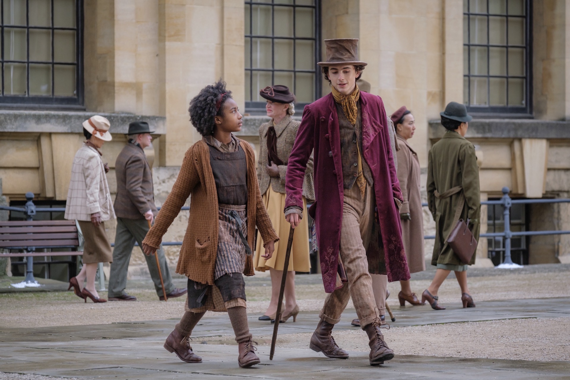
What should we make of “Wonka,” Paul King’s completely un-asked-for prequel to “Willy Wonka and the Chocolate Factory”? For many people, Gene Wilder’s original interpretation of the character has achieved iconic status, capturing a kind of whimsy that was cut with an undercurrent of adorable menace—an utterly unique prism on childhood fantasy. To be honest, I personally don’t think very highly of that 1971 adaptation, but I respect how protective so many people have become of its place in culture. And, as a general skeptic of most franchises, neither was I hungry for a new take on the Roald Dahl story. Basically, no one wanted this movie to exist.
But it came into existence anyway and somehow it’s great! Well, maybe not truly great, but director Paul King has apparently mastered the art of overdelivering on suspiciously motivated “intellectual property” adaptations that, in other hands, would almost surely have turned into dreadful movies. “Wonka” is light on its feet, continually inventive, full of totally enjoyable songs and loaded with great performances—and it’s only moderately preachy about love, friendship, following your heart, blah blah. I’m not sure it’s destined for the (deserved) adoration that King’s two “Paddington” adaptations came to enjoy, but it’s full of heart and, maybe even more excitingly, shows King growing as a filmmaker. It’s rare for prequels/sequels like this to leave me excited to see what the director will do next, but this one did that.
Here are all sixteen movies I watched in January.
“Dumb Money” (2023) ★★★½ A not bad retelling of the GameStop “stonks” episode of just a few years ago. Certainly better than recent similar current events fare like “BlackBerry.”
“Wonka” (2023) ★★★★ Even devotees of the original might find this one disarming.
“The Zone of Interest” (2023) ★★★★ Like picking up a familiar rock you’ve seen a thousand times to examine the underside and discovering a creepy, crawly subculture of mendacious strivers, doing the devil’s dirty work.
“Big” (1988) ★★★½ Rewatched. Pretty delightful before all the feelings and lessons are learned, but no matter what you think of it, Tom Hanks and Robert Loggia dancing on life-sized piano keys is pure movie magic.
“Are You There God? It’s Me, Margaret” (2023) ★★★ Great performances from the two leads in an undercooked adapted screenplay. Feels like a missed opportunity to make a classic film from a classic book.
“Rebel Moon — Part One: A Child of Fire” (2023) ★½ Zack Snyder brought together this cast of mediocre also-rans to make this truly grand expression of idiocy.
“Chicken Run: Dawn of the Nugget” (2023) ★★ In all the ways that the original movie was smart, funny and unexpected, this one is not.
“Marius” (1931) ★★★★ Lovely, profoundly humanist look at provincial drama—and comedy—among a small group of blue collar barkeeps, shop owners and sailors in Marseilles, France.
“Fanny” (1932) ★★★★ A direct sequel to “Marius” that somewhat audaciously picks up moments after the original ends. It’s heavier, but also perhaps more richly written, and it’s delivered by a true ensemble of a cast.
“Baragaki: Unbroken Samurai” (2021) ★★★½ A story of samurai trying to hold onto honor in a politically internecine Japan. Honestly, I barely understood what was going on, but it was compelling nonetheless
“The Killer” (2023) ★★★★ Rewatched. Still enjoyed this a lot, but not a masterpiece.
“Theater Camp” (2023) ★★★ Completely enjoyable farce that betrays its origins as a short. There’s not quite enough here for a feature film, but what is here is pretty genial.
“Albert Brooks: Defending My Life” (2023) ★★★ Albert Brooks and Rob Reiner talking over Brooks’s career at a dinner, and we have the privilege of being a fly on the wall.
“Broadcast News” (1987) ★★★★★ Rewatched. It’s always a joy to revisit this comic classic that feels both like some kind of modern fairy tale and also a brutally honest, almost cynical view of the way the world works. A true masterpiece.
“Stand by Me” (1986) ★★★ Rewatched. Broadly entertaining but also somewhat false at its center; the kids in this movie act more like an author’s creations than like real kids.
“Inside Llewyn Davis” (2013) ★★★★ Rewatched. What a delight to watch the Coen Brothers torture those unlucky enough to be characters in their movies.
This is the latest in my monthly round-ups of movies I’ve been watching. You can also see my year-end summary of everything I watched in 2023, 2022, 2021, 2020, 2019, 2018, 2017, and 2016. Also, you can always keep up with what I’m watching by following me on Letterboxd—where I’m also writing tons of capsule reviews.
Everyone says it was a good year for the movies, and looking back at what I watched in 2023 it’s hard to argue that it wasn’t a stronger slate than 2022. Overall the films of the past twelve months seemed to be more ambitious and larger in scope, if sometimes only moderately, and just generally better. And even if my favorites still tended to be smaller, independent-minded pictures, they still seemed to pack a larger wallop.
At the same time, many of the most anticipated movies of the year turned out to be big disappointments, at least for me. Critics more or less swooned over Martin Scorsese’s “Killers of the Flower Moon,” Christopher Nolan’s “Oppenheimer,” Wes Anderson’s “Atomic City,” Hayao Miyazai’s “The Boy and the Heron,” and Michael Mann’s “Ferrari.” And while I was very happy to see all of these auteurs back in action, I found all of these productions to be flawed, sometimes fatally.
If there was a trend with these movies, it might have been a collective unwillingness to challenge these legendary filmmakers on their creative decisions. Someone should have questioned whether Martin Scorsese truly needed three and a half hours to tell the story of “Killers of the Flower Moon.” (He didn’t.) Someone should have suggested to Christopher Nolan that another draft of his “Oppenheimer” script could have done wonders for its leaden dialogue and woefully underwritten female roles. (It couldn’t have hurt.) Someone might have asked Wes Anderson if “Atomic City” could have done with one or two fewer tedious narrative framing devices. (For sure.) Someone should have inquired of Hayao Miyazaki whether, within any of the excessive visual invention he was investing into “The Boy and the Heron,” he had ever bothered to figure out what any of its characters’ actual motivations were, much less whether the plot made sense. (Double nope.) And someone should definitely have checked if Michael Mann had ever watched “Walk Hard: The Dewey Cox Story,” if only to help him avoid recreating some of that satire’s most egregious biopic clichés—sometimes practically verbatim—in “Ferrari.”
Apparently these crucial, potentially transformative conversations never happened and it’s largely because these vaunted directors are among the elite few who get blank checks for their projects. No one wants interference from movie studio executives, but sometimes a little creative friction can be conducive to better work. I didn’t hate these movies but, relative to how much I adored many of these directors’ earlier works, it was saddening to watch all of them. This was supposed to be a year of tremendous comebacks for these auteurs, but none of the films they rolled out can stand among their best works.
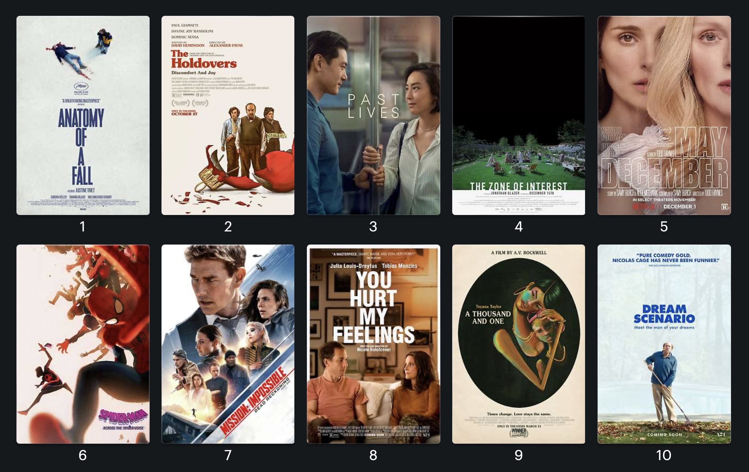
Luckily, there was plenty of great filmmaking from outside that particular canon of great directors. All of the films that did make it on my top ten list below were wonderful, enthralling moviewatching experiences, but a few of them were so powerful they just blew me away. My jaw was practically agape after watching number one on my list; after the first twenty minutes of watching number two in theaters I knew I was already in love with it; and number three had such a persistent, slow burn effect on me that I was even more impressed by it a few days after watching it. In fact, looking over the whole list, I find I’m more eager to rewatch these ten—in some cases multiple times—than I usually am with past years’ lists. In that way, it was a pretty good year after all.
“Anatomy of a Fall” Justine Triet’s courtroom drama is somehow both everything you would expect—lots of lawyerly maneuvers and legal twists—and also something completely unexpected. Halfway through it becomes a surprisingly clinical dissection of how two people in a marriage arrive at a mutual, murky definition of what the truth is, revealing layer after layer of unexpected depth and complexity. There are no special effects or visual pyrotechnics, but I still couldn’t believe what I was watching.
“The Holdovers” Director Alexander Payne sets a premise that almost seems like a foregone conclusion: a three-person odd couple, stuck at a boarding school over the holidays, are forced to somehow find common ground—cue tears, laughter, hugging, etc. But it’s executed with such enormous warmth and depth of generosity towards the three principal characters (brought to life by three off-the-charts wonderful performances) that I was bought in almost from the moment the retro, Hal Ashby-style titles rolled at the start (not the the end!) of the movie.
“Past Lives” At first I resisted this precious, overly polite indie romance, dismissing its Wong Kar-Wai and Richard Linklater homages as derivative rather than inspirational. But it’s also so damn lovely, so expertly, exquisitely modulated, and hits so squarely and with such resonance on a genuine universal sadness about lost love, that I had to give in. Among the most moving experiences I had at the movies this year.
“The Zone of Interest” Director Jonathan Glazer, whose past work has never seemed to match the hype of his movies, conjures up a wholly original nightmare in this stark, powerful statement on the banality of evil. I’ve never seen bourgeois striving rendered so horrifically—and recognizably—before.
“May December” Todd Haynes’s fascinating look at the long aftermath of a really seedy tabloid scandal is in parts a trashy indulgence, a criminal procedural, and a pitch black comedy. It’s also really sad and left me somehow mournful for things I had no previous interest in.
“Spider-Man: Across the Spider-Verse” I did not expect this sequel to be as aesthetically explosive as the 2018 original, but somehow it even exceeds that one’s accomplishments—especially in its unique mix of computer graphics with heartfelt homages to hand-drawn illustration, all in the service of building surprisingly compelling characters (see this superb thread). Despite it only being half a movie, it’s also about as emotionally complex as a mainstream animated movie has got any right to be.
“Mission: Impossible—Dead Reckoning” Coming off of a run of three prior installments that has got to be among the best sustained action cinema in history, I can see how this seventh franchise installment struck some as a disappointment. But not me. I still found the ambition on display here to be not just technically phenomenal but also a thrilling declaration of principles on where adventure filmmaking has been and where it should go. As just one example: its breathless, third act train sequence is not just technically phenomenal, but also a worthy callback to Buster Keaton’s ““The General.” This movie is basically in dialogue with action as a genre going back almost a full century, all the while renewing the potential in the same core ideas that have guided movies across that time.
“You Hurt My Feelings” Four Woody Allen-esque New Yorkers, adrift at midlife, run afoul of the boundaries between moral support and misrepresentation. This comedy of manners by Nicole Holofcener is admittedly navel-gazing but also piercingly hilarious, full of warm empathy for its characters without ever forgetting their absurdities. I saw it back in the spring of last year and never stopped thinking about it.
“A Thousand and One” Some films, despite whatever other fine qualities they might have, are best thought of as showcases for powerhouse performances. This is an example. Teyana Taylor, in the lead part in this astonishing debut feature directed by A.V. Rockwell, is utterly possessed by her role. She’s completely convincing as an emotionally damaged, single mother trying to bring up a young boy in New York City at the turn of the millennium.
“Dream Scenario” An absurdist, thoroughly Nic Cage-ian contemporary fantasy about the double-edged blade of viral fame. It’s also something of a meditation on middle age, on finding oneself at a juncture where three quarters of a lifetime of toiling seems to amount to nothing, leaving one feeling alone and at odds with the world. As a comedy it’s got a rapier wit, but it’s also uninhibitedly dark in its worldview.
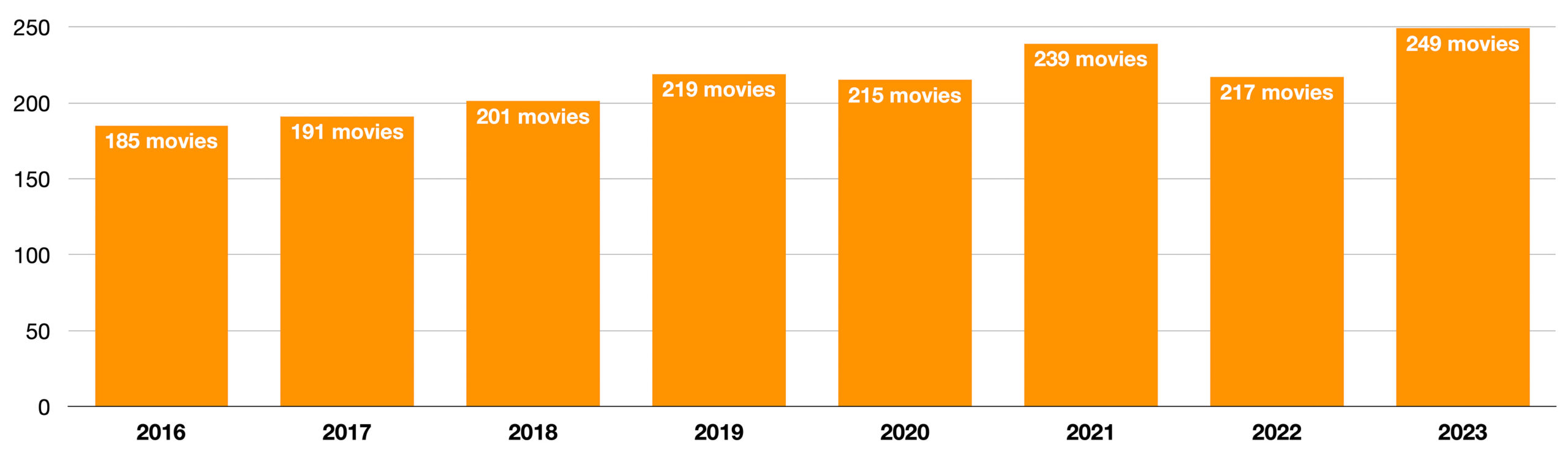
The total number of movies I watched this year ticked up a bit over previous years. I attribute this to watching a decent number of silent movies from masters like Charlie Chaplin, Harold Lloyd and, my favorite, Buster Keaton. They made a lot of one- or two-reel short films which I considered omitting from my total count, but so many of them rank among the best films ever made that it seemed arbitrary to disqualify them based on their runtime. All of which is to say, digging into those classics yielded some of the best movie watching of the last year for me. I encourage anybody to do the same.
Honorable Mentions
Though I didn’t much care for “Asteroid City” Wes Anderson also directed a series of short adaptations of several Ronald Dahl stories in 2023. They were released on Netflix so of course they instantly got buried under a mountain of that service’s countless subpar releases. But at least one of them, “The Wonderful Story of Henry Sugar” is terrific and should not be missed. It’s maybe the best thing Wes Anderson has ever done? Definitely up there.
To be fair to Netflix, they also bankrolled David Fincher’s “The Killer” last year. I’m a skeptic of this director’s work but I do enjoy his more constrained, less wide ranging projects and this adaptation of the posthumous graphic novel is just that: tightly scripted, direct and to the point, and shot with Fincher’s customary beauty. It’s just a very good movie that barely missed my top ten.
Two other releases that seem to have gotten lost in the shuffle were “Rye Lane,” a London romantic comedy in the vein of “Before Sunrise,” and “They Cloned Tyrone,” a loopy sci-fi comedy with an absolutely killer first half. Neither is perfect but they were great.
The most pleasant surprise of the year might have been “Godzilla Minus One.” I had no idea it existed until practically the day my kids and I decided to go see it in theaters; we had a complete blast. If you’re wondering what it’s about: Godzilla destroys Tokyo is what it’s about! But it’s also unexpectedly human and thoughtful, and also features some of the best Godzilla destroying Tokyo ever committed to film.
Less Honorable Mentions
I might have included Yorgos Lanthimos’s “Poor Things” in my passage above about directorial comebacks. It certainly qualifies as a bummer of a comeback; it’s ambitious and creative but kind of obvious and dull. But I wanted to point out that if you’re in the mood for a vaguely steampunk movie set against a backdrop of semi-familiar European urbanity, I would recommend the much maligned “Wonka” instead. It was directed by Paul King who seems to specialize in underestimated children’s fare; he brings the same gently whimsical creativity to this “Willy Wonka and the Chocolate Factory” prequel that he did to his initially underestimated but now much beloved “Paddington 2.” I won’t argue that “Wonka” is better than that earlier film, but it does show King growing artistically in impressive ways and I found it surprisingly delightful.
Lots of people really dug “John Wick: Chapter 4.” Good for them, but it was still extremely tedious.
After the abysmal “Haunting in Venice,” both parties in Congress need to come together and pass a bi-partisan bill preventing Kenneth Branagh from making any more Hercule Poirot movies.
Watching Pixar’s “Elemental” was one of the most excruciating experiences I had in theaters all year. It really felt like the end of that studio’s remarkable run of successes, a groaner of an entry that looks exhausted and creatively impoverished next to the brilliance of animation competition like “Spider-Man: Across the Spiderverse.”
And finally, the award for the most Netflix movie of the year, which also happens to be the worst movie of the year, is the ideological declaration of bankruptcy marketed under the name “Heart of Stone.” Publicists claimed it was a techno spy thriller/actioner starring Gal Gadot as a character named “Stone” who works with (for? against? next to?) an artificial intelligence something-or-other called “The Heart.” Hence the title! Anyway, despite what those publicists claimed, it was really just an abject demonstration of how to achieve peak soullessness in front of and behind the camera.
…
For a more comprehensive overview of what I watched last year, you can see my Letterboxd stats, beautifully presented as always by that amazing platform for all kinds of movie watchers and fans. Below is a month-by-month inventory of everything I watched, old and new, in 2023. You can also turn back even further in time and see what I watched in 2022, in 2021, in 2020, in 2019, in 2018, in 2017, and in 2016. Finally, you can always follow my capsule reviews as I write them at my Letterboxd library.
January
“Good Luck to You, Leo Grande” (2022) ★★★★ Did not expect to connect with this but it’s so universally human it bowled me over.
“Shazam!” (2019) ★★½ Rewatched. Totally, unremarkably, unexceptionally fine movie in the Marvel mode.
“The Illusionist” (2010) ★★★ Lovingly crafted homage to Jacques Tati that also completely misses the mark in capturing his sensibility.
“Theodora Goes Wild” (1936) ★★★ Genial and unrepetantly silly Irene Dunne star vehicle from the golden age of the screwball comedy.
“Kamikaze Hearts” (1986) ★★★½ Sometimes aimless but electric-charged quasi documentary made from the fringes of adult cinema.
“Carol” (2015) ★★★★ Rewatched. Still lovely but honestly a little boring.
“Babylon” (2022) ★★½ Honestly no idea how many stars to give this misbegotten hybrid of directorial masterwork and hacky cliché-fest. First two-thirds are auteur-level great, and then it just falls off a cliff.
“Puss in Boots: The Last Wish” (2022) ★★½ Beautifully animated and apparently very entertaining—I guess, because as with most animated movies these days, it put me to sleep.
“Fletch” (1985) ★ A shockingly raw time capsule from a decade when the ideal man was supposed to be the biggest asshole in any room. Also called “The Reagan Era.”
“Tár” (2022) ★★★★ Not an Oscar-baiting acting showcase, which is what I feared, but a genuinely great performance in a genuine work of art.
“Breakdown” (1997) ★★★½ Rewatched. Extremely efficient, tautly drawn little B-movie from the late 90s in which Kurt Russell’s wife goes missing. Far exceeds expectations.
“Scott Pilgrim vs. the World” (2010) ★★★ Rewatched. The cleanest distillation of Edgar Wright’s frequently hyper-showy cinematic sensibility.
“Watcher” (2022) ★★★½ Better than average thriller/horror that trades mostly on an extreme sense of dread conjured up by the isolation of being an expatriate.
“Back to the Wall” (1958) ★★★★ Superb, Hollywood-noir French thriller that got left behind with the excitement over the French New Wave. Twisty in a way that’s still surprising even so many decades later, and shot with an exceptionally sharp eye.
“Marnie” (1964) ★½ Late period Hitchcock in which the director tries to bring his usually suppressed pathologies to the fore, with disastrous results all around.
“The Warriors” (1979) ★★★ Rewatched. Sad to say this much beloved classic from the paranoid 70s may be starting to wear thin for me.
“The Bourne Identity” (2002) ★★★★ Rewatched. Now over two decades old but feels like a million years ago! Still, in just about every way, remains a contemporary classic.
“Speaking of Murder” (1957) ★★½ Jean Gabin in a flabby, wholly mundane gangster flick with very few, if any, real surprises.
February
“The Silence” (1963) ★★ Terrible title! I can never remember which movie this is. Now that I’ve looked it up again I’m reminded that this angsty, shadowy psychodrama is one of Ingmar Bergman’s more skippable works.
“Black Swan” (2010) ★ All the dream sequences, jump scares, titillating innuendoes and body horror effects add up to a prestige flick that apparently very few people other than me recognize for its astonishing silliness.
“Portrait of a Lady on Fire” (2019) ★★★★½ Rewatched. A magnificently constructed private world that’s made complete by just three young women, temporarily isolated from patriarchal constraint.
“Witness in the City” (1959) ★★★★ Fantastic, gritty French noir that works like the aftermath to an entirely different crime caper.
“Enter the Dragon” (1973) ★★★½ Before his life was tragically cut short, you could see in this explosive but imperfect martial arts bruiser how Bruce Lee was just starting to tap his full potential as a screen presence..
“Game of Death” (1978) ★½ Gets an extra ½ for the iconic jumpsuit, but overall this cash-in on Bruce Lee’s legacy is a pretty pathetic enterprise.
“What About Bob?” (1991) ★★★½ Rewatched. It’s easy to recognize how Bill Murray is at his off kilter best in this screwball psycho-comedy, but Richard Dreyfus also brings a wonderfully deft game as the straight man.
“See How They Run” (2022) ★★★½ Rewatched. Maybe I’m just a sucker for whodunnits, but this admittedly not-revolutionary murder mystery is loads of fun.
“Big Time Gambling Boss” (1968) ★★★½ Yakuza gangsters as principled salarymen. Fascinating.
“The Batman” (2022) ★★★★ Rewatched. I do wish the plot were tighter but I like this more and more with each viewing. It’s like a great downer rock album that just nails its vibe.
“The Last of Sheila” (1973) ★★★★ A deliciously snarky whodunnit with plenty of fascinating gay subtext thanks to a take-no-prisoners script from Anthony Perkins and Stephen Sondheim. Yes those guys.
“The Big Boss” (1971) ★★½ You’ve got to wade through a lot of brainless plotting and paper-thin characters to get to Bruce Lee’s explosive martial arts here, and even then there’s not a whole lot of that.
“Back to the Future” (1985) ★★★★ Rewatched. Loads of Hollywood clichés heaped upon one another—and then executed with sterling, irresistible panache.
“The Favourite” (2018) ★★★★ Rewatched. Maybe the best costume drama for a generation? Certainly the best one that’s also a cutting, contemporary historical allegory. Brilliant.
“Thoroughbreds” (2017) ★★★★ Rewatched. Half a decade later, this early psychological thriller about two horrible young women looks like a classic.
“Bedazzled” (1967) ★★★ Really enjoyed hanging out with Dudley Moore and Peter Cook mugging through some ridiculous scenarios in this swinging 60s sex comedy.
“The Private Life of Sherlock Holmes” (1970) ★½ A real comedown for Billy Wilder fans; this Holmes interpretation is not particularly incisive or revelatory in any way.
“Air Force One” (1997) ★★ Rewatched. You really need to turn off your brain for this, at which point it’s pretty fun, and afterwards you feel pretty bad. Junk food, I guess.
“Lost Bullet” (2020) ★★★ Rewatched. This is probably the best action franchise going right now (looking Mr. Diesel’s way).
March
“Lost Bullet 2” (2022) ★★★½ Rewatched. Sustained excellence in a sequel.
“The Sword of Doom” (1966) ★★★½ Incredibly dark tale of multiple intersecting lives all marred by their connection to an irretrievably fatalistic samurai.
“The Last of Sheila” (1973) ★★★★ Rewatched. A script so cynical it’s irresistible.
“The Love Nest” (1923) ★★★ Buster Keaton turns a fishing vessel into a playground for his boundless creativity.
“Our Hospitality” (1923) ★★★★ A typically stunning showcase of cinematic invention and comedic urtexts.
“The Quick and the Dead” (1995) ★★★ Rewatched. Could have been a classic of contemporary westerns were it not, sadly, for Sharon Stone’s committed but flat performance.
“Black Panther: Wakanda Forever” (2022) ★ Marvel movies are bad, but when they try to be thoughtful, they just end up being offensive.
“Police Story 2” (1988) ★★ There just isn’t enough Jackie Chan action in this Jackie Chan action movie.
“The Bourne Supremacy” (2004) ★★★★ Rewatched. A master class in communicating story through very intentional placement of tiny bits of information in a seemingly random maelstrom of propulsive action.
“If Beale Street Could Talk” (2018) ★★★½ Rewatched. Heartbreakingly beautiful but somehow hard to truly love.
“Be Kind Rewind” (2008) ★★★ Kind of a jalopy of a movie but sometimes what counts most is seeing how much fun the cast and crew had, and they apparently had lots.
“Party Girl” (1995) ★★½ Hard nineties: Parker Posey bouncing around Manhattan in crazy outfits, teetering out of control, and somehow learning the library sciences at the same time? Ridiculous but very, very likable.
“Matinee” (1993) ★★★ An endearing nostalgia trip into the lost world of 1950s B-movies, more sentimental than it is remarkable, though it starts to realize its full potential in a manic third act.
“Police Story 3: Super Cop” (1992) ★★½ The only explanation is that everyone—EVERYONE—in the “Police Story” universe is on crack.
“The Heroic Trio” (1993) ★★★½ A crazy, liminal dream world at the intersection of myth and modernity, from one of the masters of Hong Kong action film. Incomprehensible but brilliant.
“John Wick: Chapter 4” (2023) ★★½ Everyone thought this was great except for me! The third act is impressive, but everything else feels like we’ve done this three times before already—oh, we have.
“Help!” (1965) ★★★½ The Beatles’ second feature is not nearly as incandescent as their first, but it’s still a great time.
“Will Success Spoil Rock Hunter?” (1957) ★★ Hare-brained 1950s comedy full of clever visual flourishes and starring Jayne Mansfield.
April
“Beetlejuice” (1988) ★★ Rewatched. Mostly okay if you like Tim Burton.
“One Week” (1920) ★★★★ One of seemingly countless Buster Keaton shorts that, pound for pound, contain more excitement and invention than the entirety of most contemporary action franchises.
“Cops” (1922) ★★★½ Keaton lives out his horror of law enforcement.
“The Biggest Bundle of Them All” (1968) ★½ A zany 1960s heist comedy with a slack script and even slacker comedic chops, even if it sports a role for Vitorrio De Sica(!).
“Shin Godzilla” (2016) ★★★★ Beautifully realized, whip smart take on Godzilla shines the spotlight on the technocrats, civil servants and private/public partnerships that grapple with what to do about a monstrous lizard creature that emerges from the sea.
“The Way of the Dragon” (1972) ★★ It’s a tremendous shame that Bruce Lee never got one truly solid, top shelf, legitimately good script to work with.
“Grandma's Boy” (1922) ★★★½ Harold Lloyd in a typical setup: a meek man-child has to rise to the occasion. Even with a short runtime, Lloyd somehow manages to squeeze in a pretty full character arc, including a side trip to the Civil War.
“That's Him” (1918) ★★½ Another Lloyd short film, though this comedy of mistaken identity is pretty slight.
“The Super Mario Bros. Movie” (2023) ★★★ I should hate everything about this but for some reason I didn’t. Beats me.
“Safety Last!” (1923) ★★★★ Rewatched. An eternal gem of a movie, filled with ornate, sophisticated, hilarious gags, and indelible iconography of Harold Lloyd dangling off a clock face.
“The Housemaid” (1960) ★★ This South Korean classic wallows so thoroughly in the misery of its all-around horrible characters that it almost seems like a joke. In the end, it is.
“Bashful” (1917) ★★ Harold Lloyd goes to a party. Not a whole lot of plot here but energy and enthusiasm to spare.
“The Haunted House” (1921) ★★ Bank teller Buster Keaton somehow ends up at a haunted house. There are some great gags along the way, but it’s one of Keaton’s lesser outings.
“Cobra” (1986) ★ Sylvester Stallone in a pure distillation of 1980s-style white paranoia that also happens to be—surprise!—idiotic.
“Swiss Army Man” (2016) ★½ I understand The Daniels so much better now after watching this vibrant but ultimately hollow “Weekend at Bernie’s” riff.
“Bullitt” (1968) ★★★½ Rewatched. Steve McQueen’s classic policier remains a work of sterling action moviemaking, but it also comes across dumber than ever as the years go by.
“Operation Fortune: Ruse de Guerre” (2023) ★★½ This messy, Guy Ritchie-directed spy caper is convoluted and a bit inept, but somehow I enjoyed it.
“Dr. Jack” (1922) ★★ Harold Lloyd as a country doctor who has all the answers can be fun, but somehow it doesn’t feel quite right.
“EO” (2022) ★★★★ A hauntingly affecting tour of human mendacity seen through the eyes of a heartbreakingly adorable donkey. This film is a real achievement even if it sometimes feels like a pretext for the director’s masterful aesthetic choices.
“Sing 2” (2021) ½ I actually like Bono but this is beyond the pale even for him.
“Shaun of the Dead” (2021) ★★★★ Rewatched. The one time that Edgar Wright truly hit it out of the park.
“Robbery” (1967) ★★★½ This heavily procedural heist film based on the real Great Train Robbery is all dudes all the time, so your mileage may vary.
“The Suspect” (1944) ★★★½ Gleefully polite fin de siècle noir set in London-town-upon-Hollywood puts Charles Laughton in a vice and squeezes tighter and tighter until someone does the sporting thing, cheerio, oi, bob’s yer uncle.
“Freaky Friday” (2003) ★★½ Starts off as a painful slog but when the body switch happens, Jamie Lee Curtis truly owns it.
“The General” (1926) ★★★½ Buster Keaton in an unexpectedly huge Civil War epic—they send a huge locomotive flying off of a bridge! Tons of fun, except for the distasteful romanticizing of the Confederate cause.
“RockNRolla” (2008) ★★ For Guy Ritchie completists only.
May
“No Bears” (2022) ★★★★ This raw, unsparing Iranian film made in exile is the antithesis of the ongoing crop of auteur-driven “cinema is magic” vanity projects.
“Airplane!” (1980) ★★★ Rewatched. An old favorite, but I’m not sure it’s aging so well.
“Miami Blues” (1990) ★★★½ Rewatched. Frequently overlooked, pitch black noir set in brilliant Floridian sunlight. Alec Baldwin is fully convincing an entitled crazy man, somehow.
“Cure” (1997) ★★★★ Japanese serial killer noir is “Se7en” without the showboating.
“Sisu” (2023) ★★★ “Wick”-style ultra-violence carnival that brings back the fun of terrorizing Nazis.
“Predator” (1987) ★★½ Rewatched. Would’ve been a standard action flick with a horror flick grafted onto it were it not for how extremely cool and exceptionally well conceived the Predator himself is.
“Three Ages” (1923) ★★½ Buster Keaton in an epoch-spanning comedy that never really rises above the conceit. However it does set a template for countless Looney Tunes gags.
“Smoking Causes Coughing” (2022) ★★★ Wonderfully absurdist French satire about a Power Rangers-like superhero team with real issues.
“Rye Lane” (2023) ★★★★ First two acts of this “Before Sunrise”-style comedy are just about perfect.
“The High Sign” (1921) ★★★★ Buster Keaton turns doles out a string of “typically brilliant” stunts and laughs, and then towards the end blows it all out of the water with multi-level prop house that blew my mind.
“To the Ends of the Earth” (2019) ★★ A young Japanese TV personality ponders the remoteness of Uzbekistan, from the director of “Cure.” This one is much more boring though.
“Bull Durham” (1988) ★★★★½ Rewatched. The best baseball movie of all time, if not also the best sports movie of all time.
“The Balloonatic” (1923) ★★★ Another Buster Keaton joint. Starts off in a funhouse, detours to a fishing hole, and ends up in mid-air in a hot air balloon, and somehow it all makes sense.
“Winchester '73” (1950) ★★★½ Jimmy Stewart enters the bitter stage of his career in this sprawling Western.
“Missing” (2023) ★★★ “Screenlife” drama is fairly preposterous while also being highly, highly watchable.
“You Hurt My Feelings” (2023) ★★★★ Navel-gazing but warmly hilarious comedy of mid-life manners, directed by Nicole Holofcener.
“The Electric House” (1922) ★★ Little more than a series of setups for Buster Keaton to do his thing.
“Bend of the River” (1952) ★★★★ Another bitter, dark western in which Jimmy Stewart works out the trauma from his war service.
“Speedy” (1928) ★★★★½ Harold Lloyd goes to Manhattan, where he seems to whip the whole town into a frenzy.
“Enough Said” (2013) ★★★½ Went back for more Holofcener. A romantic comedy that only occasionally stretches credulity is like a gift of character development to her leads, a remarkably precise Julia Louis-Dreyfus, and a warmly powerful James Gandolfini, in his last screen role.
June
“The Far Country” (1954) ★★★½ Jimmy Stewart in another of the series of psychologically grim westerns he made with Anthony Mann. This one is pleasingly twisty and sprawling throughout, until an ending that’s a bit flat.
“Spider-Man” (2002) ★★½ Rewatched. Still pretty messy, with a hacky love triangle and a ridiculous villain. Why people remember this so fondly is beyond me.
“Spider-Man: Across the Spider-Verse” (2023) ★★★★ Incomplete but still magical and thrilling in the way you want a theatrical release to be. Shames the MCU.
“The Naked Spur” (1953) ★★★½ Jimmy Stewart in another Mann western, this time in a darker, fouler mood than ever, with redemption staved off until the very final moments.
“Raising Arizona” (1987) ★★★★ A modern classic. An impeccably structured comedic gem.
“Lovely & Amazing” (2001) ★★★ Director Nicole Holofcener dissects the anxieties of three sisters and their mother in early 00s Los Angeles. It’s generally incisive, both delicate and bold, but it’s marred by a fatuous soundtrack.
“The Man from Laramie” (1955) ★★★½ An angry, anguished Jimmy Stewart wanders into the middle of a “Giant”-style, ranch family drama, with brutal results.
“Fist of Fury” (1972) ★★½ It’s still bewildering to me how Bruce Lee’s movies were never able to fully unleash Bruce Lee.
“Pleasure” (2021) ★★★ Unflinchingly gross examination of adult filmmaking that’s long on observations but short on insight.
“Fail Safe” (1964) ★★★½ Sidney Lumet spins a stylistically brutalist tale of Cold War geopolitical crisis. Imperfect but riveting.
“Infernal Affairs” (2002) ★★★½ This Hong Kong policier will forever be overshadowed by Martin Scorcese’s remake (“The Departed”) but it’s still worthwhile, especially for Tony Leung’s performance.
“The Flash” (2023) ★★ So hacky, ramshackle, and slapdash it makes Zack Snyder’s DC movies look like the work of a master.
“One Million Years B.C.” (1966) ★½ A numbskull, essentially conservative misapprehension of how white people conquered prehistoric times.
“At the Video Store” (2019) ★★½ A teary ode to mom ’n’ pop video stores that’s as shaggy as mom ’n’ pop video stores themselves.
“Asteroid City” (2023) ★★★ A new release but basically a special edition re-issue of itself, full of multiple layers of obfuscating presentational artifice. Amusing but also frustratingly hollow.
“The Innocent” (2022) ★½ A gentle comedy of suspicions and family relationships with no real trajectory, even after it settles on a rote love story.
“The Amazing Spider-Man” (2012) ★½ This reboot is not without a few ideas, though none of them are really very good. Pretty much deserves its reputation as a misfire.
“Confess, Fletch” (2022) ★★★½ Maybe I went in with low expectations but I thought this was a riot. John Hamm’s best role.
July
“Cattle Annie and Little Britches” (1981) ★★ The great Burt Lancaster is failed by this would-be revisionist Western that passes on every opportunity to dig deeper below the surface.
“Indiana Jones and the Last Crusade” (1989) ★★★★ Rewatched. Heretically, it’s my opinion that this sequel is actually better than the first one.
“Green for Danger” (1946) ★★★½ A bitter whodunnit mashed together it’s a dishy, wartime hospital drama, starring the terrific Trevor Howard. Great fun.
“Yield to the Night” (1956) ★★★★ Cerebral, uncompromising noir with a riveting, deglamorized performance from Diana Dors, “The British Marilyn Monroe.”
“Tokyo Sonata” (2008) ★★★½ Achingly rendered, Ozu-like chronicle of family downfall precipitated by a father’s job loss.
“Mission: Impossible – Dead Reckoning Part One” (2023) ★★★★ Rewatched. Enjoyed it even more on its second viewing, when I got to appreciate not just the complexity but also the humor and grace of the many elaborate action pieces.
“Master Gardener” (2022) ★★★½ Classic Paul Schrader: mesmerizing even if a bit rote.
“American Gigolo” (1980) ★★★★½ A gorgeous, stylistic triumph.
“Command Z” (2023) ★★★ A loosey-goosey, really chatty excursion into sitcom-like sci-fi absurdity from Steven Soderbergh.
“Pale Flower” (1964) ★★★½ Antonioni-esque ennui set in a yakuza underworld of small time hoods.
“It Always Rains on Sunday” (1947) ★★★★ Superb slice-of-life British noir set in a post-War East End of London where the rain never seems to let up for long and everyone seems to have a grudge against everyone else. Superb.
“The Night Porter” (1974) ★★ A trashy, faux-artsy manifestation of an unhealthy fixation on Nazi depravity.
“Barbie” (2023) ★★★ Patchy and inconsistent, and better at comic absurdity than emotional resonance, but still undeniably fun.
“Hell Drivers” (1957) ★★★★ This blue collar British noir about the worst trucking outfit ever is a brilliant, remorseless nail-biter about an ex-con whom everyone treats like dirt.
“The Small Back Room” (1949) ★★★ A quirky, psychologically overwrought examination of a small cadre of scientists who worked on the war effort in the 1940s.
“Pool of London” (1951) ★★★★ Another excellent British noir, this one about merchant marines on shore leave who get in way over their heads. Surprisingly humanity affirming while still emotionally authentic.
“Wham!” (2023) ★★ Typically rudimentary rockumentary fluff, except for the undeniable, over-the-top charm of its two principal characters.
“Pinball: The Man Who Saved the Game” (2022) ★★½ An inescapably low-budget, not super-cohesive, yet still kind of likable story of a footnote to history.
“Stan Lee” (2023) ★★ A fairly superficial but not necessarily uninteresting documentary about the life of the man who brought Marvel to life.
“Obsession” (1949) ★★★★ Rewatched. This unrepentantly English “perfect crime” thriller with no real protagonist, just a deliciously cruel, unfailingly polite antagonist.
“The Handmaiden” (2016) ★★★★½ Rewatched. Every film Park Chan-wook makes is like a meticulously wrapped gift.
“Night and the City” (1950) ★★★★ Rewatched. A relentlessly dark tale of an irredeemable grifter trying to get ahead in post-War London. A masterpiece.
“Pee-wee's Big Adventure” (1985) ★★★½ Lit up from within by Paul Reubens’s uncanny understanding of both the naïveté and the churlishness of the child mind.
“Desperately Seeking Susan” (1985) ★★★½ Not a perfect film, but an ideal vehicle for Madonna, and a lovely time capsule of early 80s New York.
“They Cloned Tyrone” (2023) ★★★½ The first hour of this loopy sci-fi horror comedy is practically on fire. The rest can’t match that, but this is still better than most original streaming productions. Doubly sad then that it just got lost in the shuffle.
“Spaceballs” (1987) ★★ Sadly this is just an amusing slog.
“The Goat” (1921) ★★★★ Buster Keaton takes on the police.
“The Frozen North” (1922) ★★½ Uncharacteristically brutal, even for a Buster Keaton joint.
“Oppenheimer” (2023) ★★★½ Rewatched. I didn’t like this much the first time but on rewatch, I appreciated it so much more, especially the intricate structure. Read my review.
“Mrs. Doubtfire” (1993) ★ I avoided this for decades, assuming it was dumb. I was right.
“Suzhou River” (2000) ★★ This mainland Chinese romance is all vibe and little brains.
“Sorcerer” (1977) ★★★★ A terrible title for a tremendous movie. This is a masterpiece.
“The Flash” (2023) ★★ Rewatched. Kids wanted to watch it. I didn’t, but I watched it anyway.
“Bottoms” (2023) ★★★ This subversive teen comedy has a lot of laughs, but it never really goes for broke.
September
“Confessions of a Police Captain” (1971) ★★★½ Very quirky, somewhat seedy Italian policier starring, oddly, the amazing but incurably American Martin Balsam.
“The Seven-Ups” (1973) ★★★½ A diverting but not memorable derivative of “Bullitt” and “The French Connection,” directed by the producer of both.
“¡Three Amigos!” (1986) ★ Comedically pretty patchy and lethargic.
“The Maltese Falcon” (1941) ★★★★½ Rewatched. An entire world conjured up with just a bunch of tough talk delivered with incredible verve by indelible characters.
“The Hot Spot” (1990) ★★★★ Cracking neo-noir starring Don Johnson at the peak of his generally not particularly remarkable abilities.
“Duel” (1971) ★★★½ This early Steven Spielberg thriller is a thrasher pic on wheels, and an early career high that really could have led to a career in at least a half dozen different directions from the one Spielberg ultimately took.
“The Daytrippers” (1996) ★★★★ Rewatched. Impeccably structured 90s indie road movie posits that leaving Long Island for Manhattan means forgoing domestic bliss for purgatory.
“The Train” (1964) ★★★★ Burt Lancaster in this early John Frankeheimer thriller where the director ponders why we fight for a cause—but also he ponders, what if we blow up a train yard?
“Dirty Mary Crazy Larry” (1974) ★½ Peter Fonda in a ridiculous chase movie with preposterous rural car stunts and dimwitted characters speaking painful dialogue.
“Gone in 60 Seconds” (1974) ★★★ Perfunctorily scripted, amateurish LA-set car caper movie that’s also a combustible, frenetic feast of automotive stunts.
“The League” (2023) ★★★½ An ambitious documentary that widens the aperture on the history of Black baseball.
“The French Connection” (1971) ★★★★ Rewatched. A tone poem of moral complexity set against a grimy, dilapidated New York City, circa 1970.
“Alien³” (1992) ★★½ Rewatched. Not nearly as bad as its reputation suggests, but its biggest sin is that it’s just not very scary.
“Super Fly” (1972) ★★½ Mostly this is a generally okay Blaxploitation thriller that’s elevated to icon status by a killer soundtrack.
“Fear Is the Key” (1972) ★★ Weird Seventies action film starts off as a shockingly strident provocation, then devolves into totally unremarkable moral uprightness.
“The Last Run” (1971) ★★½ Ruminative, feel-bad thriller starring George C. Scott tries to elevate the hit man genre into something elegant but ultimately just comes across as pretentious.
“Thunderbolt and Lightfoot” (1974) ★★ Clint Eastwood and Jeff Bridges in an unintentionally homoerotic action film that never really catches fire.
“I… For Icarus” (1979) ★★★½ Sturdier than expected example of Seventies paranoid filmmaking, this time in the French mode.
“The Sicilian Clan” (1969) ★★★★ Solid gangland flick made even more valuable for bringing together three icons of post-War French tough guy cinema: Gabin, Ventura and Delon.
“Any Number Can Win” (1963) ★★½ Jean Gabin and Alain Delon in a gangster flick that spends a lot of time revving up but never really takes off.
“Mission: Impossible” (1996) ★★½ Rewatched. Despite kicking off a franchise that I’m a huge fan of, this De Palma original feels misshapen and awkward to me.
“Heat” (1995) ★★★★½ Rewatched. Saw this in a 70mm print that looked gorgeous, and the sound in the theater crackled with life.
“Se7en” (1995) ★★★½ Impressive on many levels but ultimately hollow.
“Naked Gun 33⅓: The Final Insult” (1994) ★★½ Rewatched. I so badly want these movies to be intense, rapid-fire gag-fests, but too often time has rendered them pokey and too leisurely to break a sweat.
“The Rat Catcher” (2023) ★★★½ Best thought of as a charming pre-show entertainment for “Henry Sugar.”
“Poison” (2023) ★★★½ Really excellent showcase for Dev Patel that makes you wonder how it’s possible he hadn’t worked with Wes Anderson before.
“The Swan” (2023) ★★★½ Another auteur-level demonstration of Anderson’s self-confidence.
“Entrapment” (1999) ★★ Sean Connery and an almost inappropriately youthful Catherine Zeta-Jones in a confused, ridiculous mash-up of heist thriller and novelistic romance.
“Fight Club” (1999) ★★★★ Rewatched. Despite its absurd, proto-incel worldview, this is truly a masterpiece of cinematic invention—David Fincher’s only legit masterpiece, really.
“Mrs. Harris Goes to Paris” (2022) ★★ A cloying fairy tale of mid-life redemption made worse by chintzy CG.
“Ferrari” (2023) ★★ Michael Mann’s first movie in years broke my heart with its shockingly disappointing averageness.
“To Be or Not to Be” (1942) ★★★★½ Rewatched. This Ernst Lubitsch classic somehow—through magic, maybe—turns a horrific milieu into a brilliant, buoyant comedy.
“Zodiac” (2007) ★★½ Rewatched. I don’t understand why people make a big deal about this term paper-esque, aimless procedural tale. Reveals all of the hollowness in David Fincher’s vaunted precision.
“Killers of the Flower Moon” (2023) ★★★½ An ambitious, expertly executed and heartbreaking noir that, unfortunately, should have been much shorter.
“No Hard Feelings” (2023) ★★ Starts off great! Raunchy and belligerent and thrilling. Then devolves quickly into cheap sentimentality to the point where I was infuriated.
“Frankenstein” (1931) ★★★★ Rewatched. Not particularly frightening but a powerhouse of visual expressiveness, almost painterly in nature, that has obviously left an indelible impression on the public imagination.
“The Adventures of Tintin” (2011) ★★★½ Rewatched. This overwrought, hyperactively CG-animated romp is not a sensical approach to adapting the vividly minimalist source material, but somehow it works better and better with each revisit.
“The Russia House” (1990) ★★★½ A real pleasure for fans of dour, not particularly novelistic spy capers.
“Moonshine” (1918) ★★ Fatty Arbuckle and Buster Keaton in a ramshackle, hilarious and unexpectedly modern comedic short from over a century ago.
November
“Panic Room” (2002) ★★★½ Rewatched. Solid, Hitchcockian, bottle-style thriller from David Fincher, who is at his best when his movies are smallest.
“A Haunting in Venice” (2023) ★½ Kenneth Branagh as Poirot seemed like a good idea at one time, but this overly serious, unscary scary movie argues that that time has come and gone.
“The Pigeon Tunnel” (2023) ★★★ A hit or miss documentary about the career of David “John Le Carré” Cornwall that’s entertaining but confusing in its mix of sober inquiry and cable TV-style dramatizations.
“Brigsby Bear” (2017) ★½ Sold as a quirky, even transgressive indie comedy, perhaps in the vein of “Dogtooth,” but fully caves in to cheap sentimentality.
“The Holdovers” (2023) ★★★★ A magnificent holiday fable.
“The Girl with the Dragon Tattoo” (2011) ★★½ Rewatched. David Fincher tries to elevate this from its trashy, beach read source material but gets tripped up in all the little details.
“The Man with the Golden Gun” (1974) ★ Rewatched. Even excusing its offensive orientalism, just a terrible outing for a Bond franchise that had really no idea where to go next.
“Spider-Man: Across the Spider-Verse” (2023) ★★★★ Rewatched. I wish I could go through it frame by frame and run high-resolution prints of the dozens—hundreds—of gorgeous images that I want to just pore over for hours.
“State of Siege” (1972) ★★★½ Star Yves Montand in another lefty thriller from Costas-Gravas. Delicious.
“The Kid” (1921) ★★★★ Chaplin’s masterpiece. His treacly, sentimental masterpiece.
“War of the Worlds” (2005) ★★★½ Rewatched. A manic, desperate post-9/11 crisis movie that’s mostly excellent until the pat ending.
“Planes, Trains and Automobiles” (1987) ★★★½ Rewatched. A relatively slight work in its day that now seems like a classic of the form.
“Afire” (2023) ★★½ Director Christian Petzold can set a mood like no one else, but in this minor outing he doesn’t do the character work necessary to make this one really hold together.
December
“Wayne's World” (1992) ★★ Rewatched. Extremely shaggy, sometimes bordering on the inept, but truly shines when Dana Carvey takes center stage.
“Tommy Boy” (1995) ★★★ Rewatched. Not much of a film except for the white hot brilliance of Chris Farley, here paired perfectly with David Spade.
“May December” (2023) ★★★★ A masterfully constructed reimagining of tabloid trash that doesn’t judge the trash, with a heartbreaking performance by Charles Melton.
“Godzilla Minus One” (2023) ★★★½ Terrific revisionist take on Godzilla that delivers heartbreak alongside genuinely great kaiju destruction.
“Rubber” (2010) ★★★ A jokey B-movie about jokey B-movies that somehow manages to live up to—and down to—everything you would expect from a story about a serial killing rubber tire.
“Tokyo Godfathers” (2003) ★★★½ An uncommonly sincere, comic animated fable that deliberately embraces cheap narrative coincidences to advance a heavy-handed plot—but that somehow still comes across featherlight.
“Shaolin Soccer” (2001) ★★★½ Bizarre, not altogether coherent fever dream of a fantasy-comedy that’s also incurably genial.
“BlackBerry” (2023) ★★ This has gotten a lot of praise, but it’s little more than an above-average made-for-TV movie.
“Showing Up” (2022) ★★★½ Kelly Reichardt has a knack for nuanced character studies lit alive with pitch perfect details, but in this one she blows it with a strikeout ending.
“Dream Scenario” (2023) ★★★½ Kaufman-esque nightmare about going viral, yes, but also a meditation about being middle-aged.
“How to Blow Up a Pipeline” (2022) ★★★ A moderately provocative political manifesto wrapped up in a fairly standard caper flick.
“Holiday” (1938) ★★★★★ Rewatched. We try to watch this every Christmas—it’s the perfect Christmas movie if you don’t like Christmas movies—and it’s always a revelation.
“Poor Things” (2023) ★★ Visually stunning but Burton-esque in how it prioritizes fantastical sets over nuts and bolts storytelling. I found its talky, pedantic politics kind of boring.
“A Thousand and One” (2023) ★★★½ Brilliant debut feature about a single mother trying to survive in New York City as it veers into the 21st Century.
“Double Indemnity” (1944) ★★★★½ Rewatched. Snarling, duplicitous good fun.
“Anatomy of a Fall” (2023) ★★★★½ Astonishingly sharp courtroom drama that’s both exactly what you want—superb legal jousting—and something else altogether—a powerfully incisive examination of what constitutes the truth between two life partners.
“R.M.N.” (2022) ★★★½ A devastatingly intimate portrayal of the how globalization feeds like a cancer on a small village in Romania. Contains a town hall meeting that’s among the ugliest things I’ve ever seen.
“Past Lives” (2023) ★★★★ I tried to resist the formally conservative structure of this indie romantic drama but it’s so genuinely, irresistibly moving that I couldn’t hold out.
“Back to the Future” (1985) ★★★★ Rewatched. With each viewing its Reagan-era cynicism looks less and less becoming, but its Hollywood-style perfection is still undeniable.
“The Royal Hotel” (2023) ★★★½ Horrific story of two young women backpacking through rural Australia, made even more complex by their inability to be there for one another.
Before we get too far into the new year, and before I wrap up my favorite movies of 2023, here are my five favorite albums from the twelve months ending in December. You’ll notice a trend: even though these are all new, they all sound like they could’ve been recorded before Taylor Swift was out of diapers. As I get older, for better or worse, I find that when I seek out new music I almost invariably prefer it to sound like old music.
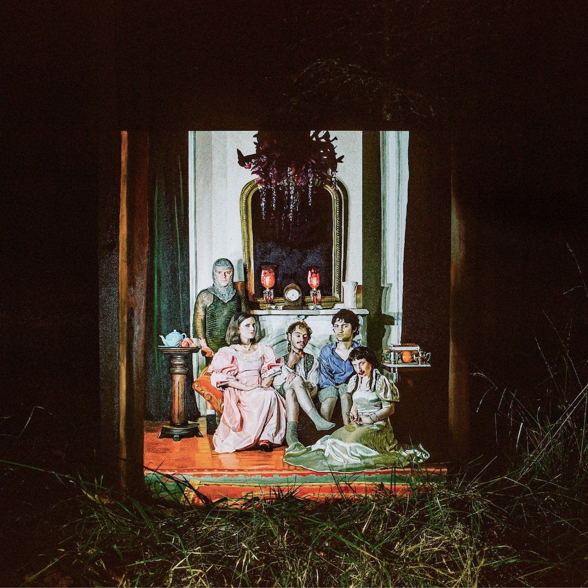
Joy Division-esque noise pop from Berlin, with a dose of The Jesus & Mary Chain, Swervedriver, etc. Not unlike the work of Charlie Megira. Best album cover of the year.
If you count their EPs, this band has been on a seven-album winning streak—now eight. They started out sounding like Suicide, Spacemen 3, The Jesus and Mary Chain, etc., but they’ve evolved into an electro sound, e.g., Yaz, New Order, etc. A brilliant album cover—actually, just the latest in a brilliant series of album covers, as can be seen here.
The best album of the year, by miles. Of all the bands on this list, Wednesday are destined for the greatest fame. You might describe them as “trailer park shoe gaze”: My Bloody Valentine, Dinosaur Jr., Ride and Drive-by Truckers in a blender. Also, a wonderful album cover.
December was crazy as always but still I tried to watch as many movies as I could, especially the critical contenders that studios like to unleash at the end of the year. There were a lot of them. Far too many for me to stand a chance of watching even just the ones I wanted to. It’s crazy that so many releases converged on the final weeks of the year like this. I know that this is a well-worn strategy meant to capitalize on holiday moviegoing and to get a jump on awards season, but in my opinion there are too many films of similar stripe—essentially more complex, “grown up” fare—seeking basically the same audience in too short of a time.
Inevitably of course, some movies will get lost in the shuffle. One that might be in danger of that this year is “Dream Scenario,” a very strange and darkly realized comedy directed by Kristoffer Borgli. It stars Nicolas Cage in a typically expressive performance as a milquetoast college professor who, inexplicably, starts appearing in the dreams of countless people all over the globe. Many reviewers interpreted this film as a commentary on the slippery nature of viral fame, but I see it more as an exploration of the vagaries of middle age. Either way, it’s side-splitting and disturbing all at once, and somehow, despite it being basically fantastical in its premise, still feels very true. It came and went in theaters in a matter of weeks (I feel fortunate to have caught a matinee screening just before it disappeared) but you can now rent it online, which of course I recommend.
“Dream Scenario” will almost certainly make it onto my best-of-the-year list which, by the way, I’m working on a best-of-the-year list. Several of the other movies I saw in December will likely be on it too, including: Todd Haynes’s “May December,” Celine Song’s “Past Lives,” Cristian Mungiu’s “R.M.N.,” and Justine Triet’s “Anatomy of a Fall”—all of them, and especially that last one, are terrific. I hope to have the list done and posted here within a few weeks, so stay tuned. In the meantime, go and watch some of them for yourself.
Here is the full list of twenty-one movies I saw in December.
“Wayne's World” (1992) ★★ Rewatched. Extremely shaggy, sometimes bordering on the inept, but truly shines when Dana Carvey takes center stage.
“Tommy Boy” (1995) ★★★ Rewatched. Not much of a film except for the white hot brilliance of Chris Farley, here paired perfectly with David Spade.
“May December” (2023) ★★★★ A masterfully constructed reimagining of tabloid trash that doesn’t judge the trash, with a heartbreaking performance by Charles Melton.
“Godzilla Minus One” (2023) ★★★½ Terrific revisionist take on Godzilla that delivers heartbreak alongside genuinely great kaiju destruction.
“Rubber” (2010) ★★★ A jokey B-movie about jokey B-movies that somehow manages to live up to—and down to—everything you would expect from a story about a serial killing rubber tire.
“Tokyo Godfathers” (2003) ★★★½ An uncommonly sincere, comic animated fable that deliberately embraces cheap narrative coincidences to advance a heavy-handed plot—but that somehow still comes across featherlight.
“Shaolin Soccer” (2001) ★★★½ Bizarre, not altogether coherent fever dream of a fantasy-comedy that’s also incurably genial.
“BlackBerry” (2023) ★★ This has gotten a lot of praise, but it’s little more than an above-average made-for-TV movie.
“Showing Up” (2022) ★★★½ Kelly Reichardt has a knack for nuanced character studies lit alive with pitch perfect details, but in this one she blows it with a strikeout ending.
“Dream Scenario” (2023) ★★★½ Kaufman-esque nightmare about going viral, yes, but also a meditation about being middle-aged.
“How to Blow Up a Pipeline” (2022) ★★★ A moderately provocative political manifesto wrapped up in a fairly standard caper flick.
“Holiday” (1938) ★★★★★ Rewatched. We try to watch this every Christmas—it’s the perfect Christmas movie if you don’t like Christmas movies—and it’s always a revelation.
“Poor Things” (2023) ★★ Visually stunning but Burton-esque in how it prioritizes fantastical sets over nuts and bolts storytelling. I found its talky, pedantic politics kind of boring.
“A Thousand and One” (2023) ★★★½ Brilliant debut feature about a single mother trying to survive in New York City as it veers into the 21st Century.
“Double Indemnity” (1944) ★★★★½ Rewatched. Snarling, duplicitous good fun.
“Anatomy of a Fall” (2023) ★★★★½ Astonishingly sharp courtroom drama that’s both exactly what you want—superb legal jousting—and something else altogether—a powerfully incisive examination of what constitutes the truth between two life partners.
“R.M.N.” (2022) ★★★½ A devastatingly intimate portrayal of the how globalization feeds like a cancer on a small village in Romania. Contains a town hall meeting that’s among the ugliest things I’ve ever seen.
“Past Lives” (2023) ★★★★ I tried to resist the formally conservative structure of this indie romantic drama but it’s so genuinely, irresistibly moving that I couldn’t hold out.
“Back to the Future” (1985) ★★★★ Rewatched. With each viewing its Reagan-era cynicism looks less and less becoming, but its Hollywood-style perfection is still undeniable.
“The Royal Hotel” (2023) ★★★½ Horrific story of two young women backpacking through rural Australia, made even more complex by their inability to be there for one another.
This is the last monthly roundup of my movie consumption for 2024—a wrap-up of the year will come soon. You can also see what I previously watched in November, in October, in September, in August, in July, in June, in May, in April, in March, in February, in January, in 2022, 2021, 2020, 2019, 2018, 2017, and 2016. Also, you can always keep up with what I’m watching by following me on Letterboxd—where I’m also writing tons of capsule reviews.
If you’re the kind of person who’s always on the lookout for a new Christmas movie to watch over and over, year after year, allow me to recommend “The Holdovers” from director Alexander Payne, which crept into theaters—in a practically furtive limited release—early last month. You might still be able to catch it too, if you hurry, but if not it’s already available for rent from the usual sources. To be clear, I’m not the kind of person who’s in the market for new Christmas movies; I find most of them—well, bah humbug. But this one struck a nerve with me.
To begin with, it’s a lovingly realized recreation of the early 1970s aesthetic of post-New Hollywood films, from the baritone voice-over in the trailer to the paperback-style typography of its posters and opening credits. This kind of superficial nostalgia may or may not be your thing, but the film itself is a home run, too. It sports a superbly prickly performance by Paul Giamatti, illuminating a finely tuned, classically structured Hal Ashby-style plot full of perfectly timed reversals and comedic surprises. The story centers on an antagonistic teacher-student dynamic in a New England boarding school where nearly everyone else has gone home for the holidays, so inevitably tears flow and heartwarming lessons are learned—but I didn’t let that bother me! I adored this movie, and I’ll probably watch it every Christmas for years to come.
Here are the other seventeen flicks I watched in November.
“Panic Room” (2002) ★★★½ Rewatched. Solid, Hitchcockian, bottle-style thriller from David Fincher, who is at his best when his movies are smallest.
“A Haunting in Venice” (2023) ★½ Kenneth Branagh as Poirot seemed like a good idea at one time, but this overly serious, unscary scary movie argues that that time has come and gone.
“The Pigeon Tunnel” (2023) ★★★ A hit or miss documentary about the career of David “John Le Carré” Cornwall that’s entertaining but confusing in its mix of sober inquiry and cable TV-style dramatizations.
“Brigsby Bear” (2017) ★½ Sold as a quirky, even transgressive indie comedy, perhaps in the vein of “Dogtooth,” but fully caves in to cheap sentimentality.
“The Holdovers” (2023) ★★★★ A magnificent holiday fable.
“The Girl with the Dragon Tattoo” (2011) ★★½ Rewatched. David Fincher tries to elevate this from its trashy, beach read source material but gets tripped up in all the little details.
“The Man with the Golden Gun” (1974) ★ Rewatched. Even excusing its offensive orientalism, just a terrible outing for a Bond franchise that had really no idea where to go next.
“Spider-Man: Across the Spider-Verse” (2023) ★★★★ Rewatched. I wish I could go through it frame by frame and run high-resolution prints of the dozens—hundreds—of gorgeous images that I want to just pore over for hours.
“State of Siege” (1972) ★★★½ Star Yves Montand in another lefty thriller from Costas-Gravas. Delicious.
“The Kid” (1921) ★★★★ Chaplin’s masterpiece. His treacly, sentimental masterpiece.
“War of the Worlds” (2005) ★★★½ Rewatched. A manic, desperate post-9/11 crisis movie that’s mostly excellent until the pat ending.
“Planes, Trains and Automobiles” (1987) ★★★½ Rewatched. A relatively slight work in its day that now seems like a classic of the form.
“Afire” (2023) ★★½ Director Christian Petzold can set a mood like no one else, but in this minor outing he doesn’t do the character work necessary to make this one really hold together.
This is the latest roundup of my monthly movie consumption. You can also see what I previously watched in October, in September, in August, in July, in June, in May, in April, in March, in February, in January, in 2022, 2021, 2020, 2019, 2018, 2017, and 2016. Also, you can always keep up with what I’m watching by following me on Letterboxd—where I’m also writing tons of capsule reviews.
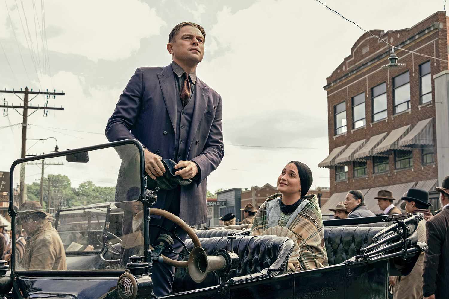
It’s the most wonderful time of the year—for film nerds. It’s that season when all the awards contenders roll into theaters and we get to see some of the best stuff of the year from some of the best directors working. Things got off to a big start last month with Martin Scorsese’s “Killers of the Flower Moon,” a sprawling, ambitious, emotionally devastating historical drama set in the world of the Osage Nation in Oklahoma, in the 1920s. It’s a towering work.
It’s also three and a half hours long! I went to the theater and sat through every minute of it and I’m glad I did; in this day and age it’s a privilege to be able to see anything Scorsese does on the big screen. And yet, it’s hard for me to deny that this thing is overlong by at least thirty minutes, if not a full hour. There’s just too much in it—too many amazing set pieces and period reconstructions and too much painstaking detail.
For Scorsese this is perhaps the flip-side of being among the elite few who can pull off the double whammy of, first, raising money from streamers like Apple, the primary backer of this movie, and second, securing from those streaming-biased companies a theater-first release for the movies he makes for them. Having been previously responsible for a long list of some of the most prominent cultural landmarks of the past four-plus decades, he brings such enormous clout to the table that the streamers apparently give him a free hand. That’s really evident when you watch “Flower Moon,” for good and bad.
To be clear, a Scorsese without limits is still very much a Scorsese in full command of his powers—or almost all of his powers, at least. Scene for scene, minute by minute, the filmmaking in “Flower Moon” is extraordinary. But what fails him is the ability to judge in the aggregate, to know when to make painful, necessary cuts for the good of the whole. You might say that carte blanche is the undoing of this otherwise immensely compelling film; absent a studio willing to battle him over the script or the budget or the runtime, Scorsese seems to be missing some of the creative friction that has made his past works so incredibly vital. Apparently there was no one to tell him that 206 minutes is too many minutes, no one to say “no.” That’s a shame, because for many artists, even singular masters like Scorsese, sometimes there’s nothing more valuable than something to fight against.
Here are all seventeen films I watched back in October.
“The Rat Catcher” (2023) ★★★½ Best thought of as a charming pre-show entertainment for “Henry Sugar.”
“Poison” (2023) ★★★½ Really excellent showcase for Dev Patel that makes you wonder how it’s possible he hadn’t worked with Wes Anderson before.
“The Swan” (2023) ★★★½ Another auteur-level demonstration of Anderson’s self-confidence.
“Entrapment” (1999) ★★ Sean Connery and an almost inappropriately youthful Catherine Zeta-Jones in a confused, ridiculous mash-up of heist thriller and novelistic romance.
“Fight Club” (1999) ★★★★ Rewatched. Despite its absurd, proto-incel worldview, this is truly a masterpiece of cinematic invention—David Fincher’s only legit masterpiece, really.
“Mrs. Harris Goes to Paris” (2022) ★★ A cloying fairy tale of mid-life redemption made worse by chintzy CG.
“Ferrari” (2023) ★★ Michael Mann’s first movie in years broke my heart with its shockingly disappointing averageness.
“To Be or Not to Be” (1942) ★★★★½ Rewatched. This Ernst Lubitsch classic somehow—through magic, maybe—turns a horrific milieu into a brilliant, buoyant comedy.
“Zodiac” (2007) ★★½ Rewatched. I don’t understand why people make a big deal about this term paper-esque, aimless procedural tale. Reveals all of the hollowness in David Fincher’s vaunted precision.
“Killers of the Flower Moon” (2023) ★★★½ An ambitious, expertly executed and heartbreaking noir that, unfortunately, should have been much shorter.
“No Hard Feelings” (2023) ★★ Starts off great! Raunchy and belligerent and thrilling. Then devolves quickly into cheap sentimentality to the point where I was infuriated.
“Frankenstein” (1931) ★★★★ Rewatched. Not particularly frightening but a powerhouse of visual expressiveness, almost painterly in nature, that has obviously left an indelible impression on the public imagination.
“The Adventures of Tintin” (2011) ★★★½ Rewatched. This overwrought, hyperactively CG-animated romp is not a sensical approach to adapting the vividly minimalist source material, but somehow it works better and better with each revisit.
“The Russia House” (1990) ★★★½ A real pleasure for fans of dour, not particularly novelistic spy capers.
“Moonshine” (1918) ★★ Fatty Arbuckle and Buster Keaton in a ramshackle, hilarious and unexpectedly modern comedic short from over a century ago.
This is the latest roundup of my monthly movie consumption. I usually try to publish these earlier in the month but it’s a struggle! You can also see what I previously watched in September, in August, in July, in June, in May, in April, in March, in February, in January, in 2022, 2021, 2020, 2019, 2018, 2017, and 2016. Also, you can always keep up with what I’m watching by following me on Letterboxd—where I’m also writing tons of capsule reviews.
September was a rough month. After a bit of travel, I came down with the latest variant of COVID, and it took me weeks to get back up to full strength. The silver lining was having lots of time to watch a lot of movies—twenty-seven in total—but not in theaters. Nearly everything in the list below I saw on video.
Most all of what I watched were back catalog movies, but I did see one recent release: Sam Pollard’s “The League,” a beautifully crafted documentary that widens the aperture on the history of Negro League baseball. This is a fascinating story about a much respected but under-examined chapter of sports lore, and it sheds genuinely new light on stories and figures that many of us thought we knew. Still, given my general lack of enthusiasm for the documentary form, I have to admit I admired it more than I enjoyed it, and to be totally honest, I would have preferred it as a New Yorker feature article rather than a movie.
I did get out of the house to go to the theater once, to catch a repertory screening of Michael Mann’s “Heat” in a 70mm projection at The Paris Theater in midtown Manhattan. The film of course looked great and continues to retain every ounce of its power, but I would be lying if I didn’t find the circumstances of its showing to be almost comedically ironic.
The Paris Theater is an historically notable moviehouse from the old days of single-theater cinemas that was bought by Netflix some years ago as a kind of trophy in the digital media wars. It occasionally shows revival screenings from the service’s streaming catalog but usually hosts limited theatrical runs for some of Netflix’s original movies. Basically the theater functions as a prestige showcase for what you can access more conveniently but less impressively on your smartphone. It’s similar to when an e-commerce business attains a grand enough level of success that it feels compelled to honor itself with a physical storefront, or when a digital-first content publisher decides to commemorate itself with its own analog publication. These kinds of retrograde gestures belie such a funny insecurity on the part of digital businesses, as if their tremendous success in effectively obsolescing physical things can only be truly validated by the rendering of physical things from that success. We live in strange times.
Here’s the full list of twenty-seven movies I watched in September.
“Confessions of a Police Captain” (1971) ★★★½ Very quirky, somewhat seedy Italian policier starring, oddly, the amazing but incurably American Martin Balsam.
“The Seven-Ups” (1973) ★★★½ A diverting but not memorable derivative of “Bullitt” and “The French Connection,” directed by the producer of both.
“¡Three Amigos!” (1986) ★ Comedically pretty patchy and lethargic.
“The Maltese Falcon” (1941) ★★★★½ Rewatched. An entire world conjured up with just a bunch of tough talk delivered with incredible verve by indelible characters.
“The Hot Spot” (1990) ★★★★ Cracking neo-noir starring Don Johnson at the peak of his generally not particularly remarkable abilities.
“Duel” (1971) ★★★½ This early Steven Spielberg thriller is a thrasher pic on wheels, and an early career high that really could have led to a career in at least a half dozen different directions from the one Spielberg ultimately took.
“The Daytrippers” (1996) ★★★★ Rewatched. Impeccably structured 90s indie road movie posits that leaving Long Island for Manhattan means forgoing domestic bliss for purgatory.
“The Train” (1964) ★★★★ Burt Lancaster in this early John Frankeheimer thriller where the director ponders why we fight for a cause—but also he ponders, what if we blow up a train yard?
“Dirty Mary Crazy Larry” (1974) ★½ Peter Fonda in a ridiculous chase movie with preposterous rural car stunts and dimwitted characters speaking painful dialogue.
“Gone in 60 Seconds” (1974) ★★★ Perfunctorily scripted, amateurish LA-set car caper movie that’s also a combustible, frenetic feast of automotive stunts.
“The League” (2023) ★★★½ An ambitious documentary that widens the aperture on the history of Black baseball.
“The French Connection” (1971) ★★★★ Rewatched. A tone poem of moral complexity set against a grimy, dilapidated New York City, circa 1970.
“Alien³” (1992) ★★½ Rewatched. Not nearly as bad as its reputation suggests, but its biggest sin is that it’s just not very scary.
“Super Fly” (1972) ★★½ Mostly this is a generally okay Blaxploitation thriller that’s elevated to icon status by a killer soundtrack.
“Fear Is the Key” (1972) ★★ Weird Seventies action film starts off as a shockingly strident provocation, then devolves into totally unremarkable moral uprightness.
“The Last Run” (1971) ★★½ Ruminative, feel-bad thriller starring George C. Scott tries to elevate the hit man genre into something elegant but ultimately just comes across as pretentious.
“Thunderbolt and Lightfoot” (1974) ★★ Clint Eastwood and Jeff Bridges in an unintentionally homoerotic action film that never really catches fire.
“I… For Icarus” (1979) ★★★½ Sturdier than expected example of Seventies paranoid filmmaking, this time in the French mode.
“The Sicilian Clan” (1969) ★★★★ Solid gangland flick made even more valuable for bringing together three icons of post-War French tough guy cinema: Gabin, Ventura and Delon.
“Any Number Can Win” (1963) ★★½ Jean Gabin and Alain Delon in a gangster flick that spends a lot of time revving up but never really takes off.
“Mission: Impossible” (1996) ★★½ Rewatched. Despite kicking off a franchise that I’m a huge fan of, this De Palma original feels misshapen and awkward to me.
“Heat” (1995) ★★★★½ Rewatched. Saw this in a 70mm print that looked gorgeous, and the sound in the theater crackled with life.
“Se7en” (1995) ★★★½ Impressive on many levels but ultimately hollow.
“Naked Gun 33⅓: The Final Insult” (1994) ★★½ Rewatched. I so badly want these movies to be intense, rapid-fire gag-fests, but too often time has rendered them pokey and too leisurely to break a sweat.
This is the latest roundup of my monthly movie consumption. You can also see what I previously watched in August, in July, in June, in May, in April, in March, in February, in January, in 2022, 2021, 2020, 2019, 2018, 2017, and 2016. Also, you can always keep up with what I’m watching by following me on Letterboxd—where I’m also writing tons of capsule reviews.
Catching up on my movies log from late summer here. At the end of August I went to see “Bottoms,” the new comedy by Emma Seligman (who also made the scrappy “Shiva Baby”). There’s a lot of funny stuff going on in this madcap, subversive teen comedy, but watching it as a fan of slapstick is also an exercise in frustration. Like so many other films where realism and verisimilitude are distorted for the sake of the jokes, “Bottoms” continually hints at going for broke, truly unleashing a no-holds-barred sensibility that could elevate it into classic status. And time and again, it pulls back from the brink, opting instead for pro forma sentimentality or uninspired moralizing or just unnecessary emotional exposition. As a result the laughs are outweighed by the wasted potential.
What always confounds me about these movies is that we live in a time when it should be easier than ever, technically, to push slapstick comedies to their absolute limit. The kind of sight gags that legends of the form Zucker, Abrahams and Zucker used to produce were incredibly laborious and often difficult to set up in pre-CG Hollywood. Take for example the bar fight in an Old West saloon that was staged under water in their 1984 film “Top Secret!”; it only lasts for a minute or so but it’s a triumph of whatever-it-takes filmmaking.
With the robust CG-fueled toolbox at the disposal of today’s directors, those kinds of gags are infinitely easier to pull off. The onscreen rendering of absurd, surreal, completely unexpected non sequitirs of virtually any scale are now theoretically within the grasp of any comedy director. In fact, we should be living in a golden age of slapstick comedy right now; screens should be overflowing with 21st century riffs on “Airplane!” It’s a mystery—a frustrating mystery to me—why we’re not.
Here are all seventeen movies I watched in August.
“The Handmaiden” (2016) ★★★★½ Rewatched. Every film Park Chan-wook makes is like a meticulously wrapped gift.
“Night and the City” (1950) ★★★★ Rewatched. A relentlessly dark tale of an irredeemable grifter trying to get ahead in post-War London. A masterpiece.
“Pee-wee's Big Adventure” (1985) ★★★½ Lit up from within by Paul Reubens’s uncanny understanding of both the naïveté and the churlishness of the child mind.
“Desperately Seeking Susan” (1985) ★★★½ Not a perfect film, but an ideal vehicle for Madonna, and a lovely time capsule of early 80s New York.
“They Cloned Tyrone” (2023) ★★★½ The first hour of this loopy sci-fi horror comedy is practically on fire. The rest can’t match that, but this is still better than most original streaming productions. Doubly sad then that it just got lost in the shuffle.
“Spaceballs” (1987) ★★ Sadly this is just an amusing slog.
“The Goat” (1921) ★★★★ Buster Keaton takes on the police.
“The Frozen North” (1922) ★★½ Uncharacteristically brutal, even for a Buster Keaton joint.
“Oppenheimer” (2023) ★★★½ Rewatched. I didn’t like this much the first time but on rewatch, I appreciated it so much more, especially the intricate structure. Read my review.
“Mrs. Doubtfire” (1993) ★ I avoided this for decades, assuming it was dumb. I was right.
“Suzhou River” (2000) ★★ This mainland Chinese romance is all vibe and little brains.
“Sorcerer” (1977) ★★★★ A terrible title for a tremendous movie. This is a masterpiece.
“The Flash” (2023) ★★ Rewatched. Kids wanted to watch it. I didn’t, but I watched it anyway.
“Bottoms” (2023) ★★★ This subversive teen comedy has a lot of laughs, but it never really goes for broke.
This is the latest, highly delayed, roundup of my monthly movie consumption. You can also see what I previously watched in July, in June, in May, in April, in March, in February, in January, in 2022, 2021, 2020, 2019, 2018, 2017, and 2016. Also, you can always keep up with what I’m watching by following me on Letterboxd—where I’m also writing tons of capsule reviews.