is a blog about design, technology and culture written by Khoi Vinh, and has been more or less continuously published since December 2000 in New York City. Khoi is currently Principal Designer at Adobe. Previously, Khoi was co-founder and CEO of Mixel (acquired in 2013), Design Director of The New York Times Online, and co-founder of the design studio Behavior, LLC. He is the author of “How They Got There: Interviews with Digital Designers About Their Careers”and “Ordering Disorder: Grid Principles for Web Design,” and was named one of Fast Company’s “fifty most influential designers in America.” Khoi lives in Crown Heights, Brooklyn with his wife and three children.
If it’s true that in comedy, timing is everything, then in design, I say that spacing is everything. Or at least it counts for a heck of a lot. This is especially true for Web design, and especially true again for the design of interfaces, which is what the bulk of Web design boils down to. The number of pixels separating elements in an interface plays a critical and frequently underestimated role in the orderliness of that interface.
This is an idea that nags at me all the time, mostly because I see so many instances when a more nuanced attention to spacing could benefit a design at virtually zero cost. And it ’s something that comes to mind especially when I look at the school of Web design that prizes functionality so highly that the deprecation of form becomes a virtue. The argument over whether usability does or does not have to come at the cost of aesthetics is so contentious and frequently debated that I won’t go into great depth with it here. Suffice it to say that I don’t believe they’re mutually exclusive. They better not be, anyway, because that’s what my whole livelihood is based upon.
Gmail, for Better or Worse
To prove the point, take Google’s Gmail. Here’s an interface that is extremely well-regarded for its excellent usability (there are naysayers, of course, but I happen to disagree with them). As far as Web-based mail clients go, it represents, to me, the gold standard. It doesn’t make the mistake that Yahoo’s mail client does of slavishly emulating a desktop mail client. Rather, Gmail’s designers understood that it had to make sense within the context of the browser — it’s exceedingly true to its medium, which is why it succeeds so well.
At the same time, it’s an ugly interface. Let’s face it: Gmail will win no awards for aesthetic elegance. Its awkward blue hues and cramped, brutally plain typography are, to me, the epitome of function at the cost of form.
Space Available
But let’s say we accept those elements as core to the Gmail brand. Set aside the subjective question of whether the color and fonts are attractive or not and just accept them as givens. Does that mean that Gmail has to look the way it does? I say no, and the reason why is that there is disappointingly little thinking about the spatial dimension between each of the elements that make up the Gmail interface.
Here’s my contention: while changing nothing about the color or the typography, it’s possible, in my opinion, to dramatically improve Gmail’s overall elegance. All it takes is a more discerning eye paid to the design of the spaces between elements. That is, by normalizing the space between like elements, aligning elements along similar spatial planes, moderately increasing the space between stacked items and paying attention to how elements are framed by negative space, we can get what is, in my opinion, a significantly more attractive Gmail interface.
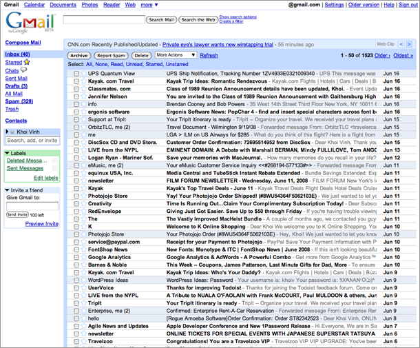
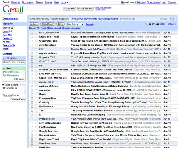
To see what I mean, compare and contrast the original interface with my spatially revised alternative. In my opinion, anyway, the extra attention paid to this facet of the design results in a significantly better presentation. It doesn’t completely transform the product, I admit, but it does add a nontrivial if intangible value to the presentation.
The original Gmail interface……and the same interface with just a bit of padding added to it.
The True Cost of Free
When I started writing this post, I wanted to say that this improved elegance can be had for free, because well spacing is free. Well, of course that’ not true. First, there’s the added overhead in the CSS; to achieve this effect, some properties would need to be explicitly specified where before they may have been set to default values. That would be a minor cost though, a few kilobytes at most, by my guess.
Comparing the two versions though, there’s a more important cost to this approach. My alternative does make fewer messages available on the screen — the taller line height for each has pushed about eight messages further down the screen. Some people will balk at this and insist it disproves my point entirely, saying that function and form are in fact mutually exclusive. I don’t really buy that, though. I think the improvement in legibility realized through the increased line-spacing is significant — it’s much easier on the eyes — and the effect is well worth the cost. Besides, I don’t know of anyone who uses Gmail who doesn’t scroll.
talk about space, nytime.com looks like yahoo, leave a lot of space on two side of the browser window. the whole layout is only stay in the middle. but I like the gmail design, the whole browser window is filled from side to side. isn’t that better?
I disagree with you on the list of messages appearing cluttered. I suppose there’s room for ‘taste’ on that issue, but I don’t see *at all* the target size being reduced. It seems obvious to me that I’d have fewer errant clicks in the subtly re
@akatsuki: In Gmail a user can click the entire area; there’d be no hit on the target size it’d actually get larger.
@mark: Liquid layouts usually hurt readability, considering the line-length, but for GMail it works.
I like your example, with
Chris Biagini
Pretty remarkable difference considering how little you’ve really changed!
As an aside, I find your comment about ‘slavishly emulating a desktop mail client’ interesting. Assuming the new MobileMe mail is as much like Mail.app as Apple would have us think, would you say that it, too, doesn’t ‘make sense within the context of the browser’?
Allan Donald
I gather that the demo is meant to be conclusive, but to me the revised version looks much worse. It’s closer to how Firefox renders it than Safari, and that’s one of the reasons I don’t use Firefox.
The key change is in the message list, and all this change has done is make it look over-leaded. I like 9 on 9.5 for text, and this is more like 9 on 12.
Interesting. I’m Khoi fanboy – so it takes me by surprise to not like this.
I’m going to have to say that, when it comes to an email index, yours is less productively functional. I feel like I’m taking a break between the individual email lines while visually processing the email.
And in the context of seeing my new emails and scanning the page, I wonder if your spaced set up would take longer to get through.
This feeling also makes me wonder if google considered this. I always wonder what google designs and what they just design. And I wonder if google had any intention in people reading each email quickly as if they were scanning the page of a book, instead of seeing each email individually in this index.
I’d like to hope that the juggernaut DID design this page with a speedy purpose in ming… but who knows, maybe the got lucky. OR maybe those of us who like the more cramped view are just bonkers.
As for general nay-sayers of the interface, YOU people (ha) are definitely bonkers.
Great post, Khoi. It’s funny you mention how Gmail has an ugly interface. The user experience of Gmail is so good that when using it, you don’t even really notice its ‘ugliness’ until you look at the details, which you’ve done.
I think that says a lot about the usability of a product when it is extremely easy to use despite its aesthetic downfalls.
Unfortunately I can’t agree with you on this one Khoi. I agree that the entire design is less than pretty, but in this case I think that form should follow function. The function in this case is to read email. Your revision puts a visual step between each email line that makes me do more work to read my mail. It no longer allows me to scan the page and complete the function most effectively.
The increased line height resulting in quicker scanning of subjects and increased target size resulting in decreased ‘time to target’ and increased accuracy should *easily* compensate for the time it would take to scroll down to read those eight extra emails.
I’ve often been dumbfounded by Google. I’ve used them as an example for good usability, but I cringe when I hear people use Google’s sites to justify their poor design choices or aesthetic ignorance. (Is that a term or did I just coin it?)
Aside from the little niceties you’ve added, I would have thought that Google would at least adhere to the basic rules of typography, particularly the increased line height for longer lines.
I agree it looks better, but I’d rather see a few more messages on my screen. The one thing that is definitely improved by your version is scanability. That would be useful for searches or sifting through spam.
I’d have to agree with the tighter-is-better crowd here.
I don’t think people scan an inbox the way they read text (when you’d wan a bit of breathing room). It’s much more of a ‘scanning for keywords’ scenario — a vertical flow — than the back and forth of longer-form reading, where you need some leading to keep your place visually while moving across the page.
As for whether Google thought of it, well probably most of their developers grew up with or still use console-based mail clients (i.e. mail in emacs, mutt, pine, etc.) where you’ve got super-tight line-spacing, but amazing functionality. So the visual design people at Google probably had to fight for the spacing you do see!
The things you can do with minimal keystrokes in those programs is amazing. And actually the modal aspect of Gmail is similar to console mail apps as well (i.e. vast keyboard navigation/control, single key commands, etc.).
I also think as hinted by the recent Gmail Labs stuff, customized themes (at least) are in the future – like iGoogle – and in a supported way, not just by overriding from client-side (css/greasemonkey).
I suspect there’s a familiarity factor occurring for at least some of the folks who don’t like Khoi’s changes.
That is to say: I don’t use Gmail (actually I do, but via IMAP, not via the web interface), and I think Khoi’s version is clearly better not only aesthetically, but in terms of readability, scan-ability, and speed of reading. I wonder if people who do use Gmail regularly are finding the original more comfortable in part because they’re used to it?
I bring up this point a lot when people debate Macs vs. PCs with regard to user-friendliness. It seems obvious to me that any objective party would consider Mac OS X to be ‘easier to use’ than Windows. However, it also stands to reason that if someone is incredibly comfortable and familiar with Windows, they’re going to find OS X to be disorienting and confusing — at least for a while.
I’m purely speculating, here, but I wonder if people’s comfort level with the existing Gmail product isn’t making them subconsciously resist any change to it — even when that change is clearly for the best.
Oh, and I forgot about this, which I don’t think has been mentioned: screenshots depicting the evolution of Gmail’s user interface before it was ever released to the public on April 1, 2004.
I, for one and as a Gmail user for practically all my email, would welcome the extra space between elements. With a pile of unread messages which make Inbox Zero a pipe dream for me (sigh!) the sense of clutter of those messages and elements fighting for screen space makes you feel almost ‘gasping for air’. A little padding space around elements does make the ominous pile of mail feel less menacing and more manageable, even if only at a psychological level – which is already a lot to say. This would be neat if added as a customizable value on Gmail, so it could be engaged or not depending on your taste.
I cast my vote for Khoi’s revised version. Maybe it’s my old eyes, but I find it much easier to read text surrounded by a little space.
I’m also unconvinced that (as a couple of comments have suggested) cramming more information onto the screen is a recipe for productivity. It may be a way to see more information at once (quickly), but that’s not necessarily more productive.
Shakespeare said it best: ‘Wisely and slow, they stumble that run fast.’ Productivity (like making love) is not just about speed.
The revision looks much better! Is there a way to specify this in a browser style-sheet?
Michael
Google’s ‘look’ played a big part when I decided to abandon my Google homepage for Netvibes. And its what has kept me from playing with gmail enough to consider replacing a desktop client with it. (But not enough to give up on Google’s search functionality!)
I am really surprised that they still haven’t adopted some more mainstream design thinking in their products. I’d like to see them go further than you have gone (as you seem to intimate you would as well), but this would be a good start.
An excellent article. Your looser example is definitely an improvement. I can’t believe those who write about ‘extra space making for a little less content’; if that’s one’s only criteria, then set everything in 8pt you’ll be able to see so many more messages on screen. The additional space defines the content. For those who don’t scroll?
SocketBreaker
I can see your WordPress Ideas username and password in your email list 😀
Folks: Thanks to everyone for pointing out that my WordPress Ideas user name and password was viewable. I was aware that it was, I just couldn’t be bothered to change it because I don’t really use or WordPress Ideas, but to save folks the trouble of letting me know, I’ve changed it.
I’m going to have to agree with what a few others have said here. Namely, that though the spacial changes work in most cases, I’m finding the increased leading between messages more of a hinderance than a help. For some reason
Excellent article. I’ve though a lot about this myself and in particular Gmail, which I use extensively.
Speaking of Gmail, I think Google has done much improvement. The latest improvement in the line of changes is the addition of colored labels. Color coding is a great way of organizing and simplifying. Some people would argue color alone is not an option because many people are color-blind. I disagree and every time someone point out that ‘fact’, I say ‘better improve the usability for some than for none’. I think the same mantra may apply to the (shared) list of priorities, a la form and function, of user interface design. Sometimes less functionality (i.e. seeing less number of rows in Gmail) is out weighted by form (i.e. seeing the rows more clearly). In this particular case of Gmail and the row height, your example of modification (more row spacing) puts _less_ cognitive load on the user, even though she must occasionally scroll to see older messages.
Interesting. I, too, have been thinking about the importance of white space, and how it relates to all design disciplines, especially ones where the term ‘white space’ is not normally used. Namely industrial and interaction design. In architecture, it’s more commonly referred to as negative space.
Also, I saw you in DC last week, Khoi. Number one, I’m glad to know how to correctly pronounce your name. Number two, nice presentation. Very informative and I appreciated your sense of humor, especially compared to the moderator. His speaking style was a little yawn-inducing and dry.
I know part of your whole goal here was showing how little it took to make the interface better. That being said, I can only imagine if you were freer to make bigger changes, how much incredibly better it could become without affecting the usability.
For example, losing the yucky colors and poorly executed rounded corners would make me so excited!
Stylish is a Greasemonkey script that has a number of options for making Gmail much prettier and easier on the eyes (i am partial to ‘gMail Redesigned by Globex)
Personally, I like the revised version, but the fact that opinions are so divided suggests that what GMail really needs is some personalisation options.
Also, their could be intersting financial implications to your design. I don’t use GMail myself – do they stick ads down one side of the window (like Yahoo do)? If so, a more spread-out inbox would offer more parallel advertising space.
Regarding the spacing of the messages only, if you switch the Gmail view to ‘basic HTML’ in the footer, the spacing of the messages might be a bit more to your liking. Obviously it cripples the interface using only basic html, but it is a difference.
Based on my training and visual sensibilities, I fully agree. BUT, it’s hard to make a truly objective decision one way or the other when the sample image is about than half the actual size of the browser window in reality. I’d like to see the type and added space in it’s true size.
Khoi, would you be willing to post a link to a full-size sketch?
I too agree that spacing would be much nicer (even as an ardent user of Gmail). It tires the eyes to look all day at screens and interfaces where something like spacing is at best ill-considered.
I would guess the space changes would have little to no effect on the sorting/searching abilities. It’s amazing how often people’s feelings don’t end up making it past the reality test. If Google just changed this most people wouldn’t even notice.
If you were to add the same amount again, it would definitely be noticeable and a burden.
One thing that I do think is VERY important that you changed is that you brought a lot of consistency to the spacing. Around the check-boxes, stars, titles, descriptions, navigation, and even the news feed all have better context to what part of the interface they fit into.
Good analysis, spacing *is* a fundamental element of web design.
When designing sites, I tend to obsess over the small things, like spacing, instead of looking at the big picture. Just one pixel out and I know it’s not right!
Nice. I agree with most of these changes except the amount of space between messages. I would stop about halfway between Google’s default and what you’ve proposed (their heavy-handed use of bold type doesn’t help matters in either case).
I wholeheartedly agree with the refined alignment. The inconsistent alignments in the current Gmail interface are a blemish on an otherwise clean presentation.
However, as a bunch of people before me have mentioned, it seems that there’s a trade-off in readability and scanability with the increased line-height. Greater spacing between e-mails = improved readability = decreased scanability. It’s something that I didn’t expect when I started reading this post, but my eyes were noticeably more stressed when scanning through the long list of e-mails in Khoi’s revision, despite the improved ease of reading each line horizontally.
With this in mind, perhaps the proper approach would be to allow the line spacing to dynamically change with the number of messages displayed on the page. i.e.: if someone has only five messages in their inbox, then have lots of whitespace between messages – maybe throw in a larger font size just for visual balance. In contrast, if someone has fifty messages in their inbox, then decrease the amount of whitespace to the amount in the current interface.
If there’s less messages to scan, then this would improve readability without any sacrifice in scanability. If there’s more messages, then the user is probably more interested in quickly scanning through all the mumbo jumbo than actually reading it, so go ahead and decrease the spacing and smash it all together.
Tony
The redesign looks really nice, and is much more pleasing on the eye, but there is one small practical concern I have for the redesign: there doesn’t seem to be much room to the left of the check boxes for the cursor that indicates the currently selected message when using keyboard shortcuts.
I’m no one to talk, but over the years their inconsistency with spacing, nav elements, et al. across products seems like an ‘sometimes unavoidable’ yet overlooked problem with their (still impressive) array of services.
Thankfully, there polish and shine is helping the rough edges over time.
You have to appreciate a product that defines usefulness and value-per-dollar (read: free).
Well, I for one prefer Khoi’s version. However, I have a ‘familiarity bias’ toward Khoi’s version since I have a custom stylesheet loaded for Gmail and Google Reader which adds leading to all the text.
I find that the extra spacing makes scanning and finding what I want to read much easier.
Excellent Khoi, and creepy: I did this exact same alteration a year ago as part of my interview process for Google. I always intended to post it, but it (along with many other things last summer) simply got away from me.
The improvement is definitely worth the slight increase in overall height, and wouldn’t take much effort at all to incorporate.
I’m going to do a quick write up and post my before/after, I think it will make for an interesting comparison.
The rollover action is easy to use, not automatically disabled in IE, and doesn’t require Flash to load. I probably would’ve made the same interface choice.
That last bit came out wrong — what I meant to emphasize was that this video loaded quite fast in my browser. Plus, it’s just fun to rollover the interface to see the changes on top of each other. As far as the IE bit, that could just be my machine settings.
Anders
Good job!
Thers’s still one important thing to improve though: everytime i’m about to write an email, i have to look around for a couple of seconds in order to find the ‘compose mail’ link. My eyes seem to focus on the blue top left corner, just above the listing of emails. Why not place the compose link there, or otherwise increase the text size to make it more prominent?
Spacing is a subtle art; you do have to have a sense of rhythm and musicality (I’d even say synaesthesia) to apply it gracefully in both print and online.
I wonder, however, why so much ‘vernacular’ design is cluttered. Whenever you see non-designers’ Word documents and PowerPoint slides (and…erm…Angelfire pages), they resemble a scrapbooking project more than a Swiss grid. Don’t get me started about ‘slideuments…’
In regards to Angelday True’s remark about the Leopard Finder, that is only true of the multi-column view. In fact, 10.5 brought back alternate-line shading, aka ‘zebra stripes,’ in Finder list views.
I think you should have the option for that, and for larger, as well as the original small size. giving people options is best.
Jon
Clearly it’s subjective. I’d swear it looks better and is easier to read with more spacing, and obviously others would swear the opposite. I’d say the interpretation is unique to the individual based on the ‘connection’ between your eyes and your brain. Everyone’s mind works differently.
My brother hates the dock because it’s all icons and this makes it harder for him to find what he is looking for. He would prefer text a la the OS 9 Apple menu. Either way works fine for me, and I can very quickly visually interpret the icons in my dock even at a very small size.
Some people prefer small font sizes, some people prefer large. Some people hate liquid layouts, others say it’s the only way. Some people say dark backgrounds are hard to read on, while others have no problem. Some people crap on Helvetica, while others herald it as a classic that is still relevant. I mean, can you really win?
Is one thing empirically better than another or is it all a matter of opinion?
I’m sure you are obviously well aware of this – but it is worth mentioning that for Google the less code the better – massive bandwidth savings. However I’m sure a good web designer could make your changes with v little or no extra coding.
Good article, thanks.
Erik
Is it just me, or did gmail just implement Khoi’s suggested changes this afternoon?
Yes, damn them, the fools, DAMN THEM ALL TO HELL! Seriously, now I need to make a sodding greasemonkey script to get some halfway-sane leading back. Grrrr, it’s off to white whines for me.
Julian
I notice it too. Did they go all the way? Can’t figure out what changed exactly, but it seems somehow spaced differently…
Khoi?
Mike Gravel
I thought I was hallucinating, but damn, it sure does look like they implemented at least some of Khoi’s changes. The line-height at least…
I really don’t understand the backlash here. The new version obviously improves scanability and readability. I never got the feeling that Khoi was saying the gmail interface was bad, but simply could be improved with some minor tweaks. And it has been.
You forget that target size for each message will be reduced as well. Plus, the list of messages actually appears cluttered in your example.
talk about space, nytime.com looks like yahoo, leave a lot of space on two side of the browser window. the whole layout is only stay in the middle. but I like the gmail design, the whole browser window is filled from side to side. isn’t that better?
Nice.
The devil is in the details, indeed.
@akatsuki:
I disagree with you on the list of messages appearing cluttered. I suppose there’s room for ‘taste’ on that issue, but I don’t see *at all* the target size being reduced. It seems obvious to me that I’d have fewer errant clicks in the subtly re
Just those spacing tweaks make it look much more pleasant. Details, details…
2 things.
1. Can a greasemonkey script be written to modify the layout? Similar to better gmail? If so, you could get a lot of nice press.
2. Curious how many people that visit this post are using FF 3.0?
@akatsuki: In Gmail a user can click the entire area; there’d be no hit on the target size it’d actually get larger.
@mark: Liquid layouts usually hurt readability, considering the line-length, but for GMail it works.
I like your example, with
Pretty remarkable difference considering how little you’ve really changed!
As an aside, I find your comment about ‘slavishly emulating a desktop mail client’ interesting. Assuming the new MobileMe mail is as much like Mail.app as Apple would have us think, would you say that it, too, doesn’t ‘make sense within the context of the browser’?
I gather that the demo is meant to be conclusive, but to me the revised version looks much worse. It’s closer to how Firefox renders it than Safari, and that’s one of the reasons I don’t use Firefox.
The key change is in the message list, and all this change has done is make it look over-leaded. I like 9 on 9.5 for text, and this is more like 9 on 12.
You may be interested in this:
http://userstyles.org/styles/5867
I myself use mac dot com and Safari, so it’s of no use to me, but I personally think it’s an improvement for those FF users who want to use Gmail.
@Nic No no no, the web clip needs the margin! See how its left edge aligns with the message lines below?
Interesting. I’m Khoi fanboy – so it takes me by surprise to not like this.
I’m going to have to say that, when it comes to an email index, yours is less productively functional. I feel like I’m taking a break between the individual email lines while visually processing the email.
And in the context of seeing my new emails and scanning the page, I wonder if your spaced set up would take longer to get through.
This feeling also makes me wonder if google considered this. I always wonder what google designs and what they just design. And I wonder if google had any intention in people reading each email quickly as if they were scanning the page of a book, instead of seeing each email individually in this index.
I’d like to hope that the juggernaut DID design this page with a speedy purpose in ming… but who knows, maybe the got lucky. OR maybe those of us who like the more cramped view are just bonkers.
As for general nay-sayers of the interface, YOU people (ha) are definitely bonkers.
Great post, Khoi. It’s funny you mention how Gmail has an ugly interface. The user experience of Gmail is so good that when using it, you don’t even really notice its ‘ugliness’ until you look at the details, which you’ve done.
I think that says a lot about the usability of a product when it is extremely easy to use despite its aesthetic downfalls.
maybe gmail can take the average of new messages a user gets a day along w/ screen resolutions and then figure out the proper spacing needed?
Unfortunately I can’t agree with you on this one Khoi. I agree that the entire design is less than pretty, but in this case I think that form should follow function. The function in this case is to read email. Your revision puts a visual step between each email line that makes me do more work to read my mail. It no longer allows me to scan the page and complete the function most effectively.
The increased line height resulting in quicker scanning of subjects and increased target size resulting in decreased ‘time to target’ and increased accuracy should *easily* compensate for the time it would take to scroll down to read those eight extra emails.
I’ve often been dumbfounded by Google. I’ve used them as an example for good usability, but I cringe when I hear people use Google’s sites to justify their poor design choices or aesthetic ignorance. (Is that a term or did I just coin it?)
Aside from the little niceties you’ve added, I would have thought that Google would at least adhere to the basic rules of typography, particularly the increased line height for longer lines.
Anyway, glad your posting again Khoi!
I agree it looks better, but I’d rather see a few more messages on my screen. The one thing that is definitely improved by your version is scanability. That would be useful for searches or sifting through spam.
I’d have to agree with the tighter-is-better crowd here.
I don’t think people scan an inbox the way they read text (when you’d wan a bit of breathing room). It’s much more of a ‘scanning for keywords’ scenario — a vertical flow — than the back and forth of longer-form reading, where you need some leading to keep your place visually while moving across the page.
As for whether Google thought of it, well probably most of their developers grew up with or still use console-based mail clients (i.e. mail in emacs, mutt, pine, etc.) where you’ve got super-tight line-spacing, but amazing functionality. So the visual design people at Google probably had to fight for the spacing you do see!
The things you can do with minimal keystrokes in those programs is amazing. And actually the modal aspect of Gmail is similar to console mail apps as well (i.e. vast keyboard navigation/control, single key commands, etc.).
I also think as hinted by the recent Gmail Labs stuff, customized themes (at least) are in the future – like iGoogle – and in a supported way, not just by overriding from client-side (css/greasemonkey).
I suspect there’s a familiarity factor occurring for at least some of the folks who don’t like Khoi’s changes.
That is to say: I don’t use Gmail (actually I do, but via IMAP, not via the web interface), and I think Khoi’s version is clearly better not only aesthetically, but in terms of readability, scan-ability, and speed of reading. I wonder if people who do use Gmail regularly are finding the original more comfortable in part because they’re used to it?
I bring up this point a lot when people debate Macs vs. PCs with regard to user-friendliness. It seems obvious to me that any objective party would consider Mac OS X to be ‘easier to use’ than Windows. However, it also stands to reason that if someone is incredibly comfortable and familiar with Windows, they’re going to find OS X to be disorienting and confusing — at least for a while.
I’m purely speculating, here, but I wonder if people’s comfort level with the existing Gmail product isn’t making them subconsciously resist any change to it — even when that change is clearly for the best.
Oh, and I forgot about this, which I don’t think has been mentioned: screenshots depicting the evolution of Gmail’s user interface before it was ever released to the public on April 1, 2004.
OK… looking again, I realized I got the two layouts backwards and commented thinking that the more spacious layout was the older version….
Either way, I’d rather see a three column layout with labels to one side
You’d be surprised: neither I nor my adjacent co-worker scroll in Gmail.
Jon: You’d be surprised. I bet you do.
I, for one and as a Gmail user for practically all my email, would welcome the extra space between elements. With a pile of unread messages which make Inbox Zero a pipe dream for me (sigh!) the sense of clutter of those messages and elements fighting for screen space makes you feel almost ‘gasping for air’. A little padding space around elements does make the ominous pile of mail feel less menacing and more manageable, even if only at a psychological level – which is already a lot to say. This would be neat if added as a customizable value on Gmail, so it could be engaged or not depending on your taste.
I cast my vote for Khoi’s revised version. Maybe it’s my old eyes, but I find it much easier to read text surrounded by a little space.
I’m also unconvinced that (as a couple of comments have suggested) cramming more information onto the screen is a recipe for productivity. It may be a way to see more information at once (quickly), but that’s not necessarily more productive.
Shakespeare said it best: ‘Wisely and slow, they stumble that run fast.’ Productivity (like making love) is not just about speed.
M
I understand your points. But.
Apple, for instance, has dropped these spaces from its GUI with the release of Leopard (see: Finder). And it totally went for the better.
In your mock-up I see the same thing, going backwards.
I’m partly there with your comments that the elements must be egalized etc. Yahoo Mail captures that quite nicely.
The revision looks much better! Is there a way to specify this in a browser style-sheet?
Google’s ‘look’ played a big part when I decided to abandon my Google homepage for Netvibes. And its what has kept me from playing with gmail enough to consider replacing a desktop client with it. (But not enough to give up on Google’s search functionality!)
I am really surprised that they still haven’t adopted some more mainstream design thinking in their products. I’d like to see them go further than you have gone (as you seem to intimate you would as well), but this would be a good start.
Couldn’t agree more with this – gmail is great on functionality but crap on looks. Could do with a facelift…
But, Khoi, I’d question how wise it is publishing a screenshot that shows un-obscured wordpress login details, among other things 😉
An excellent article. Your looser example is definitely an improvement. I can’t believe those who write about ‘extra space making for a little less content’; if that’s one’s only criteria, then set everything in 8pt you’ll be able to see so many more messages on screen. The additional space defines the content. For those who don’t scroll?
I can see your WordPress Ideas username and password in your email list 😀
Khoi, what would it take to turn your changes into a greasemonkey script, so that Firefox users can actuall implement your adjusted layout?
Folks: Thanks to everyone for pointing out that my WordPress Ideas user name and password was viewable. I was aware that it was, I just couldn’t be bothered to change it because I don’t really use or WordPress Ideas, but to save folks the trouble of letting me know, I’ve changed it.
I’m going to have to agree with what a few others have said here. Namely, that though the spacial changes work in most cases, I’m finding the increased leading between messages more of a hinderance than a help. For some reason
Excellent article. I’ve though a lot about this myself and in particular Gmail, which I use extensively.
Speaking of Gmail, I think Google has done much improvement. The latest improvement in the line of changes is the addition of colored labels. Color coding is a great way of organizing and simplifying. Some people would argue color alone is not an option because many people are color-blind. I disagree and every time someone point out that ‘fact’, I say ‘better improve the usability for some than for none’. I think the same mantra may apply to the (shared) list of priorities, a la form and function, of user interface design. Sometimes less functionality (i.e. seeing less number of rows in Gmail) is out weighted by form (i.e. seeing the rows more clearly). In this particular case of Gmail and the row height, your example of modification (more row spacing) puts _less_ cognitive load on the user, even though she must occasionally scroll to see older messages.
Interesting. I, too, have been thinking about the importance of white space, and how it relates to all design disciplines, especially ones where the term ‘white space’ is not normally used. Namely industrial and interaction design. In architecture, it’s more commonly referred to as negative space.
Here are a few of my thoughts.
Also, I saw you in DC last week, Khoi. Number one, I’m glad to know how to correctly pronounce your name. Number two, nice presentation. Very informative and I appreciated your sense of humor, especially compared to the moderator. His speaking style was a little yawn-inducing and dry.
I love what you’ve done with the place!
I know part of your whole goal here was showing how little it took to make the interface better. That being said, I can only imagine if you were freer to make bigger changes, how much incredibly better it could become without affecting the usability.
For example, losing the yucky colors and poorly executed rounded corners would make me so excited!
Stylish is a Greasemonkey script that has a number of options for making Gmail much prettier and easier on the eyes (i am partial to ‘gMail Redesigned by Globex)
Personally, I like the revised version, but the fact that opinions are so divided suggests that what GMail really needs is some personalisation options.
Also, their could be intersting financial implications to your design. I don’t use GMail myself – do they stick ads down one side of the window (like Yahoo do)? If so, a more spread-out inbox would offer more parallel advertising space.
Regarding the spacing of the messages only, if you switch the Gmail view to ‘basic HTML’ in the footer, the spacing of the messages might be a bit more to your liking. Obviously it cripples the interface using only basic html, but it is a difference.
Based on my training and visual sensibilities, I fully agree. BUT, it’s hard to make a truly objective decision one way or the other when the sample image is about than half the actual size of the browser window in reality. I’d like to see the type and added space in it’s true size.
Khoi, would you be willing to post a link to a full-size sketch?
I too agree that spacing would be much nicer (even as an ardent user of Gmail). It tires the eyes to look all day at screens and interfaces where something like spacing is at best ill-considered.
Nice job.
@SPK: FF3 here.
I would guess the space changes would have little to no effect on the sorting/searching abilities. It’s amazing how often people’s feelings don’t end up making it past the reality test. If Google just changed this most people wouldn’t even notice.
If you were to add the same amount again, it would definitely be noticeable and a burden.
One thing that I do think is VERY important that you changed is that you brought a lot of consistency to the spacing. Around the check-boxes, stars, titles, descriptions, navigation, and even the news feed all have better context to what part of the interface they fit into.
Word.
Good analysis, spacing *is* a fundamental element of web design.
When designing sites, I tend to obsess over the small things, like spacing, instead of looking at the big picture. Just one pixel out and I know it’s not right!
Thank you for this. I couldn’t agree more.
Nice. I agree with most of these changes except the amount of space between messages. I would stop about halfway between Google’s default and what you’ve proposed (their heavy-handed use of bold type doesn’t help matters in either case).
I totally agree. Very nice. I want a Gmail skin of your design.
@ Ritz (‘If Google just changed this most people wouldn’t even notice.’)
Link.
I wholeheartedly agree with the refined alignment. The inconsistent alignments in the current Gmail interface are a blemish on an otherwise clean presentation.
However, as a bunch of people before me have mentioned, it seems that there’s a trade-off in readability and scanability with the increased line-height. Greater spacing between e-mails = improved readability = decreased scanability. It’s something that I didn’t expect when I started reading this post, but my eyes were noticeably more stressed when scanning through the long list of e-mails in Khoi’s revision, despite the improved ease of reading each line horizontally.
With this in mind, perhaps the proper approach would be to allow the line spacing to dynamically change with the number of messages displayed on the page. i.e.: if someone has only five messages in their inbox, then have lots of whitespace between messages – maybe throw in a larger font size just for visual balance. In contrast, if someone has fifty messages in their inbox, then decrease the amount of whitespace to the amount in the current interface.
If there’s less messages to scan, then this would improve readability without any sacrifice in scanability. If there’s more messages, then the user is probably more interested in quickly scanning through all the mumbo jumbo than actually reading it, so go ahead and decrease the spacing and smash it all together.
The redesign looks really nice, and is much more pleasing on the eye, but there is one small practical concern I have for the redesign: there doesn’t seem to be much room to the left of the check boxes for the cursor that indicates the currently selected message when using keyboard shortcuts.
I’m no one to talk, but over the years their inconsistency with spacing, nav elements, et al. across products seems like an ‘sometimes unavoidable’ yet overlooked problem with their (still impressive) array of services.
Thankfully, there polish and shine is helping the rough edges over time.
You have to appreciate a product that defines usefulness and value-per-dollar (read: free).
Short response: I agree with Jeff Croft.
That said I use gmail through netvibes so never see the listing.
excellent post, I very much agree that the new design would help readability. (Khoi, you really need to empty your spam folder 🙂
Well, I for one prefer Khoi’s version. However, I have a ‘familiarity bias’ toward Khoi’s version since I have a custom stylesheet loaded for Gmail and Google Reader which adds leading to all the text.
I find that the extra spacing makes scanning and finding what I want to read much easier.
Excellent Khoi, and creepy: I did this exact same alteration a year ago as part of my interview process for Google. I always intended to post it, but it (along with many other things last summer) simply got away from me.
The improvement is definitely worth the slight increase in overall height, and wouldn’t take much effort at all to incorporate.
I’m going to do a quick write up and post my before/after, I think it will make for an interesting comparison.
Speaking of ugly interfaces, why did you present your suggesed improvements in a Flash video instead of just showing two GIF images side by side?
@ Allan
And the purple Serif text over the blue background on your site?
@Allan
The rollover action is easy to use, not automatically disabled in IE, and doesn’t require Flash to load. I probably would’ve made the same interface choice.
That last bit came out wrong — what I meant to emphasize was that this video loaded quite fast in my browser. Plus, it’s just fun to rollover the interface to see the changes on top of each other. As far as the IE bit, that could just be my machine settings.
Good job!
Thers’s still one important thing to improve though: everytime i’m about to write an email, i have to look around for a couple of seconds in order to find the ‘compose mail’ link. My eyes seem to focus on the blue top left corner, just above the listing of emails. Why not place the compose link there, or otherwise increase the text size to make it more prominent?
Definitely better.
Spacing is a subtle art; you do have to have a sense of rhythm and musicality (I’d even say synaesthesia) to apply it gracefully in both print and online.
I wonder, however, why so much ‘vernacular’ design is cluttered. Whenever you see non-designers’ Word documents and PowerPoint slides (and…erm…Angelfire pages), they resemble a scrapbooking project more than a Swiss grid. Don’t get me started about ‘slideuments…’
In regards to Angelday True’s remark about the Leopard Finder, that is only true of the multi-column view. In fact, 10.5 brought back alternate-line shading, aka ‘zebra stripes,’ in Finder list views.
You might try loading in Basic HTML view. At least in FF the spacing between individual email messages is adjusted and is much more appealing.
I think you should have the option for that, and for larger, as well as the original small size. giving people options is best.
Clearly it’s subjective. I’d swear it looks better and is easier to read with more spacing, and obviously others would swear the opposite. I’d say the interpretation is unique to the individual based on the ‘connection’ between your eyes and your brain. Everyone’s mind works differently.
My brother hates the dock because it’s all icons and this makes it harder for him to find what he is looking for. He would prefer text a la the OS 9 Apple menu. Either way works fine for me, and I can very quickly visually interpret the icons in my dock even at a very small size.
Some people prefer small font sizes, some people prefer large. Some people hate liquid layouts, others say it’s the only way. Some people say dark backgrounds are hard to read on, while others have no problem. Some people crap on Helvetica, while others herald it as a classic that is still relevant. I mean, can you really win?
Is one thing empirically better than another or is it all a matter of opinion?
I’m sure you are obviously well aware of this – but it is worth mentioning that for Google the less code the better – massive bandwidth savings. However I’m sure a good web designer could make your changes with v little or no extra coding.
Good article, thanks.
Is it just me, or did gmail just implement Khoi’s suggested changes this afternoon?
Erik – yep, I noticed that, too!
I’ve just noticed the change today too!
Yes, damn them, the fools, DAMN THEM ALL TO HELL! Seriously, now I need to make a sodding greasemonkey script to get some halfway-sane leading back. Grrrr, it’s off to white whines for me.
I notice it too. Did they go all the way? Can’t figure out what changed exactly, but it seems somehow spaced differently…
Khoi?
I thought I was hallucinating, but damn, it sure does look like they implemented at least some of Khoi’s changes. The line-height at least…
I really don’t understand the backlash here. The new version obviously improves scanability and readability. I never got the feeling that Khoi was saying the gmail interface was bad, but simply could be improved with some minor tweaks. And it has been.