is a blog about design, technology and culture written by Khoi Vinh, and has been more or less continuously published since December 2000 in New York City. Khoi is currently Principal Designer at Adobe. Previously, Khoi was co-founder and CEO of Mixel (acquired in 2013), Design Director of The New York Times Online, and co-founder of the design studio Behavior, LLC. He is the author of “How They Got There: Interviews with Digital Designers About Their Careers”and “Ordering Disorder: Grid Principles for Web Design,” and was named one of Fast Company’s “fifty most influential designers in America.” Khoi lives in Crown Heights, Brooklyn with his wife and three children.
Please refer to the advertising and sponsorship page for inquiries.
+
Ha, I love it!
I’d love to subscribe but those links don’t appear to be working..unless they are overloaded!
And of course it worked now, subscription complete. Thanks for the tip!
Love it.
Um… Awesome.
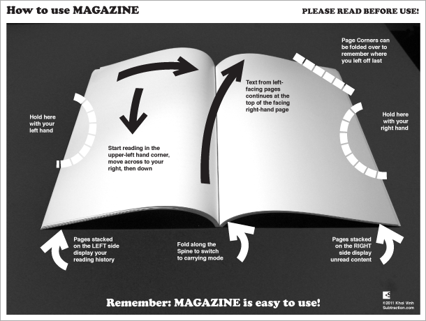
“carrying mode” haha… nicely done
Sold! I love it, just the incentive (and reminder) I needed to subscribe to this great service.
For sure! Most insightful and truth-telling infographic I’ve seen to date! lol
Uhm, you’re a few centuries too late – the Norwegian helpdesk already covered this one: http://www.youtube.com/watch?v=pQHX-SjgQvQ
HAHA. “Pages stacked on right are unread.” Brilliant.