is a blog about design, technology and culture written by Khoi Vinh, and has been more or less continuously published since December 2000 in New York City. Khoi is currently Principal Designer at Adobe. Previously, Khoi was co-founder and CEO of Mixel (acquired in 2013), Design Director of The New York Times Online, and co-founder of the design studio Behavior, LLC. He is the author of “How They Got There: Interviews with Digital Designers About Their Careers”and “Ordering Disorder: Grid Principles for Web Design,” and was named one of Fast Company’s “fifty most influential designers in America.” Khoi lives in Crown Heights, Brooklyn with his wife and three children.
Thanks to everyone for the terrific reception and constructive feedback to Wildcard’s launch last week. As we start plowing ahead towards its next stage, I wanted to jot down a few thoughts about the app’s design.
Team and Process
Wildcard is roughly twenty-five people strong at the moment, and for the past year we’ve had a two-person design team: Steve Meszaros and myself. Between the two of us, we designed the entirety of the app and our Web site, with help from a freelance designer who’s been doing a bang-up job on our developer documentation.
As a company, we imposed some lightweight structure and scheduling to guide the development of the product, but by and large there were very few formalities. We held relatively few meetings, used a minimum of jargon, and had lots of spontaneous discussion. That is really the sweet spot for product development, if you ask me. When designers and engineers can engage in a healthy, iterative dialog, and when everyone feels united towards the same goal, then job satisfaction skyrockets and great things can happen. I’ve worked in environments where there was lots of process or bureaucracy, or where the teams were subdivided into a kind of sprawl and everyone is thrown into opposition with one another as a byproduct of nonsensical org charts. Exactly the opposite was true for us at Wildcard.
Tools
We started designing Wildcard at just the right time to eschew Photoshop as our main interface design tool and instead use Bohemian Coding’s Sketch. I started the first design files for Wildcard last October, at a time when Sketch was really hitting its stride. For the most part, the app worked beautifully, though as a still young product there were minor hiccups here and there. For instance, as the number of design files and screens we were designing grew, we started to push up against the limits of Sketch’s symbols and styles features. There were also one or two times when TimeMachine backups came in really handy after a file had been corrupted.
The design work we did in Sketch formed the basis for literally dozens of prototypes, some animated and some interactive. We were aggressive about trying lots of different authoring tools including Pixate, Origami, Adobe Edge, Keynote, Form.app, After Effects, and Marvel. Steve wrote about this a bit in this blog post, and if you’re interested in that topic it’s a great resource.
Type
Early on, we settled on Chester Jenkins’s superb Galaxie Polaris as our base UI and branding typeface. It was surprising to us to find how relatively little used Polaris is in digital products, as it seems to strike a very pleasing balance between legibility and distinctiveness. It’s not a typeface that screams for attention, and yet it establishes a very unique, contemporary flavor that suited Wildcard well.
Our original intention was to use the Polaris family exclusively throughout the app, but earlier this summer, as we started to integrate more and more written content into Wildcard, we quickly realized that we’d need a different typeface, a serif typeface, for larger blocks of text. Finding the right one was surprisingly hard.
We needed something that would be a harmonious complement to Galaxie Polaris and come in a wide variety of weights and styles and that was available for app licensing at a reasonable cost. The last criteria, particularly, made things much more difficult than we expected and it took us several weeks of research, trial and error to figure it out. Ultimately we settled on Kris Sowersby’s beautifully toned Tiempos. There are eight styles of Tiempos, all of which would come in very handy, but unfortunately only four of them are currently available for app licensing. This was a big disappointment and nearly a deal breaker for us, but in the end Tiempos is such a winning complement to Polaris, and so appropriate for our intended use, that we decided we could make do with those few styles in the short term.
Branding
Every bit of Wildcard was designed in house, including the logo. In case you missed it, I wrote some thoughts about that in this blog post earlier in the year.
Card Properties
Cards are easy to recognize but somewhat difficult to define, and so we spent the first several months trying to work through a host of questions about how our vision of cards should behave, e.g., What physics should a card possess? Should cards be swipable, stackable and flippable, as some recent expressions of the form (e.g., Tinder) have made popular? Should each card act as its own UI window, with its own navigational stack and affordances? How should a stream of cards relate to common navigation, particularly the Back button?
What we ultimately settled on was a straightforward, fairly unassuming articulation of what cards can do—you can scroll them and tap on them, and there are a few other less well promoted properties built in, but beyond that, our cards are not exactly jumping off the screen. That just struck us as the most effective way to establish a baseline for a product that already introduces plenty of unfamiliar ideas to users. But the properties that our cards have today aren’t necessarily the only properties that we expect them to have down the road. We have lots of additional ideas for how cards should behave, and we’ll be implementing them as the right opportunities emerge.
Card Types
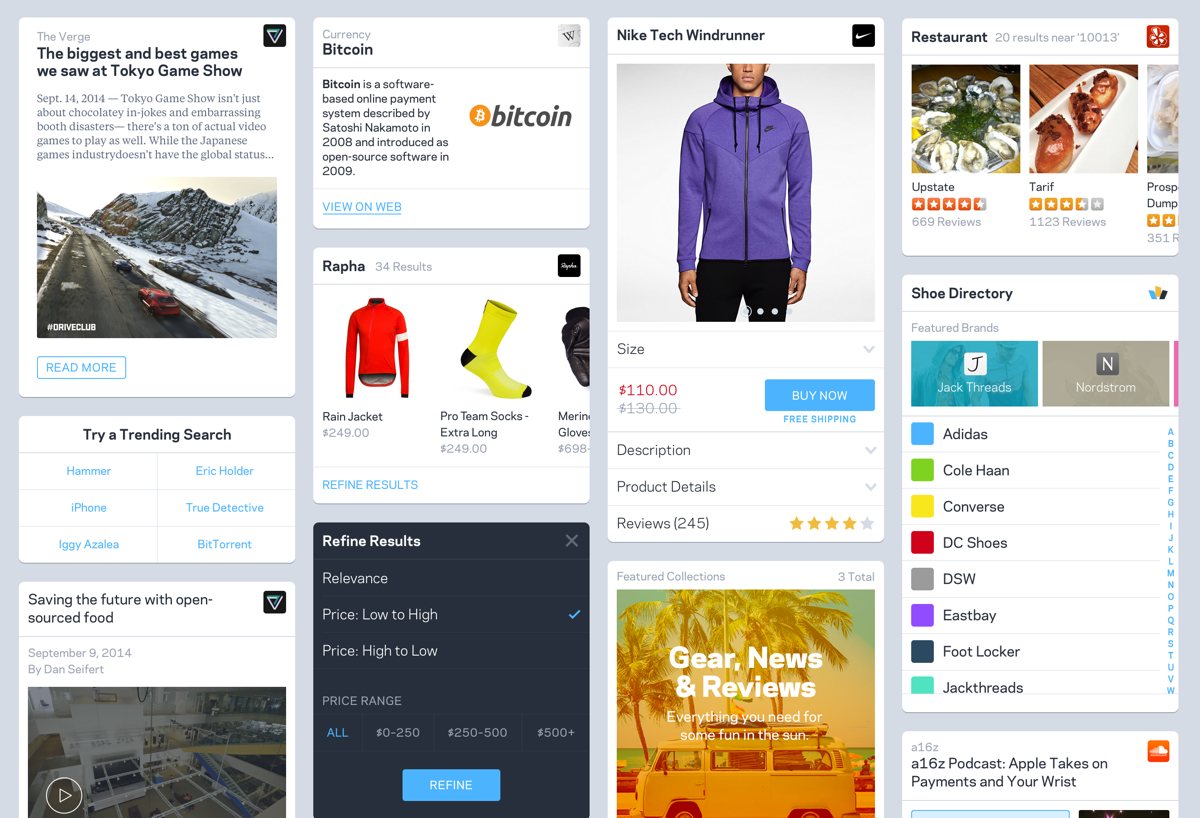
Wildcard is a browser for cards, but for now anyway, we can only display the types of cards that we’ve built support for. A few of those include: article card, product detail card, product search results card, directory card, video card, sound clip card, fact (Wikipedia) card, a card that represents a collection of cards, and several more. I’ve created a montage of a few of them at the top of this post.
Each card is a result of figuring out what’s feasible through data collection and indexing at scale—what common characteristics can be found in a vast majority of email newsletter sign-up forms, for instance, and how can we represent that in a consistent way that works with countless brands? From a user experience perspective, it’s a bit like templating large swaths of the Internet at once, which is an intimidating, humbling exercise. We think we’re just at the start of the learning curve on how to do this properly, and we have a long way to go to get really good at it. Rolling out a continual stream of additional card types is critical for us though, so expect to see new ones regularly. Each card type we introduce will affect the overall character of the app, and gradually even the ones you see in the app today will change, not just in what they look like but also how they behave and what our approach is to them. There are lots of unknowns ahead, but that’s why this is so exciting. We’re at the beginning of a long campaign to build a new kind of mobile web experience.