is a blog about design, technology and culture written by Khoi Vinh, and has been more or less continuously published since December 2000 in New York City. Khoi is currently Principal Designer at Adobe. Previously, Khoi was co-founder and CEO of Mixel (acquired in 2013), Design Director of The New York Times Online, and co-founder of the design studio Behavior, LLC. He is the author of “How They Got There: Interviews with Digital Designers About Their Careers”and “Ordering Disorder: Grid Principles for Web Design,” and was named one of Fast Company’s “fifty most influential designers in America.” Khoi lives in Crown Heights, Brooklyn with his wife and three children.
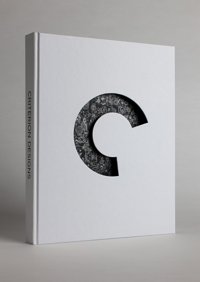
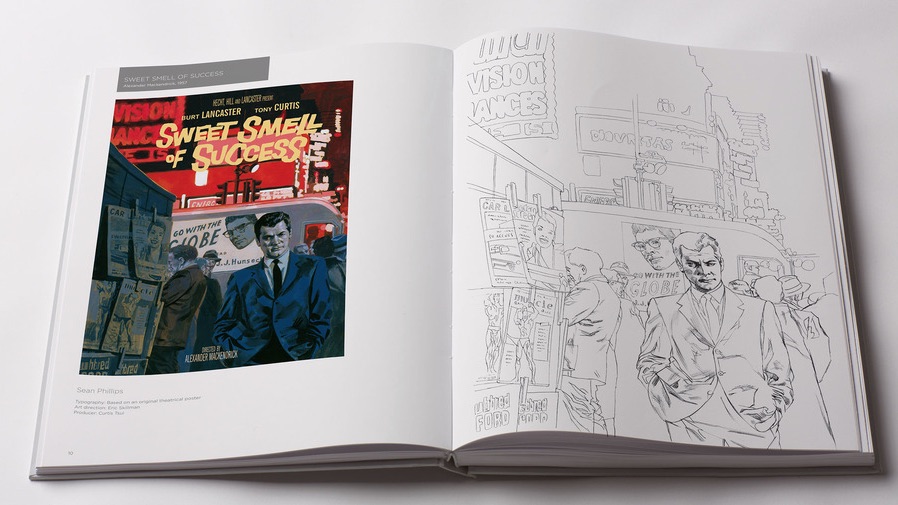
“Criterion Designs” is a new book celebrating three decades of superb, universally acclaimed movie packaging design from The Criterion Collection. It’s a lavishly illustrated peek behind the scenes, including sketches, mockups, mood boards and reference materials of all kind, all pulled from the in-house art department’s copious archives. The book originated with Criterion Art Director Sarah Habibi and Staff Designer Eric Skillman, who lovingly assembled its three hundred pages into a predictably gorgeous hardbound tome. Habibi is a friend, and so I was lucky enough to interview both her and Skillman just before the book’s launch last week.
This book celebrates thirty years of Criterion, but I imagine a similar book could have been written at twenty-five years, twenty years, even earlier—Criterion has had a reputation for doing superb design for so long. Why now?
Habibi: We really did want to create something special for the thirtieth anniversary, and we love to make beautiful things. This seemed like a natural fit.
Skillman: I think also that there’s something nice about doubling down on a really lush tactile experience at the same time as we’re expanding our efforts into more streaming and downloadable video, in addition to DVD and Blu-ray.
I want to ask about that tactility in a moment. But first, where did the idea for the book originate? With the design team?
Habibi: The discussion started with a brainstorming session between me, Eric and our president Peter Becker. Eric and I could visualize the concept of a Criterion cover art book so easily that we started working on it right away. We thought about all of the great process sketches we have received over the years (from three-minute napkin drawings to the suggestions so well executed that we ended up picking them over the more “final” art) and all of the little gems that inspired artists had created because they couldn’t stop drawing about the film they had just seen…and we could just see the pages unfold. It quickly became a labor of love for all of us.
Skillman: Yeah, we don’t often have a “work up a proposal and submit it to management” kind of workflow around here. It’s a collaboration.
“Rome, Open City” in “Criterion Designs”
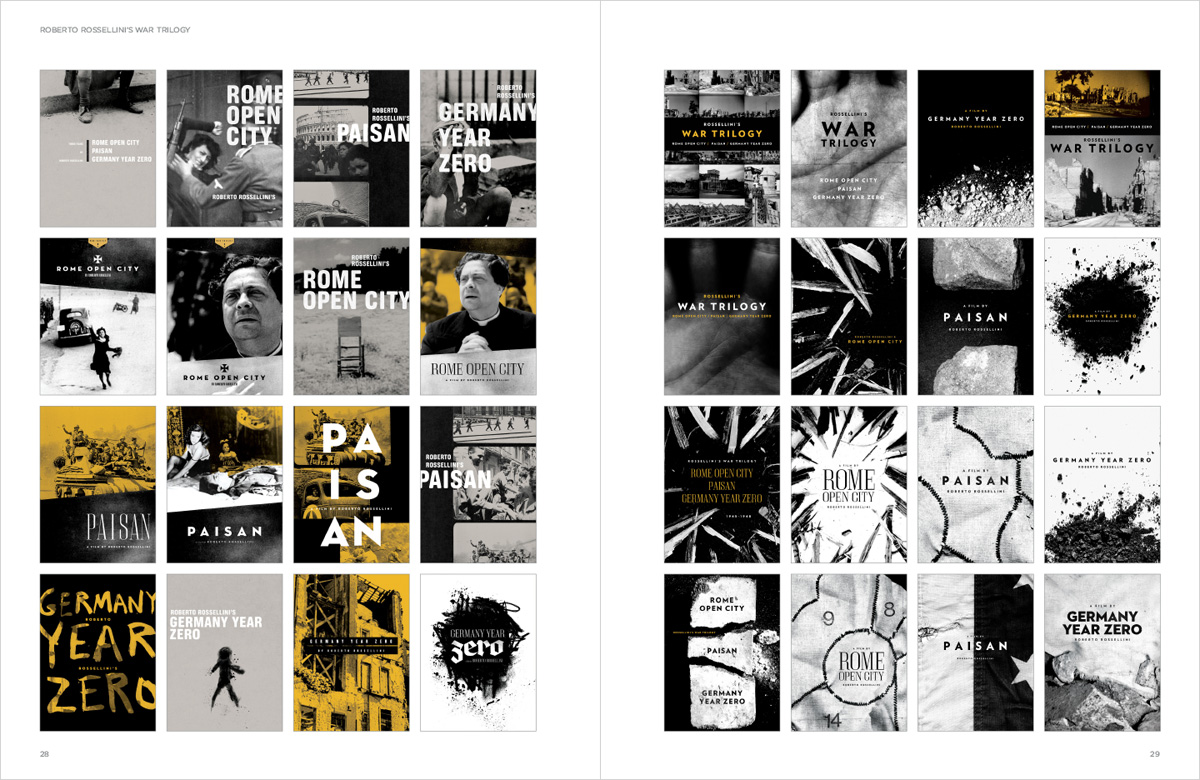
When you look back at all the process sketches and so forth, what do you see? Has the approach changed?
Skillman: It has and it hasn’t. On the Criterion side, I like to think we’ve gotten a little more organized. We now have regularly scheduled meetings with the Art and Editorial departments, the producer, and the company president, to determine the brief for each new title, which wasn’t always the case before.
On the other hand, I think the way we (or at least I—I shouldn’t speak for Sarah) interact with outside illustrators and designers has always been very project-specific. Consistent in its inconsistency, if that makes sense. Sometimes we have an incredibly specific idea of what we want and just need someone to execute that idea beautifully; sometimes we go to an artist with not much more than a vague sense of tone and some key themes and let them work it through. There’s so much stylistic variety in the films we work on, that we have to keep our working methods pretty flexible in order to keep up.
Habibi: I don’t know that the approach has changed much. We have always looked to the film and its director for our best information. But we have gained a lot from the experience of watching these films, and learning about them and working on them together for so many years. Of course, with more and more accumulated film knowledge, we can improve how we see and discuss each film within the larger context of its genre, or its period in history or its director’s work. And in terms of design we can remember what we’ve done before, and we can look at where we’ve been happy and what changes we might make now. All of which helps us to be rigorous about design. But lately, with all of this shared experience, we’ve been talking a lot about specificity. A film might have suspense and gun violence and a solo tough guy lurking in the city’s shadows, but it’s not enough to depict just those things when you’ve already worked on a lot of terrific noir films together.
When you say “with more and more accumulated film knowledge,” are you referring to your own, and that of your team? Or do you mean the public’s film knowledge? Because I would venture to guess that your customers as a whole have gotten more and more sophisticated about film over the past thirty years. Has that influenced your designs?
Habibi: I am partly referring to mine, as I did not arrive at Criterion with a complete knowledge of all of film history! That would be hard to do! But also I am referring to all of us because I personally gain a lot from the experience of having worked through these projects together over the years. For example, when I am discussing a film with a producer, we are also likely discussing other films made by that same director. Or other films we have seen from that time period, etc.
As far as outside influence, I can’t stress enough how much we go to the film itself for our answers.
Skillman: I think the Criterion audience has always had pretty sophisticated film knowledge, honestly—at least in my experience. I imagine it may have been different in the early days before we were an established presence. But in the twelve years I’ve been here, we’ve been lucky enough to be able to assume a level of engagement from our audience that allows us the freedom to design for the film, rather than for the market.
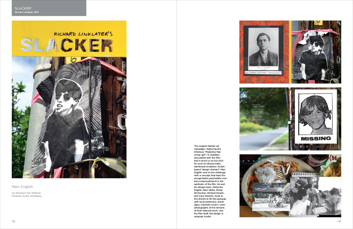
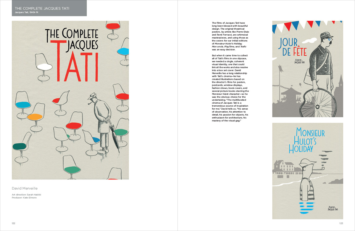
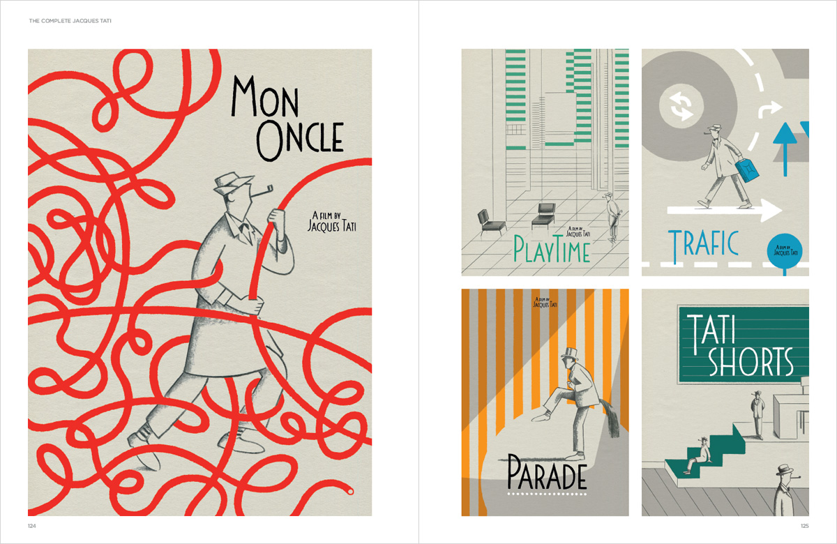
I’ve always wondered how—or if—your audience’s film knowledge determines how radically you’ll reinterpret the “identity” of a film, especially when its poster has already achieved iconic status. I’m thinking of the new releases of Jacques Tati’s films, for instance; the originals had a strong graphical identity, even an illustrated one, of their own already. And also I’m thinking of the packaging for “Slacker,” which reused the original poster in a novel way. What goes into those decisions?
Skillman: Definitely the degree to which a film is known factors into our decisions–whether you’re leaning into it or deliberately tacking away from it, you can’t not be aware of the degree to which certain images from, say, The Seventh Seal have seeped into the popular consciousness. Some films we build a little pedastal for, and in those cases we might go for the most well-known, iconic imagery. Other films are so firmly entrenched in the canon that we feel we need to kick the dust off a little bit and get people to look again with new eyes, to remind them that these are still vital works to be watched, not just archived for posterity.
And then sometimes there are other, more practical decisions being made, too. For example, Slacker was a case where the film is so deliberately diffuse and rambling (in a good way!) that it was very difficult to come up with a single image that spoke to the film as a whole. The original ad campaign tried to focus on just one character, and to our eyes it wasn’t quite successful—too narrow in focus, and oddly slick for such a handmade film. But reappropriated by Marc English as a photocopied flyer and photographed on the streets of Austin, it functions as a recognizable signifier for the film, with the added context more accurately reflecting the tone and themes.
Habibi: Yes I’ve been thinking similarly to Eric in terms of when we want to reference something iconic or ask audiences to see the film from a fresh direction. In the case of Tati, we wanted to make a set where everything worked together in one cohesive design. And then we found the marvelous illustrator David Merveille who is always drawing Tati so it became an easy decision. We are about to work on a title we don’t feel that the original poster can be improved upon. So it’s very much title by title.
Do the filmmakers get involved in these decisions? Is that helpful or not helpful?
Habibi: Well the “Director-Approved Edition” has been a big part of our brand for a long time. This is mostly when directors approve the new master/restoration, but it also often means that they have done interviews or helped with additional supplements too. And it has always been important to us to include the director credit on all of our title covers. As for art, again it really varies from project to project and from director to director. But generally speaking, we would rather that the directors are happy with the end results.
Skillman: As Sarah says, we’re always open to director involvement; the degree to which they actually get involved varies from person to person. For example, someone like Wes Anderson is very hands-on from the initial conception through the final execution, where other directors prefer to just give a yea or nay to a finished design. Some filmmakers seem to enjoy the opportunity to treat the packaging as an extension of the experience of the film, while others seem to see it as simply a sales tool. It really depends on the individual.
That raises the question: does your team think of itself as being in a service role, with “clients,” whether the client the film’s director or the client is Peter Becker or your marketing team, or do you think of yourself as being in a product role, where you are the ones figuring out what is best for the market?
Habibi: We don’t have a marketing team, and we rarely use the word “market” in our briefs meetings—for which I have to credit my bosses. I would say that we try to do what’s best by the film. Of course we work with and for many people—we want our bosses to feel good about the end result, we want the film’s producer at Criterion to feel that the completed solution is the right one, we want our artists to be inspired and pleased with their work, and we want to be excited to publish it too. That can be a lot of ground to cover. But the rigor of the process is always geared towards the film itself.
Skillman: One of the things I appreciate most about this job is the tremendous faith our bosses have in the power of the films we work on. That allows us to really focus on finding a way to honestly communicate that power in design terms, and largely ignore more crassly commercial concerns. I’m not sure it breaks down exactly into the client/product framework you mention, but I do feel a stronger obligation to question or challenge something I see as a misguided or insufficiently exciting brief here, more than I do when I’m working freelance design projects for clients. There’s a sense of a larger obligation to the film itself that gets fostered here.
Now, back to that question of tactility. As streaming becomes more prevalent and people buy fewer and fewer movies as physical objects, how does that change your way of thinking about your work?
Skillman: Yes, so far the impact of digital has been mostly after-the-fact, at least for us in the Art Department. Between the much faster turn-around times and the high volume of stuff that we’ve been making available digitally (i.e. virtually the entire collection on Hulu), the most efficient solution we’ve found has been to reformat existing print designs. So that becomes primarily a workload problem rather than an aesthetic problem. I’m sure as streaming becomes more primary, we’ll need to rethink our approach somewhat, but for now we still use the print edition as our starting point and ripple out from there.
Habibi: We definitely have a new audience of Criterion viewers who are encountering us for the first time digitally, streaming through our Hulu channel, or iTunes, or Amazon. But so far it hasn’t greatly affected how the art department is approaching the films or our work. (Besides branding implementation, many web sites use the print design that we have already done.) Generally speaking, I don’t think that Criterion will want to give up having that physical engagement with our audience. The look and the feel of our packaging has always been one of the ways that we communicate our values and our commitment to quality. We enjoy making beautiful objects like this book.
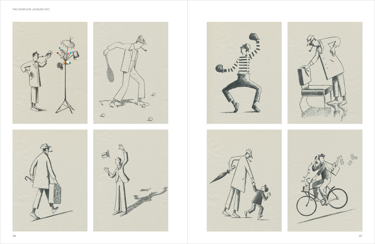
“The Complete Jacques Tati” in “Criterion Designs”
“Criterion Designs” is available from Amazon and other book resellers.