is a blog about design, technology and culture written by Khoi Vinh, and has been more or less continuously published since December 2000 in New York City. Khoi is currently Principal Designer at Adobe. Previously, Khoi was co-founder and CEO of Mixel (acquired in 2013), Design Director of The New York Times Online, and co-founder of the design studio Behavior, LLC. He is the author of “How They Got There: Interviews with Digital Designers About Their Careers”and “Ordering Disorder: Grid Principles for Web Design,” and was named one of Fast Company’s “fifty most influential designers in America.” Khoi lives in Crown Heights, Brooklyn with his wife and three children.
After a seven month design process that was conducted in the open, Mozilla this week unveiled their new branding. Tim Miller, who leads the organization’s Creative Team, writes in this announcement blog post:
At the core of this project is the need for Mozilla’s purpose and brand to be better understood by more people. We want to be known as the champions for a healthy Internet. An Internet where we are all free to explore and discover and create and innovate without barriers or limitations. Where power is in the hands of many, not held by few. An Internet where our safety, security and identity are respected…
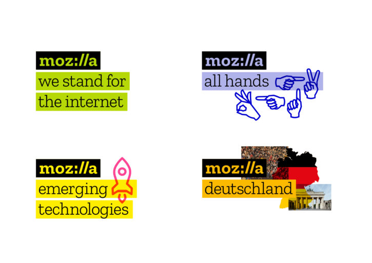
Our logo with its nod to URL language reinforces that the Internet is at the heart of Mozilla. We are committed to the original intent of the link as the beginning of an unfiltered, unmediated experience into the rich content of the Internet.
The work was done by London’s Johnson Banks, who wrote some thoughts here. The typeface is a bespoke creation by Typotheque for this project; it’s called “Zilla” and it’s intended to be free for everyone to use, but in a cursory search I couldn’t find a way to download it yet.
My first impression was that this is a bit of a groaner—the visual pun struck me as the tech/design equivalent of dad humor (as a dad myself, I should know). But it didn’t take me long to warm up to it. I’m a fan of its utter lack of pretension, and how unabashedly it embraces the organization’s geeky legacy. Overall, thumbs up.