is a blog about design, technology and culture written by Khoi Vinh, and has been more or less continuously published since December 2000 in New York City. Khoi is currently Principal Designer at Adobe. Previously, Khoi was co-founder and CEO of Mixel (acquired in 2013), Design Director of The New York Times Online, and co-founder of the design studio Behavior, LLC. He is the author of “How They Got There: Interviews with Digital Designers About Their Careers”and “Ordering Disorder: Grid Principles for Web Design,” and was named one of Fast Company’s “fifty most influential designers in America.” Khoi lives in Crown Heights, Brooklyn with his wife and three children.
Interview with the Director of “Graphic Means,” a Documentary About Design’s Lost Past
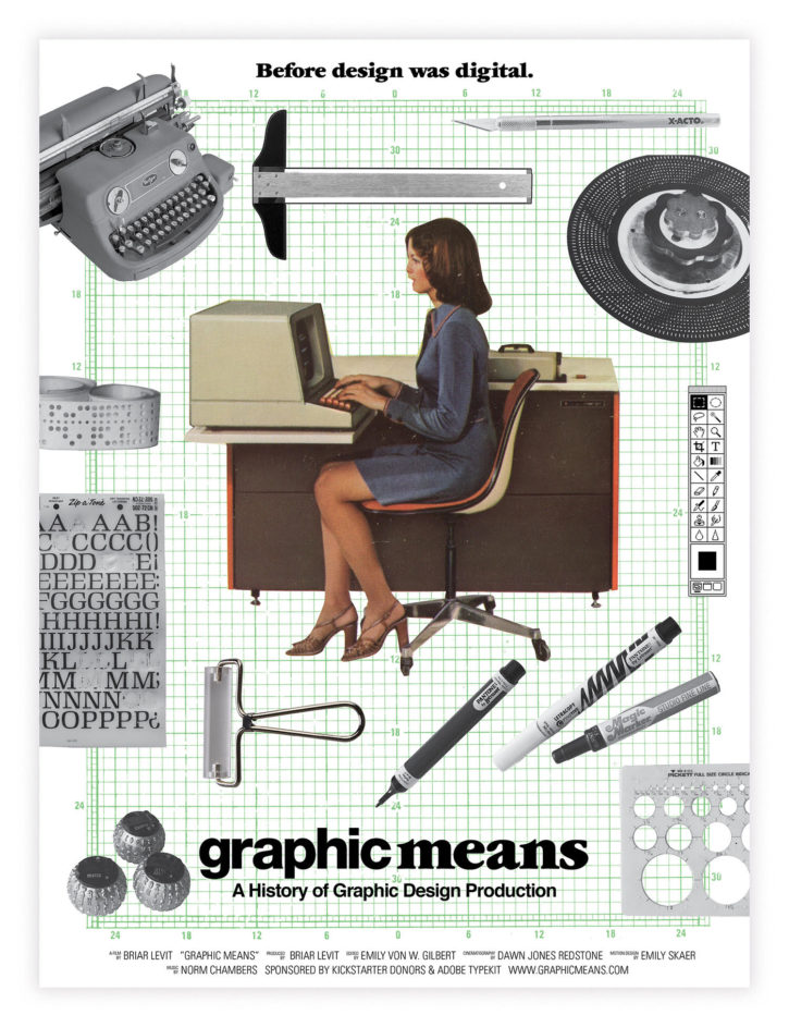
The forthcoming documentary film “Graphic Means” explores the world of graphic design production—the tools and methods that enable the craft, and how they underwent a dramatic transformation between the 1950s and 1990s. It’s not the kind of subject matter that you’d necessarily expect to be covered in film, but it exists because a determined contemporary practitioner, Portland-based designer and educator Briar Levit, took it upon herself to bring this almost forgotten era of history to life. With the film nearing completion—it debuts at the ByDesign Film Festival in Seattle on April 15 and starts streaming to Kickstarter backers the next day—I caught up with her to find out more about the project.
Khoi Vinh: Your background is in design; how did you come to find yourself directing and producing a movie?
Briar Levit: I found myself falling in love with a topic—the cold type era—that seemed to have a lot of potential appeal for other graphic designers. Initially I thought I’d just start to work this history into my classes, but it seemed unfortunate to do research only to share with a relatively small number of people.
I thought a book might be something I’d do—I’m a book designer after all. But it was having seen Doug Wilson’s film, “Linotype: The Film” some years back, that helped me settle on making a movie. His documentary was both entertaining and educational, and really helped clarify a lot of confusion I personally had as a designer who’d heard terms about Linotype thrown around, but really only knew it as a type foundry.
He certainly could have told the story in a book, but to see the machines in action, to hear the machines—that brought it to life! Not to mention the stories and personalities of the Linotype operators.
I wanted to do that for the era that followed as much as possible. As far as I know there is no phototypesetting equipment that is currently being used. So while there wasn’t the chance to make beautiful footage of the people and the machines, there is quite a lot of archival footage on the topic (much of which, Doug Wilson shared with me!).
You said you missed this period of technology and production by about a decade. How much did you find that you’d never known before?
I suppose I was aware of the tools, but seeing them in use in step-by-step photos brought home the sheer amount of skill, time and number of steps that processes like creating a comp for client approval took.
The thing that surprised me most was that designers and typesetters had to calculate the number of words/characters that would go into a given block or body of text. This number was based on everything from point size to typeface style to line length. This level of preparation is mind boggling for someone like me who lays books out and can get a quick sense of how many characters/words fit on a page in a given design in minutes with InDesign.
That shift to digital typesetting seems somewhat analogous to the transition from “hot type” to photo typesetting, which I know the film also covers. Did you get a sense of how that evolution affected the designers of the day?
Absolutely. In the transition to digital type, however, all typesetters lost their jobs, not just some. This was the period in which designers had to learn to set their own type—for good or bad. Designers I’ve spoken to say there was quite a lot of poor typesetting at the time because designers were on a learning curve, not just with computers in general, but when it came to the rules of typesetting. They had relied on skilled people before to do that job.
While it’s sad that those jobs went away, I can’t imagine not setting my own type. I love doing it—first the process of establishing a design/system, and then the sort of Zen process of implementing it across a whole book or article.
To me, that suggests a long arc for designers away from specialization and towards generalization. Today’s designers need to be able to do so much; not just layout and typography, but photography and retouching, production and prepress, code and development—you could argue even marketing and sales. Does that idea of an arc sound accurate, or is it just an illusion that the pre-digital era allowed designers to focus much more on “just design”?
You’re right that jobs were generally more specialized during the cold type era. Which, as you say, allowed designers more time to simply design. But the benefit of having to do all of these jobs for ourselves now gives us a level of control and flexibility that most designers didn’t have before. We are able to tackle design problems in a variety of media ourselves, which is very empowering for communicators.
So having immersed yourself in this era, do you feel nostalgic for it at all? Sounds like maybe not?
No. I find the methods incredibly impressive and fascinating, but I have no desire to return to them, and neither do ninety-five percent of my interviewees. The feelings around lamenting the loss of these methods are usually tied to two things—one, a perceived devaluing of the designer as expert/specialist, and two, simply missing the pride and physicality of the work.
It suggests to me that graphic design production might have attracted a different kind of person—not better or worse, just different in terms of the work that suited them, or what they wanted from their vocation. Did you get a sense for that?
That’s a great question! I would say yes and no. Yes, because it would attract a person who probably had an innate sense of attention to detail and control—perhaps a taste for math even. When I look at the processes, myself, I wonder, had I know the field even existed, if I would have attempted to study design, let alone kept with it if I started. I will say that I do think the folks attracted to design, whether now or in the past, are often folks who have a natural creative urge, but who may prefer to work with constraints. I think they are also likely to prefer working on projects that have to do with topics/issues outside of expressing their feelings, like a creative person drawn to fine arts would be more interested in.
How about in the sense of class? Today design is, for better or worse, generally thought of as white collar. Was there a blue collar aspect to production jobs?
There was, and I would argue, there still is a class divide in our field in terms of who does design work, and who does production work (like prepress at a printer, for example).
It may have been more palpable during the cold type era, because designers came into contact with many more vendors than they do now. A designer would work with production artists/designers, as well as typesetters, image retouchers, and then, later folks in service bureaus who offered services like scanning, and proof printing. This tension is explored a little bit in “Graphic Means.” The film also takes a brief look at the impact the industry had on welcoming women into the workplace when cold typesetting finally took off in the 1960s and on.
Can you talk a bit about that experience for women? And if there were any parallels to more recent history?
Basically, women were given entry into the field initially as union typesetters went on strike, and newspapers were looking to hire folks to temp for them. I should note that women were forbidden from joining these labor unions. Later, when cold typesetting started infiltrating type shops in the sixties, many union men who were hot typesetters (letterpress and Linotype), were not interested in doing the work because it was seen as ‘glorified typing’ to them. So “open shops,” or shops that weren’t union-run, often had a good percentage of women doing typesetting.
For women designers, technology had less to do with their entrée into the field, as design jobs weren’t controlled by a union. I don’t have proof, but my guess is that the number of women designers started rising as the number of women going to college grew (from 1960 on), and as acceptance grew for women to have full-fledged careers.
The field of graphic design now is pretty well balanced in terms of the sexes (that’s my guess based on experience). Women are still at a disadvantage when you look at specific jobs within design, however. Jobs that are more technical, and which include aspects like coding, have much lower numbers of women. This goes back to the issues the women of the mid-century had—opportunity and/or privilege. There has been lot less support and encouragement for girls at young ages to get involved in the more technical pursuits. I think that’s changing more and more as parents and teachers became aware of this issue and adjust their approaches. It’s exciting to see the work of groups like Black Girls Code and Women Who Code.
What are the biggest lessons you take away both from what you learned about this era of history and also from your experience turning it into a documentary film?
I think the biggest take-away I got from immersing myself in this era and thinking about the tools that designers used—is that they are, in fact, just tools. There was brilliant design before the computer, there has been brilliant design after, and there will continue to be brilliant design to come.
On a personal level, I took a lot from my interview with April Greiman. Her openness to the desktop computer is so inspiring. She was trained in International Typographic Style and New Wave typographic style, but she didn’t let that stop her from exploring the possibilities with a tool that, in most designer’s eyes was not up to their standards yet. On top of that, she didn’t just try to make the tool replicate what she’d already been doing by hand. Instead she experimented with the new possibilities the tool offered. I always wonder if I would have been an early adopter, or if I would have held out until the tools met the resolution established standards. Here’s an example of me catching myself in this kind of thinking recently…
As you may know, there was a big announcement this year from a team composed of type folks from Apple, Google, Microsoft, and Adobe, about a standardization of a formerly limited font format—the variable font. Upon hearing about this specification, which allows infinite options for weight and width, I was mortified. My mind immediately started fretting about all of the folks who weren’t trained in typography, who would use an insane number of weights and widths, and misunderstand issues of contrast and hierarchy. But I stopped myself. I thought, maybe this is opening a door to something new? I asked myself: What would April think? I’m on a mission to keep an open mind about new technologies as a result.