is a blog about design, technology and culture written by Khoi Vinh, and has been more or less continuously published since December 2000 in New York City. Khoi is currently Principal Designer at Adobe. Previously, Khoi was co-founder and CEO of Mixel (acquired in 2013), Design Director of The New York Times Online, and co-founder of the design studio Behavior, LLC. He is the author of “How They Got There: Interviews with Digital Designers About Their Careers”and “Ordering Disorder: Grid Principles for Web Design,” and was named one of Fast Company’s “fifty most influential designers in America.” Khoi lives in Crown Heights, Brooklyn with his wife and three children.
How We Built Bumpr as a Tiny Side Project—in Just Four Years!
When my pal Scott and I finally released Bumpr last week, it was both a moment of pride and a great relief. As I mentioned in my launch post we had been working on it as a side project for years. It was the first collaboration he and I talked about after we sold our company Mixel way back in 2013. Mixel had been a big effort with big ambitions; we were both very proud of what we had done but its ultimate failure was exhausting. So we picked a tiny project just to get us back in the swing of things quickly. Cut to: four years later.
That’s the nature of side projects, though. Somtimes they come together very quickly, sometimes they trundle along aimlessly for many moons until they die quiet, unnoted deaths, and sometimes they manage to drag themselves across the finish line.
In truth, Bumpr started as an idea well before Scott and I first talked about it. I’ve been using multiple browsers for almost as long as I’ve been on the web. This was mostly because I seem to have a curious habit of favoring browsers that are not the dominant market player—whether it was OmniWeb, Camino or even Firefox. So I’ve often needed to be able to switch back and forth between my browser of choice and whichever competitor has all of the most current compatibility advantages at a given time.
In the early Aughts I was using IC-Switch by Philippe Martin to solve this problem. It was little more than a utility that sat in your Mac’s menu bar, where it provided a pull-down menu of the various web browsers, mail apps, FTP clients and even newsreaders (takes you back, right?) and RSS apps that you had installed. So if you came across a link that you wanted to open in a different browser that wasn’t currently set as your default, you’d pull down IC-Switch’s menu and change that setting. It was more convenient than digging into Mac OS X’s preferences to accomplish the same thing, but it was still cumbersome.
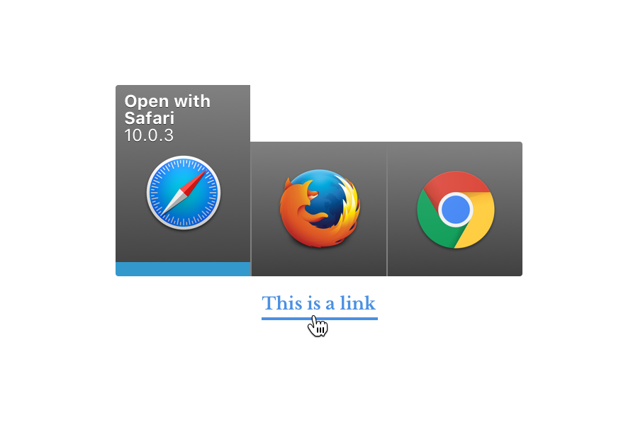
Later in the decade Choosy came along, which was a great improvement. It provides very similar functionality to what we’ve delivered in Bumpr: click on a link and a menu of available browsers pops up instantly, right there. I actually thought Choosy was a good solution, but unfortunately there was a period of several years (almost six, actually) in which it sat still, with no updates or feature improvements.
This was about the time Scott and I started thinking that we should build our own solution. Though Google Chrome had already consolidated a lot of people’s web activity into one browser, we still saw a real and persistent need for many people to use multiple browsers. Some of it was for cross-browser testing, but a lot of it, we noticed, started coming from users who had been drawn deeper and deeper into Google’s ecosystem. As Google Apps (now G Suite) gained traction in the workplace, more and more people were contending with one Google account for work and one more (at least) for personal stuff. To switch between them, these users were dedicating one browser to one account and another to a second.
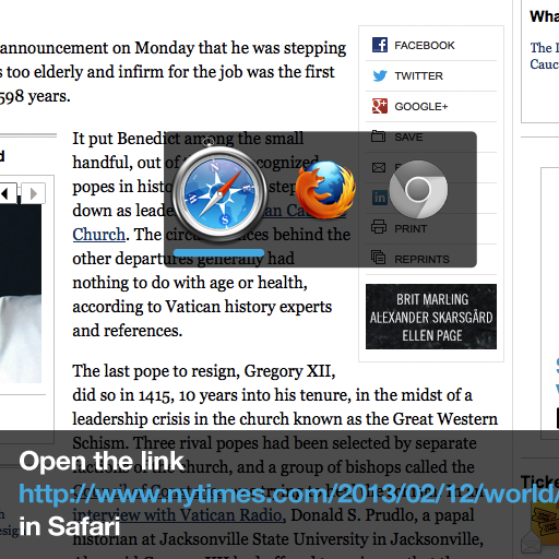
Given this belief, Scott coded a working prototype of the utility pretty quickly in the summer of 2013. For lack of a better name we dubbed it “Handler,” and I started sketching out what the interface might look like. The very earliest riffs on the interface were quite similar to what we shipped, partly owing to the fact that the app is so simple. Here’s a version that used a slightly different take on the automated color coding that Bumpr applies to the active browser.
The overlay at the bottom of that mockup shows an information bar that we considered revealing in the lower-third region of the screen whenever the app was invoked, to help make it clear to the user what was happening. We actually experimented with that in some early builds but found that in most cases users ignored it or didn’t even notice it, so we stripped it out.
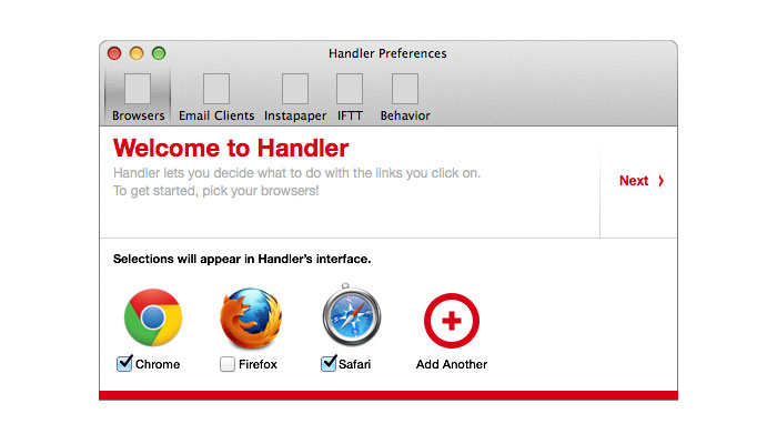
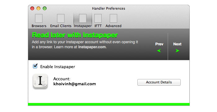
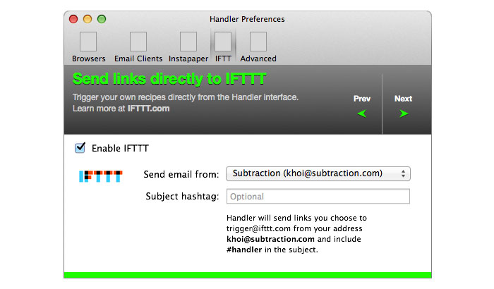
Having established the basic look of the pop-up menu interface, I started noodling around with the preferences menu. These old mockups show my early drafts as well as some of the functionality we were discussing at that stage: the ability to send a link directly to Instapaper or to IFTTT, two ideas not without their merits but which we decided to defer until we shipped a minimum viable product.
We were off to a decent start, in retrospect, but then the project hit the skids. I left the company that acquired Mixel, spent some time figuring out what I was going to do next, and then joined the startup Wildcard. I also undertook a number of other side projects including writing my book “How They Got There: Conversations With Digital Designers About Their Careers.” And what really did in Handler was that Scott and I also teamed up with my friend Matt on Kidpost, a web service for family photo sharing. There was a lot going on, and that’s not even mentioning raising three kids with my wife.
Handler was always there in the background though. Scott and I continued to use it every day; in fact, I had come to rely heavily on its ability to switch mail apps as well as browsers, as all those side projects had spawned multiple parallel email accounts. We periodically talked about finishing Handler “one day” but never committed to a timetable.
Then, in November 2015 I happened to mention Handler in a round-up of my favorite Mac utilities and was pleasantly surprised to find that it sparked the interest of a lot of readers. That spurred us to get a bit more serious about finishing it, and before too long we dusted it off again. By early last year, we’d gotten into a good cadence of turning out new builds regularly.
Coming back to the project after so long was productive in at least one way: I was able to appraise the look and feel of it with a fresh eye. I had always felt that my early designs were not very good, frankly, as they stuck too closely to the look and feel of Mac OS X apps of the time without doing anything particular worthwhile of its own. When I saw them anew, I cringed at their awkward marriage of my personal aesthetic and conventional Mac chrome.
Scott and I then had a discussion about how design could be a differentiator for this project. We knew that given our limited time to develop Handler, it would behoove us to ship as few features as we could but also as elegantly as we could, and so we decided to go back in and completely redesign the preferences interface. I took a lot of inspiration from Boom, an audio enhancement utility for Mac that has a particularly slick settings window, One of my first redesign mockups from that time shows the influence of Boom’s look and feel:
That dark aesthetic seemed too strong for such a lightweight app though, and so we pared back. Before too long we had arrived at a design that more or less resembles what we launched last week, with a dark sidebar and neutral grays in the main settings area.
By then however, I was deep into my current full-time job at Adobe and seemed to have even less time than before. The project limped along as we continued to polish and tweak, distracted continually by life’s other priorities. It took us until August of last year to finally be able to release a beta version to a small group of testers who were kind of enough to send frank feedback. That helped us identify and fix a lot of bugs and continue to polish the user experience. Meanwhile, we also started to finalize our branding, settling on the name “Handlr” and even registering the domain name gethandlr.com.
With that and a beta round under our belts we set our sights on launching the app before 2016 was out. Unsurprisingly though, the end of the year turned out to be a bad time to get anything done other than holiday stuff, to say nothing of long-neglected side projects.
However it was also at that time that we hit another snag: we’d settled on the name Handlr, but we did so without fully vetting it. We thought we were ready to submit to the App Store but our willful naiveté came to an abrupt end when a quick Google search revealed that there are several other products named Handlr out there already. That left us feeling a little dumb and dreading the prospect of rebranding. Anyone who’s ever named a product or side project knows that finding the right moniker often consumes way more energy than you’d like, and we went back and forth for weeks trying to settle on a new one.
To be honest there was a moment there when I began to wonder not just if we were ever going to launch the app, but whether there was some other reason that it hadn’t happened yet. When a project goes on this long, to some extent one has to wonder: “Am I the one who’s really holding this up? Am I just making excuses for not finishing it?” Maybe there was some deep, hidden part of me that was procrastinating on its completion? There’s a certain kind of perfection to an unlaunched product even if it remains unfinished, because in your mind you can picture so clearly all of its potential. Sometimes you can start to cherish too much just that Platonic ideal of the product, and you don’t want to shatter it forever by releasing it to the world. I think maybe there was a part of me that had fallen into that trap.
Thankfully, Scott was bullish on just getting it out there. He reminded me that there’s nothing less useful than an interface that never gets used or code that never gets run by real customers, regardless of how much effort you’ve put into developing and polishing it. So we somehow settled on the name Bumpr and then plowed through the remaining work of registering a new domain, rebranding the web site, creating new marketing images and submitting a new build to the Mac App Store. Most all of that happened in the last week or so leading up to launch. It was not a ton of work, but as I realized that we were getting close to the fourth anniversary of our first conversations about this project, it just proved to me the point that the effort that goes into building a product will take exactly as long as you let it, no shorter and no longer.
Looking back, I’m naturally somewhat embarrassed that we took so long to finally ship such a small product. Ultimately though I take pride in the fact that we did ship it—just pulling that trigger is meaningful. It’s meaningful because there are people who have since found it valuable enough to pay for, of course—we’re very grateful for that. But more than just the validation of having real customers, I think what’s important is getting a thing that you’ve started done. A good friend once told me that when he gets down in the dumps, he takes solace in shipping something—it can be as small as a blog post or as substantial as a product. I’ve found that to be very true; there’s a tremendous satisfaction in finishing, even if it took you way, way too long. Now, of course, we have to work on the next update.