is a blog about design, technology and culture written by Khoi Vinh, and has been more or less continuously published since December 2000 in New York City. Khoi is currently Principal Designer at Adobe. Previously, Khoi was co-founder and CEO of Mixel (acquired in 2013), Design Director of The New York Times Online, and co-founder of the design studio Behavior, LLC. He is the author of “How They Got There: Interviews with Digital Designers About Their Careers”and “Ordering Disorder: Grid Principles for Web Design,” and was named one of Fast Company’s “fifty most influential designers in America.” Khoi lives in Crown Heights, Brooklyn with his wife and three children.
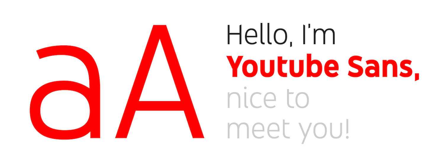
Worldwide agency Saffron did some superb work for YouTube’s brand, as detailed in this case study. Resisting the temptation to discard the brand’s enormous preexisting equity in favor of a flashy new mark and aesthetic, Saffron instead redrew the nearly ubiquitous “play” icon. They also developed, in partnership with Letterjuice, URW++ and YouTube’s own product design team a new, bespoke typeface called YouTube Sans. The results are a pleasing evolution that builds upon and strengthens the brand; I wish more branding work was as thoughtful as this.
YouTube Sans is a notable achievement on its own. It’s at once unassuming—most casual users are unlikely to notice it—and distinctive with clever, diagonally cut terminals that stake out unique territory for the brand.
I’m particularly fond of this animated demonstration of its legibility at various sizes.
In truth the principal virtue of the redrawn icon is that it’s basically the same as what came before—Saffron’s designers knew better than to mess with it too much. However like almost every design agency, they did feel compelled to justify the value of their work with this diagram of the architectural core of their redesign. Witness and—be impressed by—a bunch of hidden circles and some grids and lines and stuff revealed here:
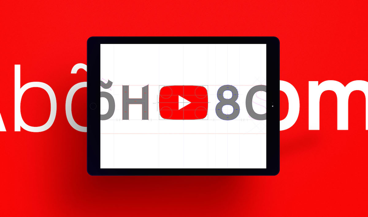
There’s also this diagram that shows a similarly architecturish link between the geometry of the redrawn icon and YouTube Sans’s letterforms. I’m not sure I understand what it’s saying, but it looks complicated.
I’ve written before about my general skepticism about designing logos with grids, a technique that usually strikes me as either fanciful or superfluous. Whether you agree with that or not, my main complaint here is the general insecurity on display. When it comes to presenting work like this, it should be sufficient to highlight its aesthetic merits. Put another way, this logo looks great and its execution is skilled and artful—and that should be enough. It shouldn’t be necessary to concoct a largely implausible structural rationale for it.