is a blog about design, technology and culture written by Khoi Vinh, and has been more or less continuously published since December 2000 in New York City. Khoi is currently Principal Designer at Adobe. Previously, Khoi was co-founder and CEO of Mixel (acquired in 2013), Design Director of The New York Times Online, and co-founder of the design studio Behavior, LLC. He is the author of “How They Got There: Interviews with Digital Designers About Their Careers”and “Ordering Disorder: Grid Principles for Web Design,” and was named one of Fast Company’s “fifty most influential designers in America.” Khoi lives in Crown Heights, Brooklyn with his wife and three children.
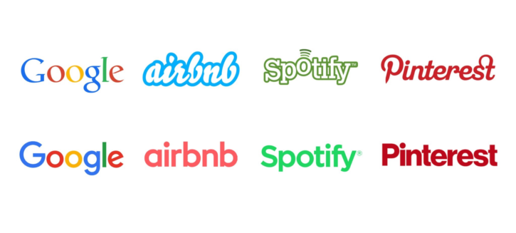
This incisive tweet from type designer James Edmonson of Oh No Type Co looks like a humorous one-liner but is actually a brilliant piece of criticism. In just four words, he summarizes the pervasive tendency towards a visual uniformity that seems to draw in nearly every major tech brand operating today.
When I read it it struck me as a good companion—a much more succinct and effective one—to the post I wrote here in January about the near ubiquity of a very specific, narrow band of visual expressiveness in illustrations for tech brands. Like that post, this tweet raises questions about what kind of culture we’re building online and whether it’s as truly diverse as their ostensibly progressive shepherds would claim. For me it also asks the question of why we aren’t examining the design language of these companies with more rigor?
Consider the macro trend of these brands all visually converging alongside the industry’s current mania for design systems. That juxtaposition suggests that we’re far more interested in implementing ideas than we are in ideas themselves. Put another way, as practitioners of design we’re most comfortable asking questions like “How do we implement our brand’s design language, propagate and scale it, and make sure it’s consistent?” We’re much less comfortable asking questions like, “What’s the larger context for the brand we’re building? Are we making a unique and worthwhile contribution to the value of our company, to the world at large, or even to our profession?” It’s the difference between merely executing ideas and really understanding them.