is a blog about design, technology and culture written by Khoi Vinh, and has been more or less continuously published since December 2000 in New York City. Khoi is currently Principal Designer at Adobe. Previously, Khoi was co-founder and CEO of Mixel (acquired in 2013), Design Director of The New York Times Online, and co-founder of the design studio Behavior, LLC. He is the author of “How They Got There: Interviews with Digital Designers About Their Careers”and “Ordering Disorder: Grid Principles for Web Design,” and was named one of Fast Company’s “fifty most influential designers in America.” Khoi lives in Crown Heights, Brooklyn with his wife and three children.
Apple’s dramatically redesigned App Store got a decent amount of attention when it debuted last year with iOS 11, but its unique success as a hybrid of product design and editorial design has gone little noticed since. That’s a shame, because it’s a huge breakthrough.
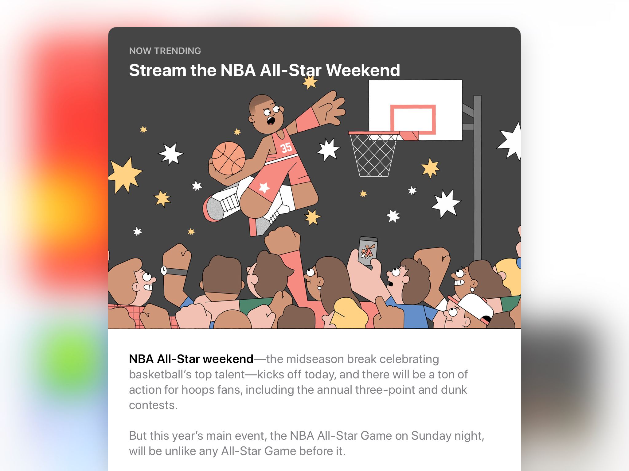
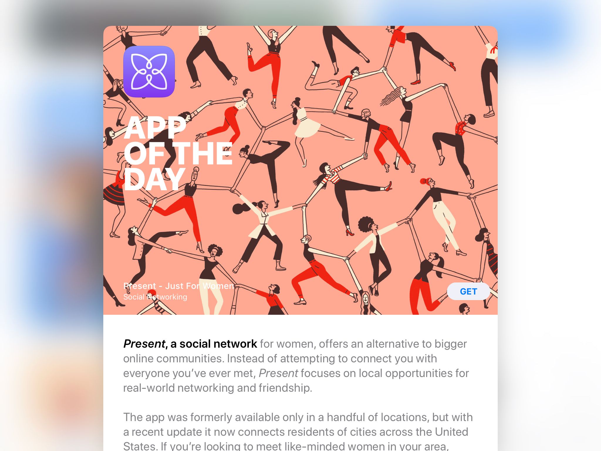
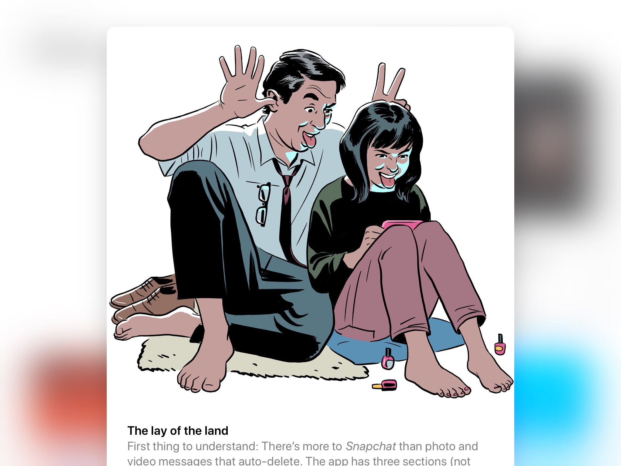
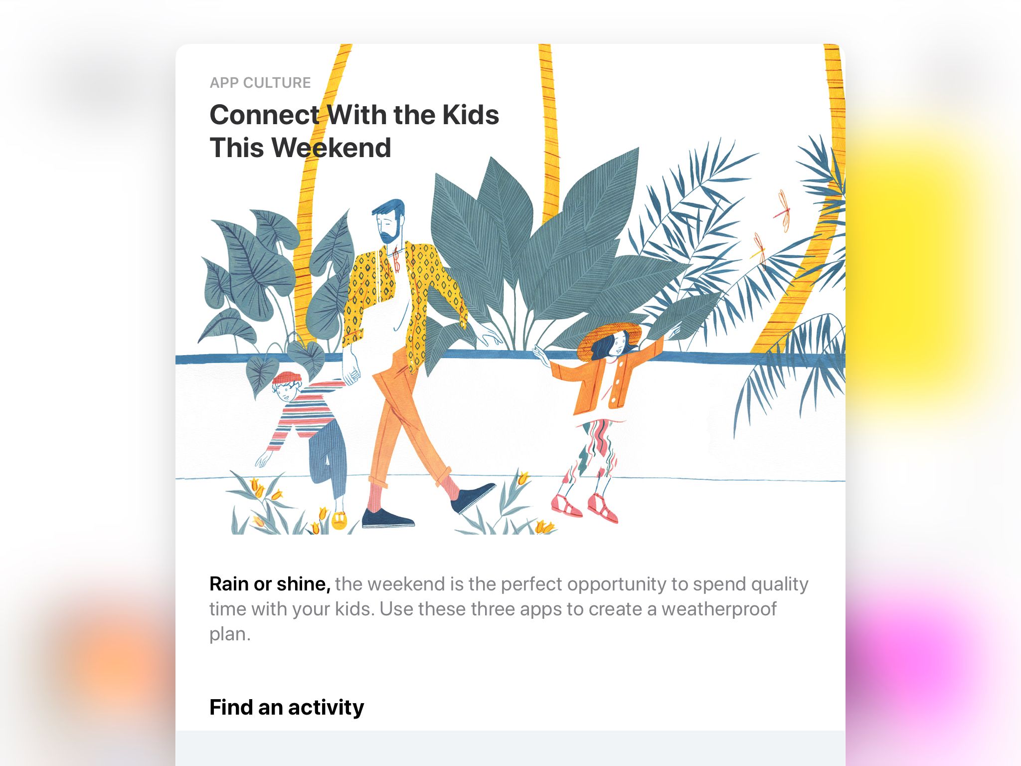
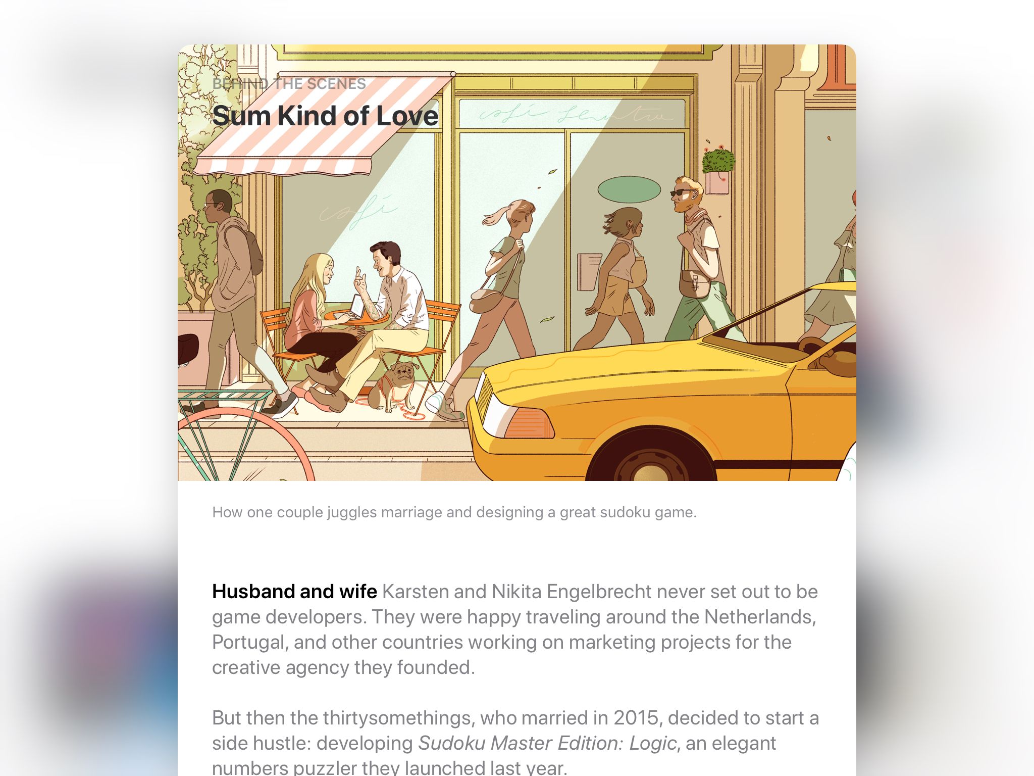
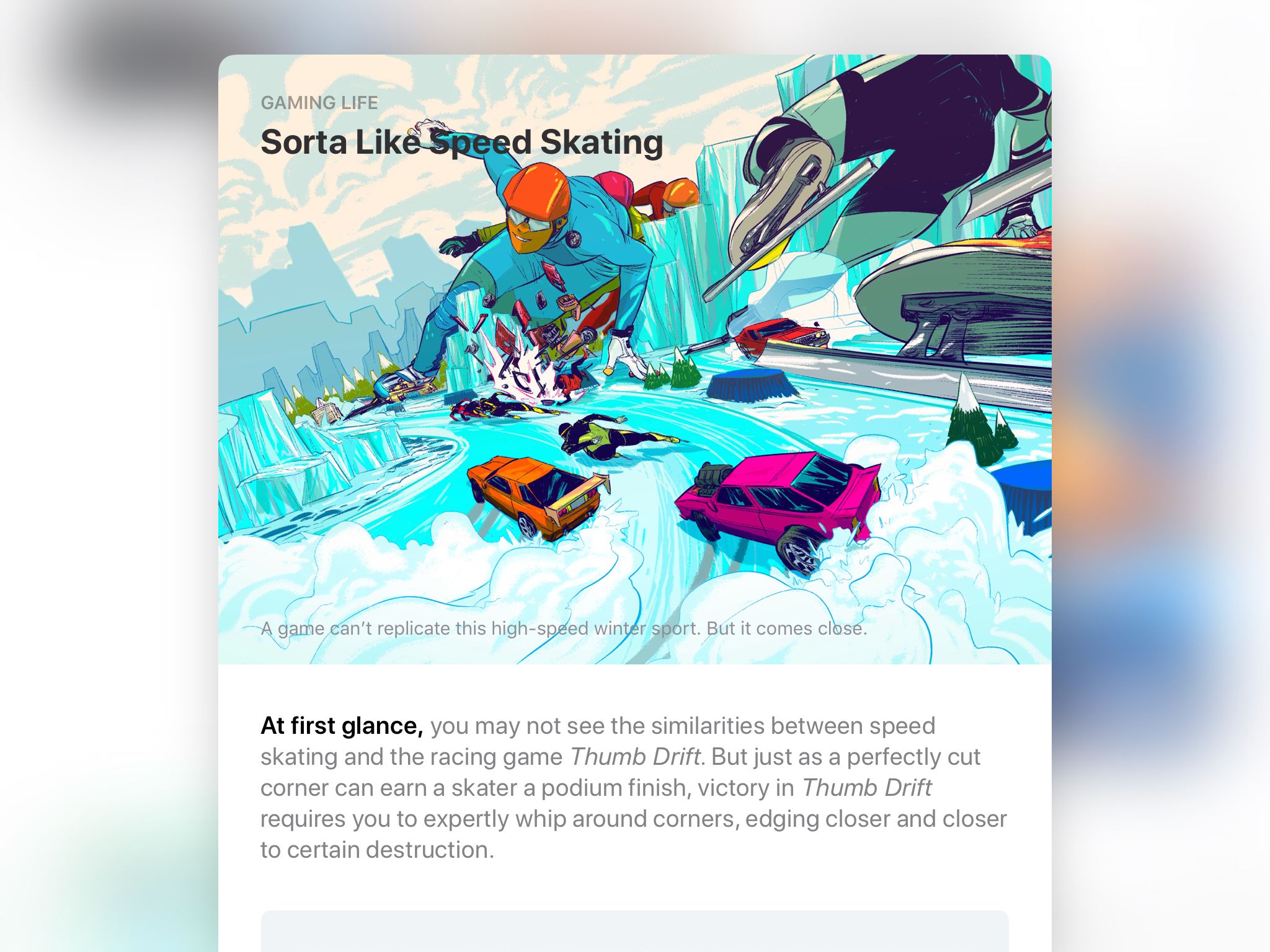
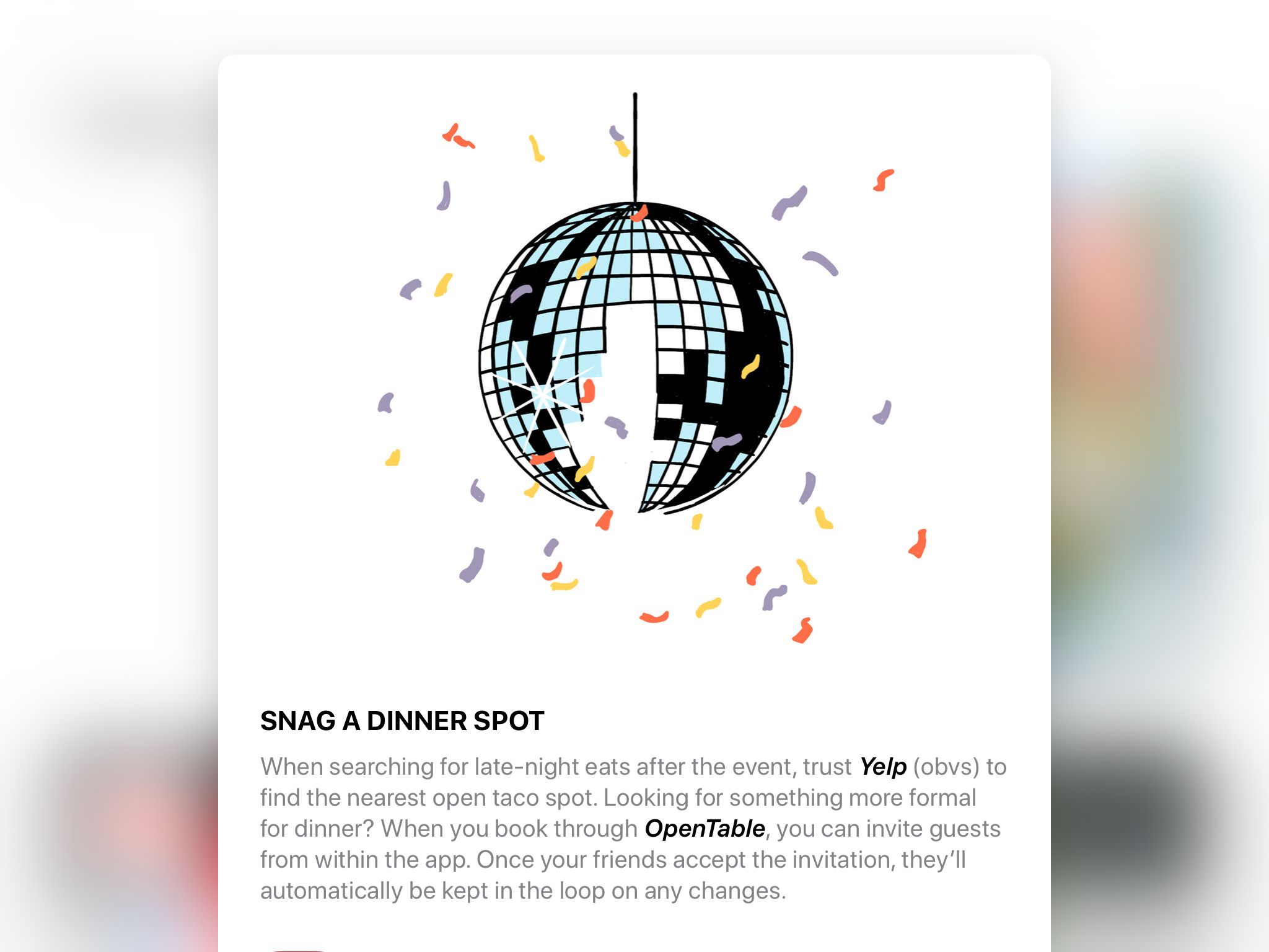
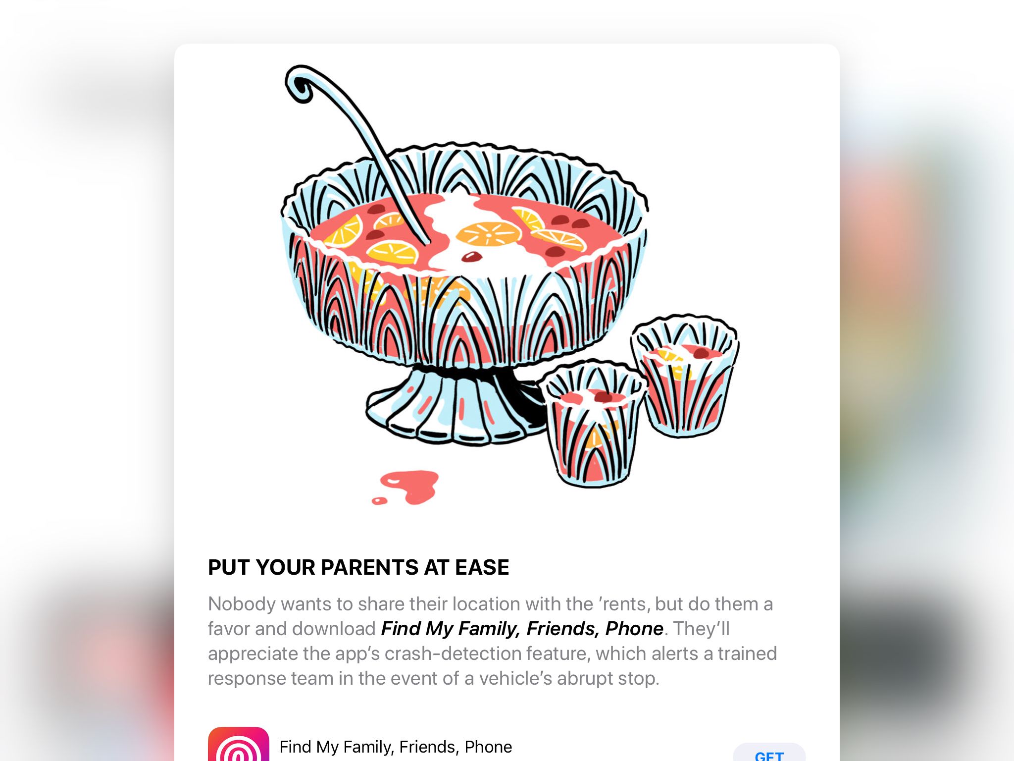
I myself paid it scant attention until one day this past winter when I realized that the company was commissioning original illustration to accompany its new format. If you check the App Store front page a few times a week, you’ll see a quietly remarkable display of unique art alongside unique stories about apps, games and “content” (movies, TV shows, comics, etc.). To be clear: this isn’t work lifted from the marketing materials created by app publishers. It’s drawings, paintings, photographs, collages and/or animations that have been created expressly for the App Store.
We don’t see this particular flavor of artistic ambition from many companies today, especially tech companies. The predominant mode of product design almost exclusively favors templates and automation, what can be done without human intervention. The very idea of asking living, breathing art directors who need to be paid real salaries to hire living, breathing illustrators who also need to be paid a living wage in order to create so-called works of art that have no demonstrably reproducible effect on actual profits is outlandish, absurd even. The mere suggestion would get you laughed off of most design teams in Silicon Valley. Design in this century has little use for anything that can’t be quantified.
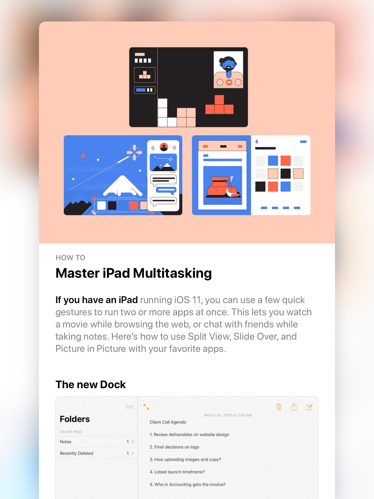
And yet, here is Apple’s App Store, presenting new, original illustrations several times a week. Of course, not everything shown is bespoke. For some recurring editorial features they use wallpaper-like designs made from app icons; other stories borrow graphics right from the apps themselves; and sometimes the art directors will sneak in a graphic that they might have used in the past.
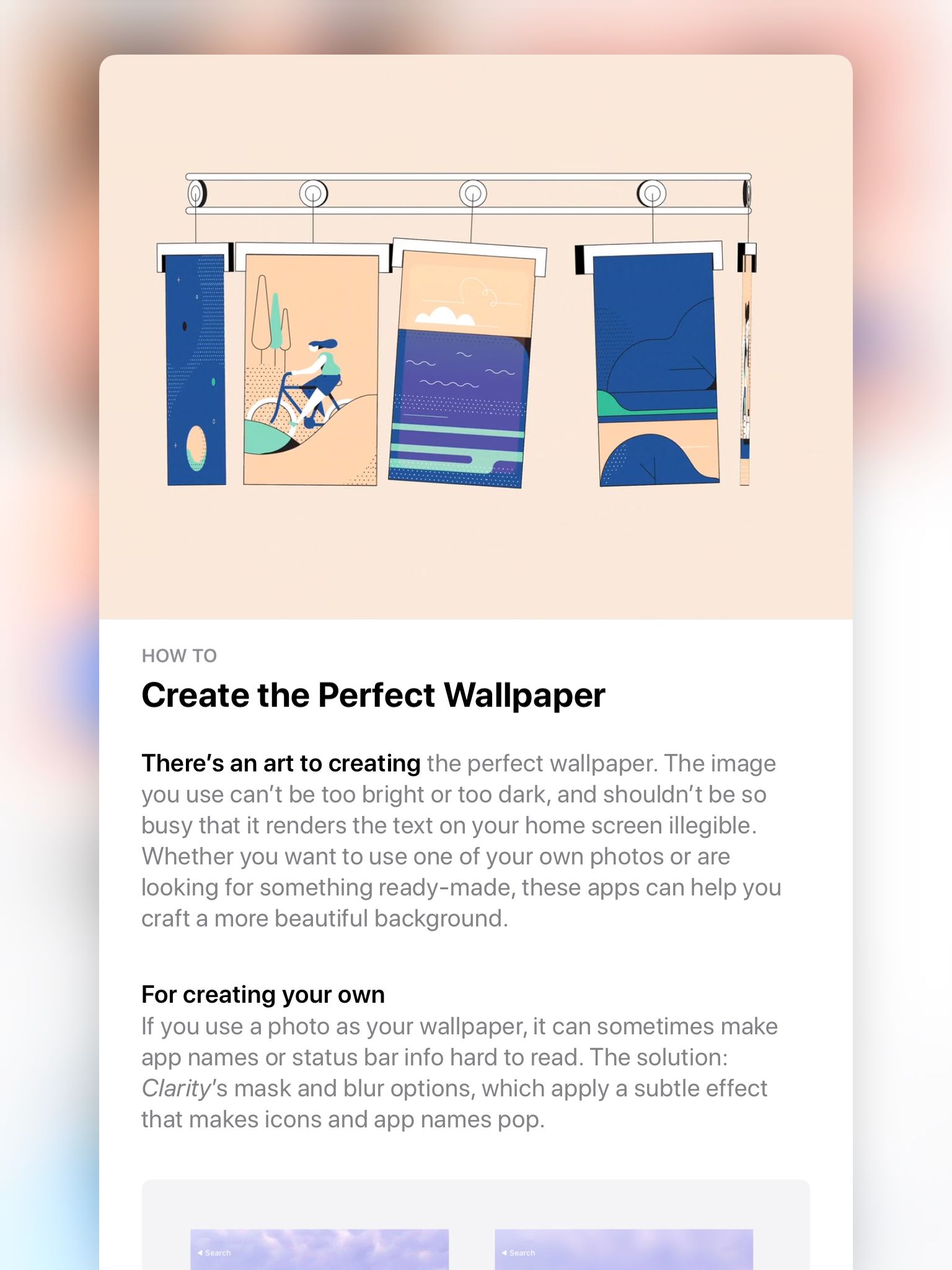
I know this because for four or five months now I’ve been coming back to the App Store at least once a week, taking screen grabs of the original art and posting them to this Pinterest board. Not all of the art I’ve captured has been truly great, but what I’ve seen again and again is an awareness of the unique power of an editorially-driven digital product and, I think, a sense of the opportunity to do things that, quite frankly, no other company is willing to do. So far I’ve taken nearly a hundred screen grabs. Here are a few of my favorites.
The sheer variety of styles here is thrilling and as accurate a reflection as any of the app ecosystem. In a sense, this art directorial strategy is a direct, logical extension of the massive diversity of apps available in Apple’s catalog.
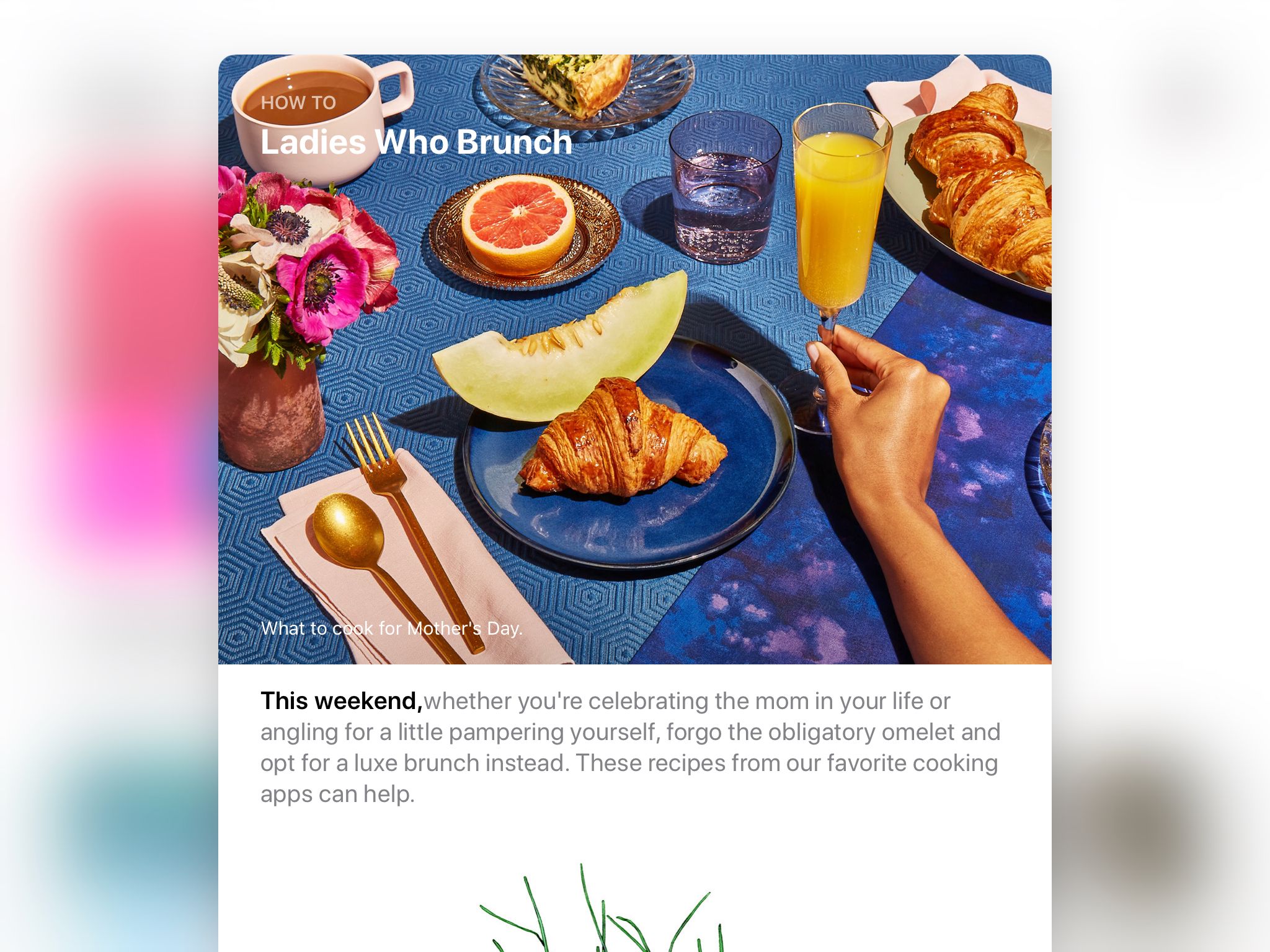
Most of the work is drawn or painted, it’s true, but Apple does also commission photography on occasion, as in this delightfully retro image promoting Mother’s Day-related apps.
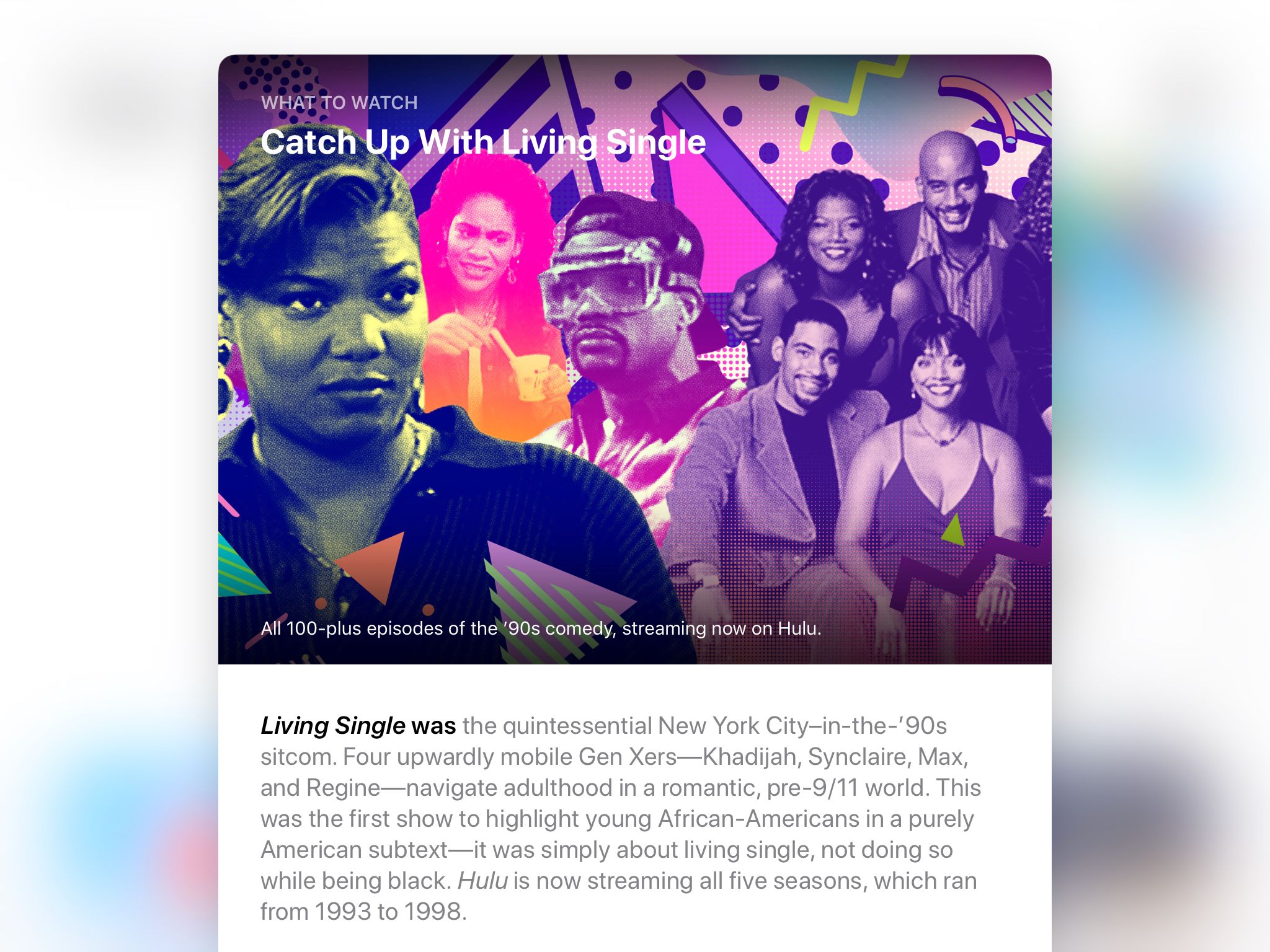
And there’s a collage here and there, too, as in this not completely successful example that nevertheless gets points for eclecticism and for promoting “Living Single.”
I’ve only captured static images but some illustrations are in fact animated. Here are two examples of what appeared in the App Store as continuously looped art. In the first, the hanging posters bump one another as if swaying on a line.
And in this second example, the details of each screen continually blink, spin, shift, resize, etc.
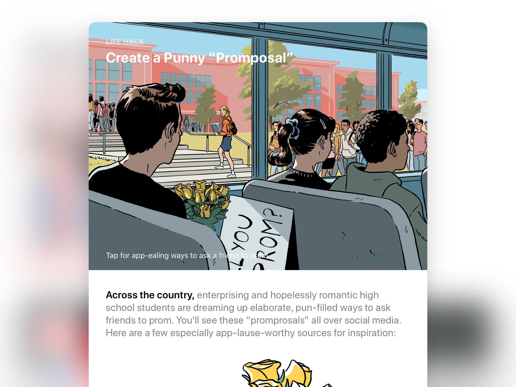
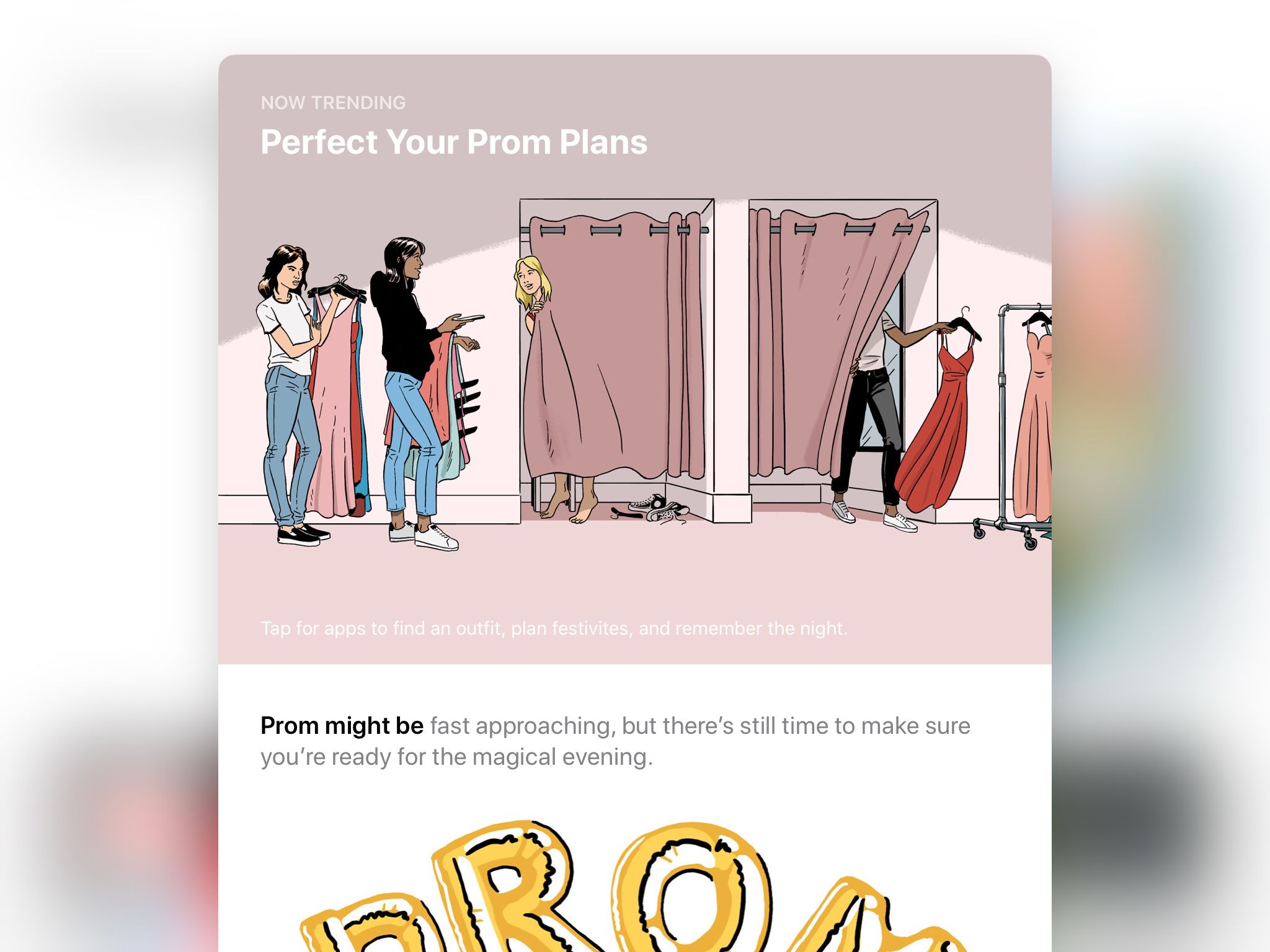
As time has gone on, the ambition of the art direction has seemed to grow, too. I’ve seen a few instances where multiple editorial stories have been tied together by a single theme—and illustrated either in the same style or entirely by the same artist. These next four form a terrific series on the theme of high school proms.
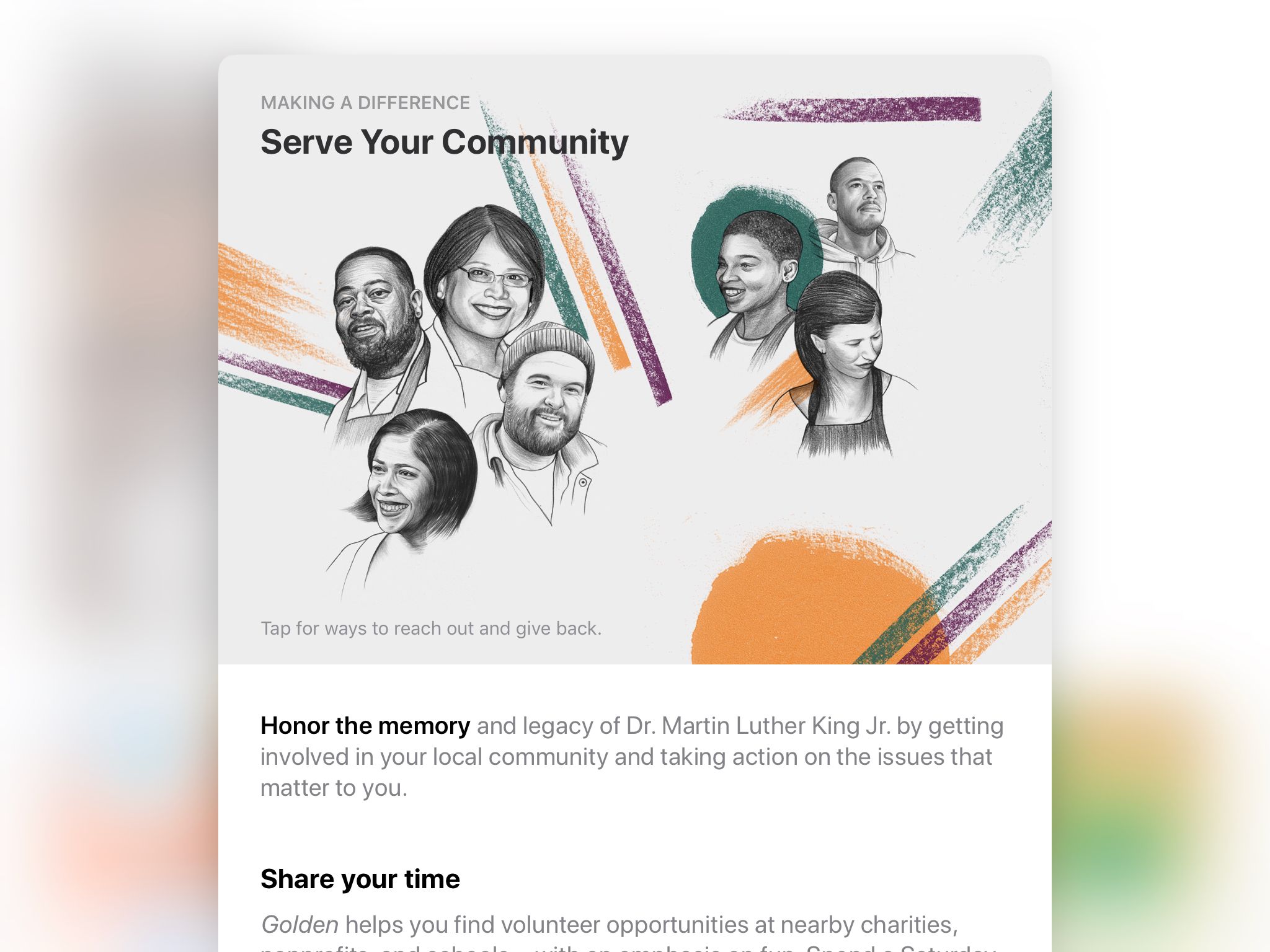
Finally, it’s worth noting that these screen grabs were all taken on my iPad in landscape mode, showing the images wider than they would appear on an iPhone. In fact, in almost all of the pictures, the “highest value information” appears on the left side of the image. This allows them to be cropped on the right side when they’re displayed in narrower viewports. The story below is a good example: on the iPhone, you only see four faces but in landscape view on the iPad you see a second set of three additional faces. It’s interesting to keep this in mind when looking at all of the art, as the illustrators were surely instructed to compose their images accordingly.
I can’t emphasize enough how truly unusual it is for a tech company to invest in editorial design at this scale. With this App Store redesign, Apple has created a truly compelling alternative to what I described in January as the monoculture of visual expression within product design, a tendency to avoid exploring the rich range of possibilities where design meets illustration. Apple shows that when a company is open to the potential there, when it’s willing to combine art and science, great things can come into focus.
See my full collection of screen grabs at pinterest.com.