is a blog about design, technology and culture written by Khoi Vinh, and has been more or less continuously published since December 2000 in New York City. Khoi is currently Principal Designer at Adobe. Previously, Khoi was co-founder and CEO of Mixel (acquired in 2013), Design Director of The New York Times Online, and co-founder of the design studio Behavior, LLC. He is the author of “How They Got There: Interviews with Digital Designers About Their Careers”and “Ordering Disorder: Grid Principles for Web Design,” and was named one of Fast Company’s “fifty most influential designers in America.” Khoi lives in Crown Heights, Brooklyn with his wife and three children.
To our own detriment, designers prefer to think about “how” much more than “why.” This was demonstrated in my blog post from earlier this week but here’s another good example—or perhaps it would be more appropriate to call it a bad example. You may or may not find it disturbing.
Last month the widely respected, “evidence-based user experience research, training, and consulting” firm Nielsen Norman Group published a fascinating report on best practices to consider when designing websites for children. Its author, Feifei Liu, summarizes a study that the firm did in which they interviewed kids aged three to twelve to learn how they behaved performing a series of interactive tasks. Liu writes:
Our research with kids on the web and mobile devices shows that the physical development of motor skills and motor coordination influences children’s ability to interact with devices.
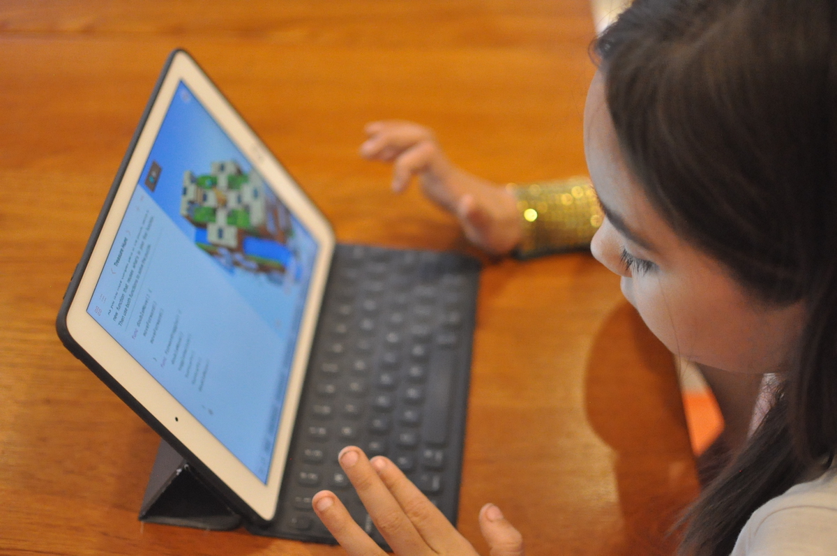
Roughly, children under five have limited motor abilities and require very simple physical interactions on touchscreens. For kids between six and eight years old, their developing motor skills allow them to perform simple interaction gestures on laptops like clicking and simple keyboard usage. Whereas starting around the age of nine years, more advanced interaction techniques become possible. Around the age of eleven years, children become able to use the same range of physical interactions as adult users. (Though obviously, their mental development stage and educational level still dictate simpler overall user interfaces for eleven-year olds than for adults.)
That’s the executive summary, leading off the top of the report. The rest of it digs into those findings, detailing a series of recommendations for designers creating websites for kids. Some of these include: emphasizing swiping, tapping, and dragging on touchscreens; avoiding interactions that require dragging, scrolling, and clicking small objects; and generally accommodating the limited motor-coordination facility of this audience.
Useful stuff. I don’t dispute the findings at all. But it’s disturbing that the report focuses exclusively on usability recommendations, on the executional aspect of creating digital products for kids. There’s not a single line, much less a section, that cares to examine how design impacts the well-being of children.
This seems particularly egregious when one considers current societal discussions about how digital technology impacts younger users. Recent studies point out that mobile device usage among young children has skyrocketed to an average of as much as two hours per day, up from as little as just five minutes a day at the beginning of this decade. Meanwhile, the American Academy of Pediatrics revised their recommendations for device usage amongst children this year to just one hour per day, arguing that “Too much media use can mean that children don’t have enough time during the day to play, study, talk, or sleep.” The non-profit group Common Sense Media found that, contrary to advice from pediatricians, much of this time spent in front of screens is happening just before bedtime, and children in lower-income families are much more likely to spend more time on devices than those from more affluent families. And a lot of attention has been paid to San Diego State University professor of psychology Jean M. Twenge’s studies of the first generation of teenagers to grow up with mobile technology, and the radical and often worrying shifts in behavior that smartphones have engendered in them.
In fairness, none of this is incontrovertible proof that screen usage is harmful to children, but it’s also safe to say that there’s reasonable cause for concern. At the very least thoughtfulness is warranted in the design of digital products for this audience.
It’s also worth noting that Nielsen Norman Group is famously focused on the narrow subject of how to make digital experiences as usable as possible; their expertise on usability is widely recognized and rightfully acclaimed. The larger question of whether a design solution is in the best interests of its users has always been purposefully beyond their scope. But pretending that there is no link between the usability of an experience and the long-term well-being of its users is, frankly, a specious position at best. Particularly for this target group of users.
Habits are formed around the usability of a product; if an app or website makes it easy to complete a task, users are likely to do it more often than not. Usability advocates often treat this as an inherently good quality; by and large every business wants their products to be easier rather than more difficult to use. But as the aforementioned research suggests, it’s become clear that guilelessly encouraging longer, more frequent sessions isn’t necessarily better for kids.
I would contend that it’s really no longer useful—or responsible—to think of the work we as designers do in such narrow terms. You don’t even need much imagination to expand the definition of “usability” in this way. Beyond just the study of practices that make digital products easier to use, it’s reasonable to think of usability as a field that considers what’s in the best interests of the user. Clearly, there are best practices to be learned when it comes to limiting children’s time, signaling danger to parents, discouraging successive sessions over short spans, and even for encouraging physical movement. That all sounds like usability to me.
We’re moving past the stage in the evolution of our craft when we can safely consider its practice to be neutral, to be without inherent virtue or without inherent vice. At some point, making it easier and easier to pull the handle on a slot machine reflects on the intentions of the designer of that experience. If design is going to fulfill the potential we practitioners have routinely claimed for years—that it’s a transformative force that improves people’s lives—we have to own up to how it’s used.