is a blog about design, technology and culture written by Khoi Vinh, and has been more or less continuously published since December 2000 in New York City. Khoi is currently Principal Designer at Adobe. Previously, Khoi was co-founder and CEO of Mixel (acquired in 2013), Design Director of The New York Times Online, and co-founder of the design studio Behavior, LLC. He is the author of “How They Got There: Interviews with Digital Designers About Their Careers”and “Ordering Disorder: Grid Principles for Web Design,” and was named one of Fast Company’s “fifty most influential designers in America.” Khoi lives in Crown Heights, Brooklyn with his wife and three children.
When designers ride public transportation, they can’t help but notice the signage—especially if it’s confusing. Most of us just tsk-tsk to ourselves or complain vainly to uncomprehending companions. But New York-based designer Adam Fisher-Cox actually does something about it: he undertakes self-initiated projects to propose redesigns and shares them with the world.
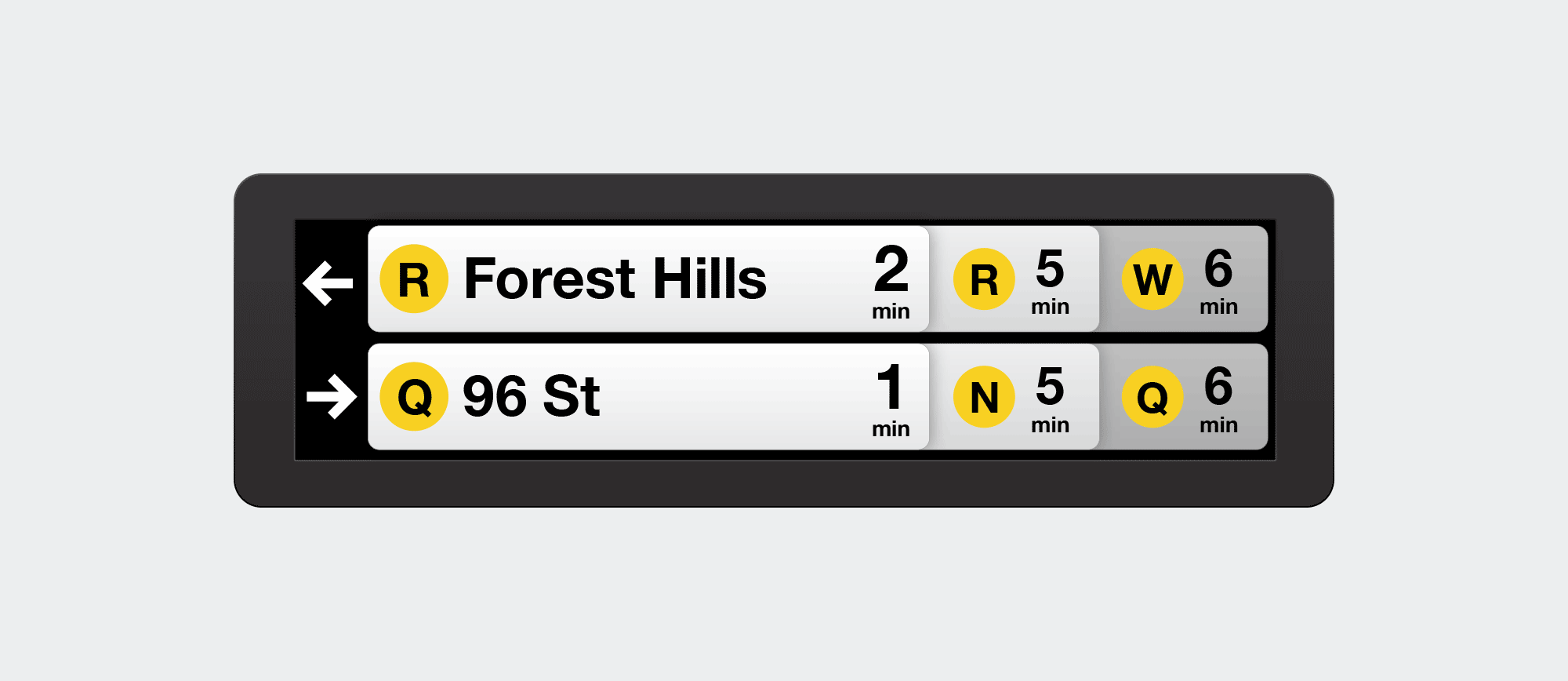
Here’s one good example: several years ago, the Metropolitan Transit Authority, which operates New York City’s subway, installed countdown clocks throughout the system. These LCD display boards let riders see at a glance just how much time remains before the next train arrives, finally remedying a perennial source of bewilderment and pain that has plagued generations of subway riders. Suddenly you could tell at a glance whether you’d be better off staying put and waiting, walking to another platform to catch an alternate route, or even exiting the station altogether and hailing a cab—and usually the information is actually even accurate. For those who live in cities where this kind of technology is already common, you have to understand: this subway system is over a hundred years old.
Still, despite providing long needed information to riders, the countdown clocks are hardly a paragon of information design. They provide only room enough to show two pending train arrivals at a time, which is too slow a pace in some stations where the train you’re actually waiting for may be third or even fourth behind the next one to arrive. Some countdown clocks also need to show countdowns for multiple trains arriving in two different directions at once, and so waiting for the information you need to be displayed can be tediously time consuming.
Fisher-Cox proposed a redesign that uses overlapping cards to indicate the next several trains arriving in two directions. It’s a whipsmart solution. You can read about the thinking that went into it in this blog post he wrote.
Fisher-Cox also did something similar for the wayfinding system for the AirTrain at JFK airport, this time with some real world impact.
This one immediately caught my attention not just because the work is very good, but because I happen to use that particular light rail system all the time. JFK is the closest airport to me, and I prefer to get there by taking the subway to Howard Beach, Queens, where I transfer to the AirTrain to get to my departure terminal. The whole journey takes not much longer than traveling by car and costs just US$7.75, but the real benefit is you’re not burning fossil fuels along the way.
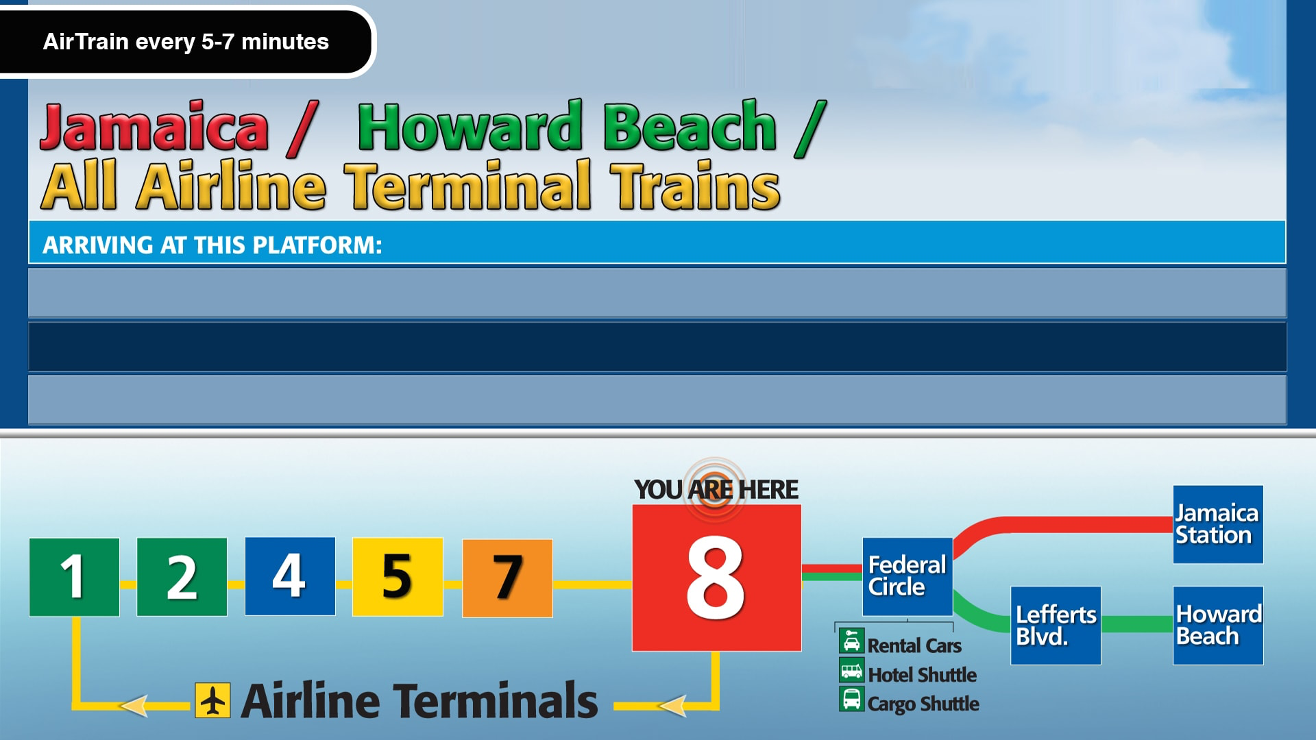
The AirTrain itself is much more modern and reliable than the subway, but its wayfinding signage is plagued by mediocre typography, questionable aesthetic choices, and less than optimal labeling and directional instructions. I mean, take a look.
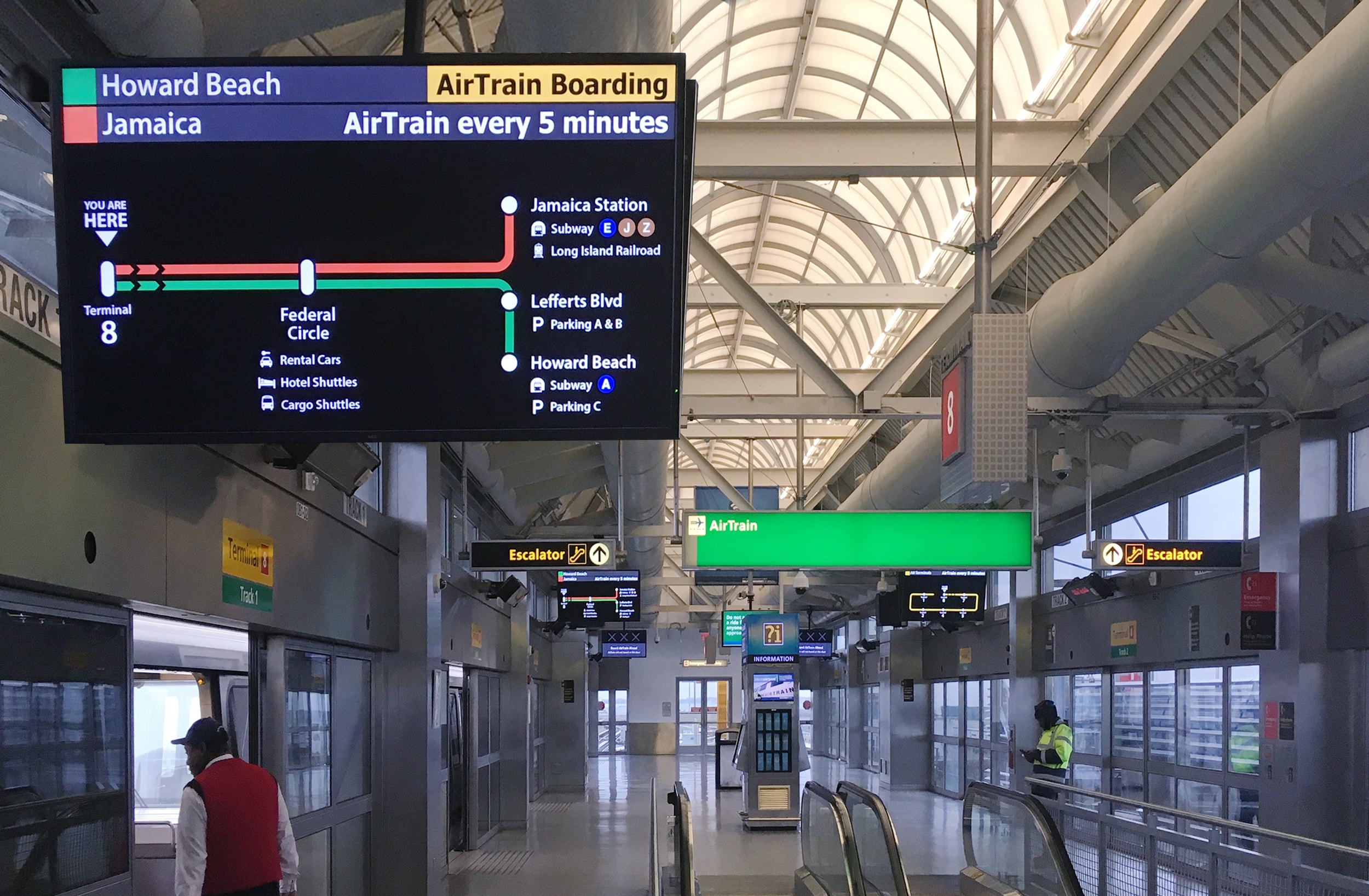
After riding it himself for the first time, Fisher-Cox wrote this extensive critique and mocked up some possible solutions. This led to him actually getting hired by the Port Authority of New York and New Jersey, the agency responsible for the airports and their attendant light railway lines, to create a pilot solution for the real thing.
Fisher-Cox’s resulting redesign is much less ornamental, much more legible, and significantly easier to understand, even at first glance. His case study lays it out in detail.
Additionally, Fisher-Cox wrote this revealing blog post in which he walks readers through the reasoning behind his solution. It’s an invaluable lesson in how to design wayfinding, but also in fundamental principles of usability. Read it at adamfishercox.com. Then maybe go out and redesign the public transportation signage in your city.