is a blog about design, technology and culture written by Khoi Vinh, and has been more or less continuously published since December 2000 in New York City. Khoi is currently Principal Designer at Adobe. Previously, Khoi was co-founder and CEO of Mixel (acquired in 2013), Design Director of The New York Times Online, and co-founder of the design studio Behavior, LLC. He is the author of “How They Got There: Interviews with Digital Designers About Their Careers”and “Ordering Disorder: Grid Principles for Web Design,” and was named one of Fast Company’s “fifty most influential designers in America.” Khoi lives in Crown Heights, Brooklyn with his wife and three children.
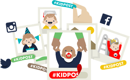
Credit where credit is due: the beautiful illustrations for Kidpost, which we launched in public beta yesterday, were created for us by the phenomenal Keenan Cummings. We were so lucky to be able to get some of his time to produce these. Not only does he keep busy as a designer and illustrator, he’s been bi-coastal since his company was acquired by Yahoo earlier this year. Keenan sent me many of the in-progress sketches for these illustrations while commuting across thousands of miles. See more of his work at keenancummings.com.
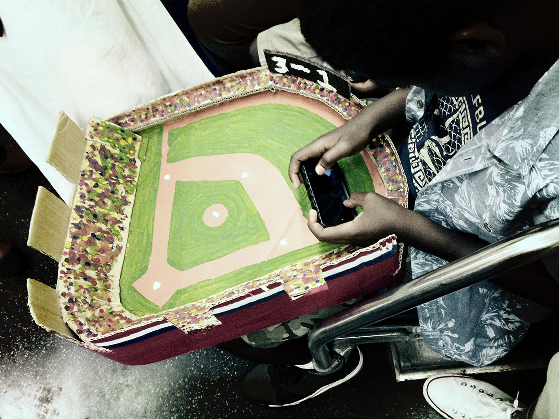
This kid and his baseball stadium made from cardboard—constructed, presumably, for a school project—was the best thing I’ve seen on the subway all week.
The alternate title of this heartfelt essay from Dustin Rowles, founder of Pajiba, is “Why So Many Film Critics Continue to Lose Their Jobs.” It talks about the vagaries of a dedication to film criticism in the face of the form’s inherently terrible economics.
While the art of film criticism is still very much appreciated, and on some outlets such as The Dissolve, appreciated enough presumably to turn a profit, for many of us, film reviews are a money loser. Reviews of those smaller, independent and art films that no one watches are particularly money-losers, even though they need reviews the most because, in many cases, it’s the most promotion they will get.
It’s one of the ironies of the Internet that it has transformed certain flavors of content—like film criticism—such that they are more plentiful than ever, while also making them less viable than ever, and maybe even less meaningful than ever. This reality is particularly depressing with film criticism because I enjoy it so much. If movies are a reflection of ourselves, film criticism lets us perceive those reflections more deeply. Great writing about films is like a seamless blend of pastime and education; you can luxuriate in it as it sends you off into countless new directions.
I’m happy to announce that starting today Kidpost is in public beta! You can head over to kidpost.net right now and start using it right away. During this period, Kidpost is entirely free; when we launch we’ll be charging a nominal fee, but early adopters will get a discount.
Here’s a quick refresher on what Kidpost is: it’s a simple service for parents that emails the kid-related stuff you post to Facebook and Instagram out to your friends and family.
Why would you use this? Let’s say you have technologically-challenged grandparents, or a sibling or friend who conspicuously abstains from Facebook usage, or an aunt or uncle who just forgets to check. These people mean a lot to you, and your kids mean a lot to them. But you don’t want to make them sign up for a new account somewhere, or download and install a new app, or check yet another web site in order to see the latest goings on with your kids.
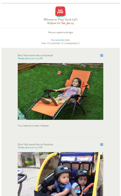
Kidpost keeps your loved ones connected in a super-lightweight, elegant fashion. All you have to do, as the parent, is add the hashtag #kidpost to the photos, videos or updates that you post, and that content is automagically bundled into a daily email that gets sent to a private subscriber list that you define. That’s it. The email looks like this:
Right now Kidpost works with Facebook and Instagram (we’ll be adding these services soon). You can connect more than one account for each of those services to it, so both parents can get all of their kid-related stuff into one Kidpost daily email. As we’ve been building the service, it’s actually worked great for me—I often miss the photos of my kids that my wife posts, but now they get sent to me automatically, once a day. Even better, our friends and family have gotten hooked on it; it’s the funnest email that most people will get all day.
We think you’ll feel the same way too, once you give it a try. We’ve worked hard to make Kidpost as easy and fun to use as possible, and we’re eager to start hearing feedback from real users. Head over to kidpost.net and sign up for it now.
In keeping with the newspaper industry’s fashion for value-add subscription offerings (which I wrote about last month), The Times of London commissioned this short film based on their nearly ubiquitous typeface Times New Roman. It’s part of a video series that’s among the exclusive benefits offered to the paper’s subscribers, though apparently they’ve made it available publicly.
It’s curious to me that a general interest newspaper feels that its signature typeface resonates with readers enough to create this video, but I can’t complain about the contribution to design awareness that the production of such a film makes. What I can argue with, though, is the limitless population of white people interviewed in typography-centric works like this one and Gary Hustwit’s famous, full-length and otherwise entertaining “Helvetica: A Documentary Film.”
These projects are generally historical and those histories almost exclusively involve white people, it’s true, but it’s still unsettling to me to see our industry consistently portrayed so homogeneously—and when you put things into moving pictures, such things become more striking than ever. I’m not saying that people of other races should be inserted into these films in order to portray false histories, or merely for political correcteness. Rather, I’m saying that there are a multitude of racial dimensions that these movies are conveniently ignoring: how these fonts inspired or were inspired by type designers working in non-Roman character sets; how these fonts were embraced, supported, even corrupted by people of other cultures; how non-white designers use these fonts today.
Picking on this particular video is a bit unfair because, like I said, in its own way it does do a service. We all want to see more movies like this about design. We also all want more visibility for more designers in the public eye. And we all want to see design become a bigger part of our popular culture. I just think that we underestimate how much of this notion of design that we’re rooting for is not representative of all the people involved in it.
On his HBO show this past Sunday night, John Oliver let loose this amazing, hilarious, inspired tirade against the FCC’s planned changes to Internet regulation. It runs a bit longer than most TV clips, but it’s highly entertaining and worth every second.
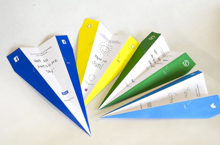
The team behind the surprisingly popular “Not Available on the App Store” stickers, who are ostensibly studying digital media and interaction at Hyper Island, seem to have a knack for playful ideas that emphasize getting offline.
Their newest project is Social Planes and it’s a very simple concept: pre-printed templates for paper airplanes that you can customize and throw at random people whose days you’d like to brighten. The video tells the story nicely, though presumably it’s also an accurate representation of the reactions they actually got—the idea is almost too cute by half, and in the real world I can imagine it inspiring as many awkward (or worse) situations as friendly interactions. Still, if it puts a smile on someone’s face, that’s something.
Even though I stopped watching “The Simpsons” a long time ago, I’m glad it’s still turning out new episodes—it’s become sort of like background music that I don’t pay much attention to, but that I’ll miss the moment it stops. The producers seem to be trying to keep it lively too, by inviting guest animators to contribute wildly unexpected versions of the show’s signature opening “couch gag.”
A few months ago, Sylvain Chomet, who directed the critically-praised animated film “The Triplets of Belleville,” turned in this hilariously Gallic take on the show:
The amazing cinematographer Gordon Willis passed away two weeks ago. Willis was a monumental talent and one of my personal heroes. I deeply admired the distinctiveness of his vision—and the fact that many of the movies he shot number among my favorites of all time. A brief list includes “The Landlord,” “Klute,” “All the President’s Men,” “The Godfather” trilogy and several of Woody Allen’s classics from the 1970s, including the breathtakingly beautiful “Manhattan,” which I wrote about in this post from 2007.
For those unfamiliar with Willis and his work, film critic A.O. Scott provides an overview in this video eulogy from The New York Times.
Last year, Willis recorded an interview with the film series Craft Truck in which he discussed his work and ideas. In this short excerpt from the interview, he talks about the importance of simplicity in cinematography—and storytelling. (The full interview is here.)
Designer Jay Machalani has a slew of ideas on how to improve iOS, but the best of them is probably what he calls “iOS Blocks.” They’re essentially a card-like mode that allow users to peek into an app for a high-level reading of its most relevant information. This concept video makes a very compelling case for them.
Read more—lots more, as Machalani writes about this and his other ideas at length—over at his blog post.