is a blog about design, technology and culture written by Khoi Vinh, and has been more or less continuously published since December 2000 in New York City. Khoi is currently Principal Designer at Adobe. Previously, Khoi was co-founder and CEO of Mixel (acquired in 2013), Design Director of The New York Times Online, and co-founder of the design studio Behavior, LLC. He is the author of “How They Got There: Interviews with Digital Designers About Their Careers”and “Ordering Disorder: Grid Principles for Web Design,” and was named one of Fast Company’s “fifty most influential designers in America.” Khoi lives in Crown Heights, Brooklyn with his wife and three children.
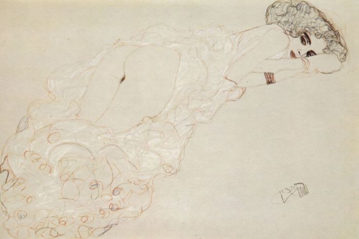
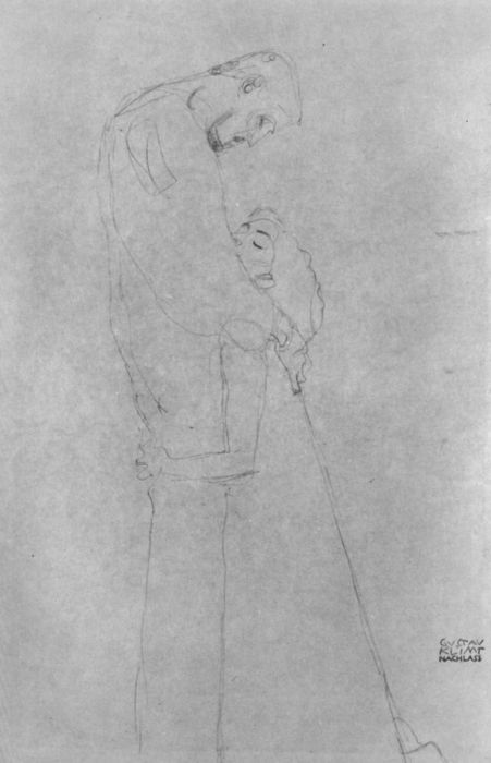
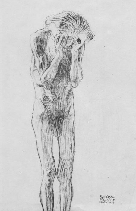
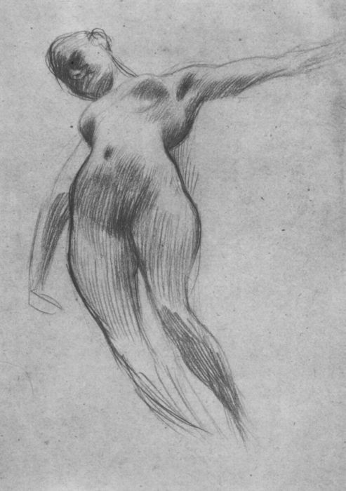
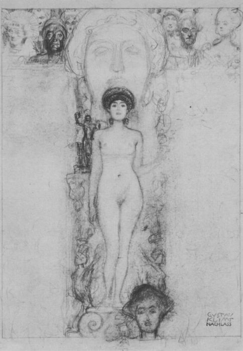
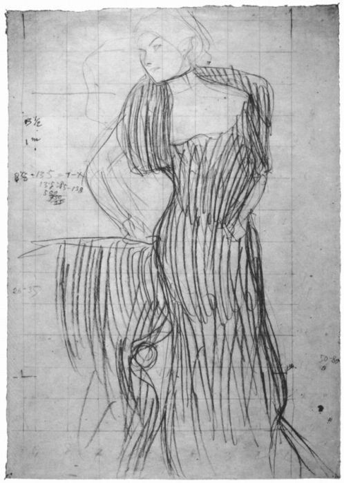
A wonderful cache of over one hundred drawings from Austrian painter Gustav Klimt. His confident, stylized, symbolist renderings of the human body are on full display here. Some of the drawings are more preliminary than others, but they’re almost all beautiful and some of them are quite amazing.
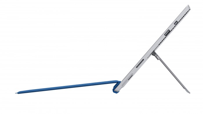
Like me, you may have been dismissive of Microsoft’s new Surface Pro 3, which has a bigger, er, surface and is thinner than its predecessor. On specs alone, it sounds somewhat appealing, but the reality is that it sticks to Microsoft’s preferred path of hybridizing tablet and laptop features into one head-scratching form factor. Early reviews seem tepid at best.
What I find interesting though is that Microsoft seems to be making a concerted effort to engage artists and illustrators in its Surface Pro 3 outreach efforts. I’ve seen at least two write-ups of the device on sites that don’t customarily review hardware at all, like this one at Penny Arcade and this one at Cartoon Brew. This can’t be a coincidence; there’s a deliberate marketing strategy behind these articles.
The idea of a tablet/laptop that’s optimized for the use cases of artists is an interesting one. The pro creatives market has traditionally been somewhat niche in nature and somewhat neglected by large hardware companies. This has been especially true over the past ten years for Apple customers; that company has been practically flagrant in its willingness to shunt aside professional users. It may say something about Microsoft’s market status that it’s turning its attention here, now. But if they’re serious about building out their Surface Pro line into a true digital version of a sketchbook or portable easel, that is something to take note of.
Note: After receiving an email from the editor of Cartoon Brew, I should clarify that I did not intend to suggest that either their article or Penny Arcade’s article (or either site’s interest in the Surface Pro 3, for that matter) were somehow not genuine. What I meant was that it’s my belief that Microsoft is deliberately and specifically reaching out to sites like these in order to raise awareness of the device.
For my money, Marc Edwards from Bjango is one of the best designers working today. His in-depth articles on technique are revealing and insightful; I’ve learned a ton from them. He’s also responsible for the incredibly useful Skala Preview, a highly polished utility that lets designers preview their designs on mobile devices in real time.
Now Edwards is turning the Skala brand into something bigger with the simply named Skala, a forthcoming Mac app that promises to be “a precise user interface and icon design tool with phenomenal rendering quality and a unique blend of vector, bitmap and 3D abilities.” I’m pretty excited about this; if it lives up to its promise, it will serve as further evidence that, after a dark age for user interface design tool options, we are emerging into a much more robust era with real competition and richer selection.
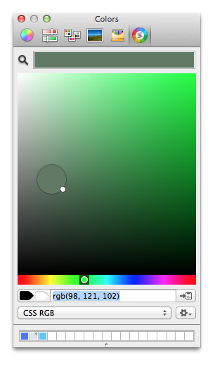
Skala has yet to be publicly revealed, but Edwards has released one small component as a preview: Skala Color. It’s a plugin for the native OS X color picker that offers an improved set of color selection tools that cover “everything you’re likely to need for Web, iOS, Android, and OS X development—Hex, CSS RGBA, CSS HSLA, UIColor, NSColor and more. It also automatically recognizes colors copied to the clipboard, presenting them as a swatch that can be applied with a single click.” It can be downloaded for free right now.
I’ve been using Skala Color for a few weeks and I can confirm: it’s a big improvement over the stock color picker provided by the operating system, which has grown quite long in the tooth. Seeing that hoary interface by Skala Color reminds me of how woeful OS X’s stock type palette is, too; that thing hasn’t been meaningfully improved practically since Mac OS X debuted. Edwards says that for Skala he and his team are building many of its support systems themselves, which presumably led to Skala Color. So perhaps there’s a Skala Type coming too.
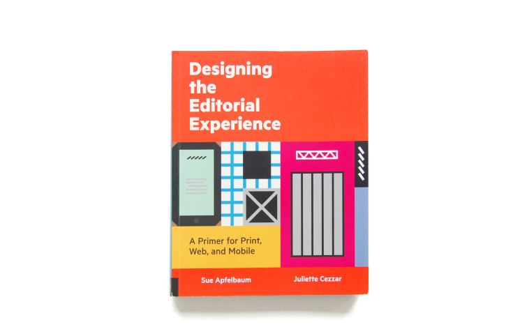
Sue Apfelbaum and Juliette Cezzar’s new book “Designing the Editorial Experience: A Primer for Print, Web and Mobile” is an ambitious survey of the converging disciplines of publication design and digital product design. It interviews many of the designers, technologists, writers and editors crafting new, leading edge reading experiences that will set the pace for the next decade of written text—both at long-standing institutions and new startups and publications.
Apfelbaum and Cezzar are both friends of mine (in fact, Sue and I are working on a different book together at the moment), so I asked them to talk to me a bit about their motivations and thinking.
What was the inspiration for this book?
Sue: I’ve been thinking a long time about how when the content and the voice and the visual elements of a publication seem to fit together seamlessly, it feels magical to me. Of course behind the scenes it’s quite the opposite. Creating great content and reading experiences over time is very hard to do well. Especially at a time when publishing models change so often—the hunger for breaking news and rich human-interest stories has always existed, but feeding it at the frequency that readers want and in all the ways they want it requires more and more work, with fewer and fewer available resources.
So for me, writing this book comes from both professional interest and journalistic curiosity. I’ve worked in print and online and been an avid reader of periodicals in all their shapes and media, and I’ve had so many questions I wanted to ask of the people who make this work that I finally got to ask.
Juliette: When Sue contacted me and asked if I’d like to work with her on a book on this subject, I was ecstatic about the idea. Good editorial design, like any other kind of good design, is situated in both form and content, and when we talk about publications that evolve over time, the relationship between designer and editor is everything. So it just made so much sense for a book like this to be co-written by an editor and a designer.
You two had experienced some of that working together previously, right?
Sue: Yes, we had worked together on a print magazine called RES, in 2005-2006, which was such a great experience. Some editors and designers have antagonistic relationships and assume that they’re working on opposite sides of the fence. It’s a big misconception to assume that “designers don’t read” or care about quality content. For us it was a true collaboration. She more than respected the content—she helped to make it better.
Juliette: Also, we worked together at a time when the conversation of the day was all about print being dead, about magazines and newspapers being done, over – killed by the internet. But in the interim we spoke often of the flourishing of all these new things cropping up around us, and about how our own reading habits had changed. We were reading more than ever, and we knew all these smart people who cared a lot more about the reader’s experience than about any kind of artificial “war” between print and digital.
That “war” narrative has been predominant for some time. Was it something that you were specifically looking to debunk?
Juliette: Yes, for sure. As a teacher especially, I’ve long felt that students need to see more examples of people who are genuinely trying to work out how to serve the content and the reader in the landscape we’re in right now. Often students feel like they need to make a false choice between digital and print media, or even worse, between “graphic design” and “interaction design.” They’re also subjected to a lot of nostalgia about the glory days of print. Meanwhile, more than half of what they see comes in through a smartphone, and the world they’re entering asks that they be able to think on their feet whether they’re talking about paper or screens or both.
What’s unique about writing this book today, in 2014, given that the changes in publishing have been ongoing for so long now?
Sue: It’s such an interesting time to reflect on where we’re at. It’s been several years since the iPad debuted, so we’re past the initial experimentation phase, yet still figuring out how users want to interact with it. Who knows what will change things next: net neutrality rules, multitasking on the iPad, something else we haven’t dreamed up. We’re not reinventing the wheel from scratch every time, so what are those principles that hold true, and where is reinvention necessary? That’s what we wanted to explore.
What makes this work different from publication design in print, if it’s different at all?
Juliette: Publication design has been user experience design all along. A well-designed newspaper or magazine considers the reader at every turn, and gives form to either the voice of the publication or its components or its authors in a way that you always know what you’re looking at in relationship to everything else.
What’s changed is that newer forms of media, such as the smartphone, limit some of those differences due to their scale; some forms of distribution, such as Twitter or RSS readers, also limit visual expression. You have to have a really strong identity and content strategy to have a publication degrade gracefully as it moves across all these different media.
So how is it different from what we’ve been calling “interaction” or “user experience” design?
Sue: The way we look at it, editorial experience design means considering how readers are engaging with your content, wherever, whenever, and however they’re reading it.
Juliette: Right. Some of the publications we feature in the book, such as Gather and Apartamento, don’t have a digital expression at all, but would never have existed in a pre-digital era. New ways to gather and distribute content affects print as well. It’s not just a matter of “oh crap, now we have to cram this thing onto an iPad.”
And not all of the people we interviewed are creating publications—David Jacobs is busy creating platforms, Mandy Brown has been working on creating both platforms and tools, and Paul Ford has been crafting the language that we need to talk about these things. What they all have in common, however, is that they care about content, and they care about readers. The work they’re doing is in part what will make the next ten years the most exciting and rewarding time for all of us.
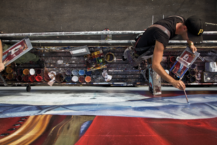
Sometimes a unique subject becomes the inspiration for two different movies within a short time frame, e.g., “Armageddon” and “Deep Impact.” This phenomenon is known as twin films, and it’s usually something that happens among rival Hollywood studios. But apparently independent film is susceptible to it as well.
A few weeks ago I posted about “Gentlemen of Letters,” a documentary about the tradition of hand-painted lettering and signs in Dublin, Ireland. Today I was made aware of “Sign Painters: The Movie,” a similar documentary about the history and current state of hand-painted signs in America. This one was directed by Faythe Levine and Sam Macon, and bills itself as “the first anecdotal history of the craft,” and “features the stories of more than two dozen sign painters working in cities throughout the United States.”
Perhaps fittingly given its American focus, “Sign Painters: The Movie” also seems to be more strident about sign painting as an art form or a celebration of individualism, where “Gentlemen of Letters” emphasized the craft’s local tradition and history. The latter, again fittingly, also seems to be a bit savvier about marketing and merchandising. It’s available for purchase via video-on-demand right now in standard and premium editions, with added footage for those who want to pay more; there’s even a companion book to the movie on offer as well. You can find out more at Signpaintersfilm.com
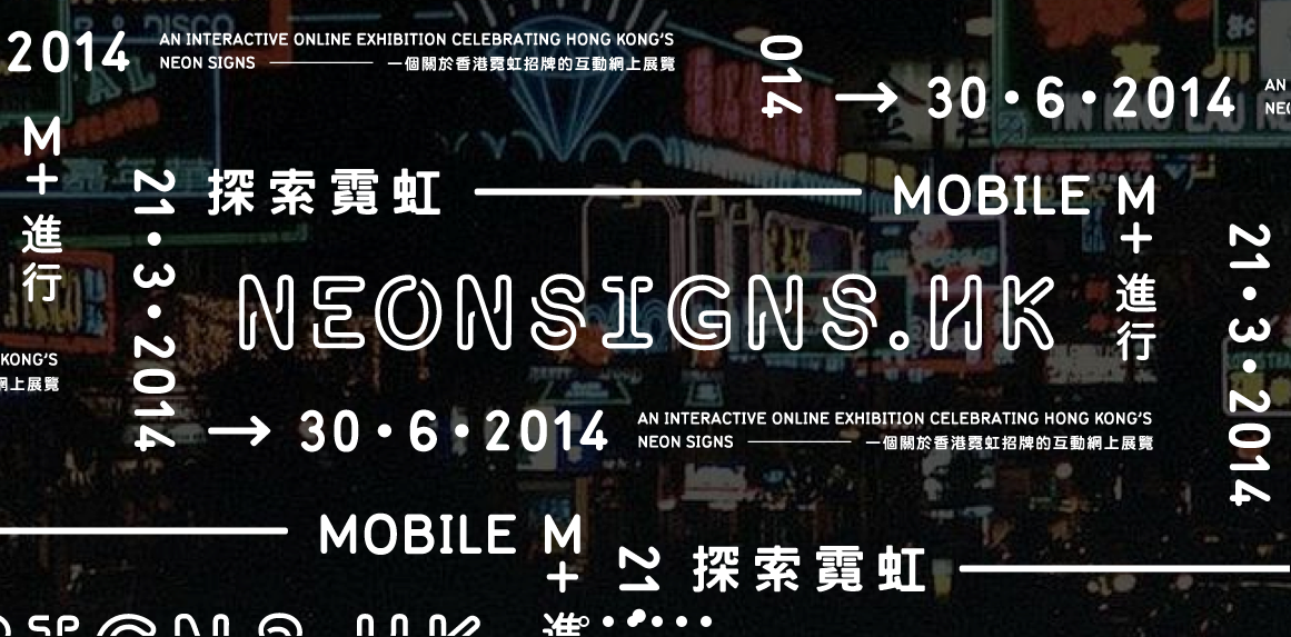
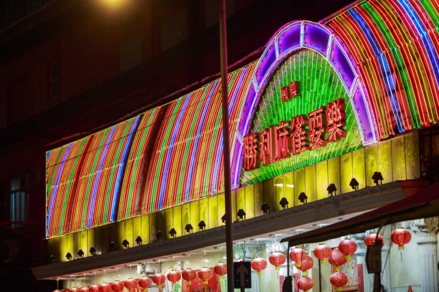
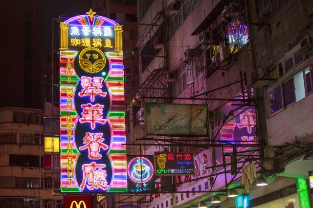
This well-designed extensive online exhibition gives Hong Kong’s distinctive neon signs their due. It features a wealth of background on the form, including a crowdsourced catalog of over 2,300 photos of neon signs, a map of neon signs documented throughout Hong Kong and Kowloon, a gallery of the area’s famous neon signs that have been lost to history, interviews, audio walks, documentaries and more. There’s enlugh much good stuff here to preoccupy even those who didn’t have a prior interest in the subject matter. Anyone with an appreciation for urban scenery could lose an afternoon poring through photos of breathtakingly elaborate or peculiarly beautiful signage like these:
My favorite part is the nine-minute video in which famed cinematographer Christopher Doyle talks romantically about his experiences filming in Hong Kong’s neon-rich visual spaces. Doyle shot several key films for director Wong Kar-wai including “As Tears Go By,” “Fallen Angels” and “Chungking Express,” which are in their way portraits of the city and its electric nighttime landscape. Those movies are practically iconic now in that they present a fin de siècle vision of Hong Kong as kind of visually lyrical fever dream—that, and the fact that they’re fantastic narrative works, too. I highly recommend them to anyone who hasn’t seen them.
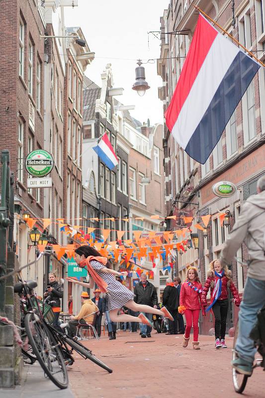
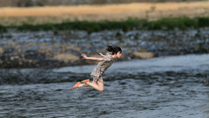
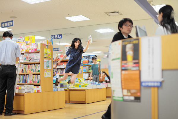
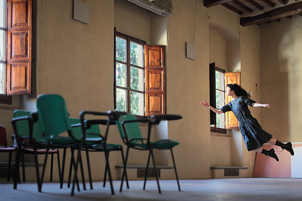
Japanese photographer Natsumi Hayashi takes photographs of herself “levitating.” Apparently, she simply leaps in place, and through a combination of graceful posing and expert calibration of her camera’s aperture and shutter speed, achieves a very convincing, thoroughly charming effect. She posts new shots on an ongoing basis at yowayowacamera.com.
This is not design- or technology-related, but what the heck. Jessica Shyba takes photos of her toddler and their adopted rescue puppy napping together; she posts them to her Instagram account.
In the 5 May issue of The New Yorker, Patrick Radden Keefe delivered this extensive account of the lengthy pursuit and eventual capture of notorious Mexican drug cartel leader Joaquín Guzmán Loera, known by his nickname “El Chapo” or “shorty.”
The full 9,700-word article is incredibly gripping and full of so many thriller-esque details that it’s hard to decide which passages to quote here for readers to sample. There’s a dissection of Guzmán’s intricate, relay-based communication system, which involved multiple layers of messengers and subordinates manually re-typing text messages from celluar-based Blackberries into secure, wi-fi-only iPads to avoid wiretapping. There are examinations of how the Sinaloa cartel laundered its obscene wealth through hundreds of legitimate businesses and parlayed that money into a quasi-governmental status in certain regions of Mexico, where they came to provide many services that the national government did not. And there are chronicles of Guzmán’s many, many successful escapes from prisons and evasions of capture, for which he leveraged his perverse creativity for criminal enterprises.
The reaction from the audience was polite but hardly rapturous, which many in the design community have taken as a reminder of how obscure our professional passions really are. It’s a reasonable reaction; Carter is one of the most impressive figures in the design community, and if he can’t inspire an appreciation for type in an audience primed for new ideas in the way TED attendees are, that illuminates a harsh but valuable context. As much as we hoped the opposite could be true, it turns out working with fonts is not a road to rock stardom.