is a blog about design, technology and culture written by Khoi Vinh, and has been more or less continuously published since December 2000 in New York City. Khoi is currently Principal Designer at Adobe. Previously, Khoi was co-founder and CEO of Mixel (acquired in 2013), Design Director of The New York Times Online, and co-founder of the design studio Behavior, LLC. He is the author of “How They Got There: Interviews with Digital Designers About Their Careers”and “Ordering Disorder: Grid Principles for Web Design,” and was named one of Fast Company’s “fifty most influential designers in America.” Khoi lives in Crown Heights, Brooklyn with his wife and three children.
LogoLounge is a database of over 200,000 logos, amassed with the intention of creating “a more efficient way to find reference material for logos.” It’s exactly the kind of laudable idea that the Internet makes possible — in the analog age, even knowing what logos were out there was an impossibility.
But the fact that a connected network of logo designers makes such a thing possible doesn’t necessarily make it good. The site charges for both access to its searchable database and for the privilege of contributing to its catalog. It’s a policy that surely deters spam but that I would imagine inhibits comprehensiveness too. It’s also worryingly reminiscent of the pay-to-play tactics of the pre-Internet design community, when publishers would reap healthy profits from entry fees for design competitions that were little more than advertising opportunities for designers.
The LogoLounge team deserves credit for their ambition, anyway, as they apparently believe enough in their own authoritativeness to produce an annual logo trends report; the 2014 edition is now online. The reports seem to be largely subjective, though based on presumably careful review of the past year’s submissions by the site’s staff. Again, this is a laudable idea with a not entirely convincing execution. The trends identified in the reports are visual tropes that are not easily quantified; they’re all based on qualitative evaluations of their execution. More problematically, the specific examples presented as evidence in support of each trend are taken at face value, with little context. There’s no economic, geographic or semantic information, so that a mark created for a two-week festival has equal weight with a new logo created for a decades-old company.
Actually, it’s probably unfair to expect FiveThirtyEight-level insights into a discipline that is largely predicated on emotional criteria, and should probably remain so. The fact that LogoLounge is undertaking an effort to produce a more macro view of the art form deserves praise. The trends they identify may not be empirically factual, but they’re interesting at the very least, and should provide some meaningful fodder for designers looking to better understand the design landscape. A lot of what goes into designing logos is unstructured visual consumption, and LogoLounge seems to provide that.
(In the interest of context: if what you’re looking for is qualitative insight into logos, Brand New is the brand to beat.)
Jim Henson passed away twenty-four years ago today. I’m embarrassed to admit that I have no distinct memory of hearing the news when it happened. To be frank, at the time, I could hardly have been bothered. I was a freshman at college, and had long outgrown the Muppets and all of Henson’s other creations.
Then, a few years ago, my daughter developed an interest in Henson’s work, first with “Sesame Street,” but then more intensely with “The Muppets” — Kermit, Miss Piggy, Fozzie, Gonzo, and the others. That spurred me to reconsider Henson’s legacy, and together she and I discovered and explored his world through books, movies, comics and the dual miracles of YouTube and BitTorrent.
That immersion made me realize how rich and nuanced Henson’s creations really were, and how remarkable was his talent for bringing to life incredibly accessible yet deeply felt characters — and crafting whole worlds around them, worlds composed of wonderfully antic, continually surprising and unceasingly joyous rules of their own. There’s no kid-oriented franchise quite like Henson’s Muppets gang (as distinct from “Sesame Street”); they speak directly to children and yet almost never feature children at all. At the same time, they reward continual exposure at all ages exactly as they are, without needing to be re-imagined with darker or more adult themes.
I also came to understand how much of a pioneer Henson was, not just in puppetry but in broadcast media. When he was first starting out television was still raw and unformed, and he took to it with an innate, preternatural understanding that few people possessed. In the middle of the Twentieth Century, puppets were strictly primitive kids’ fare, performed no differently on television than at state fairs. Henson infused puppetry with his own uncanny grasp of television’s possibilities, making it more alive and dynamic, taking advantage of the things that only broadcast media would allow like elaborate stages, clever editing and even robotics. He revolutionized the art form and turned it into legitimate entertainment for all ages and all people; by its second season, “The Muppet Show” was one of the most popular shows in the world, broadcast in over a hundred countries and seen by 235 million people weekly.
If any of what I’ve said piques your interest in rediscovering the Muppets for yourself, you could start with Disney’s recently relaunched franchise — the two movies directed by James Bobin in 2011 and earlier this year. They’re both fine, and readily available. My recommendation, though, would be to start with “The Great Muppet Caper,” which was Jim Henson’s feature film directorial debut. It’s incredibly watchable and packed to the gills with charming, razor sharp jokes that will appeal to kids and adults alike; it’s also unequivocally one of my favorite films of all time. The coffee table book “Jim Henson: The Works” is also a fantastic visual primer of Henson’s many, many projects and the extensive legacy that he left behind.
Finally, I’ll just leave you with this poignant rendering of the signature Muppet song “It Ain’t Easy Being Green,” normally sung by Henson as Kermit the Frog, but here rendered by Carol Spinney as Big Bird at Henson’s funeral. It’s sad and wonderful.
Buzzfeed got a hold of a 96-page report on the state of innovation at The New York Times, prepared by a select group of the company’s staffers and intended for internal distribution only. It’s a refreshingly frank analysis of the organization’s increasingly difficult challenges, which, for my money, are best summarized in this passage from page 81:
In the coming years The New York Times needs to accelerate this transition from a newspaper that also produces a rich and impressive digital report to a digital publication that also produces a rich and impressive newspaper. This is not a matter of semantics. It is a critical, difficult, and at times, painful transformation that will require us to rethink much what we do every day.
Our leaders know this and we have taken steps in these directions. But it has become increasingly clear that we are not moving with enough urgency. This may be the single most important long-term challenge facing the newsroom and its leaders.
There are factors that, understandably, slow this tricky transition. More than three quarters of our advertising and subscription revenue still comes from the newspaper, and most of our employees have spent their careers building skills to succeed in print. But the huge majority of our readers are digital, and this represents our single biggest opportunity for growth.
As a business, this is an extremely difficult balancing act. It is just as tricky for the newsroom. The experience of putting out the newspaper informs almost every element of how we do our jobs, from the people we hire to how they work to what they produce. These assumptions — based on the newspaper’s fixed dimensions and hard deadlines — are so baked into our days that it is easy to overlook their artificial limitations or the new possibilities we could embrace.
It has become increasingly clear that we are not moving with enough urgency. That’s been true for years, and it was exactly my experience while employed there. To be sure, for a company founded in 1851, The Times has done a remarkable job navigating the turbulent digital landscape, but there’s no prize for best 19th Century enterprise still operating in the 21st Century.
It’s interesting to note that, though the leaked copy of the report is just a photocopy, it’s obvious that it was expertly and even lavishly produced. Its layout, typography, content packaging and pacing are practically magazine-like, for better or worse. On the one hand, the report is beautifully written and impeccably presented; it’s a testament to the thoroughness of the company’s culture. On the other hand, it’s also symptomatic of The Times’ predicament that it requires this frankly extreme level of formality and production to effectively communicate what has been obvious to many, many people both inside and outside the building for years. An email wouldn’t do?
Nevertheless, as I skimmed through the report this afternoon, I found myself gratified to read its findings, even though there’s nothing truly new in its content. I still root for the company’s success, now as I did while an employee. Had it been released while I was working there, I can imagine it would have given me reason to feel optimistic that a moment of meaningful change had arrived. Of course, in and of itself the report is merely symbolic; what matters is how the company chooses to act on it.
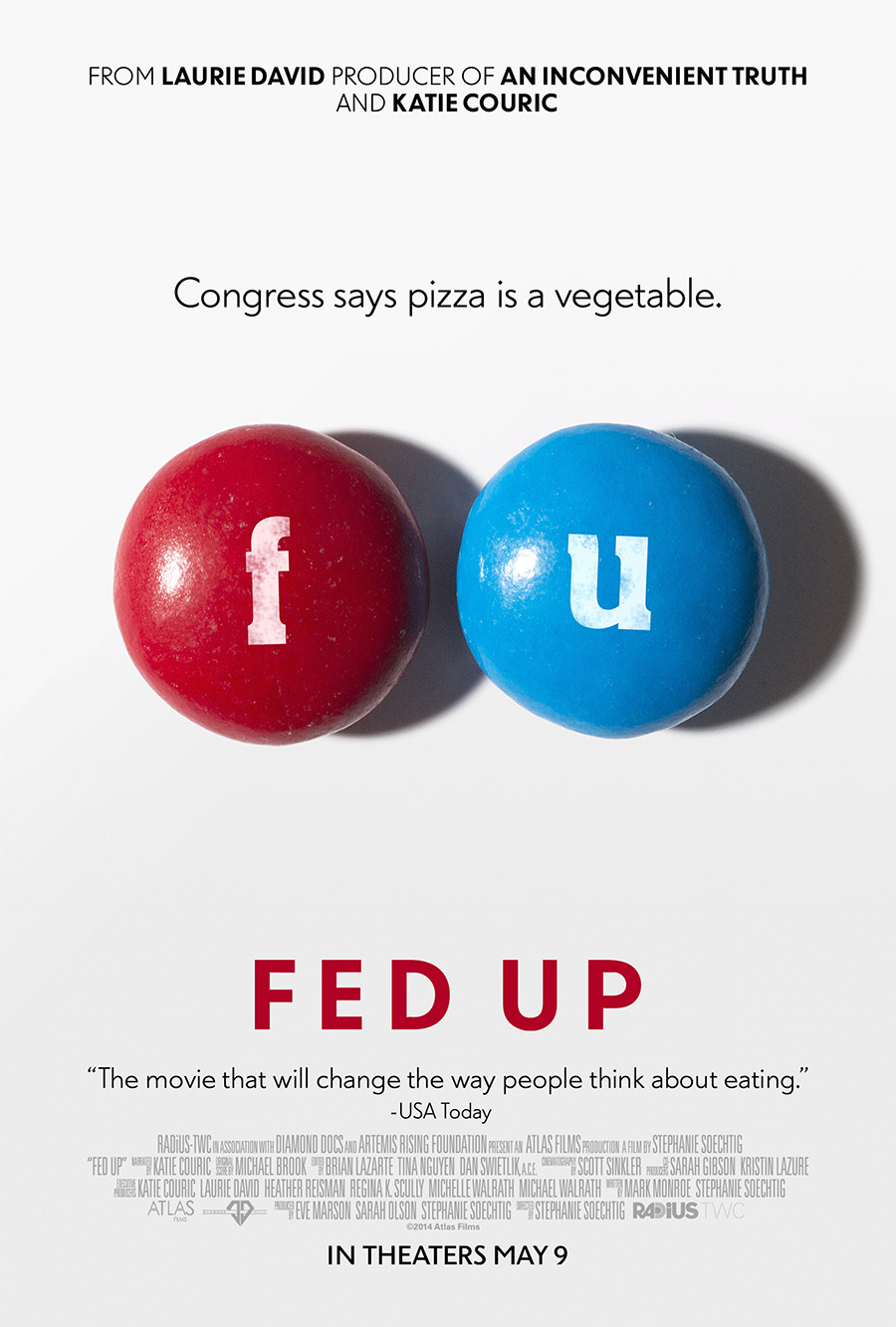
Stephanie Soechtig’s feature documentary “Fed Up” asserts that “Everything we’ve been told about food and exercise for the past 30 years is dead wrong.” It targets sugar as the leading cause of today’s panoply of diet-related diseases afflicting Americans, and talks to a number of experts as well as several people who suffer from obesity. The headline quote of the movie seems to come from former FDA commissioner Dr. David Kessler, who describes the effects of sugar as “One of the great public health epidemics of our time.” Here is the trailer.
The movie is currently in limited release in nineteen cities, opens in many more markets tomorrow, and then continues its roll out over the next few weeks. More information on theaters can be found here. It also has a terrific poster.
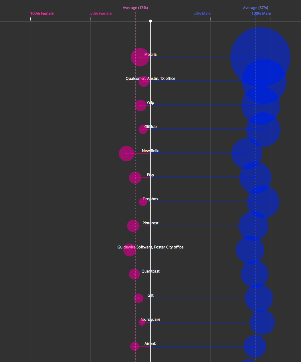
This visualization of the disparity in male and female engineers employed at roughly one-hundred fifty tech companies is unsurprising but astonishing nevertheless. Whether the companies are large or small or young or old, the split tends to look something like this:
Less than one in ten companies can claim that even a third of their engineers are women. That’s pretty stark.
I don’t mean to point fingers here, because this is one of our biggest problems at Wildcard, and almost every organization I’ve been involved with has struggled in this arena. Even Etsy, which I personally witnessed putting tremendous effort into re-balancing this equation, managed only to barely outdo the survey’s average.
Problems as endemic as this are unlikely to change overnight, and it’s important to remain vigilant in the campaigns to solve them. But I think this chart illustrates a bigger, more damning point: the tech industry is not egalitarian in the least, in spite of how enlightened it believes itself to be. It may (or may not) be true that it’s populated by a greater number of people who believe strongly in gender equality and similar issues than other industries, but in the overarching trend of how tech companies are conducting themselves, the arc of history is bending towards inequality. We’re failing this test.
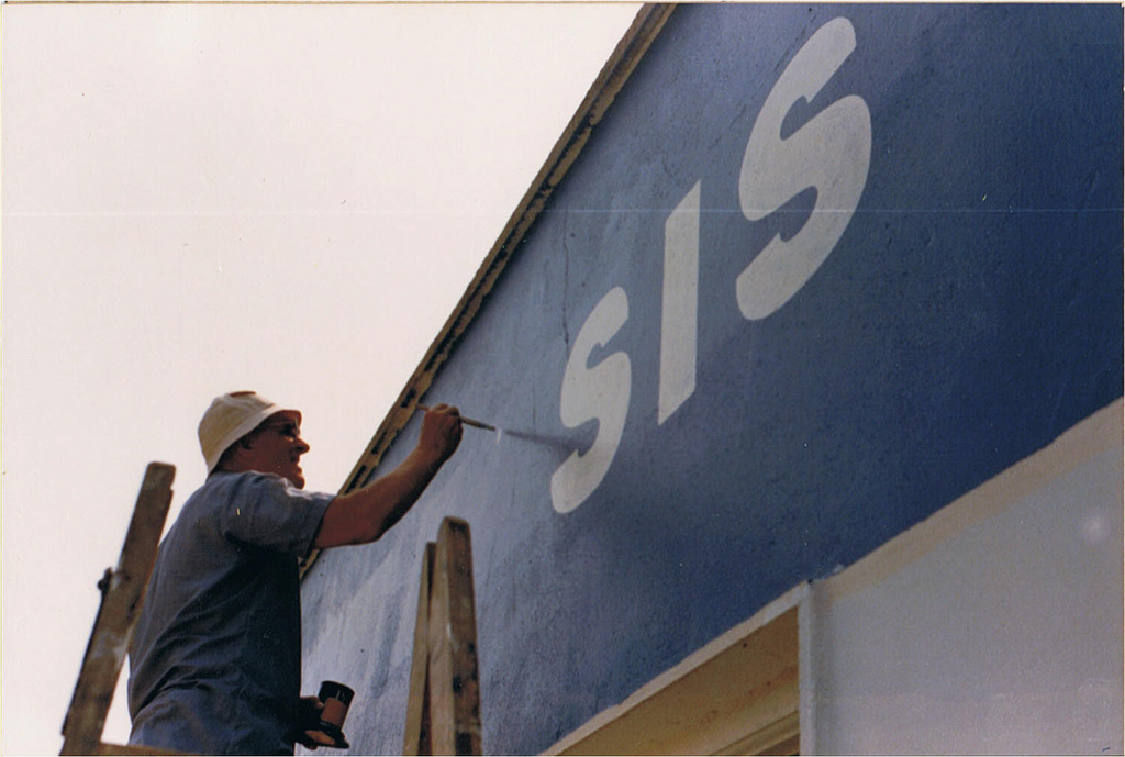
A superb, engrossing, sixteen-minute documentary about the multi-generational tradition of hand-painted signs in Dublin, Ireland and the men who still brave cold, rain and terrible parking to carry it forward. The word “typography” isn’t uttered once (or I didn’t catch it, anyway), which says something about how these practitioners think about their work: it’s a craft steeped in hard-earned, manual skills — not a rarefied technical discipline. The movie is also rich with examples of the many beautiful hand-lettered signs throughout Dublin. Well worth a watch.
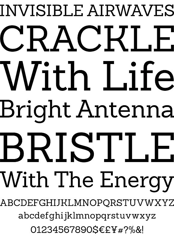
I have a conflicted relationship with slab serif typefaces — sometimes called Egyptians. On the one hand, I find their bold forms enticing; they definitely don’t lack for personality. But it can be difficult to use them tastefully; their emphatic shapes often easily overpower the content. I often see designers turn to perennial slab favorite Rockwell as a tidy compromise, but something about that typeface has never sit quite right with me.
Over at YouWorkForThem, they have a nice alternative to Rockwell by Chilean foundry LatinoType. It’s called Sanchez Slab and, helpfully, they have made its standard weight and that weight’s italic variant are both available to download for free.
It’s not just the desktop version of Sanchez Slab and Sanchez Slab Italic that are free; you can also download the webfont versions for zero dollars. Should you decide to upgrade, the full family is available for US$126 in each format. If you ask me, giving users a free taste of some of a family’s fonts is a smart way to encourage font purchases. I’ve always found it difficult to justify the investment in a brand new type family, especially when it comes from one of the smaller foundries, without being able to test drive it first.
Peter Merholz notes how the discourse around digital product design has shifted towards the superficial. To him, debates over flat versus skeuomorphic, color schemes, parallax scrolling and other presentational techniques are a distraction from the lower strata of his colleague Jesse James Garrett’s five planes of user experience rubric. His position is not altogether condemnatory, but rather cautious.
I’ve realized I’m grateful for the passionate conversation around Surface — it means that people care and are engaged. Still, we must be vigilant in maintaining similar attention to those deeper layers, precisely because their abstraction makes them more challenging to discuss.
The great Massimo Vignelli, legendary designer who shaped much of the late Twentieth Century’s visual language, is seriously ill. Creative Reviews says that he “will be spending his last days at home.” This makes me terribly sad; Vignelli is a personal hero and his work means a lot to me.
Michael Bierut, who worked at Vignelli Associates early in his career, relays a message from Massimo’s son, Luca:
Luca said that Massimo would be thrilled to get notes of good wishes from people whom he’s touched or influenced — whether personally or remotely — over the years. Luca has visions of huge mail bags full of letters. I know that one of Massimo’s biggest fantasies has been to attend his own funeral. This will be the next best thing. Pass the word.
Notes, letters and cards can be sent to:
Massimo Vignelli
130 East 67 Street
New York, New York 10021
USA
Finally, here is a wonderful video in which Vignelli narrates his thought process when designing books. It’s a short, powerful reminder of what a fantastic brain he has.
Springtime means rain, which means umbrellas. Except, a few years ago I resolved not to carry an umbrella with me unless it was really pouring out. It’s rare that I’ll head out in the morning with one now, and since then I’ve found that in most cases when there’s rain in the forecast one of two things happens: either the rain never actually materializes, or if it does, there’s not enough of it to actually warrant an umbrella.
Inevitably though a real downpour comes and only a fool would venture outside without one. In those cases I’m reminded why I dislike the contraptions so much: they’re very poorly designed.
The other day, after a particularly hard storm in New York, I wondered if anyone had solved this problem, and had done so at scale. When I asked Twitter, I got a decent amount of replies but nothing totally definitive. There are a few companies, like Davek, making high quality umbrellas, and a few, like Senz, who have tried to reinvent the umbrella, and at least one crowdsourced project, Nubrella, that seems intent on turning the form into some kind of arty practical joke. Each undoubtedly has its merits, but there was no clear winner among the responses; moreover I didn’t really see that they solved the basic complaints that I have with today’s umbrellas.
So, for no better reason than blogs must publish things like ideas for improving umbrella designs, here are my ideas for improving umbrella designs:
A strap with a buckle. Part of the reason I don’t like to carry these things is because once wet, I have no place to put them. For smaller umbrellas, it would be so useful to have a strap that fastened with a snap buckle, so that I can hook it onto my bag.
A bag you won’t lose. It should be possible to integrate a durable bag that stays dry into the design of an umbrella. This would let you easily tuck away a wet, closed umbrella without the net effect of soaking all your other stuff.
A method for easily identifying your own umbrella. Imagine a varying graphic pattern on each umbrella handle, applied at the factory. One umbrella has two dashed stripes, another has a solid stripe and a red stripe, a third has a pattern of stars, etc. If each handle was unique — or unique enough that it would be very unlikely you’d ever run into another one with the same pattern, it would make life much easier when it comes time to fish yours out of a bucket full of umbrellas at a restaurant.
An electronic tracker. Integration with a Tile-like chip would solve one of the worst problems inherent to today’s umbrellas: they get lost all the time. You probably don’t want to be notified on your phone each time you stray too far from an umbrella, but this seems like it’s a problem that technology can solve elegantly.
A means to repair a broken umbrella. I’ve thrown away more umbrellas than I care to count simply because the cost of repairing them would have far outstripped their monetary worth. I think that’s a shame. When an umbrella part breaks, you should be able to take it to a local shop or send it to a specialist to get it fixed.
If someone built an umbrella like that, I might even carry it around when the forecast calls for it.