is a blog about design, technology and culture written by Khoi Vinh, and has been more or less continuously published since December 2000 in New York City. Khoi is currently Principal Designer at Adobe. Previously, Khoi was co-founder and CEO of Mixel (acquired in 2013), Design Director of The New York Times Online, and co-founder of the design studio Behavior, LLC. He is the author of “How They Got There: Interviews with Digital Designers About Their Careers”and “Ordering Disorder: Grid Principles for Web Design,” and was named one of Fast Company’s “fifty most influential designers in America.” Khoi lives in Crown Heights, Brooklyn with his wife and three children.
Here is indie band The Pains of Being Pure at Heart previewing their upcoming album “Days of Abandon” at local station WNYC this week. At first blush, the songs sound terrific, even if the audio quality in the video is not the best.
The new album is released on 13 May and features this gorgeous cover from South Korean artist Lee Jinju. It has the look of an iconic album.
I guess something like this was inevitable, right? This new gadget snaps onto your best friend’s collar and “measures your dog’s activities, giving you a new perspective on day-to-day behavior and long-term health trends. Check in from your phone, share memorable moments with family and friends, and make informed decisions with your vet.” The device looks like this:
Though I sound a bit disdainful, I’m pretty sure I would have bought one of these for my dog when he was alive.
In his article “The Dollar-and-Cents Case against Hollywood’s Exclusion of Women,” Walt Hickey of Five Thirty-Eight looks into the numbers behind films that feature prominent roles for women. His team researched 1,615 films released over the past twenty-three years that passed the famous Bechdel Test, which determines whether a movie’s female roles are substantial or not based on the following criteria:
There are at least two female characters with names
The two female characters talk to one another
They talk about any subject besides a man
The results make a surprisingly clear economic argument for making more films that meet these criteria.
We found that the median budget of movies that passed the test… was substantially lower than the median budget of all films in the sample. What’s more, we found that the data doesn’t appear to support the persistent Hollywood belief that films featuring women do worse at the box office. Instead, we found evidence that films that feature meaningful interactions between women may in fact have a better return on investment, overall, than films that don’t.
The Bechdel Test originated in 1985 in an installment of Alison Bechdel’s comic strip “Dykes to Watch Out For.” Its simplicity has proven consistently powerful over the years; even people I have known with no sympathy for feminism take note when these criteria are suggested to them. Still, I would be in favor of adding one more rule, one that addresses an aspect of feminine ideals that I have become acutely aware of as a parent of a young daughter:
Neither of the two female characters are princesses
In fact, Hickey cites the recent blockbuster “Frozen” as an example of a movie that passes the Bechdel Test. That one does feature strong, well-written female leads, and I suppose we should be grateful for that — but they are also princesses. Where others might find it innocuous, I find the ideal of a princess — generally, in fiction, a female who can only either be born or married into her character attributes — to be pretty retrograde and not all that healthy.
This promotional video looks over the shoulder of a modern watchmaker as he assembles a NOMOS Glashütte time piece. These high-end German watches are built in-house by the company and assembled using a combination of high tech tools and human craftsmanship. If you enjoy things that are small, beautiful and precise, this video will hypnotize you.
Last weekend I found some time to make some tech improvements to our house which are probably only mildly interesting to most people but hey, that’s why I have this blog.
The headline item was probably replacing our generic thermostat with a Nest thermostat. The physical installation was easy, but I was surprised by some bugs getting the Nest thermostat to successfully connect to our AirPort wi-fi network.
I routinely connect new devices without a problem, but the Nest just couldn’t make it happen on its own. Ultimately, some combination of removing the AirPort’s guest network (which we never really made use of at our home), creating a DHCP reservation for the Nest’s MAC address, turning off the security protocols (and later turning them back on), and entering the router’s lengthy WPA2 password repeatedly via the Nest’s elegantly designed but less than optimal password entry interface worked.
Now the device is running quite smoothly and I’m very happy with it. Lots of nerds have already made the switch to Nest thermostats and so I have nothing really interesting to add — but coming late to the game, I found the novelty of a genuinely well-designed, technologically advanced appliance to be a revelation. I’m eager now to see what new products Nest will roll out; I’d be more than happy with a house that’s fully outfitted with automated systems courtesy of this brand.
Improvement number two was taking out a couple of hours to conceal a good deal of the wires snaking around our living room with Wiremold — plastic cable raceways that seamlessly attach to the mouldings at the base of your wall. I discovered Wiremold at my local Home Depot and was surprised that I had never heard of it before. It installs fairly easily, though cutting it is a bit of a pain unless you have a good saw or cutting setup, and it’s visually indistinguishable from the details of our real wall moulding. Wiremold isn’t a complete remedy to the deathly rat’s nest of cables that have collected around our house, but it does improve the picture significantly.
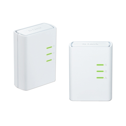
Finally, I bought a pair of D-Link Powerline adapters to see if I could get them working with my AirPort network. Powerline, in case you’re not familiar with it, plugs into standard wall sockets to make what is essentially a network out of your house’s electrical wiring. I’d been aware of it for years, but was always skeptical about whether it really worked or not — it sounded like hokum to me.
I finally decided to see if it could supplement our wireless network and reach some of the areas of the house that weren’t getting good, strong wi-fi signals, and after some light research, decided to give D-Link’s hardware a shot. By god, they worked, and really well, too. Setup was easy and the extension to the network was seamless. This coming weekend I will probably hook up one of the Powerline adapters to an AirPort Express to get a signal broadcast to our back yard, just in time for warm weather.
Did you ever think you’d see a 3,500-word article on type design in Businessweek? And did you ever think that piece would be about a contentious $20 million lawsuit over the ownership of a type foundry? Joshua Brustein penned this lengthy overview of the whole messy “divorce” between type designer superstars Jonathan Hoefler and Tobias Frere-Jones.
One place where Hoefler has never referred to Frere-Jones as his partner is on any kind of contract. In legal documents, the firm was described as the Hoefler Type Foundry, doing business as Hoefler&Frere-Jones. Frere-Jones says he never drafted paperwork to formalize the partnership he thought he was entering, nor did he hire a lawyer to examine the contract in which he signed over the rights to the fonts he had created at the Font Bureau for $10. In 2004 Frere-Jones also signed an employment agreement describing him as an employee of the firm. Both men agree that Frere-Jones signed this document, and the case is likely to turn in part on what the contract means — was he the firm’s employee? Or Hoefler’s?
From type foundry The Northern Block: Rein Grotesk is an attractive, sharply modern typeface “with a strong, neutral personality. Its tall structure and open counters make Rein Grotesk a versatile typeface which is both readable at small sizes and legible in any display environment.” Northern Block’s PDF specimen for the typeface is also more playful than most, and free to download.
It’s on sale through 19 Apr at You Work For Them for a song: the desktop and webfont versions are going for just US$39 each (full disclosure: affiliate link). Sadly, there are no oblique versions, which limits its usefulness somewhat, but I bought both versions for myself nevertheless.
Designer Craig Rozynski decided that hating Comic Sans wasn’t enough — he wanted to do something about it, too. So he set about reinterpreting the core promise of Comic Sans — a typeface that is distinctly casual and widely accessible — and created Comic Neue, a new typeface that “aspires to be the casual script choice for everyone including the typographically savvy.”
It’s a worthy effort for sure, and I acknowledge that it is an improvement over its inspiration. But we’re talking about degrees of nausea here; Comic Neue makes me less queasy, but it still makes me queasy.
You might feel differently, of course. If you like it, Rozynski has generously made Comic Neue free to download.
Thanks to the current Apple vs. Samsung trial, this highly revealing email exchange between Apple marketing chief Phil Schiller and his ad agency TBWA/Media Arts Lab became public.
It illustrates a contentious relationship between the two parties early last year, when Schiller complained to TBWA about an article in The Wall Street Journal that asks, “Has Apple Lost Its Cool to Samsung?” The assertion clearly angered Schiller, who felt that it indicated that Apple’s advertising had reached a crisis point. He turned to TBWA to remedy the situation with great urgency.
Agency executive James Vincent apparently tried to seize the moment and change the nature of the discourse between client and agency. He wrote:
It seems these times call for more open and expansive ways to experiment with ideas. Honestly, sometimes the logic of Marcom prevents us trying ideas that we think we should.
“Marcom” is a portmanteau for “marketing and communications” that in this instance apparently refers to a regular meeting between Apple and TBWA. Schiller found Vincent’s response none too pleasing, and fired back:
To come back and suggest that Apple needs to think dramatically different about how we are running our company is a shocking response. Also, to suggest we need to give you more free reign to spend money to explore ideas that you have even tried to bring up in Marcom is shocking.
Notwithstanding the irony in an Apple executive bristling at being asked to “think different,” Schiller’s response clearly set Vincent on the defensive. His response was to shift back into a deeply deferential, almost groveling mode:
Please accept my apologies. This was absolutely not my intention. In re-reading my email I can see how you can feel this way…
We are acutely aware of our exact responsibilities in this. We feel 100% accountable for our part of this job which is to create great advertising for Apple and its great products…
I can see my reaction was over-blown and not at all helpful. I’m sorry.
Perhaps it’s unfair to read too much into this particular back-and-forth, but for me this typifies life at agencies. Whether TBWA was resting on its laurels or putting in tremendous but misguided effort, they serve at the pleasure of their client. And if their client is unhappy, there is almost nothing they can say in their own defense. Their only recourse is to sublimate their own will into even greater efforts at doing whatever it takes to please their client.
The relationship between agency and client is often incredibly difficult and frequently humiliating. Few people have the stamina and perseverance for it. I flirted with it once and found that it’s not for me. I’m not exactly sure why anyone would want to do this kind of work regularly, but I truly admire those who are able to produce quality given such continually adverse circumstances.
Each film is composed of “a series of orbits around a single, unedited, scan captured in Berlin in November 2013.” While this technology is capable of producing virtual replicas of amazing fidelity, for these works ScanLAB chooses instead to emphasize the errors and glitches in the capture process.
Here we see the unedited view of the world as seen through the eyes of the LIDAR machine. Reality is shrouded in a cloud of mistaken measurements, confused surfaces and misplaced three dimensional reflections.
The results are mesmerizing — or at least they are in the preview clip shown below.