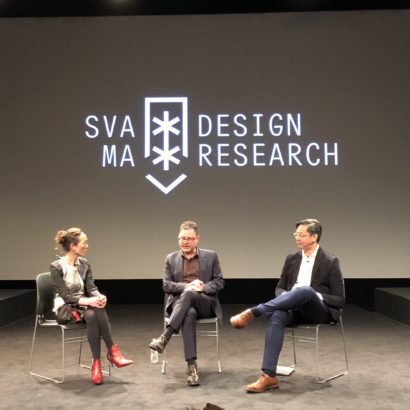
Get Fresh with Me

AIGA New YorkThe evening of next Wednesday, 16 December, I’ll have the honor of being on stage as a guest for AIGA New York’s twenty-fifth annual Fresh Dialogue event, alongside Tina Roth Eisenberg of Swiss Miss, Allan Chochinov of Core77 and Josh Rubin of Cool Hunting. Our mandate will be to cast an eye on the design world through the lens of each of our respective blogs, and to take a look at how social media is impacting the way design is practiced. The evening will be hosted by the design writer, critic and chair of SVA’s Masters in Design Criticism program, the remarkable Alice Twemlow. It’s going to be a blast.

Find out more about the event and register for your tickets here.

Continue Reading

+

New Yorker: Radiohead’s Jonny Greenwood on the Sound Quality of MP3s

Ratings

3 of 5 stars
What’s this?

From several months ago but still worth a read. The magazine’s music critic Sasha Frere-Jones interviews Greenwood on the quality limitations of today’s dominant music delivery format.

“I’d feel frustrated if we couldn’t release CDs as a band, but then, it only costs us a slight shaving of sound quality to get to the convenience of the MP3. It’s like putting up with tape hiss on a cassette. I was happy using cassettes when I was fifteen, but I’m sure they were sneered at in their day by audiophiles. If I’m on a train, with headphones, MP3s are great. At home, I prefer CD or vinyl, partly because they sound a little better in a quiet room and partly because they’re finite in length and separate things, unlike the endless days and days of music stored on my laptop.”

Though he’s talking specifically about the esoteric world of high-fidelity sound, Greenwood is effectively casting a critical eye on the whole idea of high definition.

“I find this sound quality stuff both fascinating and ridiculous. It’s like the pixel resolution of digital cameras: higher numbers are better, but that discussion always pushes the actual photography to one side, somehow.”

The essence of his argument is dead on: superior fidelity and resolution is terrific but overrated in comparison to convenience. As a parallel example, I couldn’t be happier with my HD-TV and I wouldn’t mind owning a Blu-Ray player one day when the prices are more reasonable. Meanwhile, I’m consuming tons of not particularly high-resolution content via streaming media. It’s the convenience of media formats that matters so much more. And you could re-interpret the idea of convenience as a format’s interface — if it’s easy to use, if it provides affordances commensurate to the needs of real users in actual use cases, then it will win over higher resolution. Actually, it’s the content that really matters.

+

Really Basic Maths

It should be obvious to most readers of this blog that Basic Maths, the WordPress theme that Allan Cole and I released recently (and available here), is a direct descendant of the overall look and feel of Subtraction.com. There’s a good reason for this: over the years, I’ve been asked countless times by others if they can use the Subtraction.com ‘theme,’ even though none existed — even if it did, I would have been inclined to say no, wanting to preserve its uniqueness for myself. So when I sat down to design Basic Maths, the aim was to create something that would satisfy this desire to have something Subtraction.com-like in the marketplace — not a clone, but a reinterpretation. As reinterpretations go, it’s pretty straightforward, I think. Nevertheless, I thought it would be interesting to showcase some of the steps in its design evolution, and how I arrived at the theme as it stands today.

Continue Reading

+

AisleOne: Myths and Misconceptions about Grid Systems

Ratings

4 of 5 stars
What’s this?

In this terrific rebuttal, Antonio Carusone smacks down the flagrant inaccuracies found in this article at Webdesigner Depot. The article purports to list the various “advantages and disadvantages” of designing with a typographic grid. Carusone does a measured, even-handed job of calling bullshit on the author’s arguments, even while the article’s fundamental misapprehension about the entire subject begs for a much less gentle rebuke.

As an example, here’s just one of many gems, with the author’s original emphasis included:

“Generally speaking (very generally), creative designs should stick to more freedom and not use a grid — or at least use a very lenient one.”

I’d never read Webdesigner Depot before, but based on the quality of this article, I’m pretty sure I’m not missing anything.

+

New Shell for AOL

imageIn advance of being spun off from Time Warner next month, AOL debuted new corporate branding yesterday, rolling out not just a revised logo but a visual system with a bit of a twist to it. Using a modicum of cleverness, the company’s new look is in fact a kind of visual randomizer in which a new, mixed-case typographic mark “Aol” (instead of the previous initialism “AOL”) is superimposed on top of various whimsical, silhouetted images.

Continue Reading

+

Font Hunt

Giving back to Twitter department: earlier in the month I asked people who follow me on Twitter for recommendations for new typefaces.

What I was looking for was an alternative to the typeface Klavika, which I quite like; it’s among the very best fonts that have been released in the recent past, in my opinion. Inconveniently for me, I somewhat subjectively regard Klavika as having been ‘claimed’ by a friend of mine who uses it more consistently and more effectively than I do.

So I wanted something of my own, something similarly contemporary and similarly strong in its forms, a real workhorse of a typeface that I can call to duty during those times when Helvetica won’t do. I got back tons of replies, and I thought I’d present my favorites here for those who might find themselves on a similar hunt.

Continue Reading

+