is a blog about design, technology and culture written by Khoi Vinh, and has been more or less continuously published since December 2000 in New York City. Khoi is currently Principal Designer at Adobe. Previously, Khoi was co-founder and CEO of Mixel (acquired in 2013), Design Director of The New York Times Online, and co-founder of the design studio Behavior, LLC. He is the author of “How They Got There: Interviews with Digital Designers About Their Careers”and “Ordering Disorder: Grid Principles for Web Design,” and was named one of Fast Company’s “fifty most influential designers in America.” Khoi lives in Crown Heights, Brooklyn with his wife and three children.
Most of us who lived through the end of the compact disc era and the rise of the MP3 era think we already know the story behind how music went from an incredibly profitable medium to one whose economic future seems to be in continual peril. It goes something like this: CDs were ridiculously lucrative but completely unprotected; MP3s came along; then Napster and its heirs exploited that shortcoming to completely remake the way we think about how music should be sold and distributed, etc.
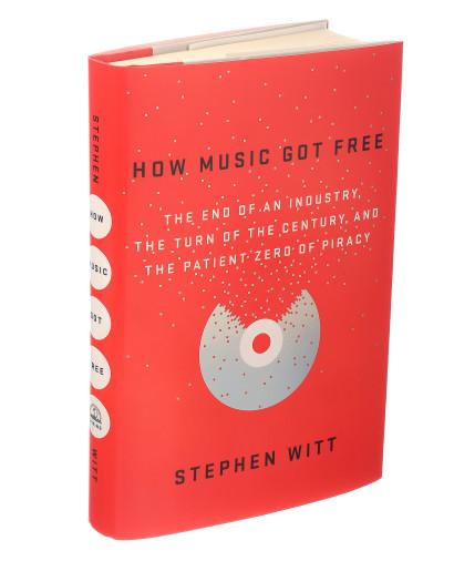
Stephen Witt’s book “How Music Got Free: The End of an Industry, the Turn of the Century, and the Patient Zero of Piracy” seeks to disabuse us of the simplicity of that narrative. It fills in the many gaps that we never knew about, digging into the character and motivation of the key players in the industry’s hellacious evolution—not just the Shawn Fannings of yore, but also the engineers who created the MP3 format, the record industry executives who grappled with it, and the early pirates who seeded the landscape with so much free music. Several months ago I read a riveting excerpt that Witt published in The New Yorker which tells the tale of a single worker at a CD manufacturing plant who was responsible for the initial leaking of over two thousand albums onto the Internet over the course of a decade.
From 2001 on, Glover was the world’s leading leaker of pre-release music. He claims that he never smuggled the CDs himself. Instead, he tapped a network of low-paid temporary employees, offering cash or movies for leaked disks. The handoffs took place at gas stations and convenience stores far from the plant. Before long, Glover earned a promotion, which enabled him to schedule the shifts on the packaging line. If a prized release came through the plant, he had the power to ensure that his man was there.
The pattern of label consolidation had led to a stream of hits at Universal’s factory. Weeks before anyone else, Glover had the hottest albums of the year. He ripped the albums on his PC with software that Kali had sent, and then uploaded the files to him. The two made weekly phone calls to schedule the timing of the leaks.
Glover left the distribution to Kali. Unlike many Scene members, he didn’t participate in technical discussions about the relative merits of constant and variable bit rates. He listened to the CDs, but he often grew bored after only one or two plays. When he was done with a disk, he stashed it in a black duffelbag in his bedroom closet.
By 2002, the duffelbag held more than five hundred disks, including nearly every major release to have come through the Kings Mountain plant. Glover leaked Lil Wayne’s ‘500 Degreez’ and Jay Z’s ‘The Blueprint.’ He leaked Queens of the Stone Age’s ‘Rated R’ and 3 Doors Down’s ‘Away from the Sun.’ He leaked Björk. He leaked Ashanti. He leaked Ja Rule. He leaked Nelly. He leaked Blink-182’s ‘Take Off Your Pants and Jacket.’
Adobe has just released the 2015 versions of its Creative Cloud software suite with improvements across the board. The feature additions getting the most attention are the changes to Photoshop CC 2015, which attempt to bring more screen design-specific thinking to the workhorse image editor. These include export improvements, the ability to add multiple styles to an element, and, most notably, new support for multiple artboards within a single PSD file. Over at Bjango, Marc Edwards wrote a nice round-up of the best of these improvements.
The most significant feature, for my money, is the one that Adobe is releasing as a “technology preview.” The Photoshop team’s Design Space project (marketed online via Github, no less) is a surprisingly ambitious reworking of the core experience of using Photoshop for designing web sites and user interfaces. It takes advantage of the reportedly tremendous under-the-hood work that’s been done over the past several years to abstract Photoshop’s interface from its raw processing power, with the result being that the team is now apparently able to entirely re-write even its most foundational interactions. This screencast—narrated by Photoshop Senior Product Manager Zorana Gee with the startling brand of confidence that possesses only those who know exactly what the future looks like—shows how very different Photoshop can be when its interface has been fundamentally rethought.
The Photoshop we’ve known for a quarter century is almost unrecognizable in this video; its tool palette has been stripped back dramatically, its layers palette has taken on unfamiliar new behaviors, and even object selection has been reworked entirely. It’s a very telling demonstration of how seriously Adobe is now listening to customers who have been complaining for many years about the application’s overdetermined feature freight. That is, it’s telling in two ways: first in that the team has gone so far as to create what is practically a wholly different product as a clear response to market competition, and second in that the company is releasing this major undertaking only as a technology preview, hidden away in the software’s preferences. Change is coming; just not quite yet.
All of these features are bound to draw even more contentious comparisons with Bohemian Coding’s Sketch, for better or worse, and you won’t need to look very far to find snarky dismissal of these efforts from design tool partisans. There seems to be some anxiety that Adobe is essentially co-opting territory staked out by enterprising indie developers, which is an understandable but not entirely logical reaction. What strikes me about this situation is how remarkable it is that it exists at all; the Adobe of a decade ago seemed to have little or no interest in what was important to web and interface designers. A sober reading of the market today reveals that in actuality customer frustration has forced the market incumbent to respond substantively, stoking competition all around. That’s what we want—we want big players like Adobe and small players like Bohemian Coding all pushing each other to create better and better tools.
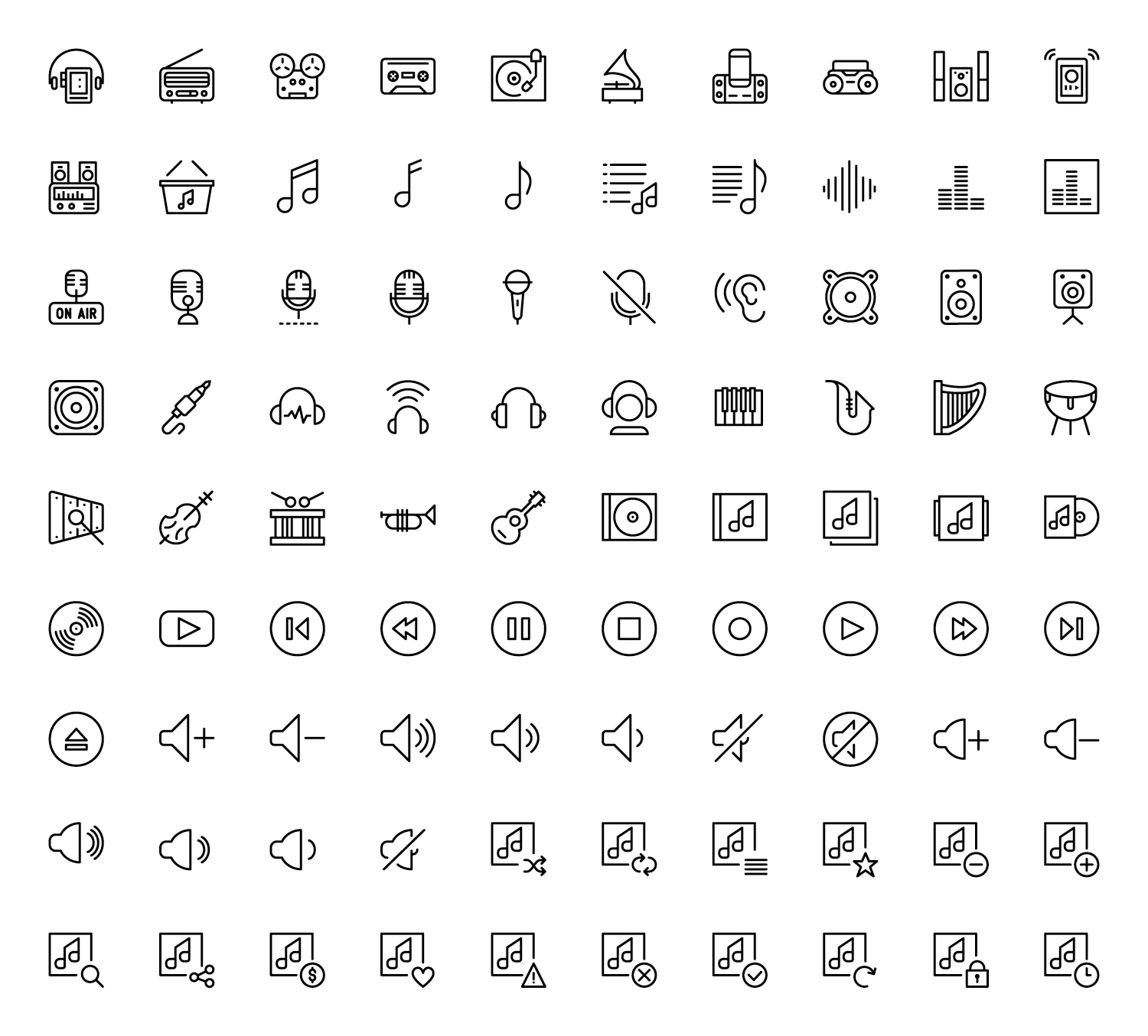
I own several icon sets but the one that I return to over and over is Vincent le Moign’s copius Streamline pack, which almost always seems to have just the pictogram I need when I dig into its catalog. In fact, when I published my Design Tools Survey recently it was Streamline I turned to when I needed to illustrate it quickly.
When I wrote about Streamline a year ago, the downloadable pack shipped with an impressive 1,600 icons. Now le Moign has released version 2.0, which weighs in at a staggering 4,000 icons. To be clear, that’s four thousand original drawings; when you figure in the multiple sizes and file formats of each icon that ships with the pack, the total number balloons even more.
The sheer volume of labor required for a project of this size seems as if it would require at least five or six designers if not many more, but when I asked le Moign over email about Streamline’s new version, he insisted that he was able to complete this revamp of the set (which includes improvements to many previously issued icons) with just one additional designer and an assistant. The dedication required to do this, not to mention the repetitive strain injury, boggles the mind.
With that many icons it’s probably true that Streamline is one of a few outliers, but it’s not uncommon to see icon packs with hundreds if not thousands of icons these days. Is this an arms race? Are icon designers escalating their numbers purely because that’s what drives sales? When asked about this, le Moign admits, “Big numbers impress and help the sales, sure. But it’s also in the interest of the designers who use these packs. With smaller packs, you may think you don’t need that many icons until one day you need one that’s not included. I regularly get emails from customers asking for more icons covering more subjects, like hotels, real estate, marketing, etc. It makes a pack much more valuable to know that you have a great chance of finding a new icon when you need it, and that it’ll fit stylistically.”
Having access to four thousand icons is of limited use though if finding them is a chore. Downloadable icon packs, in particular, are notorious for being organized according to unique schema. One publisher may issue everything in a single file, while another may distribute each icon as its own file; some sets may be parsed out into folders while others may require a legend in PDF or HTML format. Even the most thoughtfully prepared of these sets is laborious to search at best.
All of which sounds like a great argument for the terrific work that The Noun Project has done in creating a massive online repository of commercially available icons. But the continued proliferation of sets like Streamline seems to argue that lots of icon customers are comfortable with downloading these packs. For his part, le Moign does foresee standardization just over the horizon. “Searchability is the biggest request from customers,” he says, “and that will come from a standardized way of distributing these assets.” He’s already made Streamline compatible with IconJar, a burgeoning, iTunes-like desktop application for organizing and managing icons based on a new file format—.icnjar—that its creators hope will become a standard for icon distribution. Le Moign himself is actually also working on Iconbook, an open source project with similar aims.
Once searchability is solved, is there a practical limit to these icon sets? If Streamline can grow 250% in just a year or two, how far off is 10,000 icons—or more? “Ten thousand sounds crazy now,” he says. “But when I started more than just one thousand sounded like a fantasy.” And yet here we are.
Streamline is available at streamlineicons.com. Full disclosure: affiliate links.
This is a thoroughly endearing promotional video for Firefox, which is still my preferred desktop browser, the one I spend the most time in each day. I use Firefox because I like its features, first, but also because I like Mozilla’s philosophy of an open Web (even if I can’t exactly square that belief with the many other less-than-open tech products I use). It surprises some people that I’m still a devotee, but how can I not be when it’s so evident that Mozilla, for all its shortcomings, isn’t merely adhering to a dogma, but is also committed to creating something truly wonderful? This video, which is so lovingly crafted and so winning, reminded me of that fact.
I’m fascinated by the work of Vimeo user Roman Holiday (real name: “Matt”), whose supercuts scrutinize a few very specific, isolated elements of famous movies to demonstrate how they serve as universal fundamentals of film making. He has two essential kinds of videos: first, supercuts that survey dozens of seemingly unrelated films to identify a single kind of shot that appears in all of them. Below are two examples: clips of two characters driving in a car, shot from the car’s hood; and another that corrals shots from inside a refrigerator, looking out at one or more characters.
His second basic form is a distillation of a single film down to just its close-up shots, spotlighting the nuts-and-bolts detail work that helps propel a story along, often at just a second or two at a time. Below, supercuts of close-ups from “Jackie Brown,” “Die Hard,” and “Hard Boiled.”
All of them are surprisingly transfixing to watch, even with their larger narratives stripped away. See them at vimeo.com.
Thanks to everyone who took the time to participate in my Design Tools Survey over the past nine days. Today I closed the survey, but not before logging answers from literally thousands of people. What a fantastic response.
Now comes the hard part: I’ll be taking the next few weeks to parse the results and try to turn them into something interesting. I hope to publish a full set of results soon, but because I know there’s intense interest in this topic, here is a topline summary of some of the major results from the survey.
What is your primary tool for brainstorming/ideation? Pencil and paper
What is your primary tool for interface design? Sketch
What is your primary tool for prototyping? HTML/CSS
What tools do you use for project management? Slack was the top answer
What tools do you use for version control/file management? Dropbox was the top answer
I hesitated to publish even these preliminary findings because the data tells much more nuanced stories than these few outcomes suggest. That’s what I hope to do in a thoughtful way within a few weeks, hopefully with the help of some smart and talented friends I’m trying to conscript into the project. If you’re interested in the results (and you didn’t already opt in for notification while taking the survey), be sure to subscribe to my newsletter to find out when they’re released.
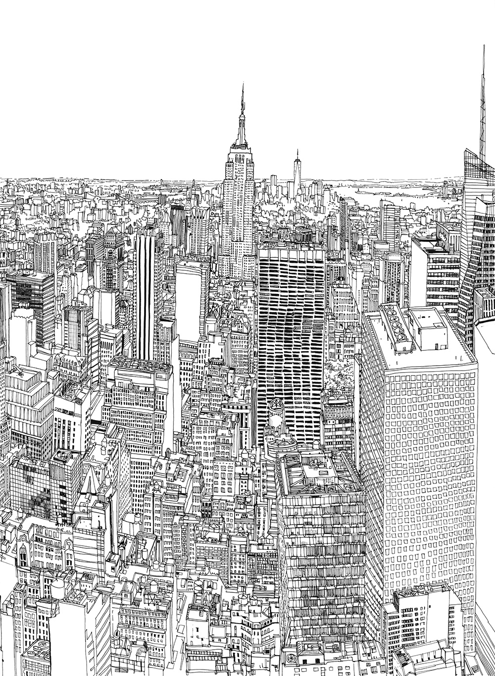
This is a time-lapse video of artist Patrick Vale drawing, by hand, the view from the top of a skyscraper in New York City. The intricate rendering—and the stamina required to execute it with consistency—is breathtaking. A detail of the piece, which Vale created last December, is below.
Vale seems to have an affinity for rendering architecture, often from very high vantage points. This is another film he made three years ago of a drawing of the view from the Empire State Building.
Also see this gorgeous collaboration with Pentagram in which Vale captured the Marylebone area of London in ink.
This short film produced by New York design studio Dresscode profiles the Revolutionary Artist and Minister of Culture for the Black Panther party, Emory Douglas. He was the art director of the party’s official newspaper (which reportedly earned him a spot on the FBI’s Agitator Index) and talks about the scrappy methods they used to assemble each issue, which led to his distinctive graphic expressions.
Designer and developer Linda Dong created this amusing and surprisingly sprightly motion graphic entirely within Apple’s Keynote presentation software. She says:
I’ve always been a huge advocate of using Keynote for basic prototyping because there are a lot of great animation/drawing goodies hidden in this app and it’s so easy to set a scene up. Same thing goes with motion graphics. Even if you’re not planning on making your final animation in Keynote, it’s an incredibly fast way to audition different effects and narratives.
Like Dong, I’m a longtime fan of Keynote, both for prototyping as she mentions as well as for its ostensibly primary purpose: creating presentation decks. That she can produce such a quality result from its relatively basic animation tools is both surprising and not surprising to me. Keynote has long confounded me as following more or less zero patterns for the way software should work. I’m not talking about its usability, which has generally been good if not perfect. Rather, I’m talking about its place in the world: it started out life as a tool for Steve Jobs exclusively, and now it’s meant for everyone—though only design and technology professionals really use it; it’s got tremendous power under the hood (as these animations prove), and yet it doesn’t really provide users an interface to harness that power easily; it’s been sold at retail prices, and it’s now mostly free… by rights this kind of software shouldn’t exist.
In any event, Dong has more details on her experiment as well as tips for animating with Keynote at lindadong.com.