is a blog about design, technology and culture written by Khoi Vinh, and has been more or less continuously published since December 2000 in New York City. Khoi is currently Principal Designer at Adobe. Previously, Khoi was co-founder and CEO of Mixel (acquired in 2013), Design Director of The New York Times Online, and co-founder of the design studio Behavior, LLC. He is the author of “How They Got There: Interviews with Digital Designers About Their Careers”and “Ordering Disorder: Grid Principles for Web Design,” and was named one of Fast Company’s “fifty most influential designers in America.” Khoi lives in Crown Heights, Brooklyn with his wife and three children.
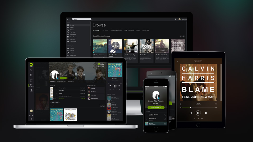
Spotify has done a remarkable job of remaking the music industry, but as a designer, I’ve found its past two years or so to be particularly interesting. Where the company itself has always been credited with being a transformative force, the aesthetics and usability of its products, at least in the beginning, were generally held in lower regard, especially when compared to its more design-savvy competitors. That began to change when Rochelle King joined as its Global VP of Design and User Experience and set about overhauling the company’s approach to design.
I got to know King in the first year of her tenure at Spotify and was privy to some of the details behind her efforts. And like many Spotify customers, I’ve also watched the fruits of her labor reveal themselves to the public; with each new release of Spotify’s products, design figured more and more prominently. Relative to where they were when she started, the design quality of the company’s offerings has progressed dramatically, though I think even King would agree there remains much work ahead. In all, this evolution has struck me as a fascinating example of a company that formerly put engineering first trying to reorganize its priorities around design. Several months ago, over email, King was kind enough to agree to answer a slew of questions that I had about what she and her team have done so far and what they hope to do in the future.
Khoi Vinh: You seem to be drawn to high profile, engineer-driven environments where design may be welcome but faces an uphill battle—first Netflix, now Spotify. Is that fair to say?
Rochelle King: I think that’s generally true. I’m not sure about the “high profile” part , but I love working on consumer products, things that I use on a daily basis. It’s also been really fun for me to work in the entertainment and media space because I love TV, movies and music. (Unlike what you might expect, my team will tell you that my tastes run very mainstream!)
I really like being in a place where I have the freedom to tackle both product and organizational challenges. At both Netflix and Spotify, we knew it was important to make design a stronger and more strategic voice in the company—but to do that you have to first build a strong team which can then become a foundation for delivering great design.
How do you go about figuring this out?
You really need to set down strong roots. Especially in companies that have been traditionally engineering driven, establishing your design team and how it works with other teams is incredibly important. Then, as long as you hire the right talent, you can get out of their way because the organization and company will understand how to give them the support they need to do their job right.
Before we talk about hiring, I want to ask about getting a design team working with other teams. Was there a model that worked for Netflix that, with some tailoring, you applied to Spotify? Or did you find you needed to start from scratch?
In both cases it’s been really important to first get the design team aligned with the larger tech and product organization and the broader company. It’s fundamentally about getting everyone to speak the same language and to explicitly align around the same goals, and to build empathy with each other. Sometimes, this means getting designers to understand the perspective from product, tech, and licensing better—and sometimes this means teaching our partners more about how design works to craft and define the user experience.
It’s worth noting that Netflix is almost twice as old as Spotify, so they were at different stages of development when I joined them. Netflix was a more established company/brand and also had a more established way of working. Because Spotify is still rapidly evolving as a company, it was even more important to be explicit, vocal and deliberate about the foundational things we were doing.
Can you give me an example of how that played out in practice? What actions did you take to express those “explicit, vocal and deliberate” foundational ideas?
The work we did around our design principles is a good example. In teams that haven’t worked together for very long, or in companies where design is a new function, establishing design principles is probably even more important because it’s also a mechanism for you to calibrate with each other. We knew we needed to be very thoughtful about both articulating the strategy behind the creation of our principles as well as rolling them out.
The first imperative was to build support from the company at large. We got feedback on initial drafts of our principles from the CEO and CPO to ensure we had their support, and then we socialized the principles broadly to the rest of the company. They’re now a key part of our onboarding “Intro Days” which all new Spotify employees attend.
We also tried to be clear in communicating their intended impact on the business. For each design principle, we talked about how it reflects our heritage in music, so that it would it resonate with everyone at Spotify, and how it can impact our bottom line, to show that good design inherently has business value. To take one example, “Do less” is a pretty standard principle that most designers understand instinctively. But we spoke about its relevance to music, about how that music should feel effortless—there should be nothing between you and its enjoyment. From a business perspective, the more that we want to appeal to a mainstream audience and grow our user base, the more important it is to make our application even easier than before.
Did that translate into a design team perspective on metrics?
Yes, absolutely. Spotify is very strong on using data to inform product decisions. We run a lot of A/B tests and collect many kinds of data (both qualitative and quantitative) about how our customers are using our product. However, the key success metric we were talking about internally was daily active users (DAU). For some of the designers and product folks, DAU can feel like a fairly abstract term, so we tried to clearly define the core user behavior that we felt was a strong driver of DAU. This was simply “playing more music.” So instead of saying to a designer, “Let’s design an experience that increases DAU,” we could say “Let’s design an experience which gets people to play more music.” It felt like a more tangible way to tie the business metrics to the user experience.
You can even get more specific about what those goals are and say, “Hey, design an experience that gets people who currently aren’t playing any songs in Spotify to play music,” and you would get a greater variety of solutions than if you had just asked for someone to design an experience that got people to play more music overall.
That brings me back to hiring. Did you find that you had the right designers in place to do this? Did you have to write new job descriptions, hire designers with different profiles?
Two years ago our team was severely under-resourced. We were at least half of the size we should have been. So while we had a really young and talented group in place, they were spread so thin that it was both difficult for them to grow as designers and to also deliver on or shape a strategic vision. Given the size of the team, it wasn’t really about changing the designers that we had for different ones. Instead it was about augmenting or growing the team to fill it out with different or complementary profiles. I often go to this metaphor of an orchestra. We had a great string section, but everyone was being asked to play violin. We needed to add the depth of some violas and cellos—but we also needed to add brass, woodwinds and rhythm sections. In design terms, that meant we needed user researchers, prototypers and others.
The company was also changing from being startup to being a more mature enterprise with a significantly larger user base, so we had to evolve in other ways as well. Bringing in people with experience working on similarly large consumer products or with different kinds of organizational experience like management or mentoring became as important as hiring folks with great design sensibility and hard skills like prototyping or conceptual thinking.
What kind of designer would do well at Spotify, and what kind wouldn’t do so well?
Well, in addition to the basic qualities that we always look for in good designers—design “chops,” ability to articulate their point of view, understanding how to leverage data to empower design—the designers here have to be highly adaptable and flexible. Spotify, as a company, is in an industry that is constantly changing. Our competitive landscape is very much in flux right now, as is the music industry itself. This means that we are constantly faced with challenges which are new to us and the company at large.
The design team is also in transition. Right now, we’re in the middle of our journey to actively and conscientiously define what “design” means at Spotify. Two years ago, there was no user research team and the design team was about a third of the size that it is now. That means that as a team we also need people who are as excited about helping to build a team and a culture of design as they are about doing the work itself.
When you look ahead, what is your vision for what Spotify’s design culture looks like?
There are three things that we’ve been focusing on when it comes to our vision for Spotify design…
First, we need to establish an awesome working culture, both in terms of who we are as a team and how we work. You can’t underestimate this. Having a high-functioning team that really respects each other, enjoys being with each other and is willing to challenge each other makes us more effective and is the foundation of what will ultimately allow us to grow as a design team and to do our best work.
Second, to build a great product, we need to be in tune and empathetic with both our users and the artists that have their music on our platform. Therefore, we want to encourage our designers to be curious about their audience and to gather as much knowledge as they can about them through research, data, interviews, etc. I also want us to be just as smart about “designing” how we collect that information as we are about creating great experiences.
Finally, it’s all about shipping with purpose. We want everyone to feel like they are proud of their work. The “purpose” behind shipping might be to learn more about our users behaviors,, to up-level our quality, or because we believe that a new experience is going to increase retention by X-percent. I’d love to have a culture where every designer has helped to define what they’re working on and therefore knows the meaning and value behind what they’re building and why they’re building it.
How far are you towards those goals right now?
I think we’ve taken a couple of initial big steps towards getting there, but there is definitely still work for us to do. Within Spotify, our team is still fairly new and everyone knows that we’re still in the process of building our design culture. So because we’re all in it together, I try to be pretty candid with them about what we’ve done so far and how far we have to go. So far, our progress has been very encouraging.
We’ve been thoughtful about hiring and we’re just starting to initiate some exciting projects around innovation and longer term product vision.
Group cohesion is an ongoing effort, I’d imagine. In the near term though, how about your progress on the practical matters you talked about before—being in tune with users and artists, and shipping with purpose?
On being in tune with the users, we took our first step by creating a user research team and we’re doing more early stage formative research, which is helping to bring the customer voice in earlier to help shape our product from the beginning.
However, our team still struggles to get time for all the projects we’re asked to contribute to, and we need to get better at communicating and broadcasting everything we’re learning to a wider audience in the tech/product and design organization, so that the great stuff that we’re finding out can have even more impact into how everyone in the company thinks about our audience.
On shipping, the first big design-led initiative was the redesign we did in April of last year. Over the years, our product had organically grown in so many different ways that it was starting to feel disjointed. To our users, the redesign was predominantly visual, which was only one of the many layers that we want to address. What you don’t see however, is the underlying framework, tools and system. That was probably the biggest win for us as a team because it changed the way we worked, and it let us focus on solving the bigger design problems that are beyond visual styling.
We have a few more design led projects in the works , so when those things launch I’ll be very excited. When we get to the point where everyone in the team feels like they’re really “shipping with purpose” and has shaped how we got there then I’ll feel like we’re meeting our full potential.
If you’re free the morning of next Tue 28 Apr and you’ll be in New York City, I invite you to join me and my collaborators from the Adobe Comp CC team at General Assembly in the Flatiron District. We’ll be serving breakfast and holding an open discussion about how design processes are changing in the mobile and cloud era. This is part of Adobe’s efforts to rethink its approach to design tools across platforms; we’ll be talking about the ideas and development of Comp CC, and sharing some of Adobe’s thinking on the present and future of design tools. Just as importantly, Adobe looks at this as an opportunity to hear firsthand from working designers about what’s important in the tools and workflow landscape today, so we hope you’ll come with all your feedback and opinions on what you’re seeing in the market right now and what you’d like to see. We expect a lively discussion.
The event is free and tickets are available at generalassemb.ly, though space is limited so RSVP before it’s all booked up. More about Comp CC here.
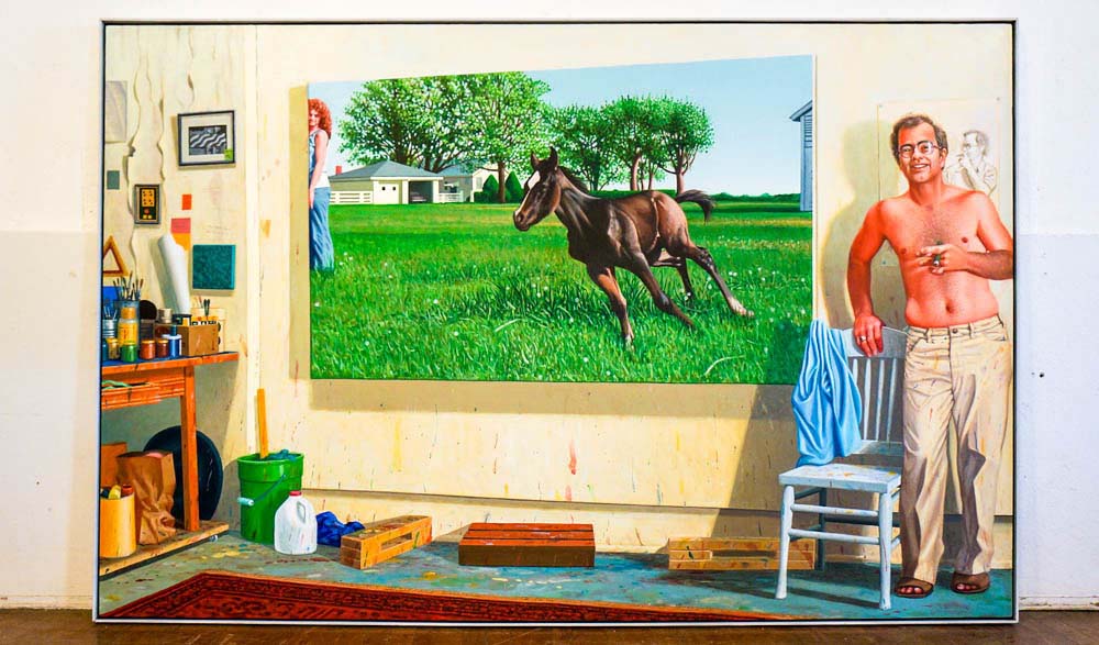
My father-in-law, Ken Holder, is an amazing painter who has produced a monumental body of work over the course of more than five decades. His œuvre spans many styles but I think of him as a prolific painter of landscapes—the landscapes of the American West, a region which is deeply embedded in his DNA (he grew up in rural Texas and taught painting for many years in the midwest), and the landscapes of the interior, particularly the dream-like world of the artist, which he has rendered with fantastical insight. His paintings often combine the two realms to produce effects that are both epic and intimate, and they’ve been collected by museums, public institutions and private collectors. You can see a selection of some of the more significant of them here.
After a devastating flood in his studio recently, Ken has decided that it’s time to downsize his operation and to find new homes for the many, many works that he’s stored there for years (thankfully, most of his pieces were undamaged). A huge retrospective of his career is currently on exhibition in Illinois, where he lives. This video that my sister-in-law shot of the gallery space during preparation for the show does a reasonable job of approximating the impact of some the larger works.
Find out more at holderretrospective.com. All of the works are on sale now, many at affordable prices.
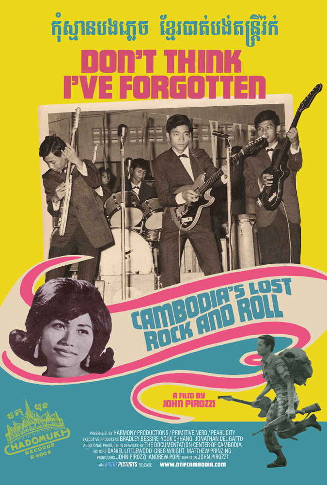
This documentary by director John Pirozzi tells the tale of an era of popular music in Cambodia that occurred during the 1960s and early 1970s but that has since become nearly forgotten by history. Combining Western rock music with distinctly Southeast Asian melodies and rhythms, a generation of Cambodian youths created a singularly idiosyncratic form of rock ’n’ roll— low-fi, primal, hooky, yet consistent with the country’s musical traditions. Sadly, much of that creative fertility was destroyed when the Khmer Rouge came to power in 1975, bringing with them a vicious campaign to wipe out all traces of Western influence as they perpetrated a massive genocide.
The film is currently on a screening tour across the United States, including two showings in New York City this week where Pirozzi and “special musical guests” will appear. More info at dtifcambodia.com.
It seems almost quaint now to find a major organization maintaining one of these, but New York City’s Metropolitan Transit Authority seems pretty committed to its Flickr account. I’m grateful for it, too; instead of relatively small, low-resolution, square-cropped images with annoying faux vintage filters, we get lots of beautiful, high-resolution shots of the city’s public transportation systems at work (admittedly, along with some mildly goofy photos from press conferences and the like).
My favorite are the shots from the in-progress Second Avenue subway line, which the MTA is going through a tremendous amount of effort to pretend is actually going to open one day real soon now (for non-New Yorkers, this project has been promised to the city for literally decades). Still, the shots, several of which I’ve included here, showcase the awe inspiring scale of the project and the tremendous amount of human and machine effort that’s going into tunneling underneath Manhattan.
Just spent ten minutes browsing Passport Index, a terrific gallery of passport covers from all over the world. These two, from New Zealand and Sweden, are my favorite. More at passportindex.org.
Employers ask me regularly if I know of any great designers they can hire. Usually, I suggest that they list their open position over at the Authentic Jobs board, where I’m a member, and then I tweet out the link a few times and mention it to people I know who might be a good fit.
Some of these jobs deserve a bit more exposure, though, as they’re unique and/or genuinely interesting. So today I’m introducing a new feature on Subtraction.com that I hope will become regular, or at least semi-regular: Job Opening Spotlight. With each installment I’ll pull a select listing from Authentic Jobs and ask the employer to make a case for why that particular job is worthy of special consideration from designers seeking new opportunities.
First up is Toca Boca, the Swedish “play studio” that has generated an amazing string of App Store hits with their toy-like apps for children. (My daughter is a big fan.) The company is branching out now, and they’re establishing a State-side presence focused on creating what they claim will be a new breed of video products for touch devices (There’s a good write-up of their plans at The Guardian today.) I talked to J Milligan from Toca Boca about their opening for a design director for this team:
What makes this job unique?
We have the chance to rethink the experience of how kids interact with video on what is becoming their first screen: the tablet. What’s so cool about the Toca Video Project is that there is no legacy to burden our design choices. We can think about content and the interface in totally new ways. For the design director it’s a chance to go way beyond the sort of DVD menu derived systems people use for video players on the web—boxes with thumbnails in grids. We need to make something playful, something that engages the viewer in the entire experience. This job is about joining a small collaborative group, designing a product, a team and a studio simultaneously, building everything out, and making it better and better. And it’s not a start-up. It’s a big initiative from a huge kids’ brand.
Is this a management job, or a hands-on job? Or both?
Definitely both. We’re going to start with a core team that is going to figure out the plan and design for the product—the larger team as a whole and the studio we need itself. So at first, the Design Director will be very hands on, expressing the philosophies and goals of the project with art, wireframes, animations, and whatever techniques he or she will utilize. As they build their team they will have to manage their resources, whether they be freelancers, staff artists and developers, or even an outside agency if we go that route. But I would hope that this person never stops sketching, experimenting and iterating. We are a production unit, not a bureaucracy!
What kind of experience would your ideal candidate possess?
Ideally this person would have worked on a variety of projects for a variety of audiences. Kids experience is a plus, but what I’m really looking for is an empathetic designer who can feel their way through the choices they make in terms of our audience’s experience. Also, they should be product-focused. We are shipping this thing on a schedule. While we want to explore and experiment, we also need to ship on time and on budget!
If you’re interested, see the Toca Boca job listing for design director. Also, if you have feedback on how I can improve this Job Opening Spotlight idea, let me know.
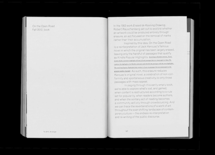
Sample from Erin Zwaska’s thesis “Adrift with a Draft: Graphic Design & the Poetic Potential of Technology”
This new project from Design Observer, in collaboration with on-demand publishing platform Blurb, seeks to highlight the work that graduating design students put into their thesis books.
Despite the fact that they represent countless hours and result in hard-earned expertise, they are too swiftly relegated to archives and libraries where they are seldom, if ever, seen again.
We want to change this.
With this new initiative, we invite graduating Master’s and Bachelor’s level students to share their thesis books. Any book designed using Blurb tools (which are compatible with InDesign) will be eligible. Students will be able to upload sample PDFs of their books: all entries will appear on the site, and links to Blurb means that anyone can buy your book, with the proceeds going to you.
Here are two superb articles about the role of aesthetics in the design of digital products. The first is from Emmet Connelly, director of product design at Intercom. Connolly laments the recent commoditization of design aesthetics. He argues that, increasingly, products look more and more indistinguishable from one another.
When you squint your eyes and tilt your head, don’t a lot of these products look awfully, well, similar? Don’t they look pretty but, at times, a little dull?
When it becomes necessary for virtually every business to signal they value design by adopting an up-to-date style, it becomes a commodity, a box to be ticked. That fresh look quickly becomes a cliché. This descent towards aesthetic monoculture was helped by the ease with which this particular style can be cheaply imitated: stick a blurred photo in the background, lay some centered Helvetica Neue on top and you’re already halfway there!
What other opportunities might we be missing out on? The internet and its surrounding technologies are the driving cultural forces of our generation. Taken individually all of these designs are quite beautiful. But who wants to live in a world with only one type of beauty?
The second article is from designer Eli Schiff and it’s the latest installment in an excellent series that he’s publishing called “Fall of the Designer.” (Part one is here, and also well worth a read.) Schiff delivers a nearly epic inventory of all the ways that designers and design tool makers have lately deemed aesthetics to be an unworthy pursuit for designers, and how these are reflective of a “larger movement that expects interface design to come a distant second to development.” The trend is to push the role of the designer closer and closer to the role of developer, and extinguish the role of the visual designer, effectively negating the aspect of design concerned with the subjective and the unquantifiable.
It would be ideal if both visual and interaction design tools could export directly and seamlessly into code—things are moving in this direction more rapidly with each passing day. Improving tools is a noble and necessary goal. But until we have such an integrated design environment, there is no need to scapegoat the field of visual design and aesthetics as Victor does by labeling practitioners as ‘helpless, dependent bullshitters.’ Those with an aptitude for visual design should not be siphoned away simply to satisfy an anti-intellectual bias towards aesthetics.
You can see in Schiff’s argument a clear explanation for the symptoms that Connolly identifies; as we have diminished the role of aesthetics in our working definition of design, we have naturally created an environment in which only one kind of aesthetic is desirable. This is the bigger-picture ramification of the past decade’s emphasis on coding as the most effective and most authentic means of executing design: we’re constraining our modes of expression at a time when we should be expanding them.
Both of these articles are superb and I recommend them. Read Connolly’s at medium.com, and Schiff’s at elischiff.com.
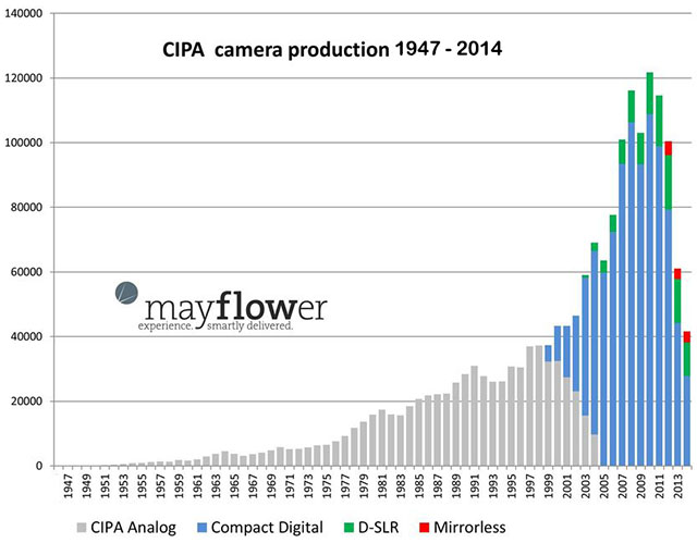
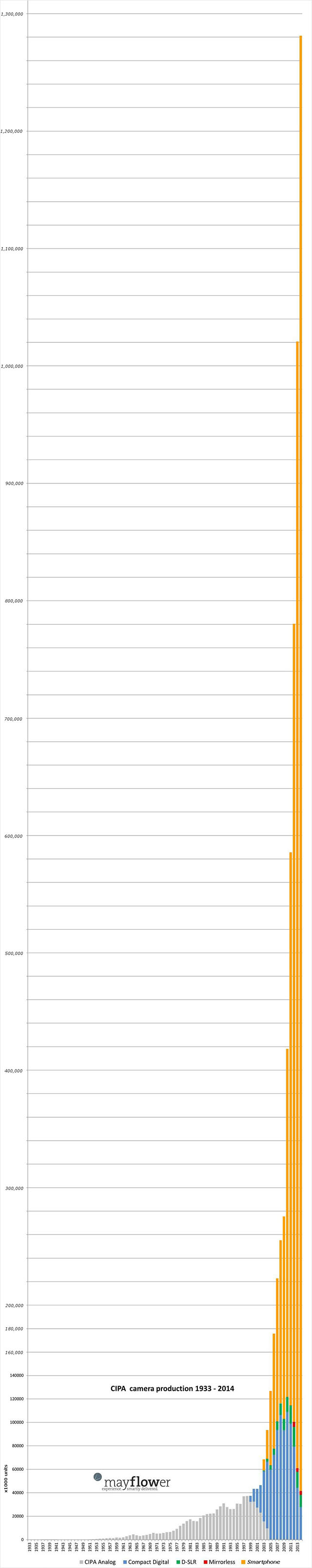
The story it tells is stark on its own, but then photographer Sven Skafisk amended the chart to account for the explosive growth of camera-enabled smartphones over the past decade. The new graphic is startling in its scale. Keep scrolling.