is a blog about design, technology and culture written by Khoi Vinh, and has been more or less continuously published since December 2000 in New York City. Khoi is currently Principal Designer at Adobe. Previously, Khoi was co-founder and CEO of Mixel (acquired in 2013), Design Director of The New York Times Online, and co-founder of the design studio Behavior, LLC. He is the author of “How They Got There: Interviews with Digital Designers About Their Careers”and “Ordering Disorder: Grid Principles for Web Design,” and was named one of Fast Company’s “fifty most influential designers in America.” Khoi lives in Crown Heights, Brooklyn with his wife and three children.
No sooner had I written in yesterday’s post that “I firmly believe that we’re in a golden age for design software” than LayerVault, the version control service for designers, announced that it’s shutting down in April. In a note posted to the site yesterday, CEO Kelly Sutton said:
Some folks may be wondering: Why? We will try to share our experience as best we can via post-mortems and blog posts, but the short answer is simple: we failed to make LayerVault financially viable, exhausted our existing capital reserves, and were unable to secure additional capital to sustain uninterrupted service. We ran out of money. Although the service will cease, we’re still hopeful that the technology may find a home.
I got to know Sutton a little bit last year and found him to be thoughtful and engaging. When I heard the news, I asked him over email if he could offer any comments. He was understandably reticent, as the company is in the process of liquidating its assets, but he did offer this.
We bit off more than we could chew. We built some good technology that explored new ideas, but failed to make a business out of it. We’ll do our best to share the lessons we’ve learned in the coming weeks and months.
It’s an unfortunate final chapter for one of my favorite startups. LayerVault was building a high-growth business predicated on the design industry. The very thought of a venture capital-scale enterprise focused on the problems that designers face every day was exciting. Adobe had done that before, obviously, but their success was rooted in a different age. I was rooting for LayerVault to be a designer’s GitHub or Dropbox, a multi-billion dollar startup that would turn into a major new brand.
That said, I have to admit that I wasn’t a LayerVault user myself. I tried on several occasions to adopt it, both for independent projects and for the work we’re doing at Wildcard. Though I found it beautiful and slickly made, it seemed to favor a workflow that wasn’t comfortable for me. It would be a disservice to describe it as more of an agency tool than a product development tool, but unfortunately that is what I heard from lots of people.
Still, none of that takes away from what the LayerVault team managed to build. By all accounts, they had lots of happy customers who used the service avidly—they just didn’t get enough of them to scale at the rate that was necessary for a venture-backed company to survive. It was a very good run nevertheless, and the team should be proud of its accomplishment.
LayerVault’s demise doesn’t shake my belief in this “golden age for design software” either. The circumstances practically demand this ongoing explosion in new products and tools: we now have a proliferation of once highly proprietary technology (today you can practically build your own Photoshop from open sources libraries); incredibly efficient, streamlined distribution (both direct channels and app stores); and a very sophisticated customer base that is practically empowered to solve the thorniest of its own problems.
From Framer to InVision to Affinity Designer to Marvel and of course Sketch, there is clearly a plethora of incredibly interesting, vibrant new players in this space. This market is so robust at the moment that even Adobe, who not long ago was effectively the only game in town, is now thoroughly motivated to work at perhaps its most innovative pace ever. (Full disclosure: I’m collaborating with Adobe on the forthcoming Project LayUp.)
And soon there will be a new player with a new take on version control for designers, too, informed at least in some small part by LayerVault’s legacy. I have no idea who they will be or what form the product will take, nor whether they will be venture-funded or bootstrapped, but I’m confident that this space is only going to get more interesting for the foreseeable future.
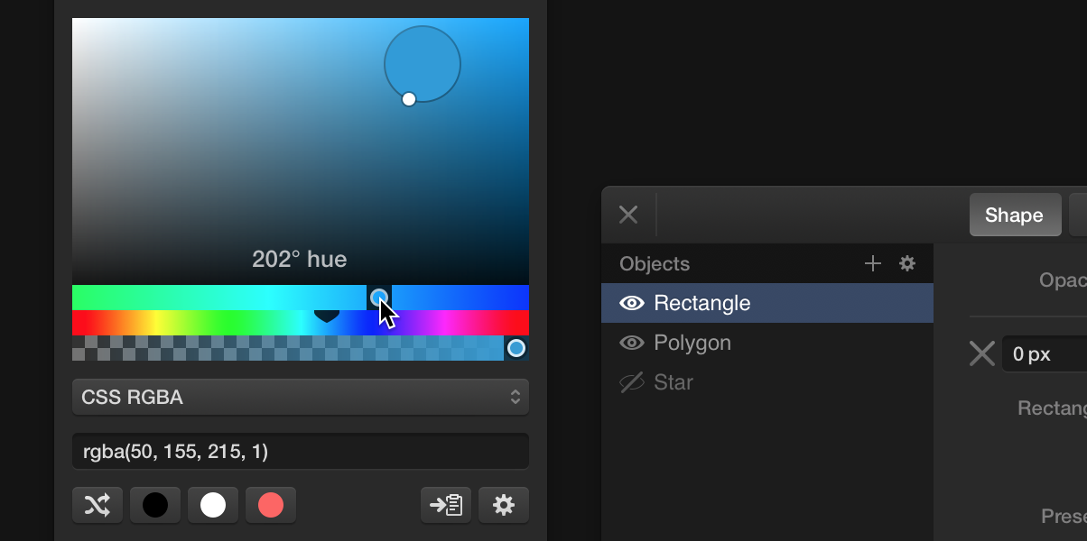
I firmly believe that we’re in a golden age for design software. The space has gotten so robust with new players, and there’s more great stuff to come. One of the long-brewing projects that I’ve been keeping my eye on is Skala from Marc Edwards and Bjango. Edwards has been working hard to get that app launched, but along the way he’s been releasing interesting, very promising bits of its functionality as standalone utilities. One of them, Skala Color gets a major update today.
This is what Edwards had to say about Skala in an email exchange we had last week:
When we began work on Skala, we decided it could be good to break out some features into separate apps. Doing so helps ensure those modules are well tested, and creates awareness Skala is coming (we’re a tiny company, so we can’t afford expensive ads).
We released Skala’s device previewing as Skala Preview. Skala Color was created to tackle our color picker. I had some important requirements for it:
The color picker had to be compact. Any pixels used to show the picker would be pixels not used to show artwork, so space efficiency is critical.
Accuracy is paramount. Skala is a professional tool, so it must be able to target any colour value easily.
A wide range of formats are needed. It’s common for designers and developers to need colours formatted for CSS, Swift, Objective-C etc.
Edwards addressed the first two points with finely tuned hue and opacity sliders. When the user drags them, a 4X enlargement opens that lets users “roughly” target a specific color, and then move the mouse pointer for more precise selection. As a result, a slider that’s only 100 pixels wide can expose four hundred unique colors. “More accuracy, in less space,” he said.
Skala Color also monitors the clipboard and, if it recognizes that a color in a known format is present, it shows a button in the correct color, which allows the user to select that color in a single click. Edwards told me: “If you’re using Skala Color to move colours between apps, it can be done with a single copy of the text, then a single click in the second app (and in many different formats).”
OS X’s color picker, like its Fonts panel, has been neglected by Apple for so long that it’s refreshing to see this kind of thoughtfulness and care put into a critical component of any screen designer’s toolbox. Get Skala Color 2 for free at bjango.com.
I can’t stop listening to “Expect Delays,” the second album from London quartet Evans the Death. Their self-titled debut album was enjoyable but I never really connected with it, due in part to my dislike for the band’s ungainly emo-esque moniker. Nevertheless, this follow-up is a real breakthrough that balances off-kilter tunefulness with a raucous wash of sound that recalls early Ride. Here is one of the strongest tracks on the album, “Don’t Laugh at My Angry Face.”
Response to my new book “How They Got There: Interviews With Digital Designers About Their Careers” has been really fantastic so far. I’m humbled by and grateful for all of the great notes I’ve been getting from people who have read it and told me how it’s exactly the inspiration and encouragement that they’ve been looking for. Thanks to everyone who’s bought it so far, and thanks to all of those who have helped spread the word.
Some of you may remember that I offered a free sample of the book’s first thirty pages, including my interview with Dribbble’s Dan Cederholm, to people who signed up for my mailing list. That offer is gone, but I’m so convinced that people who get a taste of the interviews in the book will want to read more that I’ve decided to publish a different chapter over at Medium. This time, I’m running my interview with Mule Design Studio co-founder Erika Hall in its entirety. As I write in the introduction, it was the first of the interviews I conducted for the book, and so it had special importance:
I knew that, if it went off well, our discussion would serve as a kind of template for the others that would follow, and so I was relieved when Erika talked about her professional life with such unaffected candor and incisive wit. Her tales of the first dot-com bubble and burst, and how she salvaged from that wreckage the building blocks that would lead to Mule Design, were exactly what I was looking for. This interview remains one of my very favorites from all of the ones I conducted for ‘How They Got There.’
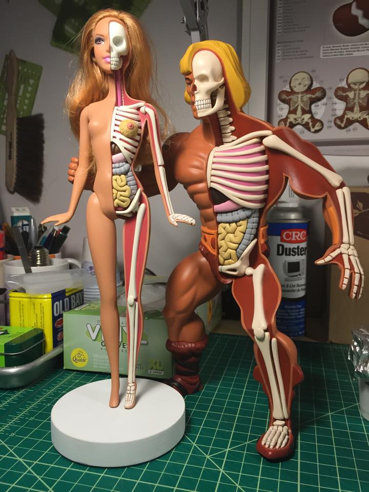
These are two of artist Jason Freeny’s recent works: Anatomical He-Man and Anatomical Strawberry Blonde Barbie. They’re sculpted in the tradition of mass-produced plastic children’s toys, excepting of course the cut-away reveal of each figurine’s insides. Many of his works are like this; one half is a note-perfect homage to the toys of a latchkey kid’s youth, and the other is a cartoonishly frank reveal of the twisted anatomical makeup that “supports” the presentable form. You can see more of these sculptures at his Facebook page and at his site moistproduction.com.
Some very useful principles in this TechCrunch article for designing animation into mobile software interfaces from Tim Donnelly, co-founder of the award-winning Storehouse. With that product, Donnelly and Storehouse CEO Mark Kawano were responsible for significantly raising the bar on how motion is used in mobile user interfaces, so his insight is highly credentialed, for my money. We’re only starting to scratch the surface on what animation can do to enhance the user experience; I expect this area to become much more sophisticated—and much more crucial for successful products—before too long.
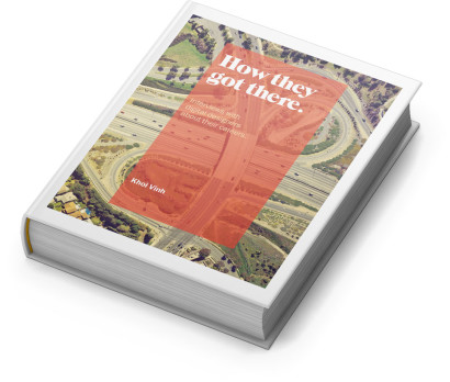
Mockup of my book (just a mockup—the book itself is available in PDF, iBooks and Kindle formats only)
As I wrote when I announced it, the book features fourteen interviews that I conducted with digital designers of prominence—many of the names will be familiar to readers of this blog, while others are up and comers or have built fantastic careers outside of the main spotlight. I talked to studio designers, agency designers, startup designers, designer entrepreneurs—I worked hard to get a diversity of folks who have done meaningful work “online” in recent history. Here’s the full list:
Dan Cederholm of Dribbble
Alex Cornell of Firespotter Labs
Nicholas Felton of Daytum
Agnieszka Gasparska of Kiss Me I’m Polish
Cemre Güngör of Branch
Erika Hall of Mule
Naz Hamid of Weightshift
Karen McGrane of Bond Art + Science
Wilson Miner of The Factory
Jill Nussbaum of The Barbarian Group
Evan Sharp of Pinterest
Geoff Teehan of Teehan + Lax
Justin Van Slembrouck of Digg
Marcos Weskamp of Flipboard
The book has already gotten some great buzz from folks like Jason Kottke, Michael Bierut, Jeffrey Zeldman, Jessica Helfand, Cameron Moll and others.
This book is special to me in that it’s the book that I wanted to be able to read when I was starting out in my career. And even as I conducted the interviews, I found lots of sage advice to consider as I think about what’s next for my own career. I think you’ll get a lot out of it too, regardless of whether you’re new to digital design, you’re a longtime veteran considering a career change, or even if you’re an executive trying to understand what motivates the very best designers in their careers.
The full price of the book is US$30, but for a limited time, you can get a discount for just tweeting about the book and helping to spread the word. (If before today you were a subscriber to my mailing list here at Subtraction.com you get an even bigger discount—sign up for future sales if you haven’t already.) Find out more and buy your copy (you get PDF, iBooks and Kindle vesions all in one) at howtheygotthere.us.
This is a pretty clever publicity stunt for Twentieth Century Fox’s upcoming film “Unfinished Business,” a comedy about a business trip starring Vince Vaughn, Tom Wilkinson and Dave Franco. The studio partnered with Getty Images’ iStock to create a series of free, downloadable images in the grand tradition of cheesy, painfully bad stock photography. Frankly, the movie doesn’t look all that great, but I think the humor in these images is pretty sharp.
There are twelve of these images in total, and Getty is doling them out in small batches at this site.
So Long, Facebox
Speaking of stock photography, this is a good time as any to mention that my frequent collaborator Matt and I recently decided to retire Facebox, our collection of fifty stock user avatar images for UI design and business presentations. We released Facebox in September 2013 after a sprint of photographing, editing and packaging that took a few short weeks. It was great fun, and we’ve been really pleased by the reaction—seeing Facebox photos show up in all kinds of product marketing on the web has been a blast. Ultimately, however, we decided that in fairness to our models, who were very generous with their likenesses, we should stop selling the package so that their faces don’t get overexposed. We accomplished what we set out to do; create a useful resource for ourselves and share it with others, so it’s time to move on to new projects.
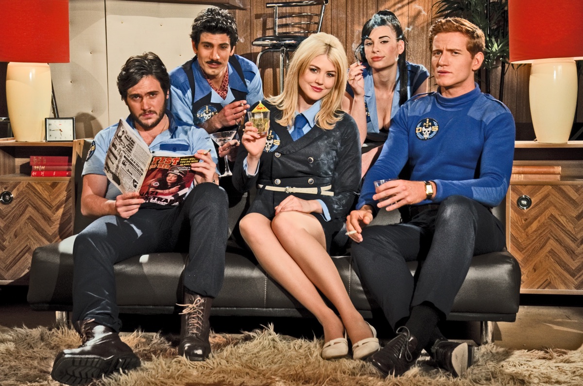
Thanks to my Australian friends for inventing “Danger 5,” the absurdist action comedy TV series that, in its first season, blended together 60s spy movie conceits, historically inaccurate Nazi villains and generous doses of “Thunderbirds” into a bizarre and generally inappropriate pop pastiche.
That first season is now available in the U.S. on Netflix—I know because I watched all six episodes while laid up in bed over the weekend with a winter cold, and I really, really enjoyed myself. Be warned though: the show is riddled with gags that will offend everybody sooner or later.
Season two is airing now in Australia, but we won’t see it here for a while. It jumps forward in “time” (the show has a very loose interpretation of that concept) to the 1980s, apparently so it can send up a fresh slew of pop culture touch points. I can’t wait. The trailer is below.
This brief, heartbreaking video was just released yesterday. Its privacy settings apparently don’t allow it to be embedded, unfortunately. PBS writes:
A few months before his death in 2003, Fred Rogers recorded this video message for those who grew up watching ‘Mister Rogers’ Neighborhood.’ This message was one of the last things he recorded in the WQED studio, according to the Fred Rogers Company. He died of stomach cancer twelve years ago today.
I grew up watching this show and my children are watching a lot of episodes now on YouTube, so seeing this was unexpectedly resonant. It nearly made me cry, and certainly made me recall what a unique and wonderful person Fred Rogers was.