is a blog about design, technology and culture written by Khoi Vinh, and has been more or less continuously published since December 2000 in New York City. Khoi is currently Principal Designer at Adobe. Previously, Khoi was co-founder and CEO of Mixel (acquired in 2013), Design Director of The New York Times Online, and co-founder of the design studio Behavior, LLC. He is the author of “How They Got There: Interviews with Digital Designers About Their Careers”and “Ordering Disorder: Grid Principles for Web Design,” and was named one of Fast Company’s “fifty most influential designers in America.” Khoi lives in Crown Heights, Brooklyn with his wife and three children.
Tomorrow at 11:00a Eastern, I’ll be joining the estimable Jeffrey Zeldman on his wonderful podcast The Big Web Show. You can tune in at that time to hear us chat live or, starting about an hour or so later, you can grab the episode via iTunes and listen to it in your favorite podcast player.
We’ll be talking about—well, whatever Jeffrey wants to talk about, because when he invites you to appear on his show, you say “yes” even if he just wants to talk about the weather. But hopefully we’ll find some time to talk about my new book, “How They Got There: Interviews With Digital Designers About Their Careers,” which is getting very close to being released. Very close! (If you missed my announcement last month, read it here.)
If you haven’t done so yet, you should sign up for the book’s mailing list. You’ll get an early bird discount when it goes on sale, but before that, if everything goes according to plan, you’ll also get a sneak peek at a sample chapter. Sign up at howtheygotthere.us.
People often ask me how I like my iPhone 6 Plus, as if its gargantuan size were some kind of burden that can only be tolerated, at best. It’s true, the Plus’s overall girth is really more than I need, and I occasionally wish it were more easily handled. On the whole though, I enjoy the copious screen resolution and don’t really mind the outsized form factor.
Frankly, what annoys me more are the Plus’s apparently unique software bugs related to screen orientation, as if the device itself is so unwieldy it doesn’t know which way it’s pointing. There are times when the interface can’t successfully make the transition from landscape to portrait or vice versa, like so:
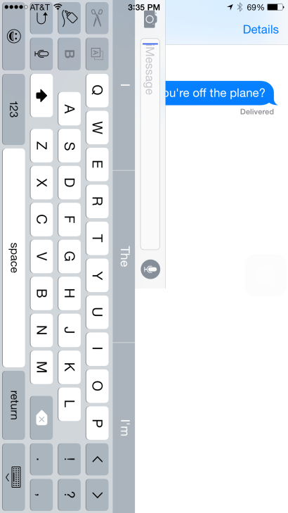
The device doesn’t fare much better when the keyboard is retracted, either. (The rather odd exchange with myself depicted below was captured from a test SMS that I sent to my new Nexus 6.)
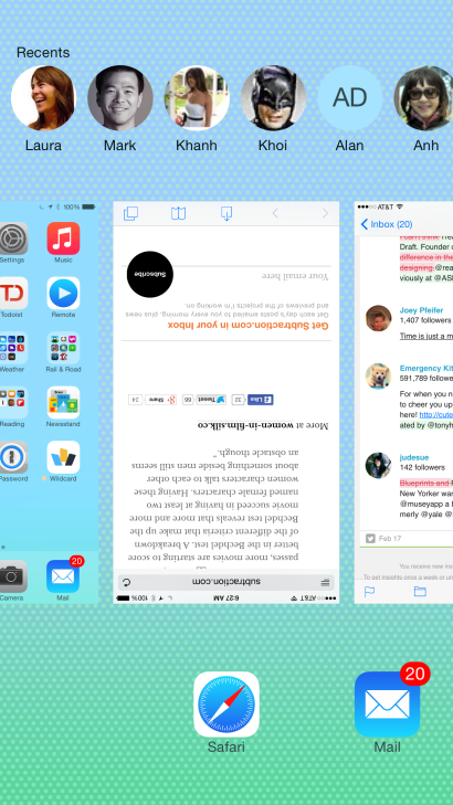
Sometimes, while clearly holding the 6 Plus in portrait mode, I’ll unlock it only to discover that the home screen is stuck in landscape mode. I wasn’t able to capture a video of that bug, but I did take this screenshot of a similar bug in multitasking view, where the rules of gravity sometimes seem fungible:
I haven’t exactly conducted a formal survey, but anecdotally these problems don’t seem to plague owners of the smaller iPhone 6. Maybe I’m wrong about that? Anyway, none of this makes me regret buying the iPhone 6 Plus. On the whole, it’s a mostly pretty good device that I’m happy to own, especially for its superb camera.
If I sound less than fully enthused by the device, it’s because I still have the same reservations about its industrial design that I wrote about last fall. What I said then was that both the 6 and the 6 Plus seemed to lack conviction, that they didn’t seem like an emphatic step forward. I had thought perhaps that after owning one for several months I might come around from that viewpoint, but that’s not the case.
Update: Okay I should have done more research. Apparently more than a few iPhone 6 users have experienced the same bug. Consensus suggests that it’s an iOS 8 problem.
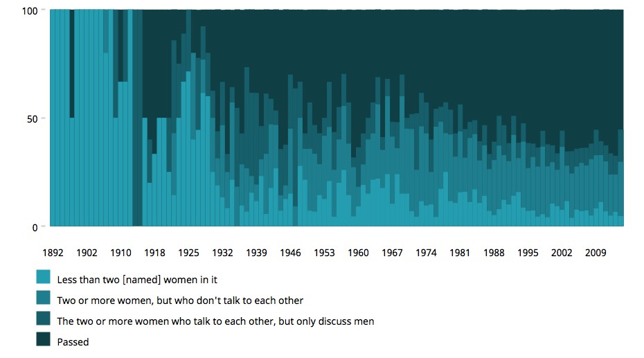
Despite its origins as a joke in a comic strip, the so-called Bechdel Test has turned into a useful, if imperfect, metric for understanding how women are portrayed in film. As a refresher, the test asks whether any given movie features at least two female characters in it, whether the two talk to each other, and whether the two talk about something besides a male character. This project at data platform Silk visualizes how well movies have fared under this test historically, over the past one-hundred and twenty or so years.
Pass vs. Failed Bechdel Test Criteria Distribution of Surveyed Movies
The project’s authors offer this takeaway:
The trend seems to suggest that, as time passes, more movies are starting to score better in the Bechdel test. A breakdown of the different criteria that make up the Bechdel test reveals that more and more movie succeed in having at least two named female characters. Having these women characters talk to each other about something beside men still seems an obstacle though.
U.K. videographer Paul Parker made this transfixing video that captures the flight pattern of birds in a novel way. He used After Effects to duplicate each bird many times along its flight path. The end result reveals a wonderful, almost mathematical, hidden beauty. Or, if you prefer, they bring to life a Hitchcockian horror sequence.
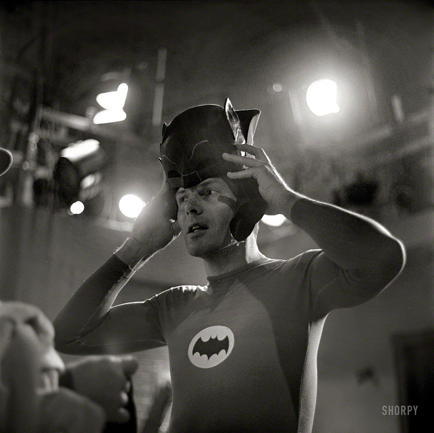
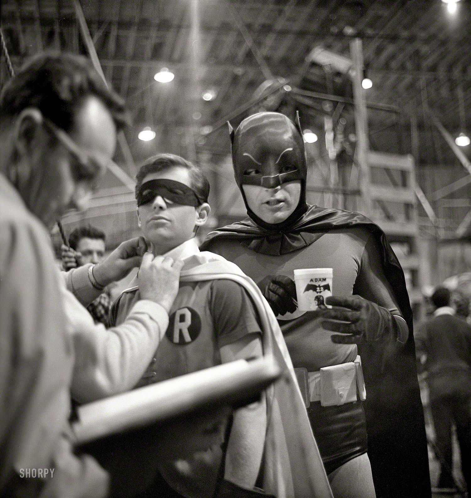
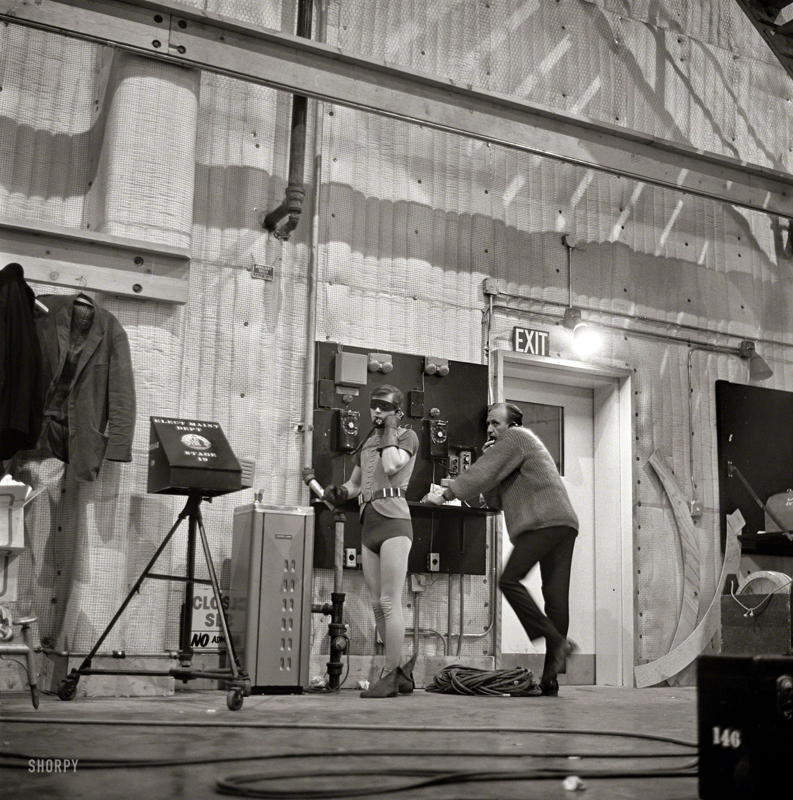
The blog Vintage Everyday has a trove of really wonderful photos from the set of 1966’s “Batman: The Movie” film starring Adam West and Burt Ward. As I wrote back in November, the TV show upon which this movie was based only recently managed to escape legal limbo; read about it in this post.
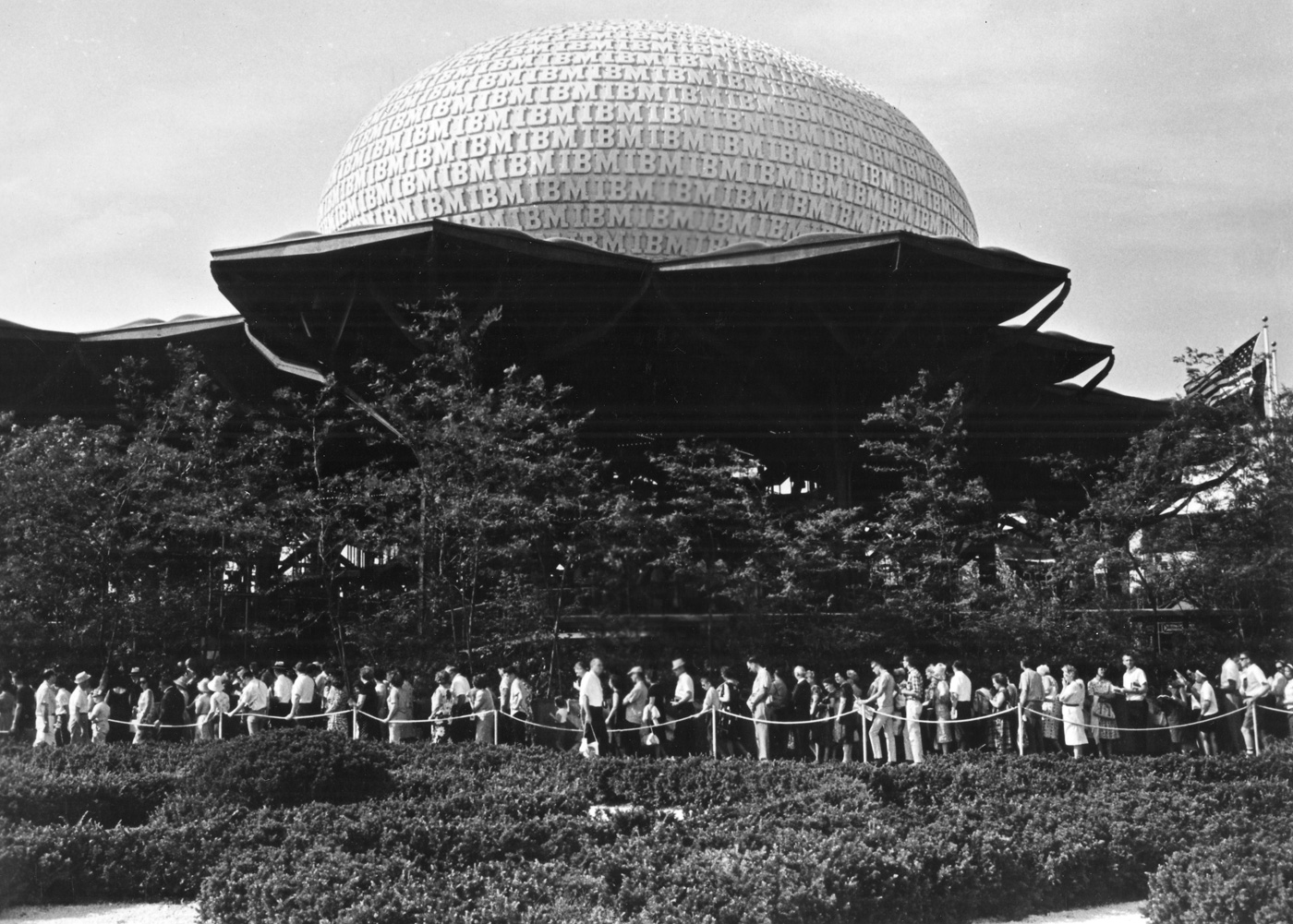
IBM pavilion designed by Paul Rand at the 1964 New York World’s Fair
Starting in less than two weeks The Museum of the City of New York will open an exhibition called “Everything Is Design: The Work of Paul Rand” highlighting the career of the famous graphic designer. Its scope seems ambitious, being organized into five major sections: “Early Life and Career,” “Transforming Madison Avenue,” “Books and Publications,” “Creating Corporate America,” and “Writing and Teaching.”
The show was curated by Donald Albrecht, who is the City Museum’s Curator of Architecture and Design, co-chaired by Michael Bierut, Steven Heller, Curt Schreiber, Willy Wong, and Keith Yamashita, and designed by Perrin Studio. It has a generously extended run from 25 February through 19 July, so you have plenty of time to see it. (Those who still won’t be able to make it to New York during that time might do well to settle for Steve Heller’s superb monograph “Paul Rand” instead.)
Today I found myself browsing the many After Effects project templates available at creative marketplace Envato, in particular the ones that offer the sort of make-believe user interfaces that are popular in action and sci-fi films. I was impressed by their quality. Here are a few examples, as represented by their demo reels.
The first thing that struck me about them was that they’re quite extensive; each boasts literally hundreds of design elements, almost all of them animated. And they’re not bad looking either; my critical eye for this kind of thing is solely limited to my experience as a moviegoer, but on the whole these design “systems” look about as good as what you’d get in your average summer blockbuster.
It’s interesting to think of this kind of work as evidence of the increasing commoditization of design. These projects seem to have taken many, many hours of meticulous labor, and yet any of them can be had for less than US$50—an almost comically affordable price point. Of course in all three of these cases they look like they were created in non-Western markets, where the economics make that kind of calculus possible.
You could argue that this kind of product, in which aesthetics are entirely divorced from utility, is ideal for an arrangement in which lower-wage workers deliver highly polished but functionally meaningless work. A corollary to that would be the assertion that truly in-depth, purpose-driven design will always need to be done in Western markets. Personally, I don’t buy that argument—it seems inevitable to me that the sale value of design work will trend down over time.
Then again, that was what I believed a decade ago too, when it first became possible to work with less expensive, remotely located designers efficiently. In the intervening years though the market has not tilted towards offshore work in any significant way; the very best work still needs to be done in relatively close proximity to the actual businesses that commission it.
Still, the fact that it hasn’t happened yet doesn’t mean it won’t happen—or that it can’t happen. Whether it takes another ten or twenty or thirty years, as technology further shrinks the world and other markets shore up their ability to produce substantive designers, it’s my bet that the world at large will catch up with the cozy, affluent market that Western designers enjoy today. The clock of globalization is ticking for us.
Celebrated type designer Tobias Frere-Jones is apparently offering a master course in the finer details of making typefaces viable over at his blog.
Our conscious minds want to draw one shape, but our eyes need to see another. Part of typeface design is managing this eternal friction between logic and optics. It’s always there, no matter the style.
This new series of posts will explore what I call ‘typeface mechanics,’ the behind-the-scenes work that makes typefaces visually functional. It is what placates the stubborn oddities of human perception, helps or hinders the user, and informs long-standing conventions of design.
The first lesson delves into optically normalizing the height of characters so that they appear at the same scale and it’s clear, straightforward and superb. There’s no indication of how often these will be published, but thankfully RSS was invented.
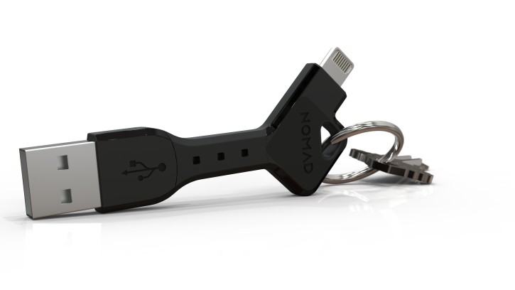
San Francisco’s Nomad Goods makes some of the niftiest smartphone gadgets I’ve seen. Each of their charging accessories has a novel twist, just enough of inventiveness to set it apart from the pack. Their diminutive Nomad Key is a compact, rubberized USB-to-Lightning (or, if you insist, USB-to-Micro USB) cable that fits onto your key chain, so that you can always have one handy.
Similarly, their Nomad Clip is a caribiner with a Lightning cable built into its spine. Maybe even better, their Nomad Plus piggybacks onto your iPhone’s power adapter and adds an 1800mAh external battery; the device charges your phone first and then immediately charges the external battery.
More at hellonomad.com (that link gets you 15% off and gets me a little kickback).
I read Pulitzer Award-winner Lawrence Wright’s “Going Clear: Scientology, Hollywood, and the Prison of Belief” when it was first published a few years ago and couldn’t put it down. It’s a riveting, often horrifying account of the history of Scientology, but also an unstinting look at what motivates the church’s followers. One assertion that Wright made that I found particularly salient was the idea that Scientology, for all of its ills (and Wright is unsparing in detailing them), is fundamentally not much different than any other faith in the first century of its journey. That’s neither an endorsement nor an indictment, just a sober observation on Wright’s part that speaks volumes about his highly disciplined approach to the subject matter. (You can read some of the work that Wright put into “Going Clear” in his 2011 New Yorker article “The Apostate.”)
Wright’s book has since been adapted into a documentary by highly regarded filmmaker Alex Gibney under the slightly shortened title “Going Clear: Scientology and the Prison of Belief.” It debuted at the Sundance Film Festival last month to a warm reception. HBO has picked up rights to air it in March, and it will also run on Vimeo later in the year. There’s no trailer available yet (that I could find), but this short video from The Hollywood Reporter featuring Gibney and Wright gives a flavor of the film.
Update, 19 Feb: HBO has released the first trailer for the film, below. I also understand from folks close to the production that it will show in a theater in New York City for a limited run before it airs on HBO.