is a blog about design, technology and culture written by Khoi Vinh, and has been more or less continuously published since December 2000 in New York City. Khoi is currently Principal Designer at Adobe. Previously, Khoi was co-founder and CEO of Mixel (acquired in 2013), Design Director of The New York Times Online, and co-founder of the design studio Behavior, LLC. He is the author of “How They Got There: Interviews with Digital Designers About Their Careers”and “Ordering Disorder: Grid Principles for Web Design,” and was named one of Fast Company’s “fifty most influential designers in America.” Khoi lives in Crown Heights, Brooklyn with his wife and three children.
Jerry Seinfeld delivered this stand-up routine on Jimmy Fallon’s Tonight Show earlier in the week. His bit apparently followed a segment in which members of the studio audience all received brand new televisions; Seinfeld uses that gesture of corporate largesse as a jumping off point for some hilarious, incisive ruminations on acquiring and owning things. It’s not a standard diatribe against materialism as a moral failing, but rather a witty, smart assessment of the actual nature of having things, and the inherently perishable nature of possessions.
Merry Christmas, by the way.
This is the second time this year I’ve linked to surprisingly smart routines that Seinfeld has delivered—watch his devastatingly frank Clio Award acceptance speech here. I’ve always thought he was talented and funny, but if these are any indication, it feels like he’s doing some of the best work of his career lately.
This fall I started making some decisive home automation improvements to our house—I know there are plenty of others who are much further along this particular curve than I am, but I thought I’d share some brief thoughts on what we’ve done so far.
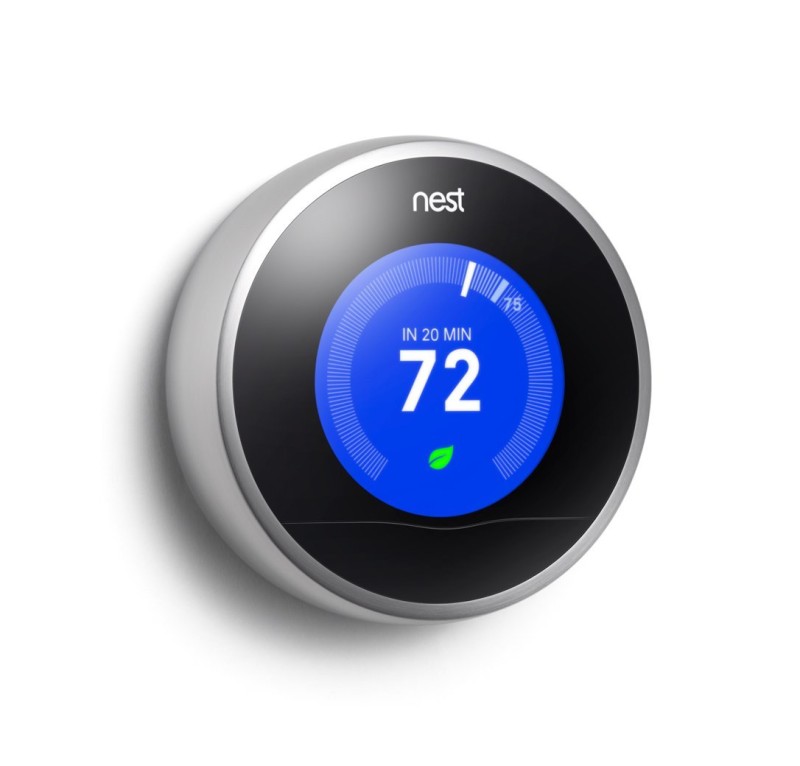
Actually this effort really started earlier this year when I installed our first Nest Thermostat. We live in a century old house without central air, so the Nest only controls heating during cold months, but it works terrifically. It’s a triumph of through-and-through good design—the interface and the hardware are intimately, elegantly linked.
If it did nothing more than demystify the act of changing the temperature in one’s house—something that has always been confounding with older thermostats—that would almost be enough. But all of its advertised “smart home” benefits also ring true in everyday use: the thermostat learned our heating preferences and tailored a schedule accordingly. As a result, it begins heating up the house shortly before we wake up, and turns it down by itself while we’re out of the house for extended periods of time.
I’ve been so happy with the Nest thermostat that I bought a second one for the bottom floor of our house. In fact, my experience with the Nest brand has been so convincing that it’s now my preference for all things home automation. Unfortunately, that only gets you so far.
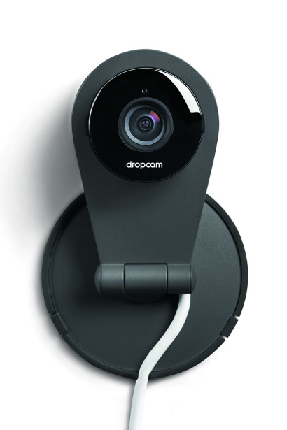
Nest does produce a smoke and carbon monoxide detector, which interests me, but I’ve been focused on more immediate home automation needs instead. For instance, we have twin toddler boys who are getting increasingly rowdy in their cribs when they can’t sleep, so a good baby monitor has been a necessity for some time now. Earlier in the year I bought a Wi-Fi Baby brand camera, which is really just a value added Y-Cam. I almost immediately regretted the decision, as those cameras really feel primitive and unsophisticated next to the Dropcam that ultimately replaced them. Y-Cam software feels out of date, as if it were ported from an old Windows application to the Web, its hardware is clunky and unattractive, and the camera itself has poor, frustratingly narrow viewing angles. By contrast, Dropcam has modern software, a unique, attractive industrial design, and a much wider, much more useful viewing angle. I would recommend it to anyone.
The company was acquired by Nest not long ago, but unfortunately my Nest account and my Nest iOS app (which is very well-designed too) still don’t work with the Dropcam. I had to register for a separate Dropcam account and install a separate Dropcam iOS app—first world problem, I know.
What I really want is a Nest-powered home security system, but absent that I settled for a system from Frontpoint Security, which provides its own hardware but resells monitoring services from Alarm.com. Frontpoint is pretty well reviewed, and were recommended by The Sweethome, which is what convinced me to go with them.
The system is easy to install yourself and reliable, and hooks into Alarm.com’s serviceable iOS app. While my family and I were traveling over Thanksgiving, I was able to disarm the system for a guest who had her own key (we don’t yet have automated locks on our doors), which felt very satisfying. But overall the product lacks the polish of Nest or Dropcam and feels closer to a more polished version of Y-Cam-style hardware—still clunky, with the feel of cheap plastic materials. Unfortunately, Frontpoint’s pricing makes it hard to avoid signing a long contract, so I’m committed to the system for the next few years.
Signing a contract at this point in the evolution of home automation is particularly painful because so much is changing so fast. I expect a much more robust set of offerings in the market within a few years. For instance, it would be surprising if Nest doesn’t have a more complete set of home automation products—including security—by that time. What’s more, as soon as next year, we should start seeing the first products built from the ground up with Apple’s HomeKit home automation SDK at their cores, which could be really game changing. I’m already considering lighting automation courtesy of Lutron, which looks set to integrate HomeKit, and rumor has it that the next major revision of Apple TV will function as a kind of hub for HomeKit-connected products. (Actually, Frontpoint has indicated that they may do an integration as well.) The future is right around the corner, as always.
Ancient history: thirty-seven years ago yesterday one of the most electrifying live performances on American network television ever was broadcast. Elvis Costello, making a last minute appearance on Saturday Night Live with his band The Attractions, interrupted his own song “Less Than Zero” and broke into a performance of “Radio Radio.” The former is a plenty acerbic song on its own, being at heart a denunciation of a British fascist politician, but the latter, which still stands as among the best of Costello’s many, many superb compositions, was a clear flipping of the bird to media powers—it includes the lines “I want to bite the hand that feeds me/I want to bite that hand so badly.”
Watching Costello upend the proceedings and then, before anyone realizes what’s happening, rally his band to perform an entirely different song is still startling—a perfect marriage of the power of live television and the then still nascent punk spirit. The stunt enraged SNL producer Lorne Michaels who reportedly watched it with his middle finger raised, and who subsequently banned Costello from the show for over a decade.
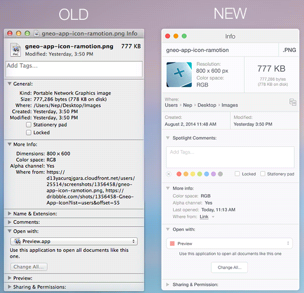
This is a really interesting proposed redesign of OS X’s standard Get Info window by interface design studio Ramotion. It applies a fresh, Yosemite-like coat of paint onto a design that has hardly changed in a decade. It reminds me that each time Apple implements a major overhaul of its desktop operating system’s visual furniture, they always seem to neglect pedestrian but important elements—Get Info is one of them, but I’d like to see redesigned Fonts and Colors palettes even more. I’d guess that those two are more deeply integrated into more workflows than Get Info, and they’re both deeply broken in terms of usability.
That’s not to take away from Ramotion’s Get Info design though. It’s quite attractive and full of interesting ideas. See the full project at behance.net.
This lovely short film documents the process of hand-printing and binding a book. There are ancient looking hammers and hot metal tools and wooden printing presses and guys with beards involved. In truth, it’s a lovely tableau and reveals some techniques that I wasn’t aware of, though the precious lighting and delicate piano music involved could inspire feelings of nostalgia for just about any kind of activity.
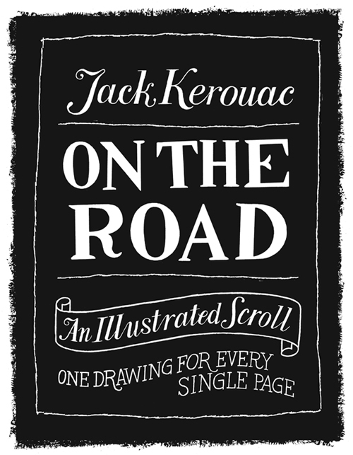
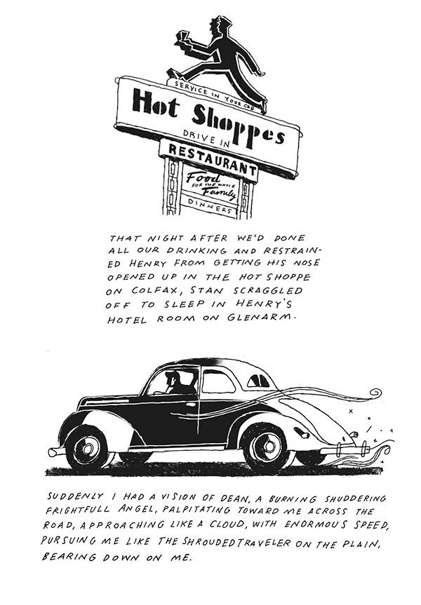
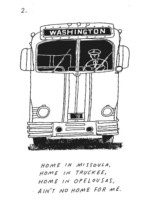
Illustrator Paul Rogers recently completed illustrating Jack Kerouac’s “On the Road”—he made one black and white drawing for each of the novel’s 309 pages. The work is fantastic; it’s lively and bold and improvisational and clever, just like the book itself. Rogers posted the drawings in a series of very tall scrolling blog posts, which you can see collected here. A few examples below.
Unsurprisingly, Rogers’s project attracted a lot of interest and Viking Penguin had even considered publishing it—but the work apparently did not meet with approval from the Kerouac Estate. Rogers writes:
They decided not to grant permission because they feel that the project ‘detracts from the book,’ is a ‘dumbing down’ of On the Road, and ‘diminishes the aura’ that the novel possesses. We disagree, but it seems the Estate has made up its mind about it.
For such an iconoclastic book, that response strikes me as remarkably tone deaf.
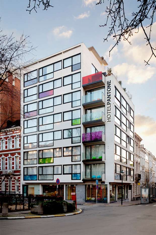
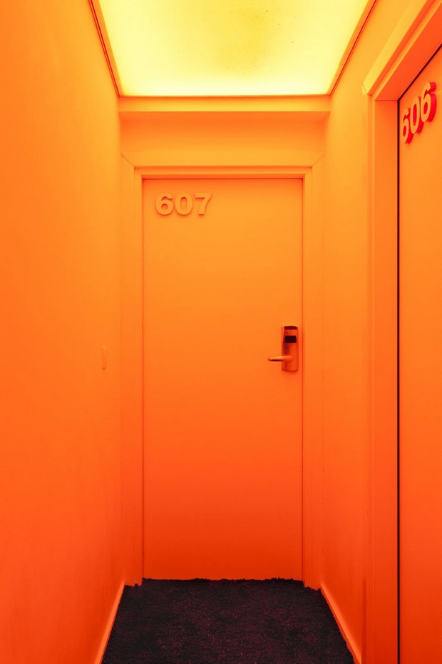
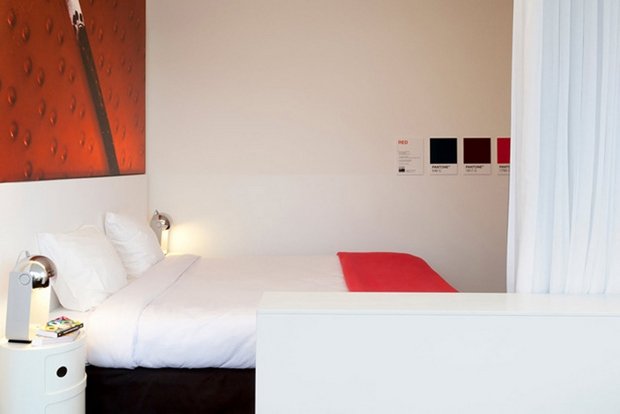
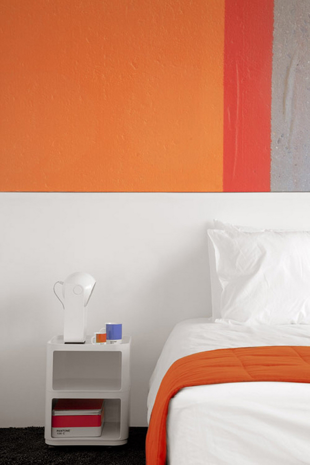
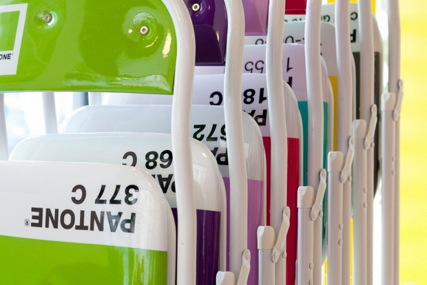
I’m surprised by how well PANTONE has managed its brand in recent years. What started as an obscure system for the faithful reproduction of colors in mass media is being progressively transformed into a kind of lifestyle brand where the central idea is simply colors. You can buy all sorts of consumer products bearing the distinctive look of a PANTONE color chip, and people apparently pay attention to the company’s absurd Color of the Year pronouncements. Now, if you live in or are traveling to Brussels, you can stay at the PANTONE Hotel, too, where the linens, walls, closets and even the folding chairs are all PANTONE branded. It actually looks kind of adorable, if also ridiculous.
They call it “the center of the color universe,” whatever that means. More information at pantonehotel.com.
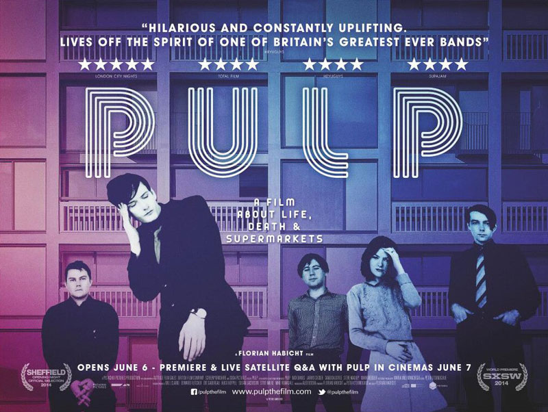
This is the U.K. poster for the British band Pulp’s documentary “Pulp: A Film about Life, Death & Supermarkets.” It’s passable, but perhaps because the central band photo is so familiar to me from following Pulp since the 1990s, it comes off as unremarkable, even lazy. Meanwhile, a far superior poster was issued for the same film’s U.S. release (which I wrote about here):
Aside from that selection, the rest of Curry’s list makes a lot more sense to me and contains some real gems. You can see it in full at mubi.com.
If you are the kind of person who is both a color enthusiast and a masochist, this 1,000-piece jigsaw puzzle of the full CMYK gamut was made for you. Each piece of the puzzle is made up of a single color, and your task is to place it in relation to all the other pieces. Like any jigsaw puzzle, the box has a picture of the completed image, but in this case it seems only barely helpful. Still, cute idea.
Here’s a time lapse video of the puzzle being pieced together. There’s no indication of how long it took.
This is a really great supercut of the way outer space has been portrayed in numerous films from “2001: A Space Odyssey” through “Interstellar.” It demonstrates how effective contemporary cinema has been at depicting the beauty of space, even if much of it was imagined and scientifically inaccurate—and even if it was imagined by Michael Bay, as was the case with “Transformers: Dark of the Moon.” Seeing all these disparate sources from the past several decades, when our ambitions for actually going into space dimmed significantly, underlines how a lot of that imagination was funneled into a sort of alternative, collective dream about what space could be. We gave up on the reality of space and instead dreamed about it at the movies.