is a blog about design, technology and culture written by Khoi Vinh, and has been more or less continuously published since December 2000 in New York City. Khoi is currently Principal Designer at Adobe. Previously, Khoi was co-founder and CEO of Mixel (acquired in 2013), Design Director of The New York Times Online, and co-founder of the design studio Behavior, LLC. He is the author of “How They Got There: Interviews with Digital Designers About Their Careers”and “Ordering Disorder: Grid Principles for Web Design,” and was named one of Fast Company’s “fifty most influential designers in America.” Khoi lives in Crown Heights, Brooklyn with his wife and three children.
The mystery of the Apple Watch typeface was solved yesterday when Apple released WatchKit SDK. The typeface is called San Francisco, and, as Co. Design remarks, it was seemingly inspired by similar typefaces Helvetica and DIN.
Twenty-three versions of San Francisco are available to download with WatchKit (though you can download it alone via this Dropbox link), but Apple hasn’t released any marketing materials for it. There’s no parallax-scolling microsite, no video, no highfalutin language about the typeface’s unprecedented breakthroughs or how it augurs some new age in device interface type design. That’s nice.
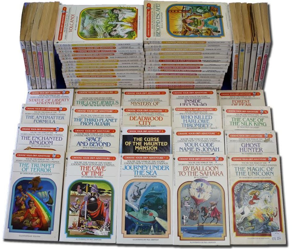
R.A. Montgomery, the publisher of the Choose Your Own Adventure series of books, passed away earlier this month at age 78. That series debuted in 1976 and went on to terrific success. It also figured prominently in my youth, when its many installments were borrowed heavily from my school library and traded amongst my friends and classmates avidly. Just the sight of those early paperback versions, with their distinctive use of ITC Benguiat, their elliptical archway frames, and their way-out post-Pushpin Graphic-style illustrations, and I’m instantly transported back.
I never really knew the story behind the series, but this obituary at Chooseco, Montgomery’s company, sums it up nicely:
In 1977, an author named Ed Packard approached Montgomery about publishing his interactive children’s book ‘Sugarcane Island.’ The young publisher saw it for what it was: a role-playing game in book form and eagerly agreed to put it in print. He felt so confident about it that he announced it as the first in a series entitled The Adventures of You. When Packard left Vermont Crosroads Press to write his next book for Lippincott, Montgomery wrote the subsequent book—‘Journey Under the Sea’—and published it under the pen name Robert Mountain. When his marriage ended in divorce a short while later, Montgomery sold his interest in the press to his ex-wife, and brought ‘The Adventures of You’ to Bantam Books, which was looking for something ‘different’ with which to inaugurate a new children’s book division. Bantam offered Montgomery a contract for ‘Journey Under the Sea’ along with five more untitled books and renamed the series Choose Your Own Adventure. Little did Bantam or Montgomery realize that a publishing legend was about to be born. Choose Your Own Adventure went on to sell more than 250 million copies across more than 230 titles in over 40 languages, making it the fourth bestselling series of children’s books in the world.
For those who want to revisit the series, I just did a quick search on eBay and saw that a bundle of ten or so books will cost you in the ballpark of US$20. Or, for free, you can enjoy the Tumblr blog You Chose Wrong, which has collected scores of the surprisingly terrifying endings that readers encounter as they wind their way through these books. Good times.
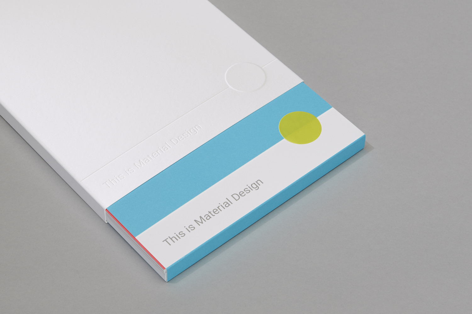
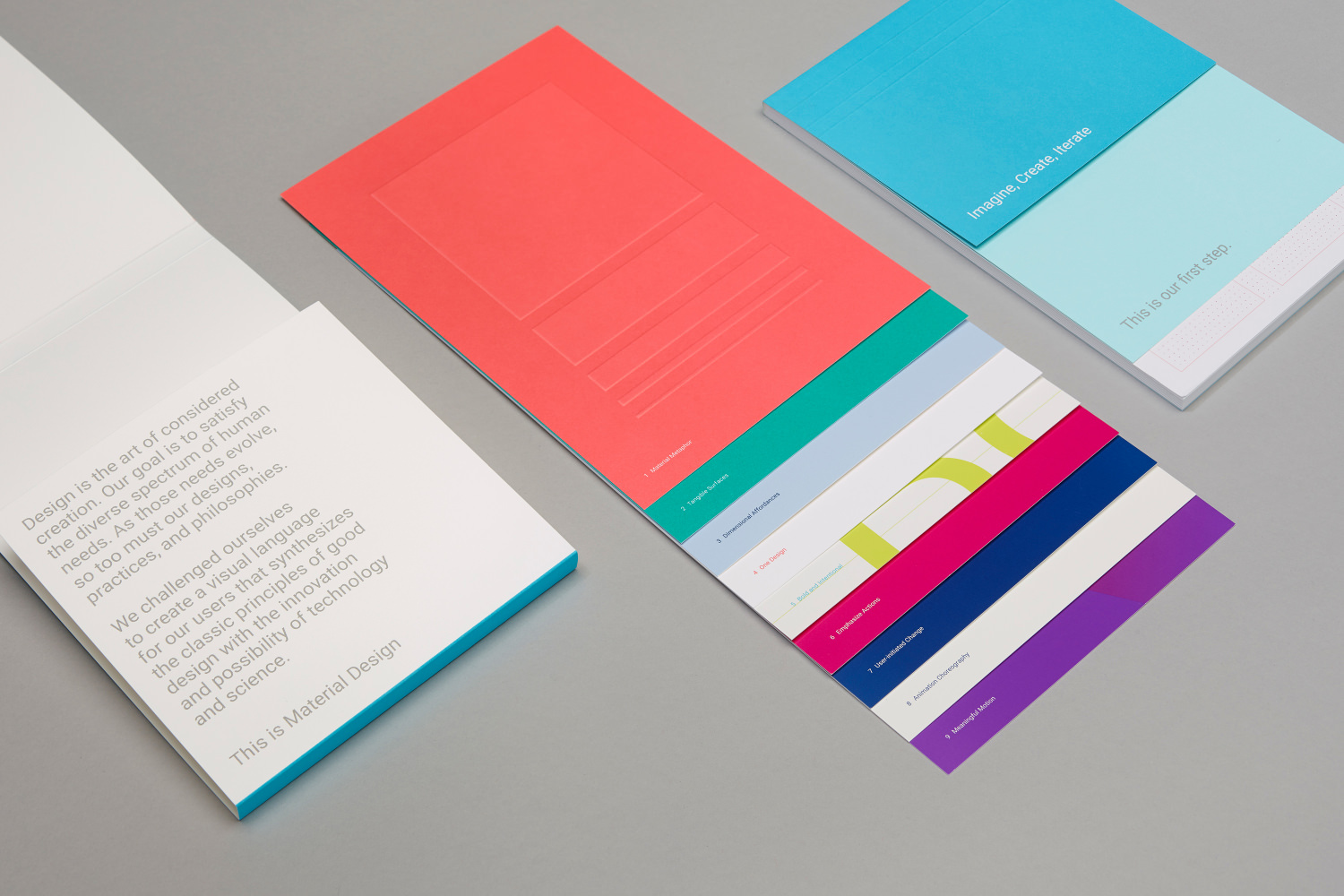
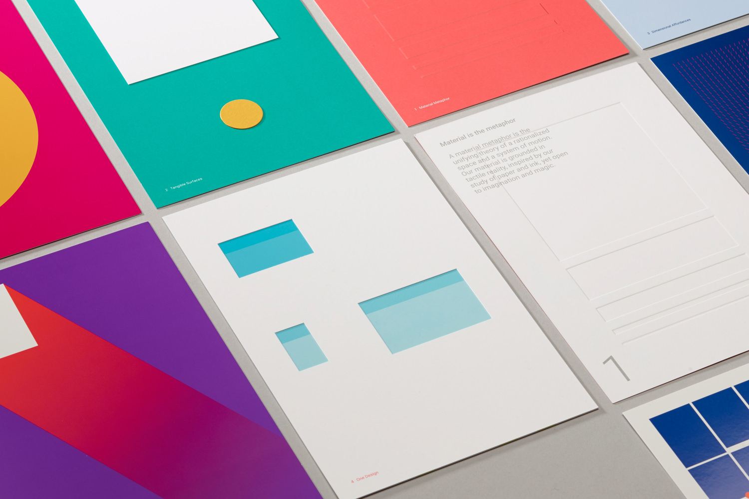
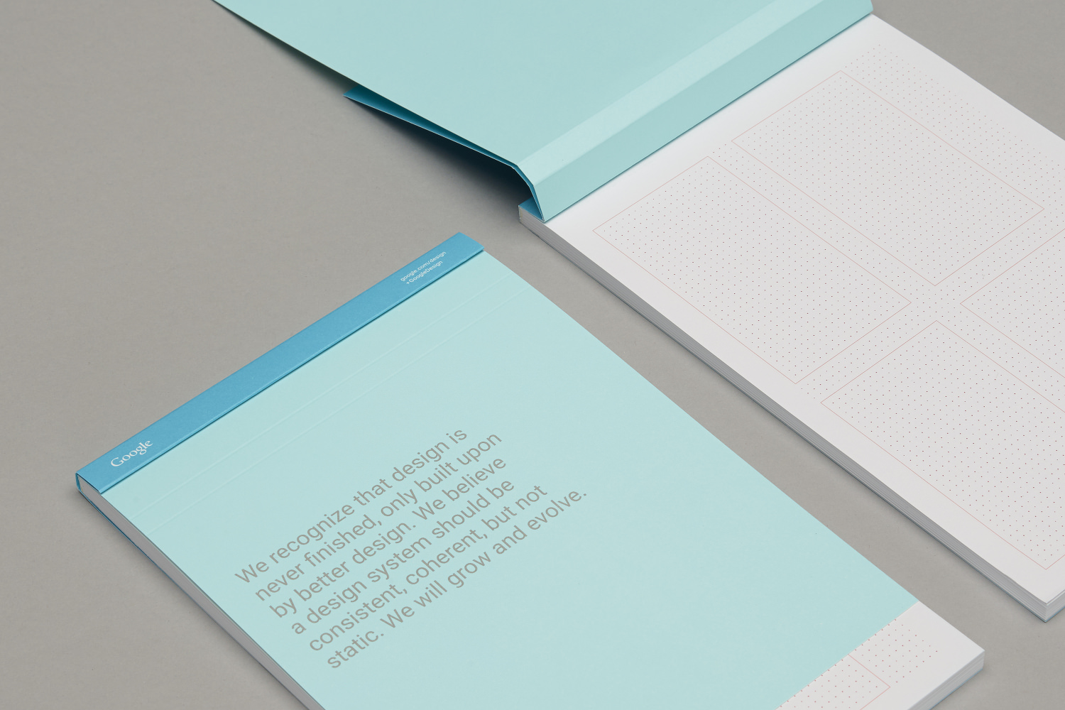
Google tasked San Francisco design studio Manual with interpreting its Material Design design language in print form. The results are beautiful, at least insofar as it’s novel to see digital design translated into tactile form. Which is to say, these are nicely done, but I’m not sure they would attract much notice apart from the Material Design connection, just as I’m not sure Material Design would attract much notice apart from the Google connection. For the record, I find Material Design to be a nice bit of work and it’s certainly attractive, but the rhetoric around it strikes me as a lot of hot air.
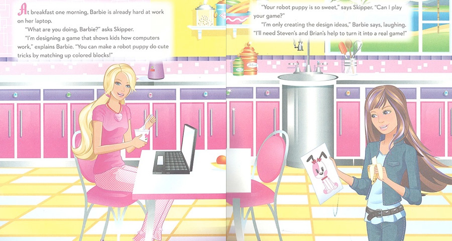
The Internet is rightly furious at toy manufacturer Mattel for its new book “Barbie: I Can Be a Computer Engineer.” Despite its constructive-sounding title, the plot of the book actually has Barbie yielding her opportunity to actually do any kind of engineering to two boys, implying that the skillset is entirely foreign to her. It’s appalling that this kind of blatantly unreconstructed sexism makes it way into children’s literature these days.
It’s also moderately less riling, but no less offensive, to note that the story implies that since Barbie can’t program she resigns herself to “only creating the design ideas.” In Mattel’s worldview, I guess, women prettify while men do the building and never the twain shall meet.
More detail on the book’s many crimes at dailydot.com.
This short documentary from 1985 shows Steve jobs at the start of NeXT Computer, meeting with designer Paul Rand to see the company’s new logo for the first time, brainstorming with the NeXT team on the kind of company they want to build, and, in an absurd bit of B-roll, pulling carrots on his hands and knees in an idyllic garden. The voice-over is also ridiculous; the narrator’s voice is deep, authoritative, and something straight out the opening credits for “The A-Team.” Still, it’s fascinating to see Jobs at work, in his element, building his own myth. Absolutely riveting.
The video is part of the YouTube channel EverySteveJobsVideo, which is just what it sounds like.
Pretty funny demo reel of sorts from my friend Alex Cornell of Moonbase, who make awesome videos for technology companies and ideas. More at moonbase.com.
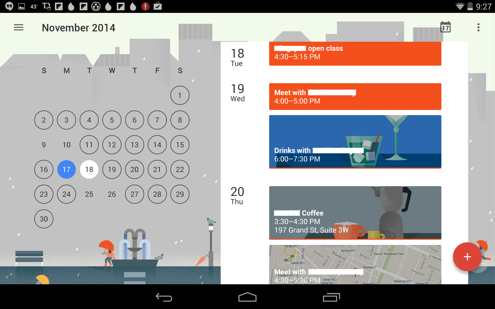
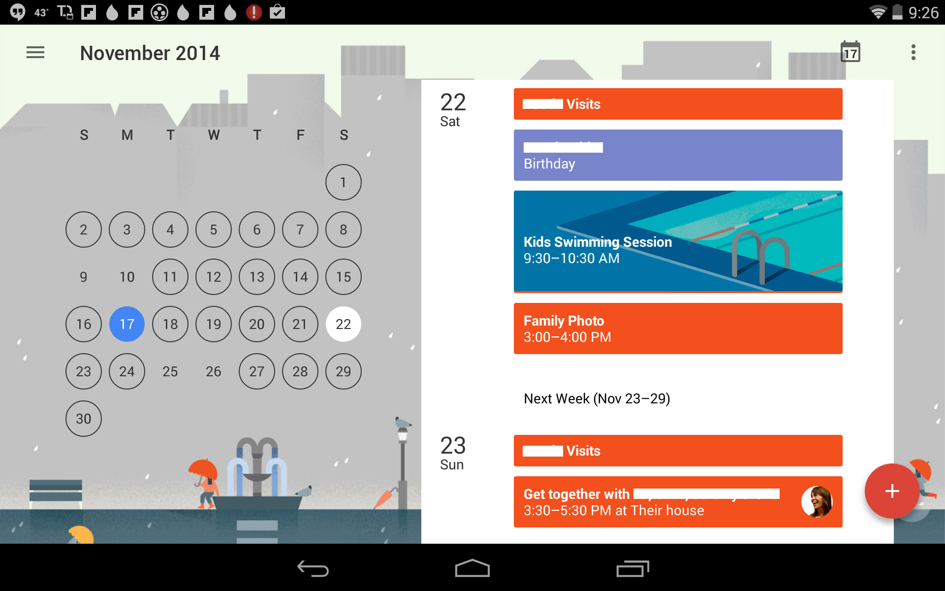
Google’s new calendar app for Android is perhaps the best yet demonstration of how illustration can be used as a key element in digital product design. Each view has a charming seasonal illustration at the top which expands to fill the left half of the screen in landscape mode on tablets. In the app’s “schedule” view, upcoming events are rendered as colorful blocks, sometimes with photographs or maps as backdrops—but also, most surprisingly, sometimes with illustrations (in the same style) apparently determined by key words in the event’s title. Here are a few that showed up on my calendar, with some private details redacted:
Pretty wonderful, right? I would have never expected the event for my kids’ swimming lesson would get its own art, but there it is.
In a way, this is a minor revelation; illustration as a tool for visual communication has suffered tremendously since the advent of digital media, and has been virtually ignored by product designers except for marketing or onboarding purposes. I’m not the biggest fan of the style of illustration used here, but it does show how much warmth and humanity can be added to software through the clever, integral use of illustration. I’d even like to see more of it; why show just one illustration for coffee- or drinks-related events (which are likely to appear on a user’s calendar repeatedly) when the user could be continually delighted by an array of them?
Admittedly, the sheer effort involved in going from one illustration to many is not trivial—effort, and the corresponding time requirements, have always been the deterrents to marrying illustration and digital products. But it’s encouraging that Google, of all companies, went to the lengths necessary to prove that those impediments can be overcome, and to winning effect. It’s even more surprising that the company responsible for this low-key breakthrough is Google, who once infamously multivariate-tested shades of blue.
Update: on Twitter, Anthony Dines pointed out that the illustrator, Lotta Niemenen, has posted work from the project at lottanieminen.com. Also, Joost Wouterse points out that the illustrations inside the event boxes were done by Maya Stepien, who has posted some of them at mayastepien.nl.
After being heads down with launching Wildcard for most of the past week or so, I’ve been debating this morning over whether or not to post this sublime video from Adult Swim. It already has over two million views on YouTube, so it certainly doesn’t need the infinitesimal boost that my blog would give it. But it’s such a bravura piece of off-kilter pop culture satire that I couldn’t resist sharing it. Even at a surprisingly long eleven minutes, unusual for a viral video, “Too Many Cooks” is unusually riveting—I couldn’t take my eyes off of it. In short, it’s genius.
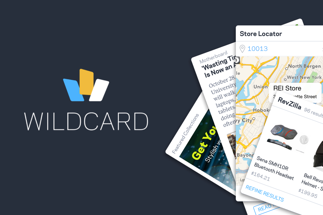
If you’re a regular reader of this blog, you may recall that over the past year or so I’ve written periodically about the emerging interaction paradigm of cards. During that time, I’ve also been toiling away in an office in downtown Manhattan, focused on this challenge of bringing what you might call “the card web” to life, alongside an amazing team of engineers, designers and analysts at a company called Wildcard. Today, finally, we’re launching the fruits of our labor: Wildcard is the world’s first browser for cards. It’s an iPhone app, it’s free, and it’s available for download in the App Store right now. Go get it!
We think today is a milestone for cards, but it’s still very early in the game. The entire concept remains somewhat theoretical, and lots of otherwise savvy technology consumers have no idea what cards are. If you fall into that camp, don’t worry—the burden is on folks like us at Wildcard to make sense of it for you, to turn this idea into something that delivers practical benefit to real world users. If you’re interested in learning more, you might read my post “What Is a Card?,” but here’s a short explanation of how we’ve executed the ideas in our app.
Cards are single units of content or functionality, presented in a concise visual format that resembles a real world playing card or postcard. In Wildcard, they’re faster than web pages because they’re built from native iOS code, and because they pull from the web only what the user needs, i.e., the actual content or functionality that she’s interested in, leaving behind tons of unnecessary code. Our cards let you catch up on news, watch video, listen to audio, browse products and even complete purchases all in a very elegant, mobile-optimized environment. You can search for anything you’re interested in and if we have cards that match, we’ll return the actual cards to you, so that you can interact with them without having to jump off to a destination web site.
Most of the talk about cards in the past few years has been premised on the idea that it’s an emerging phenomenon, perhaps soon to become an emerging standard, that it’s coming soon, one day in the future. Our goal at Wildcard has always been to build the premier browser for this new frontier, but in order to demonstrate its potential in a way that makes sense to people today, we knew we had to also kick the card web into high gear. That’s why a huge part of our effort over the past year has been invested in building the largest library of cards anywhere. We’ve done that by proactively going to the top web sites and “card-ifying” their content, indexing their content and translating them into our card language. Currently we’re serving up countless cards from hundreds of brands, and soon, as we get better at automating this process, we’ll feature tens of thousands of brands. Wildcard is the most extensive demonstration yet of what an entirely new mobile web might look like. (We also invite anyone to write cards for our browser—head over to our partner site to learn more.)
All that said, we have lots and lots of work to do. Our search engine, which is still young, has been subsisting on search traffic from only a few hundred test users for the past year or so. As our app goes out into the world and we see larger volumes of search queries, we expect it to get much more precise and much more responsive. We also have tons of new kinds of cards to build—what they can do at this moment is just the start. But for today, we’re really excited to get Wildcard out into the world. Please download it today and let us know what you think.
Update: Lots of people have asked why the app is U.S. only. We have some features, particularly checkout, that are not yet ready for other markets. Suffice it to say we intend to fix that soon. Many apologies to those who have tried to download it from outside the States and were met only with frustration.
London’s Unit Editions publishes some of the very best design books anywhere. In their few short years in operation, they’ve elevated the form to an extraordinary degree, producing some of the most exquisite, well-written studies of various aspects of the graphic design industry ever to hit bookshelves.
Not long ago, they published “Manuals 1,” described as “the first comprehensive study of corporate identity design manuals, [featuring] 20 examples from the 1960s to early 1980s—the golden era of identity design.” The book included extensive overviews of manuals created for institutions and corporations such as NASA, Lufthansa and British Steel. I bought a copy, and every designer I showed it to coveted it immediately. It was a beautiful, revealing bit of design history, and it sold out very quickly.
Now, less than a year later, Unit Editions is publishing “Manuals 2,” available now for pre-order and shipping next month.
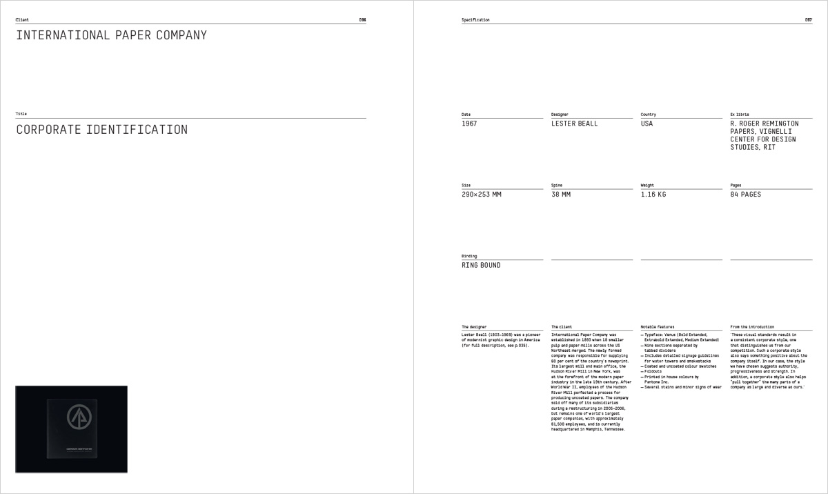
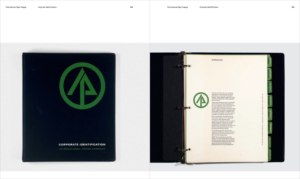
‘Manuals 2’ features a mix of 20 outstanding American and European design manuals. Each is photographed in exquisite detail and accompanied by meticulous descriptions of their physical make-up.
Featured manuals include IBM, Westinghouse, Canadian Rail, Bell, Knoll, PTT, Montreal Olympics and Dutch Police. Manuals 2 also comes up to date, incorporating contemporary manuals for RAC and First Direct. Many of the manuals are designed by the masters of 20th-century identity design: Lester Beall, Paul Rand, Allan Fleming, Total Design, Alan Fletcher, Otl Aicher, Studio Dumbar and North.
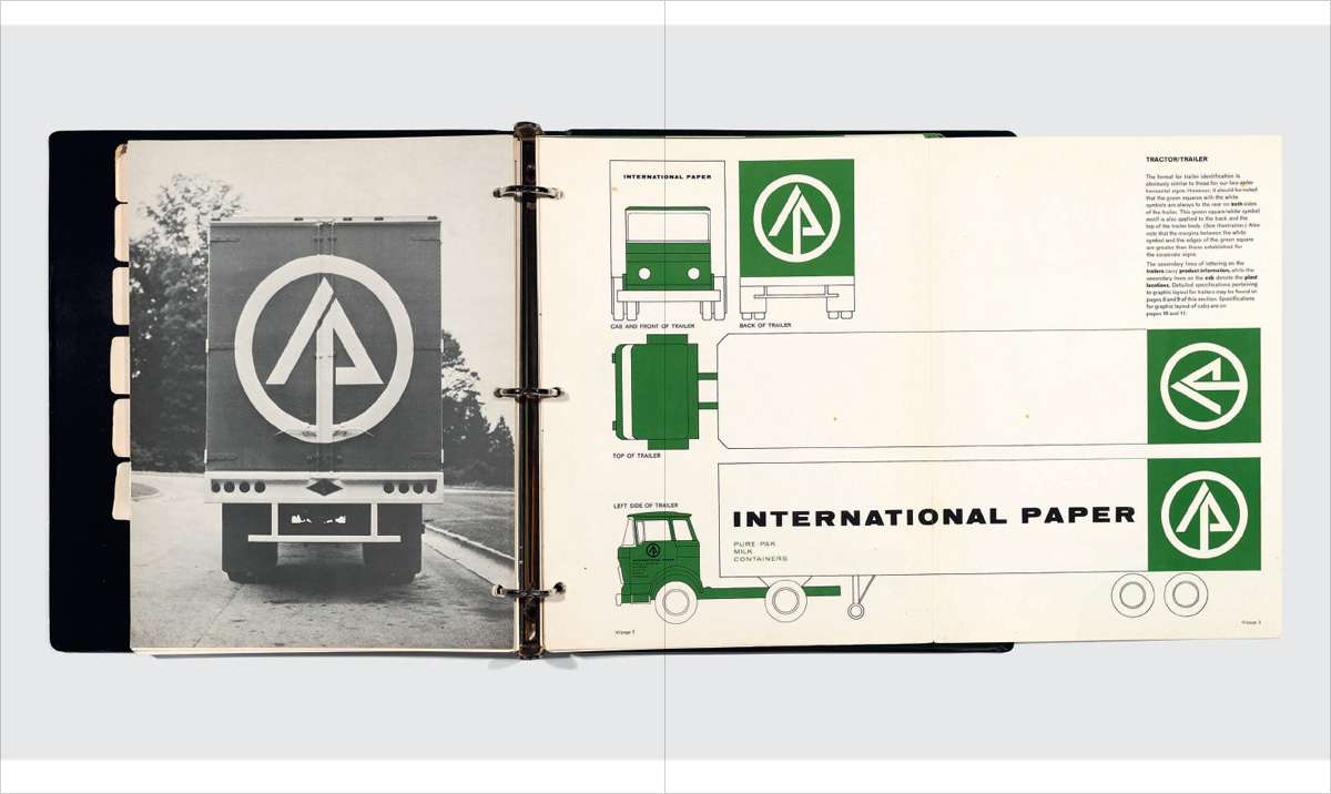
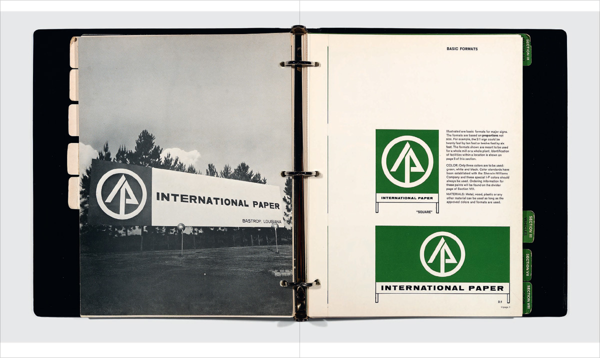
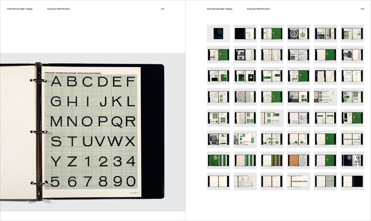
Here are some samples from the forthcoming book, featuring pages from a section on International Paper’s graphic standards manual.
Documenting these otherwise ignored artifacts of design history is worthwhile work, but when I read through the several thoughtful essays included in “Manuals 1,” I noticed something telling: without exception, they all ruminate on the authorship of the manuals, on the designers’ process, how they distilled ideas into rules, how they expressed those ideas in diagrammatic language, how they gave physical form to those ideas in aesthetically beautiful, elaborate binders and short-run publications. Essentially “Manuals 1” focused on the graphic standards manual as a lost channel for designer expression, and if it doesn’t lament its passing, it certainly looks back on the “golden era” with tremendous fondness.
That’s all well and good, but what was conspicuously missing, for me, was any notion of how these manuals were actually used. There was no mention of the experience of the manuals’ intended audiences—production designers, paste-up artists, pressmen, signage fabricators, the folks who had to take the guidelines from those manuals and apply them to the real world.
For me, the book left open many critical questions, such as: Which manuals succeeded and failed? Which of the conventions that they used to communicate their ideas fared the best in practice? Was there a dialogue between front-line production staff and the designers who authored the manuals, before, during or after their printing? How did manuals evolve over subsequent revisions? And, my biggest question, having worked on a handful of manuals in the past and having had to comply with a few others: did anybody really even use the manuals, or were they just politely tucked away in desk drawers?
The question of how good design gets implemented and sustained is a fascinating one, and “Manuals 1” told one aspect of that story with gorgeous, meticulous detail. But there’s a bigger story that interests me, personally, that that first volume didn’t address. Maybe “Manuals 2” will tackle some of those questions, or perhaps a future installment in the series will.