A Teacher’s Resignation Letter

This resignation letter by Gerald J. Conti, a veteran social studies teacher formerly of Westhill High School in Syracuse, NJ, ran in The Washington Post last year, but earlier this month it was picked up and re-run by Daily Kos and has since attracted some renewed attention. Conti had been teaching for twenty-seven years but ultimately called it quits out of frustration at how his job had changed. He used his resignation letter as an opportunity to deliver a full-blown critique of his school administration, his teachers’ union and legislators.

My profession is being demeaned by a pervasive atmosphere of distrust, dictating that teachers cannot be permitted to develop and administer their own quizzes and tests (now titled as generic ‘assessments’) or grade their own students’ examinations. The development of plans, choice of lessons and the materials to be employed are increasingly expected to be common to all teachers in a given subject. This approach not only strangles creativity, it smothers the development of critical thinking in our students and assumes a one-size-fits-all mentality more appropriate to the assembly line than to the classroom. Teacher planning time has also now been so greatly eroded by a constant need to ‘prove up’ our worth to the tyranny of APPR (through the submission of plans, materials and ‘artifacts’ from our teaching) that there is little time for us to carefully critique student work, engage in informal intellectual discussions with our students and colleagues, or conduct research and seek personal improvement through independent study. We have become increasingly evaluation- and not knowledge-driven. Process has become our most important product, to twist a phrase from corporate America, which seems doubly appropriate to this case.

In the past this has been an abstract issue for me, but now, with my daughter in her first semester of kindergarten and her second year in public school, I’ve been grappling with the reality of providing a quality education to a child. I went to public school myself, all the way through high school graduation; we had an excellent system in Montgomery County, MD. Or at least I’ve always assumed that it was a great school system, just as I had always assumed that I would forever be an advocate of public school education.

But as I’ve experienced the New York City Public Schools system as a parent of a student, I’ve come to wonder if it’s even capable of providing the kind of education that I really want for my child, or if public education is even capable of preparing today’s children for the world that will greet them as adults. Not only does the system seem unreasonably focused on testing, but Americans are doing so little to invest the immense wealth that we’re generating into the education that it’s hard to come to any other conclusion than that society is trying to starve the institution entirely. As a result I’ve come to question all of my assumptions, even the assumption that the public school education that I had was really as substantive as I remember it.

Read Conti’s resignation letter at washingtonpost.com.

+

A Time-lapse View of the Sun

Remember how your parents told you that you should never look directly at the sun? The Internet lets you defy them once again.

This video combines over 17,000 images of the sun shot at 4K (read: very high) resolution by the Solar Dynamics Observatory, captured just a few weeks ago, between 14 Oct and 30 Oct. It’s best viewed full-screen.

If you have your headphones on you’ll hear an indistinct, machine-like humming soundtrack, which I’m assuming was just added for maximum sci-fi effect. They should include it on the DVD extras for “Interstellar.” However, that minor absurdity doesn’t detract from the fact that the animation is completely mesmerizing.

+

Quarto from Hoefler & Co.

Quarto Typeface

Quarto is a new serif typeface from Hoefler & Co.. It was inspired by the work of Flemish punchcutter Hendrik van den Keere, and the marketing copy is a tour de force in inventive ways of saying interesting things about the uneventfulness of type design:

Its consistently dark strokes are offset by bright, crisp serifs; its resolute verticality is punctuated by moments of lavish roundness. This theme of ‘controlled contrast’ helped propel Quarto into territory unexplored by Van den Keere, including an italic whose fluid motions are checked by a steadfast rhythm, and heavier weights whose density is invigorated by sudden geometric turns and sharp corners. Like the Baroque models that inspired it, Quarto’s large x-height, short descenders, and trim serifs invite both tight tracking and solid leading, making it an excellent choice for headlines both in print and on screen.

If the font is not quite as thrilling as that passage makes it sound, it’s nevertheless a work of beauty. I’m already looking for excuses to use it, and at US$199 for all ten styles, it’s reasonably priced, too. (If you want to use it on the Web, you’ll need to subscribe to the company’s Cloud.typography service. I couldn’t find licensing options for usage in native apps.)

More at typography.com.

+

Sky Series

Barra de Navidad, Mexico

Eric Cahan’s beautiful “Sky Series” project captures sunrises and sunsets from a variety of geographic locations. Cahan takes pains to include the exact GPS coordinates where each of them were taken, and even links to that location on Google Maps. The colors are remarkably rich, which might lead some to assume that they’ve been extensively retouched through digital means. Cahan explains:

In fact, very little Photoshop is used. I will only tone photos to match the paper type and, in some cases, add a bit of color curves. The actual process is done with colored resin filters I make myself and hold in front of the lens before I shoot a picture. When a color filter is used against a blue sky, it always alters the color of the sky. I know the colors I am trying to conjure and choose the filter accordingly.

One thing I noticed is that the dramatic color ramps of each image really reveal the limitations of JPEGs and computer monitors; I’m seeing much more color banding than I imagine the artist would like.

Bridgehampton, NY
Gulf of California, NM
Salton Sea, CA
Lightning Field, NM

See more at ericcahan.com.

+

Thoughts on Interstellar

“Interstellar”

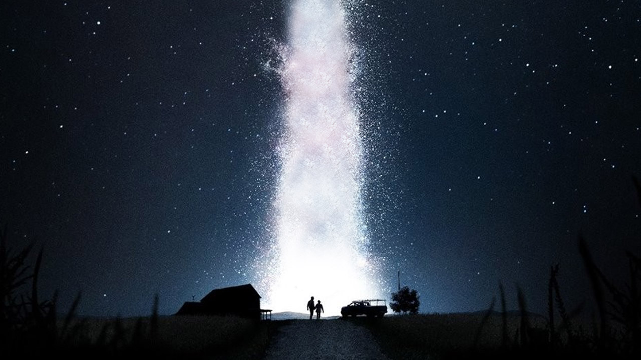
On Wednesday night I got to go see Christopher Nolan’s new film, “Interstellar,” on IMAX in a 70MM film print. This is a big, big movie, but not in the way that we’ve come to think of big movies—there’s a tremendous gap between “Interstellar” and the blockbusters that dominate cinemas in the summer, and almost as large of a gap between “Interstellar” and the Oscar-bait epics that start rolling out towards the end of each year. Nolan’s film is a work of both ideas and of spectacle and for the most part it successfully balances both, which is quite rare.

Which isn’t to say that it’s a movie that is going to please everyone; there is a lot that’s wrong with “Interstellar.” But for the most part I was very much taken with it. Over the past day or so I’ve struggled to put together a coherent essay from my impressions of the film, but given how little time I have these days, I ultimately copped out and decided to throw out a bunch of random bullet points, in the perhaps vain hope that getting some thoughts out there is better than none.

  • It’s been well-publicized that Nolan intends for “Interstellar” to be seen on film, and on IMAX, whenever possible. This is the first movie I’ve seen where I can say that those technologies made the experience palpably better than they would be otherwise. There are some IMAX shots that are stunning; not just of space and other worlds, but of Earth too, specifically of cornfields—who’d’a thunk it? They were just breathtaking. And the picture quality of the nearly pristine film print was so much warmer and more inviting than anything that I’ve seen from digital projection. It’s a reminder of how far digital has to go yet.
  • “Interstellar” is not just about space travel, but about the dream of space travel, and how vital that is to us both in terms of fulfilling who we are as a species and in terms of our long-term survival. After watching it, it suddenly became obvious to me that many of Nolan’s films are about dreaming. Not just “Inception,” which was specifically about the architecture of the sleeping world, but also “Memento,” which was about a waking state made dreamlike by a physiological condition; “Insomnia,” which was about what happens to the soul when it is starved of sleep; and “The Prestige,” whose big plot reveal is a kind of circular nightmare. Even his Dark Knight trilogy has the feel of a long fever dream punctuated by horrors.
  • I’ve watched almost everything that Matthew McConaughey has done since the beginning of his so-called “McConnassaince,” and almost without exception I’ve found them all to be overrated and self-conscious. The same goes for his work in “Interstellar,” but it was the least distracting of all his performances to date, and reasonably effective. The nub of this movie is the relationship between McConaughey’s character and his daughter, who become separated from one another; I was genuinely moved by the way McConaughey seemed to inhabit the skin of a pained father.
  • Christopher Nolan gets a lot of flack for being a very pedestrian filmmaker, one whose ambitions outstrip his skills. I think that criticism is overblown and in my mind this movie should solidify him as an extraordinary director (though many will still disagree). “Interstellar” is full of extraordinarily inventive and breathtaking cinematic spectacles—all with genuine dramatic weight—that very, very few other filmmakers could bring to life. I can’t think of another contemporary director who has so frequently surprised and amazed me. He stands almost alone as someone who is making movies that are truly cinematic experiences, something that is sadly becoming a thing of the past.
  • On other other hand, Nolan does have an unfortunate aversion to ambiguity, and that causes his films to regularly slip into the pedantic or the maudlin. There are times during “Inception” that the film feels too overdetermined, too tidy, and sentimentality is too abundant. The last act of the “Interstellar,” in particular, resolves the various emotional crises that have been set up too neatly and broadly for my taste. The characters, who were so vitally alive for most of the movie, suddenly switch into a lifeless, automated mode in order to expedite the resolution.
  • The most obvious film that “Interstellar” brings to mind is “2001: A Space Odyssey.” The comparison isn’t necessarily flattering, mostly because “2001” wasn’t afraid to leave things unanswered where “Interstellar” is almost obsessive about explaining everything, even the unexplainable. But I don’t think Nolan has anything to be embarrassed about when these two movies are mentioned together; few films are as ambitious as “2001,” and “Interstellar” clearly is, and it largely works.
  • Speaking of similar movies, “Avatar” also comes to mind, and in my opinion Nolan’s film is leagues beyond it. Cameron’s 3D extravaganza was drastically overrated and its massive box office masked how insubstantial a movie it really was. It was set on a distant planet, but it was less about imagining mankind exploring other realms than it was about imagining what contemporary technology could do on the movie screen. “Avatar” was ambitious in a small way; “Interstellar” is ambitious at a whole different scale.

Finally, even at a running length of nearly three hours, there is so much good stuff in “Interstellar” that I’m eager to revisit that I would gladly go see it again. I hope lots of other people agree. For all its flaws, we’d be lucky to have more movies with the unbridled ambition and dedication to imagination that “Interstellar” has in abundance.

+

Very Detailed Maps from the Midterm Elections

Yesterday The New York Times published these maps from the midterm elections and billed them as “the most detailed you’ll see.” I can’t verify that, but I do know that they’re very probably the most beautiful election maps from this cycle we’re likely to see. I hope they also goose the competition and that next cycle we’ll see even more similarly gorgeous visualizations.

NYT Midterm Election Maps

See them in all their glorious detail at nytimes.com.

+

When Typography Is Suspenseful

This is one of many videos from Airbrush Action Magazine capturing self-taught airbrush artist Glen Weisgerber, who has been painting custom lettering and graphics for trucks, cars, guitars and motorbikes since the 1970s.

It shows Weisgerber demonstrating his “round hand lettering” technique—essentially a kind of calligraphy that emphasizes open, flowing letterforms—by hand-painting words on an unforgiving, high-gloss surface. His mastery of the paintbrush is remarkable, almost athletic in its blend of physicality, speed, assurance and accuracy. It’s one of the only examples I can think of in which watching the execution of typography is actually suspenseful; I couldn’t turn my eyes away.

Weisgerber trades in a flavor of graphics that many designers, myself included, would typically regard dismissively, but as this video proves, he is undoubtedly a designer, illustrator and typographer of extraordinary skill. Also, more than most designers I know, his personal appearance is completely consistent with his work.

+

Ghostbusters Redux

This was posted three months ago, but it’s still marvelous, and maybe one of my favorite things I’ve seen on the Internet ever: a group of middle school students produced this shot-for-shot remake of the trailer for “Ghostbusters.”

Here is a version where you can compare it side by side with the original trailer.

This project came out of the RAW Art Works program for kids in Lynn, MA. You can donate to help sustain it here.

+

Animography

Animography is a type foundry specializing in the combination of motion and typography. They sell a variety of animated typefaces that are geared towards motion designers and video editors. Naturally, each one comes with a nifty promo video showing the typeface in action, like this one for Webster:

Here’s one for Anodine.

This one for Franchise Animated is fun:

The company also produces a video series called “Animography Monthly” which spotlights short works exploring animation and typography. This one, from last summer during the World Cup, is a really lovely mash up of playful typography and illustration.

Lots more at animography.net.

+

How the 1960s Batman TV Show Escaped Legal Limbo

How “Batman” Got to Home Video

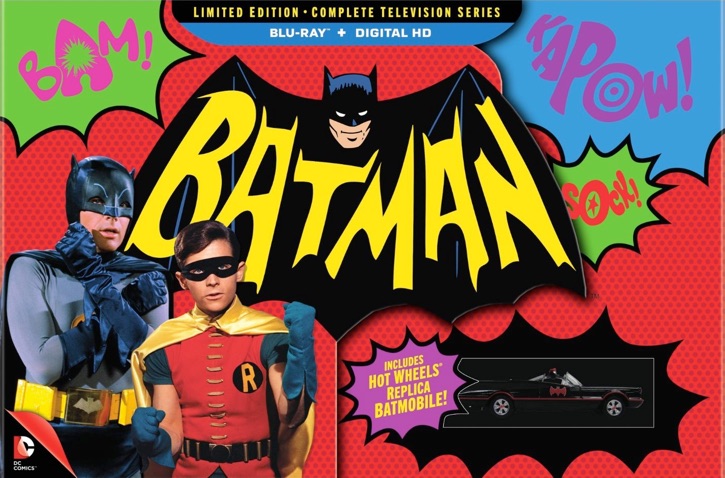
I realize that the Venn diagram of Subtraction.com readers and fans of the Adam West-starring 1966-68 television show “Batman” probably entails a pretty small overlap, but I thought this Wired article about how that show was finally untangled from the legal mess of conflicting rights holders might be of some interest anyway. The show sat in limbo for decades despite consistent fan interest in a home video release; one studio, Warners, owned the characters while another studio, Fox, owned the episodes themselves. And that’s just the simplest overview; in reality, the resolution involved a manufacturer of unsanctioned model kits featuring Adam West’s likeness, the show producer’s aging children, a third party “content acquisition specialist” called Classic Media, and a weird legal concept called a “Dutch agreement” that’s almost too convenient to be believed. An excerpt from the article:

Classic offered Fox a seven-figure sum for its stake in ‘Batman.’ Per the contract, Fox had to sell or buy it for the same price. Kaplan’s strategy had made it a no-lose proposition for Ellenbogen: either Fox sold its share, allowing Classic and Warner Bros. to proceed, or Fox would pay roughly three times what Classic had paid for the rights. In the end, Fox decided to buy, which consolidated the series under one banner.

The entire series is due out on home video next week, and apparently the picture quality of the transfers is excellent. That’s the good news. The bad news is, after all that trouble, the studios responsible seem intent on gouging their patient customers; the full set is currently listed at US$175 on Amazon.

Read the article at wired.com.

+