is a blog about design, technology and culture written by Khoi Vinh, and has been more or less continuously published since December 2000 in New York City. Khoi is currently Principal Designer at Adobe. Previously, Khoi was co-founder and CEO of Mixel (acquired in 2013), Design Director of The New York Times Online, and co-founder of the design studio Behavior, LLC. He is the author of “How They Got There: Interviews with Digital Designers About Their Careers”and “Ordering Disorder: Grid Principles for Web Design,” and was named one of Fast Company’s “fifty most influential designers in America.” Khoi lives in Crown Heights, Brooklyn with his wife and three children.
This appositely named Tumblr blog collects screen shots of software before users have input their own data. Its goal is to encourage designers to “delight users by designing the empty states”—details matter. Here’s an example from Conjure.io.
The Hershey Company, unofficial sponsors of diabetes, just redesigned their logo. Below are the old mark, at left, and the new one:
I have to admit that the simplicity of the redesigned logo surprised me. It seems to run counter to recent trends in identity overhauls in that it throws away the pretense of dimensionality for a more straightforward and frankly more sophisticated flatness. My initial reaction was that it’s a pretty successful bit of work, at least until I read the comments over at Brand New, a hub for discussions of redesigned logotypes.
The sentiment at that site is that the Hershey’s Kiss icon actually looks like, well, like something distinctly less pleasant that also happens to be brown-colored; and that the tiny silver flag, which is a distinctive element of the wrapper of a Hershey’s Kiss, comes across like steam rising from said unpleasant brown something. Not exactly the right connotation for a world famous confectionery.
This immediately calls to mind the mini-controversy wrought by Airbnb’s new logo, which at its debut was ridiculed for unintentionally suggesting various parts of human anatomy. That was a bump in the road for a company that is otherwise doing gangbusters, and like Airbnb, the Hershey Company is unlikely to see any long term fallout from this particular mishap.
Still it’s worth mentioning that there is a school of thought that argues that reading these unintentional messages into logos is unwarranted and even juvenile, or worse. Some argued, particularly after Airbnb’s debacle, that to see feces or genitals or any given unmentionables in a multimillion dollar company’s earnest branding efforts is a debasement of our discourse.
This line of reasoning mystifies me in that it’s an inversion of how we expect logos and branding to work. What is a logo but an abstract graphic symbol intended to evoke reactions in consumers? Which is to say that it’s the responsibility of any given corporate mark to invoke the connotations that its owner desires. Airbnb’s new logo was intended to connote the benefits of a global network of rentable spaces; Hershey’s new logo was intended to bring to mind the universally loved sweetness of its signature Kiss product.
And yet they didn’t do that, at least not solely. They inadvertently tapped into what are admittedly the baser parts of the human id, where bathroom humor rules and the finer points of graphic design are, presumably, absent.
Getting this kind reaction can be a real disappointment. So much is typically invested in these major overhauls—countless hours and dollars of research, iteration and refinement—only to be greeted by schoolyard cries. It almost seems like those of us who saw these unintentional symbols weren’t doing our jobs, weren’t living up to the expectation that we should all be grown ups.
That’s not how visual symbols work, though. Once a logo is forged and released to the wild, as it were, every interpretation is fair game. There will always be some folks who will see the worst in any logo, no matter how benign. That is unfortunate, but the interpretation of logos is not regulated according to some code of manners. People will see what they see, no matter how deviant it might be from a company’s branding strategies and aspirations.
More to the point, it’s up to the owner of a corporate mark—the company itself, and more practically the designers—to generate a logo that produces the reactions that they intend. If a logo comes across as unsavory—especially when that unsavoriness reaches such notorious heights that it’s written up in mainstream news outlets that are typically disinterested in the arcana of branding—it’s not the fault of the viewer, it’s the fault of the company. To say that the viewing public is being irresponsible is unrealistic. And in actuality it’s the opposite of what’s really happening; the company has been negligent in its responsibility to create a logo that conforms to its own intentions. Whether these logo mishaps were simple oversights or obstinate derelictions of duty, the fact remains that these brands themselves are responsible for the reactions that they inspired.
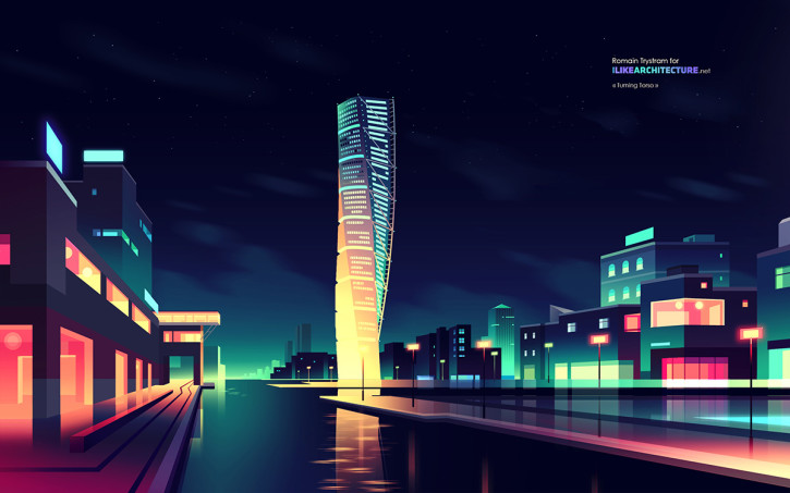
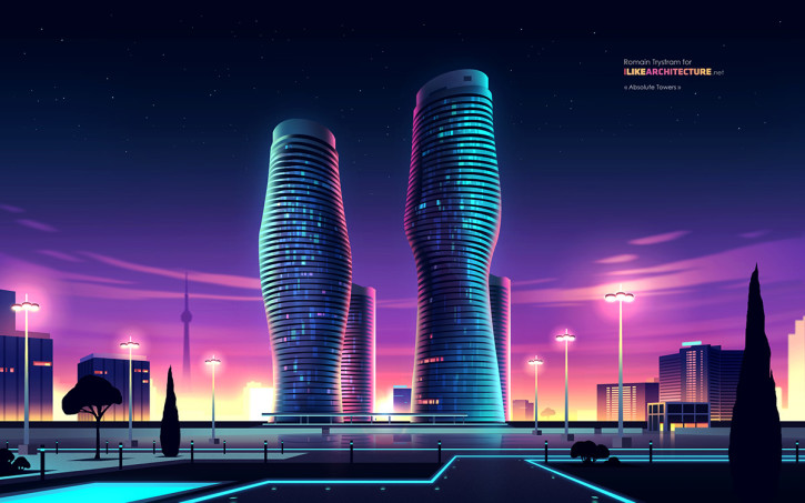
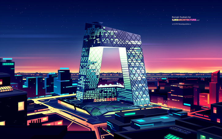
Once a month starting back in January, the site I Like Architecture has been publishing these beautifully stylized portraits of famous contemporary skyscrapers from around the world, lovingly crafted by French illustrator Romain Trystram. Their exaggerated color palettes and simplified details emphasize the sci-fi, “architecture of the absurd” quality of building trends. Here is a small sampling:
HSB Turning Torso, Malmö, SwedenAbsolute World Towers, Ontario, CanadaCCTV Headquarters, Beijing, China
Trystram’s wallpapers for January through August are currently available at ilikearchitecture.net.
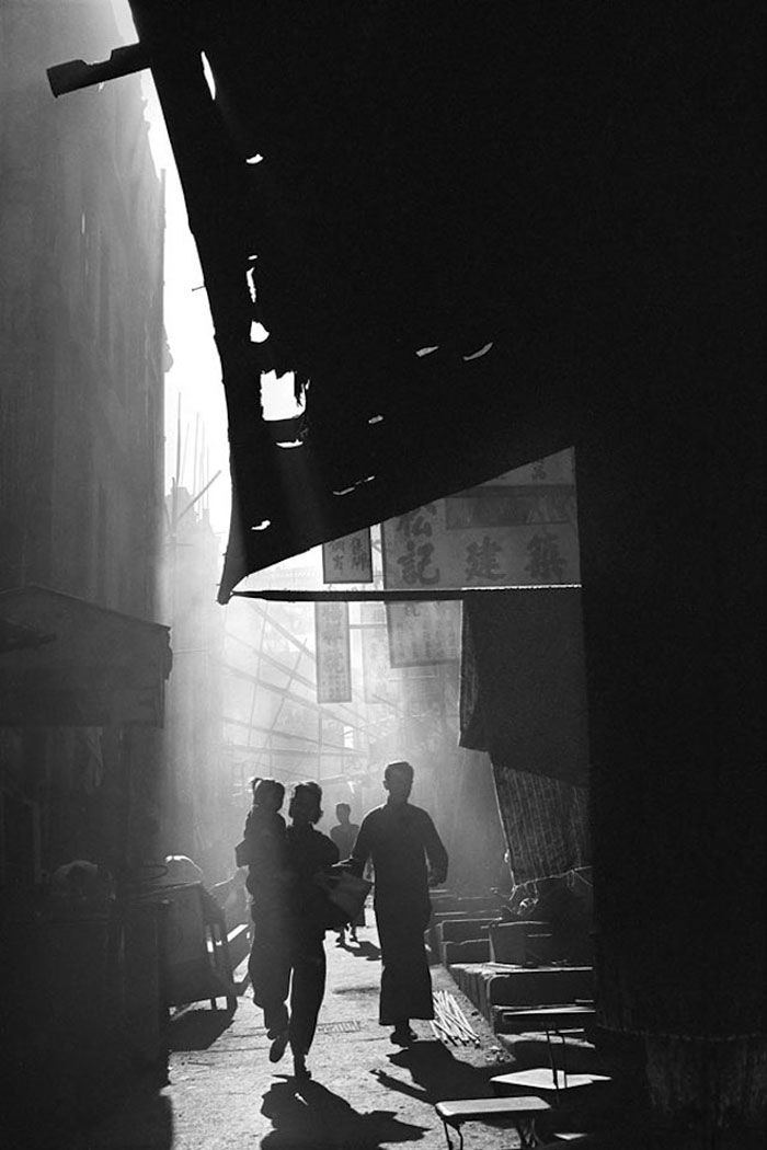
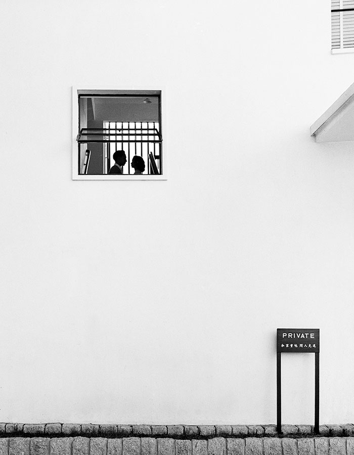
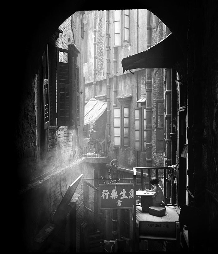
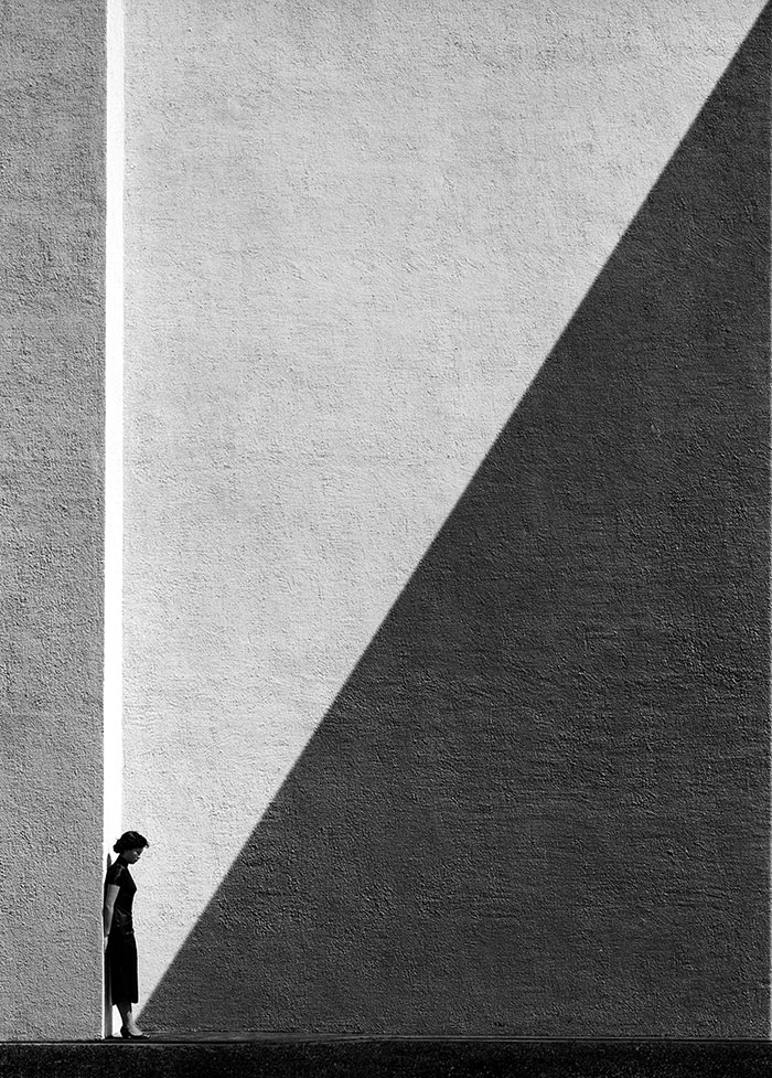
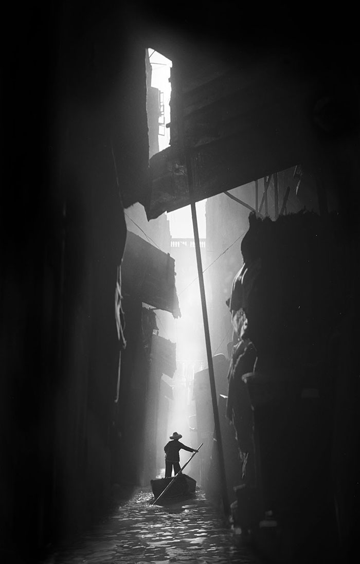
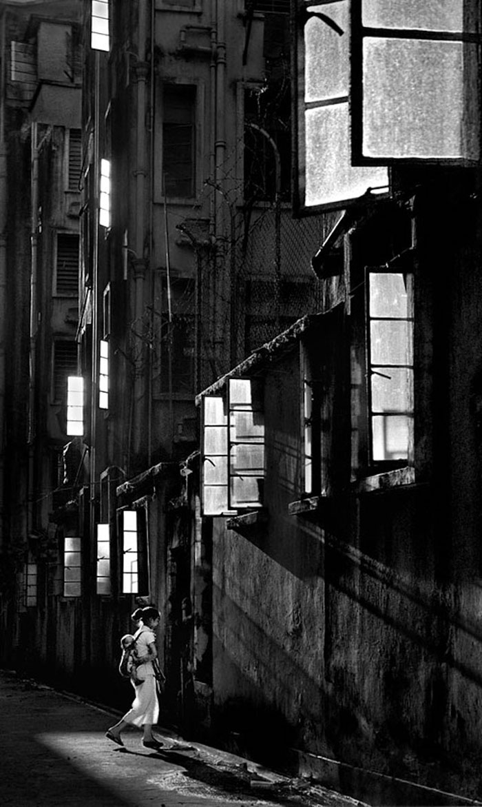
The award-winning photographer Fan Ho spent many years capturing the grit, congestion and vibrancy of mid-Twentieth Century Hong Kong. A selection of his photos have been on display at San Francisco International Airport’s Terminal 2, though apparently they’ll come down at the end of the month, so there are just a few days left to see them. Not to worry, though, as later this year, Modernbook Editions will publish the third in its Fan Ho monographs, “Fan Ho: A Hong Kong Memoir.” As you can see below, the photographs are uniformly breathtaking in how they play with light to portray the distinctly narrow verticality of the city.
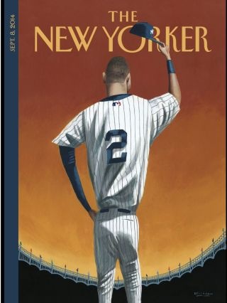
The “poet laureate of baseball,” Roger Angell has been translating the sport’s milestones-just-passed into vivid, crystalline reminiscences for decades. In the latest issue of The New Yorker he bids farewell to the Yankees’ Derek Jeter, who is retiring this fall. Though the iconic shortstop isn’t quite gone yet, the league has spent the better part of the year to date missing him already; Angell captures it all with exquisite succinctness.
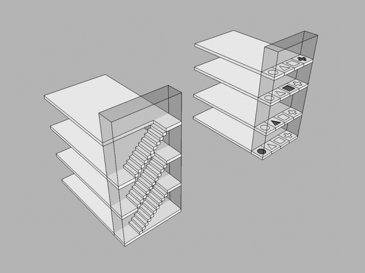
This is the first in a series of posts from Melissa Mandelbaum, designer at Percolate, about lessons to be found in architectural principles for product designers.
Here she focuses on the notion of circulation within buildings as it relates to navigation within apps: a building’s given method of circulation—stairs, elevator—directly impacts how we use the building, e.g., stairs might inhibit moving upwards, where an elevator might make it likelier that heavier objects are brought into the building. She relates how she applied those ideas to deciding between “hamburger” navigation and tab navigation for Percolate.
The Dissolve’s Movie of the Week is Steven Soderbergh’s 1998 classic “Out of Sight,” a small, taut and unyieldingly charming adaptation of an Elmore Leonard novel—that also happened to reignite the director’s career. Its success put Soderbergh back onto Hollywood’s A-list, and in the decade and a half that followed, he went on to create a string of both big budget Hollywood blockbusters and fascinating indie experiments—one of the finest bodies of film work of the early 21st Century.
Celebrating “Out of Sight” is worthwhile, but even more interestingly, editors at The Dissolve use its Movie of the Week spotlight to look at the period that immediately preceded Soderbergh’s triumphant return. In an essay appropriately titled “Soderbergh: The Wilderness Years,” writer Jason Bailey goes into considerable detail about how the director seemed to peak early with his 1989 debut, “Sex, Lies & Videotape,” which he made at just age 26 and which won the Palme d’Or at the Cannes Film Festival. Almost immediately after its success, the director ran aground.
Bailey expends almost 3,000 words critically reappraising the movies that Soderbergh made between 1989 and 1998, and the analysis is insightful. But in actuality his essay is a chronicle of failure, of how a talented director wrestled with great expectations and repeatedly flailed, misfired and lost his sense of true North. Bailey quotes Soderbergh’s particular dissatisfaction with his 1995 neo-noir “The Underneath,” which was made at a low point for him both professionally and personally.
‘It’s a very unpleasant feeling,’ he explained recently, to ‘see everybody working so hard, the cast and the crew, to give you what you want every day. And you know that this thing’s just dead on arrival.’ The issue was not problematic collaborators, or studio interference, or lack of funds. ‘I had everything I needed,’ he said. ‘I’m the one that didn’t show up’…‘I can’t say that I would recommend it to anyone,’ he adds, ‘other than to look at it in the context of a career.’
What’s interesting is that though Soderbergh regards it as a nadir, he also recognizes that “The Underneath” is possibly his most important work. His dissatisfaction with its process and end result were the impetus for a new creative chapter; even before the film was done he knew he had to find new approaches and more fertile ground to work from. Almost immediately after that film wrapped, he made the highly experimental “Schizopolis,” an odd, intentionally unorthodox project filmed on a tiny budget and with no stars, but that reignited his drive and provided templates for many of the ideas that would fuel his later successes.
I’ve been a devoted fan of Soderbergh’s work since “Out of Sight,” so I’m probably predisposed to being captivated by this story. Nevertheless, I think there are a lot of lessons in this essay for anyone who still operates under the misconception that careers are direct trajectories, or who has experienced the valleys of trying to forge a career of personal work. Read the full article here.
Nick Keppol “dissects” the new design language of OS X Yosemite’s icons.
There was a lot of speculation that icons in Yosemite would all be super-ellipses or circles. Thankfully that’s not the case. I think Apple’s designers have done a great job building a flexible system that allows for a clean look, but retains the flexibility we desire to create a unique icon.
Keppol sagely notes that “Apple is consistently inconsistent,” so if you’re looking for a grand unifying theory of Yosemite iconography, even this level of inspection will frustrate you. Read the full article here.
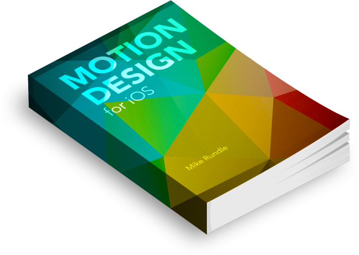
Somewhat unexpectedly, many designers are now would-be animators too, thanks to the transformation wrought by native mobile apps. Mike Rundle’s new book, “Motion Design for iOS,” the latest installment in his “Design Then Code” series, offers the best yet overview of what it means to bring the magic of movement to what has until very recently been the relatively static art of designing digital products. It’s a how-to book, but it’s also a flag planted in the ground—if it’s not the first, then it’s likely the best yet statement on the intersection of these two disciplines.
“Motion Design for iOS” debuted just this week, and is on sale for US$20 off for a limited time.
Well, to be more accurate, they’re using 3D technology to render not only the product images in their famous catalogs, but also the exquisite, idealized and some would say unrealistic “photographic” tableaus of Ikea products in home settings, like this one.
That’s right, that image was generated entirely inside some nerd’s computer. This fascinating article at CGSociety (“The most respected and accessible global organization for creative digital artists”) includes lots of revealing details on this practice.
It began only in the past decade, as 3D technology matured, and advances made it possible not just to create entirely convincing images, but also to relieve the logistical headache of coordinating the delivery of props from all over the world to a photo shoot. Today, three-quarters of Ikea’s product images are CG, and the team maintains a bank of about 25,000 models, all rendered at “ridiculously high resolution” so that they can be used for any purpose, including very large wall murals in stores.
I found the comments on how the company made the transition from photography to mostly digital through cross-pollination of disciplines particularly interesting:
There was a very intensive period of training where the entire photography team met with V-Ray gurus over in Bulgaria and came back with a number of tasks to complete—more 3D pieces to create. And for the 3D artists, it was the opposite way around. They were trained in photography in the studio. This process is absolutely what made for an increase in quality—both in 3D and photography. Actually now some of our photographers have completely ‘gone over’—they’ve become 3D artists. And some of our 3D artists have abandoned their computers and become photographers!