is a blog about design, technology and culture written by Khoi Vinh, and has been more or less continuously published since December 2000 in New York City. Khoi is currently Principal Designer at Adobe. Previously, Khoi was co-founder and CEO of Mixel (acquired in 2013), Design Director of The New York Times Online, and co-founder of the design studio Behavior, LLC. He is the author of “How They Got There: Interviews with Digital Designers About Their Careers”and “Ordering Disorder: Grid Principles for Web Design,” and was named one of Fast Company’s “fifty most influential designers in America.” Khoi lives in Crown Heights, Brooklyn with his wife and three children.
Even as the notion of cards as the next big software interaction paradigm continues to gain momentum, it hasn’t gotten much easier to explain to the uninitiated what, exactly, a card is. When asked this question, I find it hard not to ramble on at great length, and even harder to avoid using technical jargon, which usually produces diminishing returns in conversations with “normal people.”
So I thought I would try to unpack this idea a little bit, as simply and briefly as I can. No guarantees, though.
To begin, when we talk about cards in digital products, it’s important to understand that there are actually two, interrelated concepts at work that some people conflate as one. I’ll use some grossly simplified language to label them as cards as presentation and cards as third-party content.
Cards as Presentation
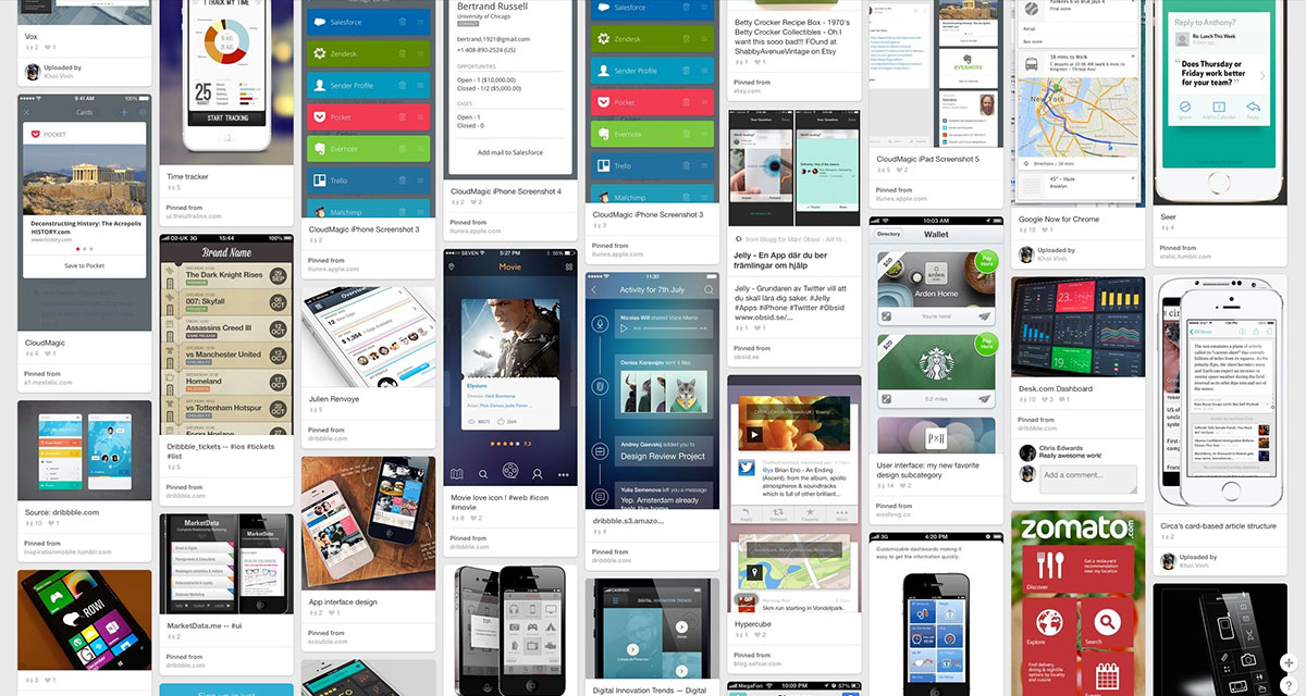
This is the most visible permutation of cards right now. It simply entails adapting the visual form of cards that we know from the real world (e.g., index cards, business cards, credit cards, etc.) into a visual unit for presenting an app’s content or features. This is familiar to many users from Tinder, Pinterest or even The New York Times, where the things that you read or do are displayed concisely in rectangular shapes, and are arranged so that they’re clearly distinct from one another, whether they’re separated by vertical space or laid on top of one another in a virtual stack.
Choosing to visually package content in this way seems arbitrary, but this trend is reflective of our changing relationship to software. We used to sit down with software and point and click on things; now we carry software around and tap, swipe, pinch and zoom on things. As our computing habits have gotten more mobile and more physical, the metaphor of pages, which implies a more focused, dedicated frame of mind, has become less useful.
Cards offer an alternative metaphor that’s much more complementary to how we use phones and tablets. Just as in the real world, you don’t need to sit down at your desk in order to use cards; you carry them around and whip them out whenever or wherever they can help you—again, think of index, business or credit cards—in context of what you’re already doing (that respect for the user’s current context is important to cards as third-party content, too). Cards just make more sense on mobile than pages.
Moreover, cards in digital products are ideal for a world in which users often expect the same content or feature to be usable regardless of the screen size or platform they’re viewing it on. A card’s inherently simplified design form almost always consists of a single column of words and images—there’s no room for multi-column layouts or fancy grid systems (sniff). As a result, cards are much more conducive to responsive design methods, and can scale up or down according to the screen size.
Cards as Third-Party Content
If that was all there was to this cards phenomenon, it would make for an effective user interface approach, but not a particularly powerful new interaction paradigm. The second concept at play in cards makes them much more interesting: the idea of cards as third-party content. This describes a more advanced conception of cards in which they look the way I’ve described above, but they can also surface content or functionality from elsewhere—and make it available and interactive directly within a user’s current context.
This is a departure from the convention of clicking on a link and being taken to its destination, familiar to us from years of using web pages. In a third party card, the content is embedded in the card itself so that it can be experienced wherever a user might encounter that card.
You can see the fundamentals of this approach in action today with Twitter cards, which for some time now have proactively transformed links in users’ tweets into cards (even though, frustratingly, they don’t look much like cards). Twitter cards first require third-party sites to do some technical work to make their content visible to Twitter as cards. Once that’s done, a link to a story on a news site, say, will render with the story’s headline and accompanying picture right alongside the original tweet itself.
Granted, that’s not a tremendous amount of third-party functionality to surface. It doesn’t truly obviate the link itself; it just gives the user a better idea of what awaits on the other side of clicking that link. But cards are getting more robust as time goes on, and before long they won’t require the user to click through at all.
This tweet from Acura is a very recent example of Twitter’s ambitions for the form. It showcases a more advanced card in which users can configure the features on an Acura TLX sedan without leaving the Twitter stream. It’s still fairly rudimentary stuff, but it doesn’t take much imagination to extrapolate from this a not-too-distant future in which cards will allow users to book travel plans, bid on auctions, check in at venues, scan for real world objects around them, and much more.
This kind of syndication of content and features is nothing less than an attempt to reshape the mobile landscape. Rather than requiring dedicated apps for every situation, an ecosystem that supports third-party cards can allow you to access the content or features that you need, where and when you need it. Is it truly necessary to go to the trouble of logging into the App Store to download a native app from a given airline, say, if you only fly that airline once in a while? Given the right cards, you could book your flight, check-in, track its progress and more, all at your whim. What’s more, when you’re done, you can essentially dispose of the cards until you need them next; that functionality that you needed from Delta for just a few days no longer has to reside on your device, taking up space while it sits unused until you fly Delta again at some unknown point in the future. That’s a much more fluid, much more lightweight experience that’s easier for consumers and more efficient for companies on many levels.
A Working Definition
So much for brevity, right? And I’ve only just touched on the most basic underpinnings of the card concept—there are many more aspects to this paradigm. Having run through all of this, though, is it still possible to write a simple answer to the question, “What is a card?” Here’s what I would say:
A card is a single unit of content or functionality, presented in a concise visual package. More advanced cards use that form to surface content or functionality from other apps, and allow users to interact with that content or functionality directly in the context of where a user encounters the card.
That’s not perfect by any means, but if you have some suggestions as to how that can be improved—and, ideally, shortened—let me know and I’ll update it here.
Further Reading on Cards
Wildcard. Full disclosure: I get paid to think about and design cards at this startup in New York City, where we’re working on the world’s first browser for cards. You can read more here or find out about our partner program here. None of what I’ve written today has been vetted by the company, and I’m solely responsible for its content.
“Twitter, Canvases and Cards.” This article by Benedict Evans from last year was a highly influential rumination on cards based on changes that Twitter was making at the time to move towards the new paradigm.
“Why Cards Are the Future of the Web.” Paul Adams of Intercom wrote this early article on the rise of cards last year, and it remains a terrific primer on the form.
Cardstack.io. This is an open source initiative by Chris Tse that aims to create standards around writing and distributing cards.
“Card Architecture > Card Design.” This article by Taylor Davidson talks about “the difference between the card design and the card architecture” in this excellent overview.
F37 Bella, type designer Rick Banks’s beautiful riff on Didot serif typefaces and a 2012 Tokyo Type Directors Club winner, is currently on sale for half off at HypeForType. Bella comes in three weights—Original, Heavy and Stencil—all of which have luxurious, buxom curves and theatrical hairline (or basically invisible) serifs. In practice, it’s virtually useless for typesetting paragraphs of text, but if you have occasion for ostentatiously large, dramatic letterforms, this is a fantastic arrow to have in your quiver.
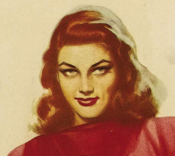
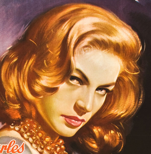
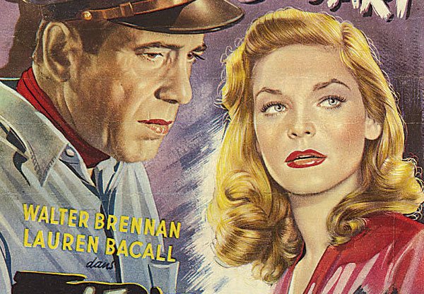
Adrian Curry, in his Movie Poster of the Week column that he writes for MUBI, posted this wonderful tribute to the recently departed film icon Lauren Bacall. Curry makes canny note of a phenomenon that, in retrospect, seems like a tremendous disservice to one of the most magnetic faces in cinematic history:
For most of her career, however, while she was never less than a star, she was rarely a leading lady, playing co-star to her great love Humphrey Bogart in four of her first five movies, then to Charles Boyer, Marilyn Monroe and Betty Grable, Kirk Douglas, John Wayne, Rock Hudson, Gregory Peck and so on. As a result, she rarely appeared solo in posters and is often dwarfed by her male co-stars.
His post reproduces almost three dozen details from many of these posters, all focusing on renderings of Bacall’s image. To look at them in aggregate is to realize how distinctive her features really were, how even when filtered through the hand of many different illustrators, they were still able to transmit the actress’s one-of-a-kind, slow-burn sensuality. It also reminds us how wonderful the world was when posters were illustrated by hand, rather than just Photoshopped.
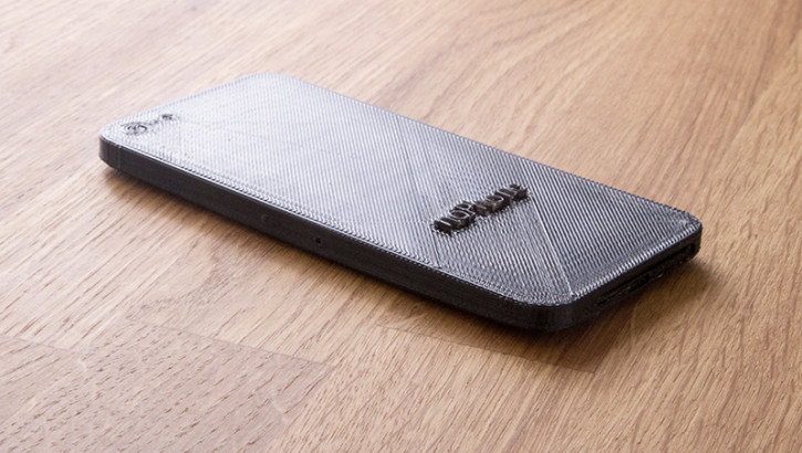
A technology-free alternative to constant hand-to-phone contact. With a thin, light and completely wireless design, the noPhone acts as a surrogate to any smart mobile device, enabling you to always have a rectangle of smooth, cold plastic to clutch without forgoing any potential engagement with your direct environment. Never again experience the unsettling feeling of flesh on flesh when closing your hand.
The accompanying “How does it work?” video is particularly hilarious.
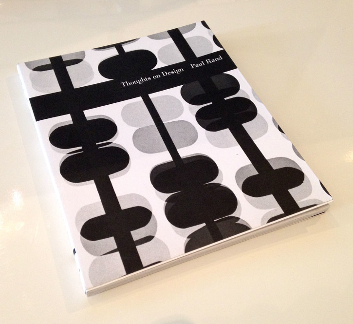
Chronicle Books has put legendary graphic designer Paul Rand’s legendary book “Thoughts on Design” back on bookstore shelves after a long absence. First published in 1947, the short, highly regarded volume has been out of print since the 1970s, and used copies have been very difficult to come by. This new release is priced reasonably, can be had in electronic form (let me know what this looks like if you buy it), and features a brief foreword by Michael Bierut, who writes:
Ostensibly, it is nothing more than a how-to book, illustrated with examples from the designer’s own portfolio. But in reality ‘Thoughts on Design’ is a manifesto, a call to arms and a ringing definition of what makes good design good.
Alas, no hardcover edition is available, which seems halfhearted given how the publisher’s own marketing copy describes this work as “seminal.” You could argue that there’s not a huge market for high-end design treatises, though Unit Editions would likely make the case that there’s a robust one, at least. We should probably all just be grateful that Chronicle brought this back into print in any form, but it’s worth saying that they had an opportunity to produce something really special here and they passed on it.
In the spirit of last week’s post about a mashup of Dr. Seuss and the Ramones, as an addendum to my post back in May remembering Jim Henson, and in keeping with August’s uncanny ability to inhibit truly substantial blogging, I present to you Animal, Beaker and the Swedish Chef “covering” the Beastie Boys’ 1992 classic “So What’cha Want.”
Cards as an interaction paradigm took a small but significant step forward today with this tweet from Acura. It introduces interactivity to Twitter’s previously rather rudimentary definition of the form; the card embedded in this tweet lets you actually “configure” an Acura TLX—choose your preferred engine, steering and color—and then tweet out the result.
It’s not an earth shattering level of interactivity—in fact it’s kind of banal. But it’s meaningful in that the card does something without taking you out of your current context. This is a key aspect of what lays ahead for cards, and part of why they have tremendous potential. I’ll be writing more about this soon; in the meantime, you can learn a bit more about what we’re doing in this arena at at Wildcard.
This is London creative agency Territory Studio’s showreel of user interface concepts developed for this summer’s “Guardians of the Galaxy.” I’m not sure I see very much that’s new here, but it’s good, fun stuff—much like the movie itself.
Territory’s Vimeo account also has some longer shots from the movie, including this footage showing “weather systems” from one of the movie’s spacecraft.
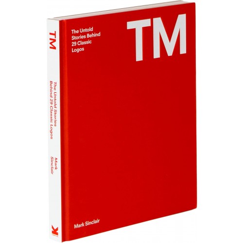
The book takes 29 internationally recognized logos and explains their development, design, usage, and purpose. Based upon interviews with the designers responsible for these totems, and encompassing the marks from a range of corporate, artistic, and cultural institutions from across the globe, TM reveals the stories behind such icons as the Coca-Cola logotype, the Penguin Books’ colophon, and the Michelin Man.
Sinclair is deputy editor of the U.K.’s Creative Review magazine, so the list of brands that he covers, below, includes some names that might not be immediately familiar to many Americans. Nevertheless, it looks terrific.
Bell Systems, Saul Bass, US, 1985
British Rail, Gerry Barney, UK, 1964
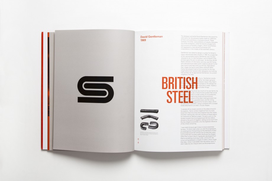
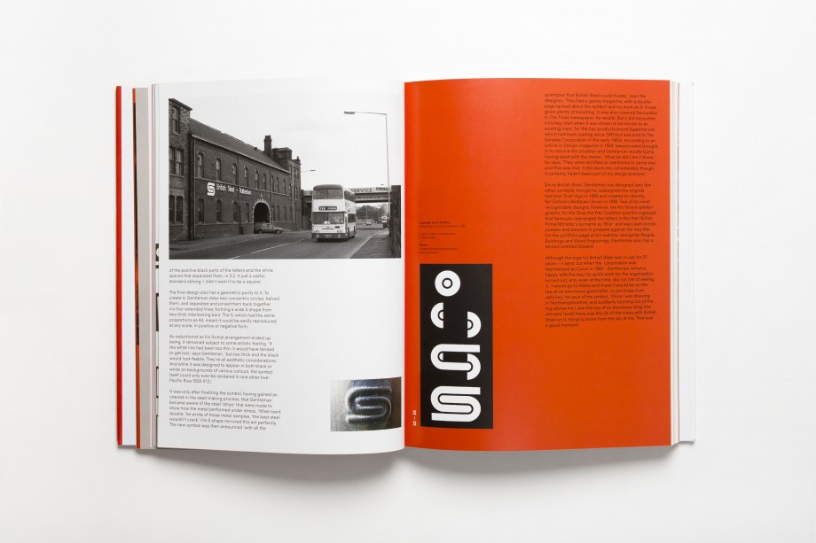
British Steel, David Gentleman, UK, 1969
CBS, William Golden, US, 1951
Canadian National, Allan Fleming, Canada, 1960
CND, Gerald Holtom, UK, 1958
Coca-Cola, Frank Mason Robinson, US, 1887
Deutsche Bank, Anton Stankowski, Germany, 1974
ENO, Mike Dempsey, UK, 1991
ERCO, Otl Aicher, Germany, 1974
España, Joan Miró, Spain, 1983
I Love New York, Milton Glaser, US, 1975
London Underground, Edward Johnston, UK, 1919
Michelin, O’Galop, France, 1898
Munich, ’72, Coordt von Mannstein, Germany, 1971
Musée d’Orsay, Bruno Monguzzi, Switzerland, 1983
NASA, Bruce Blackburn, US, 1974
National Theatre, Ian Dennis, UK, 1974
Osborne Bull, Manolo Prieto, Spain, 1956
Penguin, Edward Young, UK, 1935
Peru, FutureBrand, Argentina, 2011
Pirelli, Unknown, Italy, 1908
Pompidou Centre, Jean Widmer, Switzerland, 1977
Randstad, Ben Bos, Netherlands, 1960
Tate, Wolff Olins, UK, 1999
UPS, Paul Rand, US, 1961
V&A, Alan Fletcher, UK, 1989
Woolmark, Franco Grignani, Italy, 1964
WWF, Sir Peter Scott, UK, 1961
More information at laurenceking.com, or you can pre-order a copy at Amazon.com—if you use that link, I get a little affiliate fee and everyone’s happy.