Portrayals of Texting in Film

Tony Zhou produces wonderful short video essays about film under the name Every Frame a Painting. I wrote about his piece on Michael Bay’s “Bayhem” brand of filmmaking last month. It’s well worth a look (afterwards you might read my thoughts on Michael Bay too).

His latest essay is called “A Brief Look at Texting and the Internet in Film,” and it examines the evolving methods that filmmakers have used to incorporate this new social behavior into narrative film-making. The solutions are often quite graphical in nature, and Zhou discusses the pros and cons of that. He also makes the argument that the various techniques we’ve seen so far are proof that film is a continually evolving, unfixed form.

It’s a great piece, though it piques my interest about how various other technological innovations have been portrayed in movies, especially in their early days. It would be fascinating to see a similar study of how movies first wrestled with television, for instance, or mobile phones.

+

Typo.io

Typ.io is a running collection of Web typography specimens that aims to identify particularly effective pairings of web fonts. Its goal is to “know what font goes with what?” among the still relatively limited selection of typefaces designers can specify for the web. Combine this with Justin Van Slembrouck’s fantastic Type Sample utility, and you’re set.

+

Escher Girls

This is a blog to archive and showcase the prevalence of certain ways women are depicted in illustrated pop media, specifically how women are posed, drawn, distorted, and/or sexualized out of context, often in ridiculous, impossible or disturbing ways that sacrifice storytelling.

The site focuses primarily on the hyper-real illustrative vocabulary of comic books, which has always been highly exaggerated but in recent decades has become grotesque. There are lots of images that I could have reproduced here, but the site’s authors make such a thorough case for the aggregate vulgarity of this kind of imagery that to include even one seems like it would be an endorsement. See for yourselves here.

+

Virginie Morgand

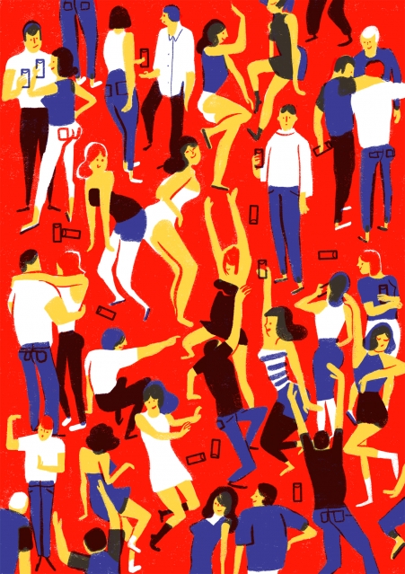
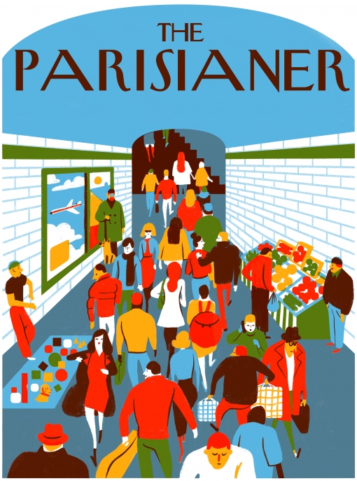
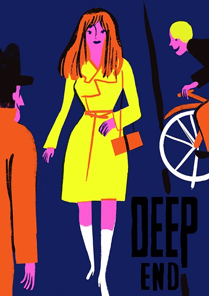
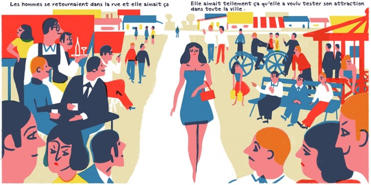
I’m completely captivated by the work of French illustrator Virgnie Morgand. Even when viewed on the screen her work has a wonderfully nostalgic feeling, like crude color printing on newsprint.

Lots of contemporary illustrators achieve a similar look by adding digitally faked streaks, spots and mis-registration of color fields—techniques which while effective can come across as superficial. Morgand does do a little of that, but the warmth in her work is less contingent on shallowly recreating analog visual tropes than it is a product of her judicious use of restrained color palettes, a line quality that is at once casually expressive and precisely graphic, and a textile designer-like understanding of visual patterns. It’s also distinctly European, if not singularly French.

Virginie Morgand
Illustration by Virginie Morgand

More at Virginie Morgand.

+

Rise of the Super Drug Tunnels

This short film from Reason takes a look at the struggle against the ever increasing number of tunnels being dug by drug cartels to transport drugs from Mexico into the United States. It focuses on Joe Garcia, a deputy special agent with the Department of Homeland Security and head of the San Diego Tunnel Task Force, who has discovered and shut down over two hundred tunnels since 1990, even as new ones continue to proliferate. It also features insightful commentary from David Shirk, associate professor of international relations and director of the Justice in Mexico project at the University of San Diego, who argues that simply throwing more money at the government agencies fighting this problem is a futile solution; “You can’t fight markets,” he says.

The whole phenomenon of drug tunnels is shocking to me, a case of what seemed like fantasy revealing itself to be reality. Just a few years ago I thought that the idea was outlandish when I first encountered it in television shows like “Weeds” and in movies like “Fast & Furious.” But smuggling drugs into the country via tunnels has been a known practice since the Prohibition era, according to this film. In the past two decades though tunnels have gotten more elaborate and become a more effective tool for cartels. (Patrick Radden Keefe’s New Yorker article on the hunt for Joaquín “El Chapo” Guzmán Loera also details how the Sinaloa cartel leader turned tunnels into a crucial tool for his successful escalation of the drug trade.) A drug tunnel, it turns out, costs as much as US$2 million to construct, but can make back that money in just its first day of operation. With that kind of incentive, it’s no wonder that this problem is so intractable.

+

Apple on Diversity

Apple released a kind of status update on its current diversity initiatives yesterday. The numbers are better than I expected, and CEO Tim Cook’s statement is encouragingly frank:

Apple is committed to transparency, which is why we are publishing statistics about the race and gender makeup of our company. Let me say up front: As CEO, I’m not satisfied with the numbers on this page. They’re not new to us, and we’ve been working hard for quite some time to improve them. We are making progress, and we’re committed to being as innovative in advancing diversity as we are in developing our products.

One thing nags at me, though: what would this report look like if you segmented out Apple’s retail division, which I’m guessing employs a greater number of women, minorities, gays, veterans and disabled workers than its product, engineering and marketing operations? Moreover, most retail employees are likely part-time and/or relatively low wage earners; what would these numbers look like if they were segmented so that we can see how well Apple’s diversity initiatives are faring for full-time workers earning over $100,000 a year? Or full-time workers earning more than $200,000 a year? I suspect the numbers would then look less encouraging, maybe even starkly different from what’s being reported here.

If the company is truly “committed to transparency,” then this kind of insight is important, because it gives us a much clearer picture of what opportunity looks like at Apple than simply counting all 98,000 of its employees as being equal.

+

Graphic Design Industry Advertising from Yesteryear

Print Magazine’s Imprint blog recently ran a short series of posts collecting advertisements aimed at the graphic design industry from the 1950s, 1960s and 1970s. Together, they make for a revealing tour through a neglected facet of design history.

The post gathered together almost ninety examples of magazine ads for photostats, dye transfers, photo lettering, color separators, engraving and similar products and services. Some of them are still in use today, but as with all technologies they have become commoditized over time, so the excitement and gusto with which they were marketed forty or fifty years ago seems foreign and a little absurd to us today. It’s also fascinating to see them organized by decade; each grouping bears the marks of its contemporaneous limitations in printing, and they get progressively more lush and colorful as four color printing technology becomes more widespread, affordable and capable.

I’ve reproduced a few of my favorites after the jump.

Continue Reading

+

Tic Toc Transit

Tic Toc Transit is an iPhone app for New York City subway riders. It provides timetables for all of the system’s lines; just choose your station and you’re presented with countdowns for the next four trains arriving in a sharp, minimal interface.

Tic Toc Transit

I’ve wanted this kind of data for years, and yet this is still not quite what I was hoping for. Tic Toc Transit is only able to provide the official train schedules. That is, it can’t provide accurate, real time, live data reflective of any of the many delays that beset train lines every single day. The fault lies with the Metropolitan Transit Authority, which simply doesn’t provide it, and can’t even collect it, for all I know.

This is symptomatic of the system’s ancient, struggling infrastructure; it’s so sad that it’s 2014 and real-time data in New York City subway tunnels still seems like a pipe dream. There are probably more smartphone carrying riders in the New York City subway than any other un-wired transit system in the world, and yet the system can’t even hope to meet the data needs of that ridership.

+

The Ramones Plus Dr. Seuss

The best kind of art is the kind that rewards you with something new each time you come back to experience it again. Since becoming a dad, I’ve learned that many things from my childhood have this quality, like The Muppets, which I wrote about back in May, and Dr. Seuss, which I guess everyone knew about, but I didn’t really fully appreciate until I read “Dr Seuss’s Sleep Book” as an adult. What an amazingly intricate, wonderfully absurdist, surprisingly airtight piece of work.

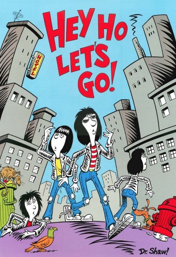
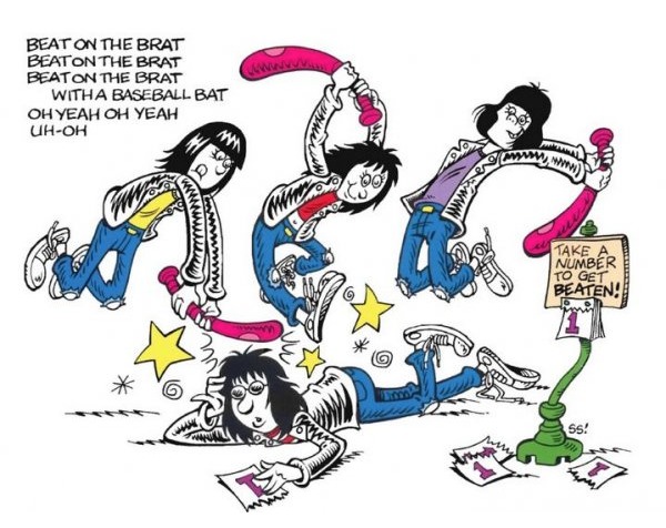
Anyway, that’s why these drawings mashing up the Seussian illustration style with the practically cartoon-like personages of The Ramones caught my eye. The two make for an entirely inappropriate pairing, but as drawn by legendary comics artist and animator Scott Shaw! (it’s a kind of trademark of his to include the exclamation point in his name), the combination seems irresistible. Wouldn’t you want to read this book?

The Ramones in the style of Dr. Seuss

Though I just discovered these drawings recently, Shaw drew them a decade ago as part of a Ramones compilation “Weird Tales of the Ramones” issued in 2005 by, you guessed it, the inimitable Rhino Records. It’s apparently out of print, but as always, eBay can scratch this itch.

By the way, don’t get the artist Scott Shaw! mixed up with this Scott Shaw.

+