is a blog about design, technology and culture written by Khoi Vinh, and has been more or less continuously published since December 2000 in New York City. Khoi is currently Principal Designer at Adobe. Previously, Khoi was co-founder and CEO of Mixel (acquired in 2013), Design Director of The New York Times Online, and co-founder of the design studio Behavior, LLC. He is the author of “How They Got There: Interviews with Digital Designers About Their Careers”and “Ordering Disorder: Grid Principles for Web Design,” and was named one of Fast Company’s “fifty most influential designers in America.” Khoi lives in Crown Heights, Brooklyn with his wife and three children.
In light of the fact that I now work at Adobe, I feel quite ill at ease when it comes to making public statements about Bohemian Coding’s Sketch these days. Nevertheless, the fact of the matter is that I’m still a dedicated user; it’s the tool that I turn to nearly every day, and with pleasure—I still find it to be the best solution on the market for web and mobile design.
It’s not perfect, though. In fact, it’s sometimes infuriatingly imperfect. Maybe this is the underlying truth for all design software; as good as these tools get, there may always be a nontrivial minority of features that are just terrible.
Sketch’s Achille’s heel, in my opinion, is its erratic handling of type. It’s not quite true to say that type behaves unpredictably in Sketch when you edit copy or change line-spacing because there’s some kind of logic driving it. But it’s a logic that defies understanding, at least for me. This glaring inefficiency has plagued the program as long as I’ve been using it—more than two and a half years now—and it’s been frustrating to watch it remain unchanged, revision after revision.
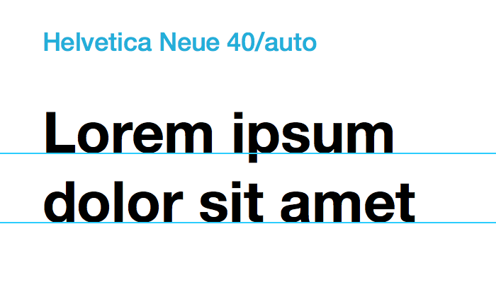
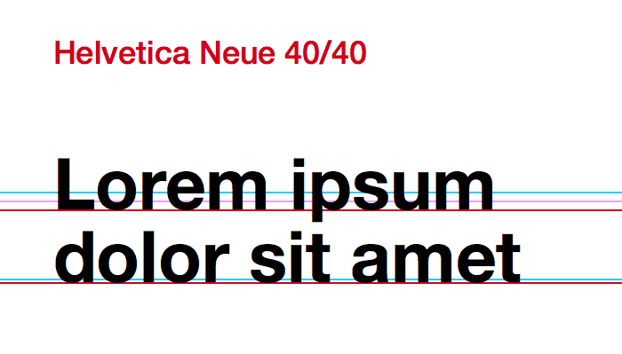
Sometimes, when faced with intractable problems in life, it’s helpful just to talk about those problems—or blog about them. In order to let off some steam, then, I tried to document the craziness of Sketch’s type handling. First, I set a short block of lorem ipsum at 40 pt. with three different line-spacing values: Sketch’s automatic leading (effectively 49 pt.), 45 pt., and 40 pt.
The automatic line-spacing demonstrates Sketch’s type handling at its most reliable in that the app behaves pretty much as you would expect it to with respect to the baseline. In this diagram, I’ve drawn a cyan line at the baseline of each line of text.
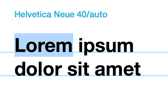
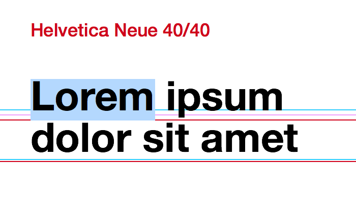
In this next image, the blue highlight indicates that I’m actively editing the copy. As you would expect, the type remains in place relative to the baseline.
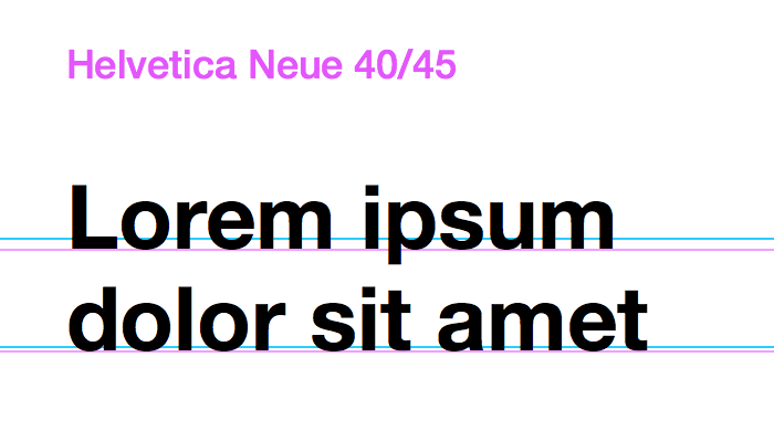
Now if I reduce the line-spacing to 45 pt., things start to get weird. In fact, the spacing here is not quite 45 pt. but actually 46 pt. when measured. The baseline of the first line of text shifts downward—my expectation would be that it would shift upward, if at all. What’s more, the amount that that first line of text shifts downward is different from the amount that the second line of text shifts downward. You can see that difference in the image below with the magenta baselines I drew; compare them to the cyan baselines which mark the baseline positions from the earlier automatic line-spacing example.
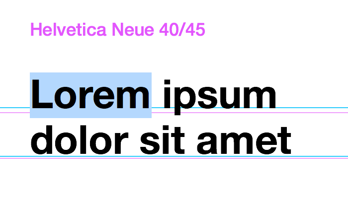
When I edit this example, the text now inexplicably shifts upward. In fact, the first line of text seems to now match the baseline of the automatic line-spacing example, but not quite; it’s a point lower. The second line of text has risen up dramatically, too, for a reason I can’t figure out.
One more example to bring the point home: here I’ve changed the line-spacing to just 40 pt. The first line of text drops further again, but the second line of text hasn’t dropped at all.
And this is what happens when I edit the copy:
As I said, there is surely some kind of engineering logic that’s driving this behavior, but whatever it is, it escapes me, and I would guess it escapes most Sketch users too. The fact of the matter is that precise type placement in Sketch is very difficult; most of the time I find myself approximating placement, rather than truly specifying it. That’s a severe handicap.
As an avid user, I desperately want to see this fixed, but I have to admit, I hesitated to write this post. Though I’m friendly with the Bohemian Coding team, it can be unbecoming to point out flaws in the competition’s products—and no one would argue that Adobe’s products don’t have glaring issues of their own.
But type handling is so fundamental to what Sketch promises as a product that to leave it unattended like this seems to undermine the potential of what its team has built.
As this market for UX/UI design tools heats up, as Adobe rolls out Project Comet, as Affinity continues to burnish their excellent Affinity Designer, as even prototyping apps start to push more towards end-to-end design-to-prototyping solutions, it becomes increasingly important that foundational features like this should be unassailably polished when they ship. In my belief, that’s just table stakes for long term success.
With luck, what we’ll see in a few years is a truly robust market with not just one dominant app, but many thriving, commercially successful applications for UX and UI design. That’s the ideal that translates into a net benefit for everyone, especially users—it’s the notion of a truly vibrant array of choices for the consumer. The apps that will get there will get there with winning ideas; original, thoughtful approaches to how design work gets done, along with superb execution. Sketch has those ideas in spades, but its handling of type does those ideas a disservice.