is a blog about design, technology and culture written by Khoi Vinh, and has been more or less continuously published since December 2000 in New York City. Khoi is currently Principal Designer at Adobe. Previously, Khoi was co-founder and CEO of Mixel (acquired in 2013), Design Director of The New York Times Online, and co-founder of the design studio Behavior, LLC. He is the author of “How They Got There: Interviews with Digital Designers About Their Careers”and “Ordering Disorder: Grid Principles for Web Design,” and was named one of Fast Company’s “fifty most influential designers in America.” Khoi lives in Crown Heights, Brooklyn with his wife and three children.
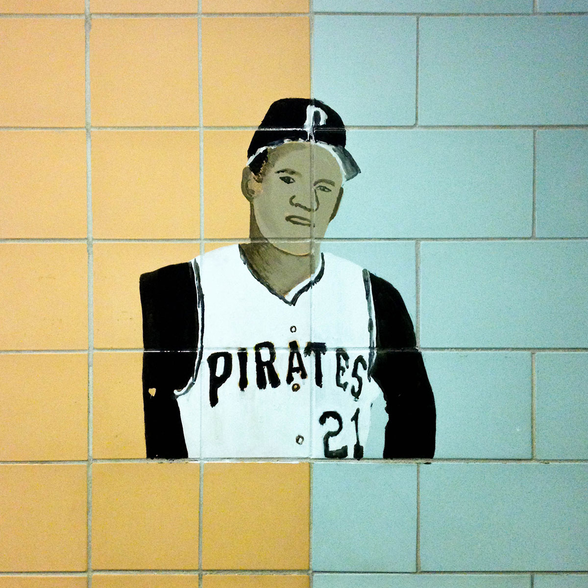
I only noticed this image of Roberto Clemente painted on the wall at my daughter’s school this morning. I was really captivated by its simplicity, and the way it was positioned exactly at the dividing line between two different colors of tiles.
Bad news for Dan Snyder, owner of Washington’s NFL franchise, as reported in The New York Times:
On Wednesday, a division of the federal government ruled that the Redskins name was disparaging. The team was stripped of federal protections for six of its trademarks.
If the ruling stands, then the loss of the trademarks means that anyone can manufacture and sell team merchandise without a license, which in turn means that the brand value will plummet, effectively canceling any reason to hang on to this frankly embarrassing moniker. It won’t be soon enough for me.
I grew up just outside of Washington, D.C., so I feel a vague personal connection to this story. What I remember from my exposure to the controversy as a kid was that, among locals, there was never a doubt that the name was racist at all. Everyone knew it was, and that it was actually kind of a horrible thing to have a team with that name. But there was just a collective disinterest in whether it actually offended anyone or not—basically few in the area cared at all.
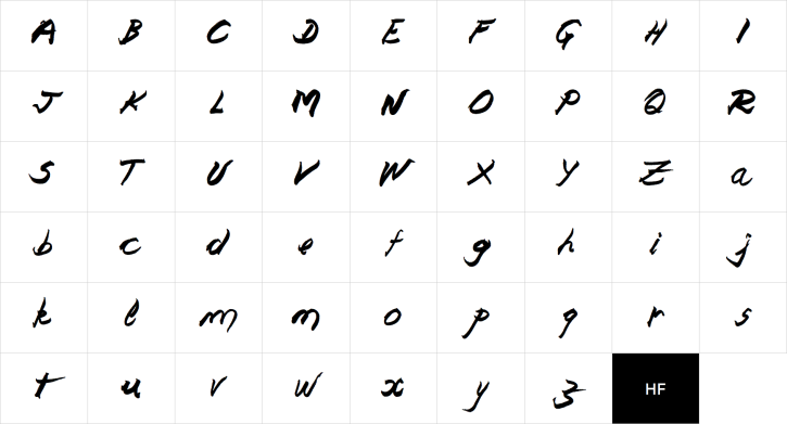
This excellent tutorial on how to create art in the “8-bit” mode offers wonderful insight into an obscure genre of visual expression. It lays down many of the aesthetic principles that underpin the rendering of convincing looking objects with restrictive color palettes and limited resolution. It was written by the artist Arne Niklas Jansson, who has a knack for making this very particular technical proficiency sound like an extension of more traditional forms of art.
In a way, pixel art is like analog art scaled down, but the pixel space can force certain exaggerations, detail reductions, alignments, graphical simplifications and iconographies. It has to be adapted so it’s readable, but a lot of the functionally effective ideas and wisdoms from analog art (be it more abstract graphical ideas or realistic-ish painting styles) can be ported and applied, I think.
However, when a human is presented with the very structural pixel art space she tends to ignore that and go into telephone doodle mode, making patterns, symmetries, outlines around outlines, little pointless ramps of colors, and other needless additions because the spatial forms somehow encourage it. When I fall into that mindset it helps to retract my mind from the pixel space and imagine the sprite/tile more like a regular painting done with a very large brush. Each pixel is very important as it actually corresponds to a large blotch of paint rather than a single tiny pixel. I think pixel art is very much about knowing where to make sacrifices of detail due to the scale, and how to make each pixel do double duty.
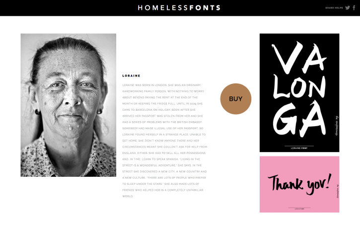
I’m always a little suspicious of philanthropic graphic design projects. The profession is generally so preoccupied with prettying up useless goods to be sold at premium prices that when it endeavors to do something actually worthwhile, the effort often looks superficial and disingenuous. This novel project from The Arrels Foundation seems to have some ring of that, but that may just be my cynicism coming through, because its concept is fairly clever.
Homeless Fonts works with homeless people from the streets of Barcelona to translate the handwriting they use on their signs into typefaces. The hope is that advertising agencies and corporations will use license the resulting works, with the proceeds going back into programs to help the homeless. The results are often distinctive and quite elegant.
There are five typefaces from five different people so far, and each is accompanied by beautiful photo portraits and a brief overview of that person’s story. The site also showcases people who are in need of typographers to help them create their own fonts. More at homelessfonts.org.
Earlier today I went to Adobe’s Creative Cloud 2014 event, which they billed as their biggest single day of product announcements ever. I was invited based on my friendliness with the Behance team, who are now a part of Adobe. (Full disclosure: for some months now I’ve been working with that team on some exploratory product ideas.)
The presentation began with updates and improvements to Adobe’s workhorse desktop apps, particularly Premiere and Photoshop. There was a lot of what you’d expect in terms of simplified workflows and computationally powerful new tools for creative imaging. This included new methods for isolating complex images from complex backgrounds (a problem that the company seems habitually preoccupied with; I feel like I’ve been watching demos of tools that do this same task for at least a decade) and working with three-dimensional objects in two-dimensional design environments.
It was technologically impressive stuff, but it left me somewhat underwhelmed—better iterations of existing tools is what Adobe has been doing for years. Thankfully, I was much more taken with the second half of the presentation, when the company announced several new mobile, cloud computing and, most surprisingly, hardware initiatives.
I did my fair share of grousing when Adobe switched from a boxed software model to a cloud services model, but in retrospect I have to respect the shift in strategy. The fact that they pulled off such a transition is no mean feat. Not only did they convert over two million milestone customers into paid monthly subscribers, but in doing so, it’s now clear, they opened up a new front for their creative tools, one that was frankly impossible without first moving to a cloud-based paradigm.
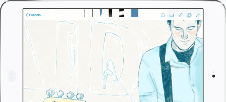
Adobe’s new Sketch app for iPads.
The products they announced today—their precision drafting app Adobe Line, their expressive drawing app Adobe Sketch, and mobile versions of Lightroom and Photoshop—are all intimately tied into their Creative Cloud service. They function well enough on their own, but they were clearly brought into the world as network-aware applications that are much richer when connected.
This new stripe of Adobe software is made possible by the company’s shift away from building value in shipped software and towards building value in the cloud. Which is to say, Adobe no longer has to make money from its monolithic software packages like Photoshop, Illustrator and InDesign, because people are no longer paying for those packages. Instead, they’re paying for Creative Cloud.
This still means that Adobe has to build software that people fundamentally want, of course. But it also means that they no longer have to concentrate their efforts solely on their core franchises. Any software that hooks into Creative Cloud and makes it more valuable for subscribers is a worthwhile effort. So it’s possible that we could see a lot more apps like Sketch and Line, which are sleeker, purpose-built concepts free of the cruft that has weighed down Adobe’s big applications for so long. And it’s also why even Ink and Slide, the company’s unexpected pressure-sensitive stylus and weirdly useful ruler, are both intimately hooked into Creative Cloud.
The best example of this was also today’s most muted announcement: Adobe’s Creative SDK will allow third-party developers to build new iOS apps that hook into Creative Cloud, and theoretically benefit from access to that huge market of pre-qualified consumers of design tools. Only a select few (as yet unidentified) developers have been given access to the SDK, but if the company properly nourishes this initiative, it could eventually outstrip today’s other announcements in importance.
A properly implemented third-party developer ecosystem could mean that the next Photoshop or Illustrator competitor won’t have to fight against the full might of Adobe in order to gain mass acceptance. Rather, with access to Creative Cloud’s millions of pre-qualified customers of creative tools, they could compete against Adobe’s marquee apps on a feature-by-feature basis. So long as they’re driving more subscriptions, Adobe benefits regardless.
It’s too early to say so definitively, but this is starting to feel like a new and different kind of Adobe. In the past, I’ve been ambivalent about their outsized domination of our creative tools, and I’m an unalloyed advocate of challengers to their throne like Bohemian Coding’s Sketch. But I’m starting to see now that Adobe has a unique opportunity to transform the creative process from a software-enabled workflow to a cloud-based activity. If done properly, there will be enormous implications for how we think about making and designing things, and even for who makes and design things.
German type designer René Bieder’s typeface Choplin is the latest release in Font Fabric’s continual string of free fonts. For the low, low price of no dollars you get two weights, but for the introductory price of US$35 (through 26 Jul), you get eighteen total weights as well as old style and tabular numerals, case sensitives, accented glyphs and fractions—tons of stuff, in short. That’s cheap, especially given how attractive it is.
You can download the free version at Font Fabric. You can buy the full family (and/or webfont versions) at My Fonts.
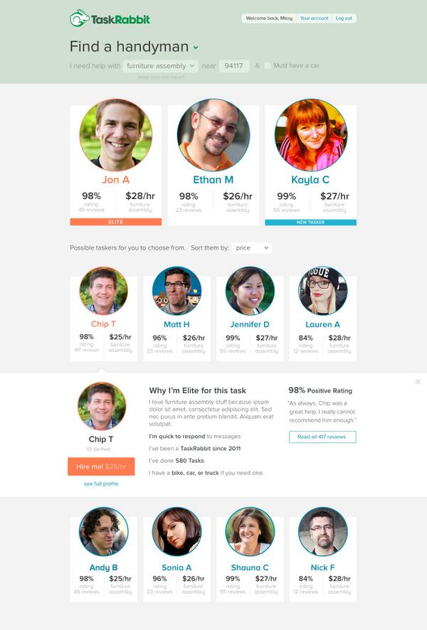
One question my friend Matt and I get frequently with Facebox, the pack of fifty royalty-free user avatars that we made last year, is “Why would I buy Facebox when I can just grab pictures from the Internet for free?” Here is one reason, pointed out to me by Andy Baio: TaskRabbit posted a new product mockup to their blog that included pictures swiped from the Internet without permission, including a few of Andy and other Internet-famous folks.
Designer Sacha Greif takes the five dollar-per-logo service Fiverr for a spin and writes about the experience. He created a fictional company and wrote a short brief that three designers on Fiverr responded to. The results are about what you’d expect.
It’s obvious to me now that the $5 promise of Fiverr is more of a marketing gimmick than a good deal. There’s no way you will get anything usable at that price, if only because all designers charge extra to provide their source files.
A lot of designers will argue that this kind of offering devalues logo design, but as far as I’m concerned it only devalues it in the sense that a $2 burger at a fast-food joint devalues a $35 kobe beef burger at an upscale steakhouse.
If what you want is the cheap burger, then get that. As long as you know what you’re getting for that price, then I don’t have a problem with it.
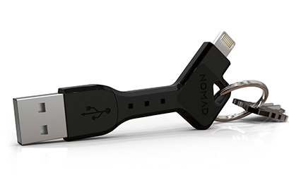
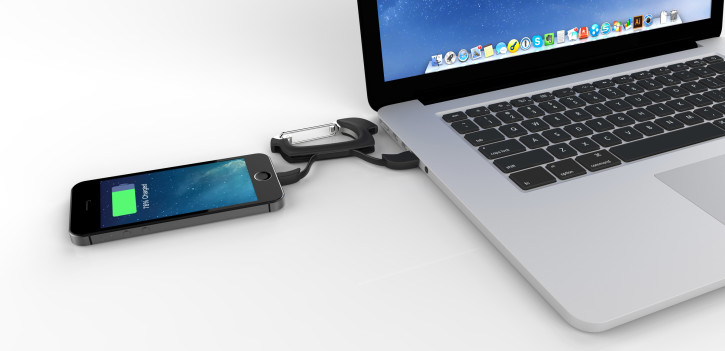
Peripherals manufacturer Nomad is doing some unexpected things with USB cables. First came their Nomad Key, which combines USB and Lightning connections into a short, compact, resilient cable that you can clip onto your key ring.
Now the company is releasing its Nomad Clip, which integrates a USB/Lightning cable into a carabiner.
Later this year, in August, my daughter will turn five years old, which also means that I’ll mark half a decade of being a father. I’ve learned a lot about parenthood in that time, about what it takes to be responsible for keeping someone else alive and happy and making sure all that all her numbers—age, weight, I.Q., etc.—keep moving in the right direction.
Some of this knowledge has come from absorbing widely circulated “best practices”; anecdotes and rules of thumb and pearls of wisdom from my elders. Some of it comes from research, which is usually imparted to me by my wife, who has always done a lot more reading about child rearing than I do, I’m embarrassed to admit. But a lot of it has come from trial and error and just figuring things out along the way.
Early on, I felt kind of guilty about this, about sort of making stuff up as challenges were presented to me, and about not preparing more intently to be a father. I have a distinct memory from years ago of strolling my newborn daughter in our neighborhood and seeing other dads with kids who were further along, maybe a year or two years old, and being so impressed by how much they had their act together; they’d done their homework and successfully gotten their kids pretty far down the line without any apparent damage. I privately despaired that when I reached that stage, I would be an obvious, faltering mess of a father.
Then my daughter actually did make it it to that age, and I noticed that I still didn’t feel like I knew what I was doing, I was still improvising every day. And yet, in spite of that, my daughter seemed to be doing just fine. In fact, she was turning out to be kind of an amazing, wonderful and happy little person.
I thought back to those dads I’d admired from afar in the early days and reconsidered what I had assumed then: it now seemed obvious to me that they almost certainly hadn’t had their act together, at least not as much as I imagined. They too were probably just barely holding it together, juggling informed strategies with heaps of ad hoc decision-making, skating by on their wits and feeling their ways through each new crisis or milestone in their kids’ lives.
Furthermore, it was dawning on me that it wasn’t just parents of newborns and toddlers. It was everyone—new parents, seasoned parents, even my parents. Everyone’s just winging parenthood. No one knows anything for sure, because the combination of any child at any specific age and under any given circumstance is inherently novel, unprecedented, untested in its own way. You can read books and you can watch videos and you can take classes, and there is worth in those efforts for sure, but in the actual moment when parenting is done the only thing that you have to really guide you is your gut.
This is probably the biggest realization that I’ve had as a father, and maybe one of the most important realizations of all my years. Not knowing is our default state, and no one has it all figured out…and yet that’s okay. Accepting uncertainty is freeing, even empowering. It absolves you of the responsibility of predetermining things you cannot affect, and lets you focus instead on the much more urgent, meaningful task of being a father who is present in your kids’ lives. So long as you’re putting your full weight and passion and commitment into this thing we call life, and especially this thing we call parenthood, then you’re doing it right, the way it was meant it to be.