is a blog about design, technology and culture written by Khoi Vinh, and has been more or less continuously published since December 2000 in New York City. Khoi is currently Principal Designer at Adobe. Previously, Khoi was co-founder and CEO of Mixel (acquired in 2013), Design Director of The New York Times Online, and co-founder of the design studio Behavior, LLC. He is the author of “How They Got There: Interviews with Digital Designers About Their Careers”and “Ordering Disorder: Grid Principles for Web Design,” and was named one of Fast Company’s “fifty most influential designers in America.” Khoi lives in Crown Heights, Brooklyn with his wife and three children.
In the introduction to these points, Zeratsky touches on how most designers don’t think of themselves as being responsible for user interface copywriting, and a primer like this is very useful for establishling the right frame of mind. Zeratsky is a very good writer himself, though, and I think he inadvertently glosses over how truly difficult writing is for most designers. I like to flatter myself in considering my writing skills passable, but even so, I admit to struggling with writing for user interfaces. I can’t think of a single project where I’ve tried my hand at copywriting and haven’t felt the frustration and dissatisfaction of wrestling with something that doesn’t come naturally or easily.
One of the things that I’ve found that makes this a little better is to write both within the context of the interface and also outside of that context. I’ll often take a first and sometimes a second pass by throwing text right into Photoshop or Sketch or even in the code. That gives me a sense of how long each bit of text needs to run, and how it all hangs together. But then I’ll turn to a text editor or a word processor and start to rewrite things, more in the abstract, so that I can focus on how the writing hangs together, whether tenses and style and all of that stuff makes sense in aggregate. This is also the time when I start to jot down a glossary of sorts, so that I can keep the terminology straight in my head and apply it across the interface consistently. When I feel good about that, I throw it back into the interface and revise event further. Because I generally feel like I’m not very good at it, I keep tweaking it as long as my team will let me.
Some people would say that this is really the job of a writer or a content strategist, and I think there’s a lot to be said for the idea that you want the people best suited for each task to tackle them. But I do agree with Zeratsky when he says, “Writing is part of the design process.” Especially in the early stages of design, and on smaller projects that can’t afford to bring on specialists, having the designer take on some of the writing is enormously helpful, even if it’s revised later by a “real” writer. When you can establish the right interplay between the visual interface and its text, you’re able to communicate the character of the product you’re trying to bring to life much better than if you ask someone else to do it.
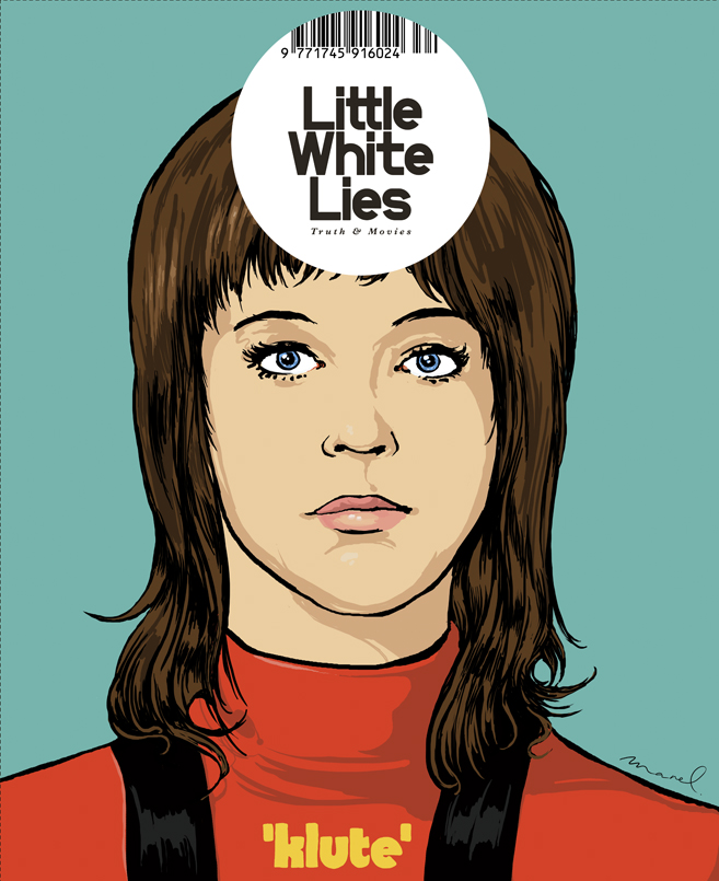
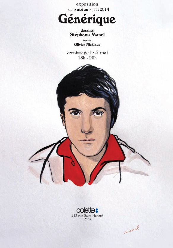
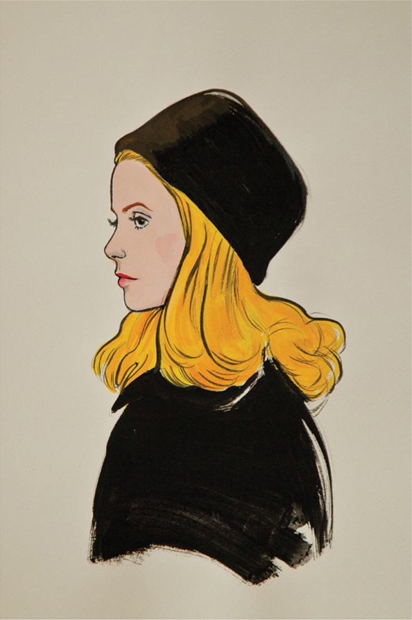
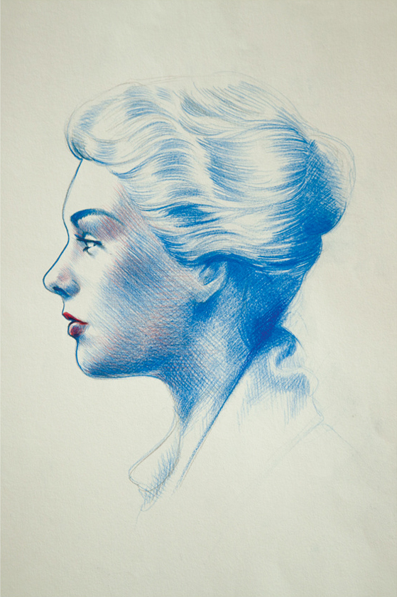
These portraits by Parisian illustrator Stéphane Manel are wonderful — the linework is supple and organic without being ostentatious, and of course his ability to capture likenesses is uncanny. I also enjoy that a contemporary illustrator is finding opportunities to render the stars of yesteryear — just because I’m an old codger, I guess.
Jane Fonda by Stéphane ManelDustin Hoffman by Stéphane ManelCatherine Deneuve by Stéphane ManelKim Novak by Stéphane Manel
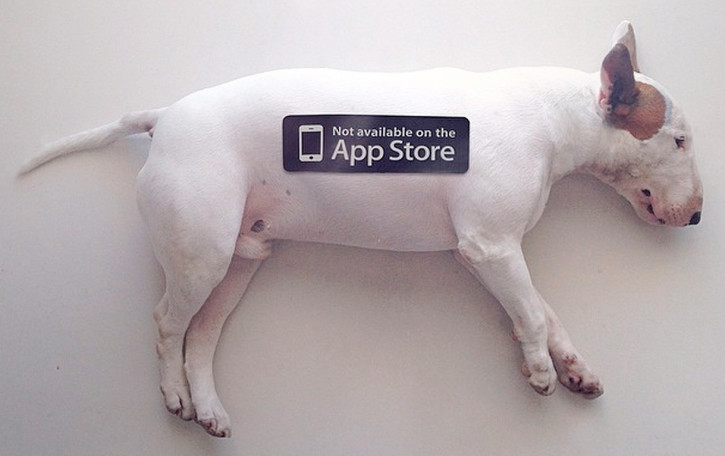
This got a tremendous response when I tweeted it last week so I thought it was worth repeating here. A trio of friends had the idea to distribute these stickers that riff on the prevalence of apps — their goal is to encourage people to put down their smartphones and engage with the physical world.
The team behind the project Rafael Ochoa, Caio Andrade and Linn Livijn Wexell appear to be studying at Hyper Island, though they seem to be reluctant to call much attention to themselves. When I emailed them to get a bit more of the back story on these stickers, they wrote back a friendly but short reply:
You need to see the big smile on our face every time we receive a new email. We are really happy to see all the attention the project is receiving.
Anyone can download the .pdf for free on the site, our goal isn’t to make money, it’s just to spread the word.
We got a pretty funny email from a parent who was on his away to buy an iPad for his son, saw the project and decided to buy something else. Pretty cool but I do not know if the child liked the idea.
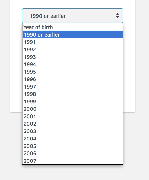
Idea for a Tumblr blog: screen captures of user interface elements that make you feel old. Here’s one I came across today that asks for the year of your birth — but lumps everyone born “1990 or earlier” together:
So basically if you’re any older than 23 or 24, it’s all the same to this service. Depressing.
In the magnificent romantic comedy-cum-fable of journalism “Broadcast News,” Albert Brooks’s character, a brilliant but socially challenged network television reporter named Aaron Altman, sneers at a moment when the news camera momentarily turns back to show a fellow reporter on screen. Sarcastically, he jokes, “Let’s never forget, we’re the real story, not them.”
For decades, serious journalists strove to be invisible, but that is perhaps changing now as news organizations look to find new ways to bind their dwindling audiences closer to their brands. At some publications, the emerging wisdom seems to be that if readers can be given a peek behind the curtain of the journalistic process, they will feel more compelled to pay for subscriptions, whether digital or print.
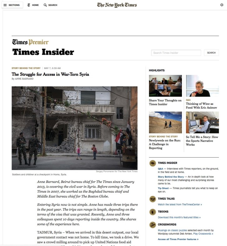
You can see this in The New York Times’ Times Insider, essentially a backstage look at the news organization’s operations and staff. A running blog with original content, Insider offers “interviews with Times reporters, on the ground, in the field and at home,” in depth looks at “how many of our most challenging and surprising stories came to be,” and “tip sheets” of news stories on the bubble, as curated by journalists.
I’m a digital subscriber to The New York Times but Times Insider is part of their Times Premier plan, so it’s only available to customers willing to spend several hundred dollars more per year. It will be interesting to see how the company will measure success here; Times Insider content doesn’t look particularly cheap to produce, while page views and engagement are unlikely to follow standard patterns given the smaller, rarefied customer base.
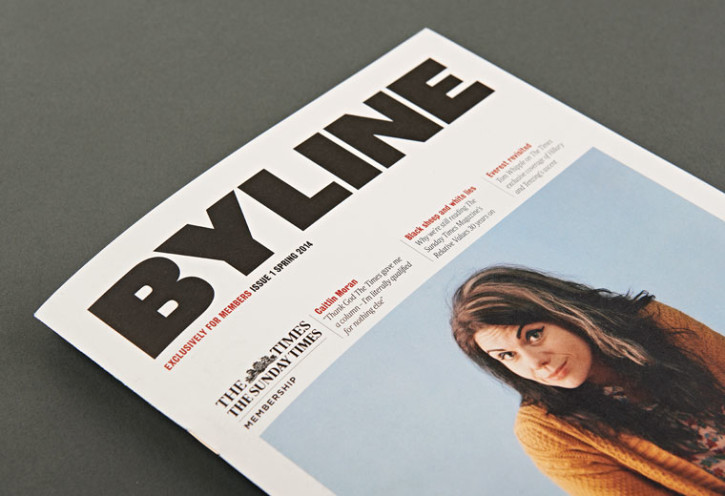
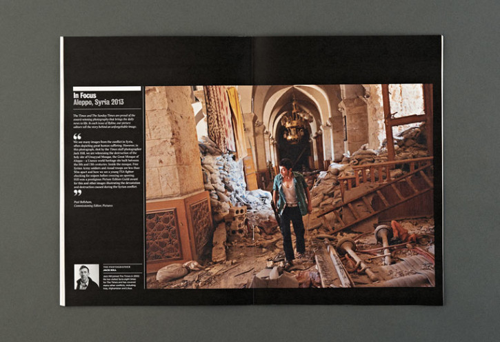
When it comes to experiments like this I typically favor digital media, but I wonder if The Times and The Sunday Times of London have placed a smarter bet with Byline, their new print product. Similar content, similar customer base; but instead of a blog Byline packages behind-the-scenes stories for their Times+ subscribers in a beautifully designed quarterly magazine.
I’ve long argued that “extras” like these do little to persuade people to pay for content, but it feels like what each of these projects is trying to do is to extract more value from people who would pay anyway. That’s where the news business stands today, apparently.
Given the choice between the two options, I’m not sure which I would choose. On the one hand, I would likely get more actual use out of the Times Insider model. On the other hand, I’m skeptical about how often I’d really access that content, and having a real physical object like Byline’s lavishly produced magazine mailed to me four times a year feels like it might be a good reminder of the value of a paid subscription. In either case, the existence of these two experiments will likely tell us how compelling stories about the journalists themselves really are.
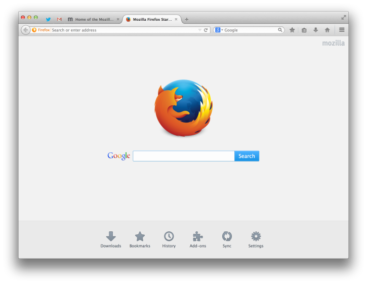
I pretty much use three browsers continuously every day, but the browser I spend the most time in — out of choice — is still Firefox, despite the fact that it has gotten steadily less and less popular over the years. I appreciate Chrome’s sleek dependability and Safari’s deeply integrated Apple-ness. But I still like Firefox best, mostly for individual, quirky features that I’ve become accustomed to and don’t want to give up. I also happen to like its refreshed design, which after much road testing in beta form was finally released with version 29.0 late last month.
Firefox’s golden age on the desktop is well over, and the organization behind it seems to be investing more effort into the browser’s future as a mobile operating system (which strikes me as perhaps even less of a sure thing). But I still get a good deal of satisfaction out of supporting the Mozilla Foundation and its good works. And more than that, I like using a browser that is not owned by one of the major tech companies; that’s an independence that is becoming rare and may one day become a luxury.
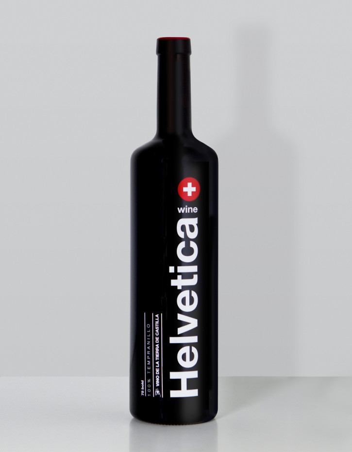
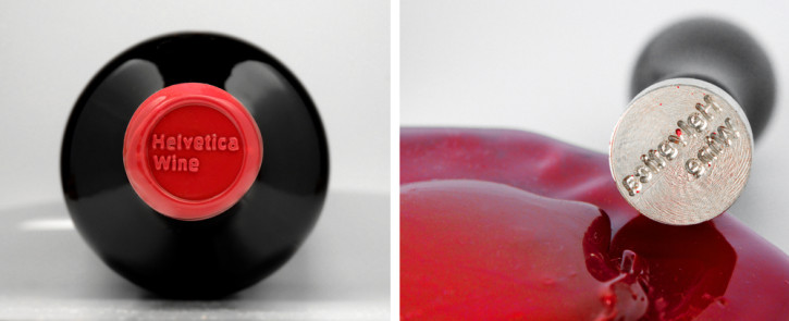
I try to resist feeling duty-bound to blog most of these gimmicky Helvetica-related tchotchkes, but this one seems particularly well done: Wild Wild Web Studio of Madrid produced this beautiful packaging for Helvetica wine.
Gofor is a service that provides drones on demand. Download the app and summon a drone on a job basis to help you complete a variety of tasks such as location scouting, aerial visual documentation, personal security, telepresence, internet range extension and more. The team refers to it as “Uber, for drones.”
Drones are summoned much like taxis in other popular service apps. Your desired task is either noted at the outset using presets, or customized using voice commands. Once the drone arrives, your phone’s flashlight is used to pair your device with the drone. From there, it depends on the task, the object-based UI is very easy to understand.
The app looks like this:
Actually, Gofor’s Web site, videos, app screens — its very concept — are all a goof. Gofor is a hypothetical business and its product don’t exist (yet). It all comes from the fertile imaginations of my friend Alex Cornell and his cohort Phil Mills. Drones are an obsession for them, apparently: they were also responsible for “Our Drone Future,” a video of mock drone footage made late last year. That project, like this one, is terrifyingly convincing.
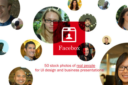
Excuse the plug: my friend Matt and I are holding a sale for Facebox, our pack of stock avatars for user interfaces design and presentations. Here’s the deal: the full pack is usually US$35, but today only you can get it for US$10. Tomorrow, the price goes up by five dollars to US$15; the next day it goes up another five dollars to US$20, and so on and so on — until Saturday morning (New York time), when it’s full price again.
For those who aren’t familiar: Facebox is composed of fifty high-quality shots of real people that Matt and I took last summer on the streets on Manhattan. Each avatar comes cropped in three shapes — squares, circles and rounded rectangles — and there are files and templates for Photoshop, PowerPoint, Keynote, OmniGraffle and Sketch. Having these on hand makes life much easier when you’re preparing mockups for Web sites and apps, or putting together business presentations, because all of the images are rights-cleared and royalty-free (unlike many other similar products you can find out there). All told, this is a great deal at full-price, but it’s a steal at US$10. Get it before the price goes up!