The 12 Principles of Animation

In his project “The Illusion of Life,” animator Ceno Lodigiani illustrates the “twelve principles of animation” set forth by Walt Disney Studios in the 1930s. These ideas guided the pioneering hand-drawn animated craft of Disney’s films, and they were later enumerated in a 1981 book by two of that studio’s animators, Frank Thomas and Ollie Johnston, called “The Illusion of Life: Disney Animation.”

Lodigiani created animated GIFs interpreting each of these principles. They can be seen at this Tumblr blog. He also created this short video that rounds them up.

Watching it, it’s remarkable to note how it is ostensibly just a pedagogical inventory of techniques, with no story or characters, and yet it is still surprisingly entertaining in and of itself. Working with little more than simple geometric shapes and a few lines, Lodigiani shows how even the fewest elements can still be vividly transformed by each of these principles, and how powerful they can be in instilling belief and wonder in audiences. It’s a good reminder that as the overlap between interface design and animation grows wider, designers would do well to take note of the many decades of insight and knowledge that animators have accrued.

+

Century: 100 Years of Type in Design

Now open at the AIGA National Design Center in New York City: Century: 100 Years of Type in Design. This is a major exhibition put together by Monototype; its somewhat broad goal is to celebrate the past century’s worth of “type as a constant influence in the world around us.”

Gathering rare and unique works from premier archives in the United States and London, ‘Century’ will serve as the hub of a series of presentations, workshops and events held at the AIGA gallery as well as the Type Directors Club and the Herb Lubalin Study Center of Design and Typography at Cooper Union in New York City. The ‘Century’ exhibition features a range of artifacts representing the evolution from typeface conception to fonts in use. Typeface production drawings by the preeminent designers of the last 100 years, proofs, type posters and announcement broadsides are supplemented by publications, advertising, ephemera and packaging.

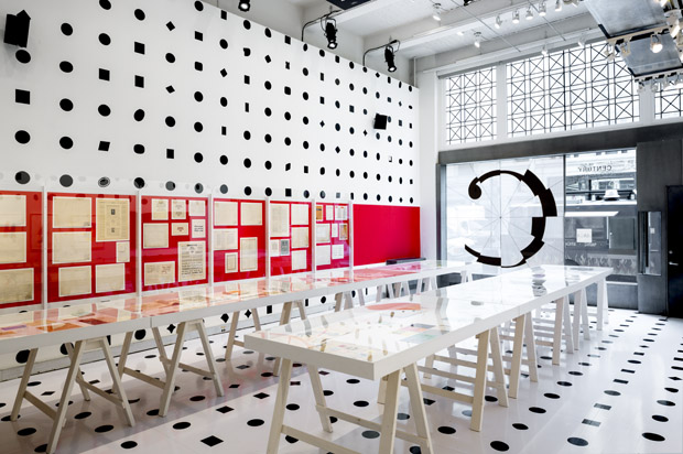
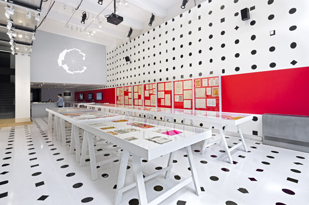
The show was designed by Abbott Miller of Pentagram. I haven’t seen it yet, but the photos are handsome:

Century: 100 Years of Type in Design

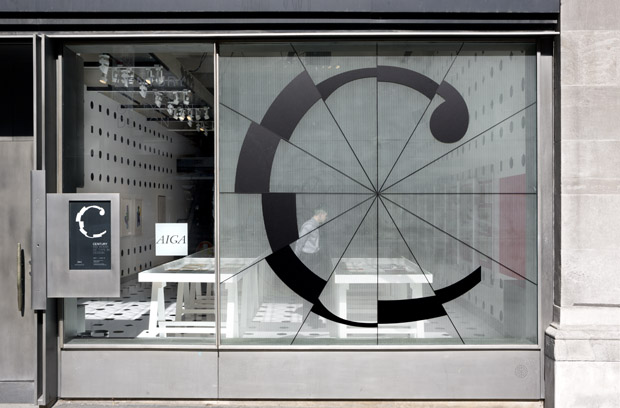
Miller and his team created a clever logo that allows fragments of fonts of many different eras and styles to form a letter C. In an animation they produced, the logo framework cycles through 250 fonts while still retaining the distinctive identity of the show.

Century: 100 Years of Type in Design

A post at Pentagram’s site discusses the design of the exhibition in greater detail. The show is open through 18 June at 164 Fifth Avenue in New York City, and you can find more information here. Note that this will likely be one of the last few exhibitions that you’ll be able to visit at AIGA’s venerable national headquarters; the organization recently sold the building against the loud protestations of many of the leaders and members of its own community.

+

Blokk Neue

I tweeted about this last year but was helpfully reminded of it today by ThinkUp, and figured it would still be useful to lots of folks. Norwegian design agency Dinamo Services created Blokk Neue as an font alternative to lorem ipsum dummy text. They cheekily describe it as “a font for quick mock-ups and wireframing for clients who do not understand Latin.” A few sentences of the font at 24 pt. looks like this:

BLOKK Neue

Even better, TTF and Webfont versions are free to download at Blokkfont.com.

+

Sketch Viewer

This is a lovely concept for a companion application to Sketch that would make it easier to collect the necessary measurements for design specifications. The idea is that it could open up Sketch’s native files, and allow anyone to simply hover over UI elements in order to reveal measurements automatically.

Sketch Viewer

This would certainly be useful and as you can see it’s superbly imagined and rendered here by designer Neway Lau.

I have a slightly different take on this problem, though: in this day and age, why can’t specifications and style guides just be automatically generated from source files? Every element in an application like Sketch is a known quantity in a database; why can’t the rules that we are effectively creating through visual means be parsed out into explicit, written rules by the software we use? Why should specification be something that happens at the end of the design process when it could be instead something that happens concurrently? Wouldn’t it be powerful to have a inspector pane for style rules that a designer can monitor as she works on a design, so that she is consciously aware of these rules that she’s creating? It’s a hard problem, to be sure, but the technology exists and we can bend it to our will to make this a reality if we want to.

+

iBeacon Is the New Frontier

iBeacon Logo

A very smart post about how Apple’s indoor positioning system represents a huge advance in how “smart” our smartphones really are — and, consequently, how iBeacon represents a huge opportunity for new innovations and businesses.

So iBeacon really is the digital equivalent of something we all take for granted: analog human sight.

Because up until this point smartphones have had no idea what is around them, closing the attribution loop in online-to-offline commerce has been impossible. And solving this is a trillion dollar problem. No company has ever had success (monetarily) with online-to-offline search or discovery, because you can’t go to an app and carry that discovery process to your offline environment. Yes, you can absolutely use a search query to find a place to go, but when you get there no one knows you arrived because of that service. In fact, your phone has no idea you arrived! Your smartphone is actually contextually dumb, blissfully going about its job missing this fifth sense.

The full must-read article is available at Steve Cheney’s blog.

+

Reappraising “House of Cards”

Respected television critic Alan Sepinwall summarizes his thoughts on Netflix’s popular flagship program:

I began the series being impressed by its pedigree and visual style, but finished its first season finding it to be good but not great. Then I saw the first four episodes of the new season, and by then had downgraded the whole thing to decent: slick and pretty, but ultimately empty.

And by the time I finished watching the second season, most of it within the space of a few days, I had come to the conclusion that it’s simply a bad show with the pretensions of a good one — a USA show that’s bad because it thinks it’s an HBO show.

He goes on to discuss how the show’s enviable pedigree argues for a certain level of respect that it doesn’t fully earn.

‘House of Cards’ wants very much to be an Important Show about the intersection of power and government and media and business, and about the depths people will sink to in order to hang onto what’s theirs. It has the veneer of that kind of show, with a polished look crafted by David Fincher, then maintained by later directors. (James Foley was behind the camera for six of the 13 season 2 episodes, along with Carl Franklin, Jodie Foster and a few others.) It has a two-time Oscar-winner as its star in Kevin Spacey as Vice-President Frank Underwood, an impressive co-star in Robin Wright (who also directed an episode this season) as his wife Claire, and an ensemble made up of actors who played roles big and small in some of the great cable dramas of this century (Gerald McRaney and Molly Parker from ‘Deadwood,’ Reg E. Cathey from ‘The Wire,’ Benito Martinez from ‘The Shield’). It has all the trappings of quality…

Because “Cards” wants to be treated as prestigious, it then demands to be judged as such, and it comes up wanting.

I’m a big fan of Netflix in general, but I’ve been baffled by how eagerly people have been willing to conflate that service’s business innovation with the actual end result of “House of Cards.” The decision to bankroll a prestigious television show and release each season in a single drop demonstrated a certain kind of genius, but each episode of “House of Cards” demonstrates a distinct lack of genius, in my view. I watched the first four episodes and came to the same conclusion as Sepinwall — it had great ambitions but they amounted to little more than great pretensions.

Meanwhile, there is in fact another premium television show about Washington, D.C. that is much superior, and yet it gets little notice: HBO’s “Veep” is probably the most incisive and definitely the most consistently funny television show about Washington politics ever aired. In spite of star Julia Louis-Dreyfus earning an Emmy for her work, the show generates much less buzz than “House of Cards” or even “Scandal” (which by all accounts is more entertaining than “Cards,” but I just haven’t had the opportunity to sample it). That’s a shame, because its cast is magnificent, its writing is relentless and its showrunner — Armando Ianucci — is truly a genius.

+
Daft Punk Merch

I really am a sucker for convincingly rendered simulations of yesteryear — especially if it’s from the days of my youth. Earlier in the year I wrote about Future City Records and their uncannily 1980s-style album covers. I spent a lot of time poring over them and marveling at how accurately they had recreated the look of that decade.

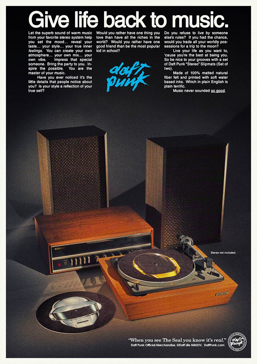
A few days ago I came across Daft Punk’s official merchandise. It’s moderately retro, but what really impressed me is the way that the items are showcased within mock magazine advertisements from the 1980s.

Daft Punk Merchandise
+

Rice Cooker Technology

Rice Cooker

This is the rice cooker that my parents bought for me when I went to college in the fall of 1989. It’s been with me ever since, through many roommates, girlfriends, and lonely spells as an eligible bachelor. And it’s been a reliable workhorse for my young family too, regularly serving up fresh, hot, perfectly cooked rice for all five of us.

That’s twenty-five years of loyal service. Along the way it acquired some unbecoming yellowing on its painted sides and a nasty dent along the rim of the pot itself (you can see the way the pot sits unevenly as a result). But it never let me down, not once, in all that time, until finally it succumbed to age a few months ago and cooked its last pot. A sad but noble end to an illustrious kitchen career.

The point of this post has been made many times, but I make it again here partly out of sentimentality: simple appliances like my old rice cooker have become complicated by digital technology. In some instances, they’ve been made worse. This is what I encountered in the instruction manual of the newer model we brought home to replace the old one.

Instructions for a New Rice Cooker

Granted, some of these steps are necessary for primitive cookers too — putting the rice in the pot and plugging in the cooker, for instance. But the old cooker had one button that worked all the time, and I always knew when it was on and I never had to consult a manual to figure out how to use it. The new one is practically inscrutable in comparison. You might argue that the new one does more, of course; there are at least a half-dozen modes, and maybe some of them are useful, even. But I’m willing to bet that it’s not going to last me twenty-five years.

+

Videos of People Making Luxury Goods

Digital media engenders all kinds of ironies. For instance, as the things we interact with on a daily basis get less and less tangible, we turn to digital media itself to fetishize the things that digital media can’t reproduce. I see this in videos documenting the intensity of manually assembling high-precision luxury objects from real materials. A few weeks ago I posted a video of a watchmaker at work, and the response was pretty enthusiastic. Something in our lizard brains delights in watching other people engage in manual labor, even if we have no inclination to undertake such activities ourselves. Here are a few more of these videos:

First, a four minute overview of the assembly of a classic Eames Lounge Chair at the Vitra factory in Switzerland. It’s actually quite educational; I never really knew that so much of this iconic object is literally hand-made. But it’s a little bit pornographic too in the way the camera tightly frames the chair’s famously sumptuous curves.

Next, this video captures the total effort in assembling a limited Leica MP-9 Edition Hermès camera kit. It shows how the body is fit together, how the leather is stitched for the carrying case, how the box is assembled, and, my favorite part, even how paint is hand-applied into the embossed numbers on the sides of the accompanying lenses. An enormous amount of care went into each kit, but then again, they sold for US$50,000 each.

Finally, to take this thread to one logical extreme, this video, again from Leica, shows forty-two minutes of polishing the body of a new Leica T camera. The company itself bills the video as possibly “the most boring commercial ever made.” But its point is plain: a lot of care goes into a Leica T, and you should be prepared to pay for it.

Much thanks to reader Adrian Ulrich for bringing all of these videos to my attention. Made my day.

+

Pearl Paint, R.I.P.

The Wildcard offices are only a few short blocks from the legendary Pearl Paint art store on Canal Street, but somehow I didn’t hear until after the fact that the longstanding New York art world institution shut down a little more than a week ago.

I shot this picture of its signage this morning on my walk to work. I guess I had never noticed how ragged the storefront looked.

Pearl Paint

Over at Vulture they have a nice piece in which six artists reflect on how Pearl Paint figured into their careers.

+