is a blog about design, technology and culture written by Khoi Vinh, and has been more or less continuously published since December 2000 in New York City. Khoi is currently Principal Designer at Adobe. Previously, Khoi was co-founder and CEO of Mixel (acquired in 2013), Design Director of The New York Times Online, and co-founder of the design studio Behavior, LLC. He is the author of “How They Got There: Interviews with Digital Designers About Their Careers”and “Ordering Disorder: Grid Principles for Web Design,” and was named one of Fast Company’s “fifty most influential designers in America.” Khoi lives in Crown Heights, Brooklyn with his wife and three children.
The future came to my neighborhood a few weeks ago when the city’s MTA bus system started reporting each bus’s location over the Internet. Brooklyn residents can now point their browsers to Bustime.mta.info to find out where along a given route the next bus is currently located, and therefore avoid long waits in inclement (or just boring) weather. I take my daughter to school each morning on the B65, and the availability of this information has radically changed the character of our mornings. We’re still rushing out the door to catch the bus — that can’t be helped with kids — but we do so with certainty now, which is a game changer. I know plenty of other cities have had this information for years, but New York’s public sector has lagged so egregiously in technology upgrades like this one that I can hardly believe it’s really a thing now. Next up: eagerly anticipation for whatever clever apps that developers cook up with the Bus Time API.
Industrial designer Martin Hajek produced these impressive concepts for what a next generation Apple TV might look like.
There are some interesting ideas here: multiple color options, adding a curved touchscreen to the remote control, turning the set top box into a charging station, and using the remote as a game controller. This kind of visualized speculation is entertaining, but it just makes me more impatient for Apple to reveal whatever it’s working on in this space. There are a few components in our home theater system that are ripe for upgrades, but I feel compelled to hold off until we find out what Cupertino has in mind.
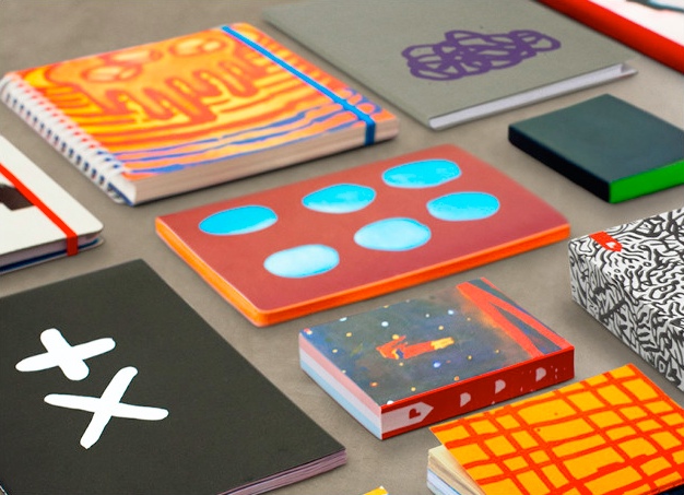
You wouldn’t think that there a lot of new products to be dreamed up in the notebooks/sketchbooks category, but people keep trying — presumably because other people are still very fond of the tactility of real paper. In just the past few weeks, I’ve become aware of three new lines of notebooks.
Mod Notebooks offers a series of notebooks that “syncs with the cloud.” At first I thought that might mean that the books were specially printed with marks that make it easier to scan and upload images, but their solution is a bit more straightforward: once you’ve finished filling up a Mod with your writings or drawings, you mail it to the company where they scan its entire contents. They then provide the pages to you as images within a web app (the service is also compatible with Evernote, Dropbox and OneNote). The web site has a demo of the end result, which looks pretty, though I didn’t see any searching, indexing, bookmarking or export features.
Mod Notebooks’ Cloud App
Plumb Goods’ products are less technologically integrated, but probably more successful as re-imaginings of what a notebook can be. Once a season, the company collaborates with three different contemporary artists to produce unique notebook editions. These aren’t off-the-shelf paper products that have been superficially decorated by the artists, but rather individually customized notebooks that have been designed from scratch. Their lack of uniformity is surprising, actually, and makes for a far more interesting product slate than most of what we typically see in this category.
Plumb Goods’ Artists Notebooks
Baron Fig eschews these high concept twists for something more straightforward and, arguably, more difficult: making fundamentally better notebooks. They began life as a Kickstarter project and have since transitioned to a self-sustaining company. Their approach is to design and manufacture notebooks based on interviews with “hundreds of thinkers worldwide,” and to produce exquisitely crafted notebooks that match that criteria. In an email exchange, I asked one of the company’s founders how Baron Fig’s notebooks were different from others, and he said simply, “Better materials, better function, better price, to name a few.” So there you have it.
The Confidant Notebook from Baron Fig
I have yet to take to any of these new brands, though I wouldn’t rule anything out. Most people I know use the versatile, surprisingly popular Field Notes series, which I’ve tried here and there. But I always come back to Moleskine’s Cahier journals, which are unassuming, highly portable and inexpensive (they come in packs of three!).
Moleskine’s Cahier journals.
After several months of use, their sturdy, lightweight cardboard covers attain a very satisfying patina. Despite not being hardbound, in the seven years or so that I’ve been using Cahier journals—bending them absent-mindedly, stuffing them into my back pocket, and tossing them in my bag on a daily basis—not one of them has fallen apart on me, which counts for a lot.
Wes Anderson’s newest film, “The Grand Budapest Hotel,” is out, and so people are openly debating the merits of his work again. I have yet to see it, but from what I’ve heard it’s more of the same — which is to say, it’s likely to continue to please his fans and continue to displease his skeptics.
Two years ago, when Anderson released the beautiful, frustratingly shallow “Moonrise Kingdom,” I summed up my feelings about his recent work with this passage:
Part of the wonder of a Wes Anderson film, for me, is getting to see the kind of film a designer would make given a budget, a crew and a sampling of today’s most notable celebrities. Anderson populates his movies with big name actors eager to burnish their indie cred, and he surrounds them with the accoutrements of his obsessions: obsolete technology, dubious uniforms, imaginary cartographies, naïve architecture, and more. Every single piece counts, and is placed exquisitely in relation to every other. Most filmmakers compose their frames, but it might be more accurate to say that Anderson lays his out, much the way print designers once pasted up pages in lavishly illustrated encyclopedia volumes. It’s not film direction, it’s art direction.
If anyone ever doubted my assetion then, well here is further proof — made more credible and persuasive in that it is Anderson’s own work speaking for itself. In this supercut video, courtesy of prolific supercutter (?) Kogonda, the director’s persistent preoccupation with symmetrical frame composition is revealed. Watching it is to realize how shockingly faithful Anderson is to his own design sensibilities.
For the record, this sort of aesthetic precision is catnip for me; it squares (no pun intended) nicely with my own grid-centric, orderly compositional tendencies. But as I said in my 2012 post, as much as the designer in me delights in it, the moviegoer in me feels starved by it.
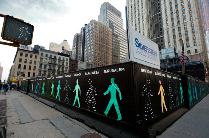
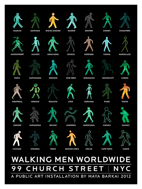
The artist Maya Barkai collected these surprisingly diverse examples of crossing signal “men” from around the world.
For the past several years she has used them to create art installations in New York City (above) Australia, Russia and Israel. She’s also run a limited edition silkscreen print (below), though I personally find that the typography ruins the collected beauty of the image (with the exception of movie bills, I rarely want to see type on posters). The title and event information distract from the fascinating variations on what is ostensibly a universal icon.
Product design studio Berg re-imagines the washing machine as a connected device, including extensive integration with smartphones. This is an internal prototype that doubles as a showcase for the firm’s deeply thoughtful approach to designing experiences.
Of course, rooting out its provenance was all but impossible, even after a search on TinEye. As I wrote several years ago in a post title “The New Who Thing,” Tumblr is amazing but its inability to attribute or provide sourcing is a perpetual frustration to me.
I’m really impressed by Creative Market’s campaign to build a robust marketplace for designer-created tools for other designers. I’m not altogether convinced that there’s a huge business here, but I hope there is. Lots of smart, talented people turn to Creative Market to sell clever, useful solutions that make designers’ lives easier and more interesting — people should be able to make a living from that.
Granted, few of the design solutions are genuinely innovative or spectacular, and lots of them are redundant of one another. But even among the simplistic ones, there is really good stuff, like this Photoshop template for “Ultimate Identity Mockups.” It allows identity designers to quickly swap out concepts for logos and other assets in a photo realistic fashion, thanks to crafty use of Photoshop’s smart objects feature.
This is the kind of resource that just wouldn’t have been widely available a decade or two ago, and now we’re just a browser click away — what’s more, it costs an absurdly low US$9. You can hardly go wrong. While it’s true that Creative Market isn’t necessarily the catalyst for the proliferation of this kind of product, if they can convene an active, thriving marketplace around this emergent activity, many more interesting things are sure to happen.
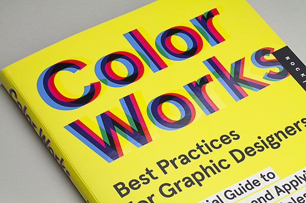
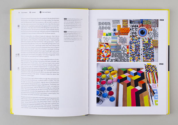
People rarely ask my advice on color — I made my bones with this black and white Web site, after all — but when they do, the best I can do is basically say, “Try a bunch of different stuff, and get lucky.” That’s why I was intrigued by Pentagram partner Eddie Opara’s new book “Color Works,” a guidebook to color usage in graphic design.
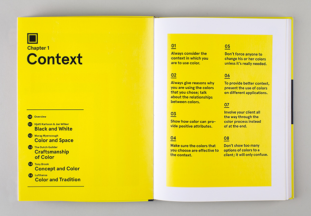
The book is organized into thematic chapters that cover various conceptual aspects of practical color theory, e.g., “Context,” “Awareness,” “Production & Information,” etc. Over at Pentagram’s blog, a post about the book explains:
Within each chapter, a series of illustrated case studies look at iconic projects that have used color for impact. The essays are written by designers who share their first-hand experience of working with color: Stefan Sagmeister and Tony Brook on using color conceptually; Brian Collins and Michael Rock on color for branding; Paula Scher on helping Tiffany establish its own PMS color; Willy Wong of NYC & Company on using color in the master brand for New York City; Gale Towey on using color to set up themes in Martha Stewart Living magazine; and Hjalti Karlsson and Jan Wilker on using a simple palette of black and white.
If you can get past the fact that this is largely the usual cadre of famous graphic designers that show up again and again in graphic design books, there is some interesting stuff here. I particularly liked London design studio Cartlidge Levene’s comments on color and wayfinding, which have some parallels with usability in digital products.
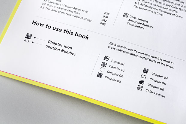
“Color Works” is also quite attractive. It has some of the hallmarks of a designer-authored book (though to be accurate, Opara shares author credit with writer John Cantwell): the layouts are visually striking; it’s laden with beautiful, probably too small type; and it features an inscrutable, debatably useful iconographic system that requires a “How to Use This Book” legend.
TL; DR aims to crowdsource “software licenses in plain English,” a library of colloquial translations of the dense legalese that governs popular Web sites. I’ve been wanting a site like this for years and daydreamed about building it many times, so I’m glad that Kevin Wang went ahead and made it a reality.
However, some of the translations are discouragingly off-the-mark. For example, TL; DR’s current take on the Dropbox terms of service sounds quite dire:
Dropbox and Third Parties that they work with are allowed to access, scan, store and duplicate content that you put on the service.
When I first read that, I was quite alarmed. But a closer look at the actual language reveals that that interpretation may not be so clear cut.
When you use our Services, you provide us with things like your files, content, email messages, contacts and so on (‘Your Stuff’). Your Stuff is yours. These Terms don’t give us any rights to Your Stuff except for the limited rights that enable us to offer the Services.
We need your permission to do things like hosting Your Stuff, backing it up, and sharing it when you ask us to. Our Services also provide you with features like photo thumbnails, document previews, email organization, easy sorting, editing, sharing and searching. These and other features may require our systems to access, store and scan Your Stuff. You give us permission to do those things, and this permission extends to trusted third parties we work with.
Whether the translation is accurate or not is a matter of legal opinion, I suppose. The fact that TL; DR provides a simplified take on it is somewhat helpful, but it hardly seems definitive. The challenge for TL; DR is to build a community and ecosystem that put level-headed interpretations forward. Here’s to hoping they get the chance. Visit TLDRLegal.com.