is a blog about design, technology and culture written by Khoi Vinh, and has been more or less continuously published since December 2000 in New York City. Khoi is currently Principal Designer at Adobe. Previously, Khoi was co-founder and CEO of Mixel (acquired in 2013), Design Director of The New York Times Online, and co-founder of the design studio Behavior, LLC. He is the author of “How They Got There: Interviews with Digital Designers About Their Careers”and “Ordering Disorder: Grid Principles for Web Design,” and was named one of Fast Company’s “fifty most influential designers in America.” Khoi lives in Crown Heights, Brooklyn with his wife and three children.
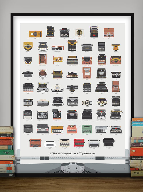
Patrick Mulligan and Ben Gibson’s Pop Chart Lab turns out wonderful prints. This one is particularly nice and sure to appeal to those of us who tirelessly (and often tiresomely) fetishize the analog: a visual catalog of many of the most notable typewriter models throughout history.
You can zoom into the illustrations for a closer look at the cleanly rendered hardware, though personally, I would have just emphasized that handiwork and done away with the bottom of the poster, which forms a trompe l’œil conceit.
Design studio 1910 have some interesting thoughts on the arrested state of email typography.
One thing that’s always struck us as odd is the way typography of email applications has been left untouched since the early days of the internet. Even modern applications released in the post-PC era mostly forget about this, focusing on new ways of managing your inbox, various forms of social integration, or on the appearance of a flat surface instead.
It’s one of those blindingly obvious insights that has somehow escaped most of us for years. The nature of email protocols and the dramatically uneven distribution of taste among the authors of email programs probably means that this problem will not get addressed on a widespread basis anytime soon. But individual clients can probably start to make some strides. If we can get an email app that looks anywhere nearly as good as 1910’s example, I’ll be happy:
Here’s an update on Kidpost, the service that I’m building with a few friends that will aggregate parents’ photos and updates from social media into an email digest for their extended families. (Read the announcement here in case you missed it.)
We’re now sending out regular digest emails to our very small cohort of alpha testers. The digests aggregate photos from Facebook accounts only (for now; see below). Each Kidpost account can link to multiple Facebook accounts, so anything my wife or I post with the hashtag #kidpost is getting scooped up into our digest email. As I’ve said before, I often miss her posts because I’m so busy, so it’s been great to have them delivered to my inbox.
In addition to Facebook, we have definitive plans to support Instagram, too. We also had a shortlist of additional services we want to integrate with at launch, but rather than just making assumptions about which ones our potential customers would want most, we decided to put the question to them directly.
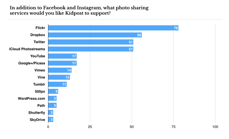
So last month we ran a one-question survey in which we asked respondents to identify the services they’d like Kidpost to support. We had about 130 votes, and what we found out was surprising. Here is a chart of the leading answers.
I don’t think any of us expected Flickr to do so well, and to lead by such a clear margin. Personally, I had assumed that that service had been nearly forgotten, but perhaps with the generation of tech-savvy parents who are raising kids right now, the memory of Flickr’s heyday has helped it parlay into a useful platform for family photo sharing. Of course, there’s almost certainly a selection bias at work here, too; the folks who responded to our survey were probably not unlike Matt, Mike and me — which is to say, we all actually remember the world before Facebook.
Also surprising was how well Apple’s iCloud Photostreams did. No one talks about this baked-in feature of the iOS and OS X ecosystem; it’s rarely mentioned in analyses of the incredibly competitive photo sharing landscape. And yet, personally, this is my favorite photo sharing platform of all. Almost all of my immediate family is on it, and it’s the first place I share the many, many shots of my kids that would otherwise bore the public at large. I just assumed that, as an Apple fan, iCloud Photostreams were a fairly niche product. But at least in these results, it turns out to be quite popular.
Last month’s survey was limited to people who signed up for our mailing list at Kidpost.net, and it’s now closed. But we have an identical survey open now at this URL, so if you’re interested in voicing your opinion, please go vote. Though these results will be even less scientific than our admittedly pretty unscientific first survey, it will be interesting to see how dramatic the differences will be. I’ll report back in a few weeks.
This is a trivial matter to the world at large, but I’m pretty excited that this new design of my site finally lets me post videos inline. My last design was coded at the dawn of the age of embeddable videos, and in the time since, video has become such an important part of the Web in so many respects. I’ve long wanted to get around to rejiggering the markup and CSS to properly accommodate video players, but never found the time.
Now that’s changed, and in honor of it, I’m posting this wonderful supercut of 80s-era strangeness, called “Memorex.” I wrote about it back in December but sadly couldn’t embed the video at that time. Enjoy.
Victory Journal has been doing incredible web presentations of long-form sports stories. They’re all gorgeous and very inventive, including this hockey story that employs comic book-style illustrations and charmingly primitive animations.
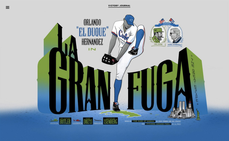
My favorite is this story about Orlando “El Duque” Hernández, one of the most charismatic baseball players of the late nineties and early 2000s. It’s lavishly illustrated by Micky Duzyj in a warm, storybook style. The opening art is something straight out of the portfolio of Will Eisner.
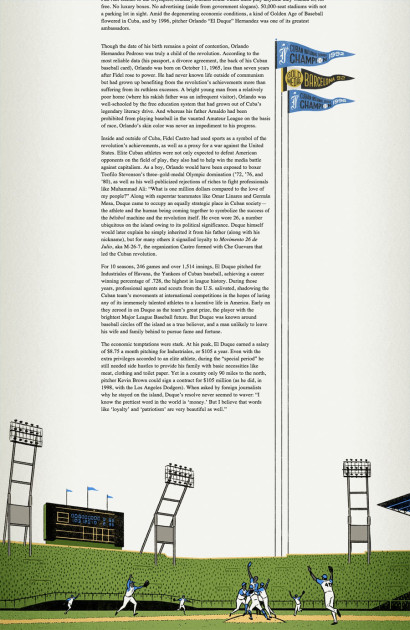
The layout does a terrific job integrating Duzyj’s artwork into the structure of the page. There’s a procedural illustration that details the process of Cuban nationals working the system to become free agents to Major League Baseball which reveals itself as the user scrolls down. And there’s a wonderful visual device where a set of pennants stretches far down the side of the article to root itself in a great drawing of a team at play on a baseball diamond.
This is great work, and Victory should be proud of how expertly they’ve used artwork here — it’s a new level for salvaging the relationship between words and illustration online. I can’t wait to see what else they come up with.
At a higher level, I must admit that this kind of exuberant experimentation is made possible, at least in part, by the breakthrough in online storytelling wrought by The New York Times’ widely hailed “Snowfall” article. I spoke somewhat disparagingly about that piece late last year but I think I didn’t give enough credit to the ripples it would cause, which have proved to be more positive than I expected. This new form of narrative is still young and awkward in many ways, but it’s very encouraging.
On the other hand, I would also say that I didn’t read this article. So there’s that.
Tonight, I’m unveiling a brand new design for this blog. The old design debuted during the second Bush administration, in an age when people actually used to read weblogs, and when liking something wasn’t the same thing as an acquiescence of your privacy. It’s been a long time, is what I’m saying; nine years in fact. It would have happened sooner — I’ve been wanting to redesign for years — but life intervened. Here’s what it looks like:
Some highlights of the new design:
It’s responsive, so it will scale up for large screens and scale down for mobile devices. Be sure to visit this site on your phone or your tablet; I’m really proud of the way it looks on those screens.
Images are much bigger and when the aspect ratio is not complementary to the column structure, they’re letterboxed, so that everything looks nice and tidy. This post from Sunday is a good example if you’re looking at this one a very wide screen.
The home page now features infinite scroll. This one might be a little tricky; we tried hard to work out all the kinks, so if you find it’s troublesome, please let me know.
Comments are gone, as explained last week. That is, the old comments are preserved for posterity, but going forward no new comments will be accepted. Instead, you can use the comment form to send your remarks directly to me, and they will not be published publicly.
Web fonts, because it’s the year 2014. I’ve finally jettisoned Microsoft’s ersatz Helvetica clone Arial in favor of Helvetica Neue, and I’m using a serif typeface for the first time, Libre Baskerville.
All the old archives have been ported over, but there may be some cleanup left to do, so beware those who dare tread too far into history’s bowels. Also, the archive page itself, while technically comprehensive, is not a great experience for those looking to separate my longer form essays from the many shorter posts that I’ve published over the years. I’ll be revamping that at some point, too.
This is all the result of months of after hours work with my friend Allan Cole, the designer and WordPress developer extraordinaire who collaborated with me on the Basic Maths premium theme several years back.
There are two things you can read into our work here. The first one is that, after starting life many years ago on Blogger.com, then moving to Movable Type, then to ExpressionEngine, this blog is now running on WordPress (hosted at WP Engine). The second implication is that Allan and I are going to follow up on our previous premium theme collaboration with one based on this new design; expect for it to go on sale within a few months. If you want to be notified, sign up for my email list, which you can find just after this post on the home page.
Have a look around, and let me know what you think, though keep in mind that things are still a bit raw. There’s more work to do yet on this new design, and more to write about the process that got me here, so stay tuned for that. And for those who have been reading all through the years, a very sincere thank you.
Technology writer Julia Angwin wrote this op-ed piece in today’s Times about the mounting burden on consumers to protect their own privacy.
The more we learn about how our data is being harnessed — and how it may be exploited in the future — the more likely we are to re-evaluate the true cost of these supposedly free services. And some of us will start trying to buy our way out of the trade-your-data-for-services economy.
But, as I have learned, it isn’t cheap or convenient to start buying privacy. I spend annoying amounts of time updating software or trying to resolve technical difficulties when my different privacy-protecting services conflict with one another…
As more privacy-protecting services pop up, we need to consider two important questions: Can we ensure that those who can afford to buy privacy services are not being deceived? And even more important, do we want privacy to be something that only those with disposable money and time can afford?
I’m personally surprised and dismayed by how slow moving the public conversation around privacy has been for the last two decades, even as the intrusions on our privacy have gotten ever more aggressive. Full article here.
FastCo Design asked Tobias Frere-Jones, Stefan Sagmeister and Bonnie Siegler for their opinions on the proposed redesign of the new nutritional label, announced last week. The changes are an improvement, though I wish the new design would provide more useful context for the numbers; knowing that a given item contains 18% of daily values is helpful, but it’s not as helpful as knowing whether that’s an excessive percentage, or how that percentage benchmarks against other foods of its type. Full article here.
This weekend I found myself similarly frustrated when I posted this image. Its full frame version, shown here, is much more interesting, to my mind. It gives you not only the proper vertical scale of the buildings, but the snaking hose and safety cone at the bottom of the frame — two details I just couldn’t fit into Instagram’s square format.
Prince Street, New York City, taken 28 Feb 2014.
It’s useless to complain about this, I know. Still, given the sheer volume of images posted to Instagram, I can’t help but wonder about all the other things that we’re missing out on when we peer through its limited frame.