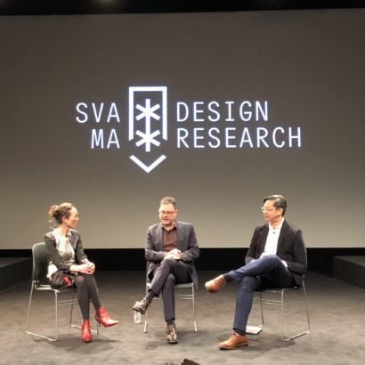
Crossing the Line: The 2010 D-Crit Conference

Ratings

3 of 5 stars
What’s this?

A one-day symposium from The School of Visual Arts MFA Design Criticism (“D-Crit”) Department, organized by its first class of graduating students. “Moderated by D-Crit faculty member, award-winning author and ‘Studio 360’ host Kurt Andersen, this inaugural event will feature thesis presentations by all fifteen graduating students alongside professional critics and thinkers including design visionary and Doors of Perception founder John Thackara and author and educator Peter Hall.” At the SVA Theatre in New York City all day Friday, April 30, and free, to boot. R.S.V.P. here.

+

Print Magazine: Everything You Need to Know about Adobe Creative Suite 5

Ratings

2 of 5 stars
What’s this?

Patric King, from House of Pretty, reviews the newly announced upgrade to Adobe’s anchor suite.

“On one level, I like a lot of the new features, and they will actually save me time in the day-to-day workflow. On the other hand, I am still frustrated by its lack of consistency between interfaces, despite that being the primary point of CS4.”

I’m afraid this will always be the case with these major releases from Adobe; Creative Suite just can’t seem to shake its major inconsistencies, no matter how the company tries and no matter how much we wish it would succeed. Read the full review here.

A mildly interesting side note: a Twitter query that I posted today unscientifically confirms the generally held suspicion that many designers have adopted an ‘every other release’ approach to Adobe Creative Suite. Most respondents are considering an upgrade from CS3 (which is what I’m using myself right now), having skipped over CS4.

+

Boston Bound

This coming Wednesday, I’ll be giving the 36th Annual William A. Dwiggins Lecture in Boston, Massachusetts for The Society of Printers. It’s an unbelievably humbling honor, as past speakers for this event have included Milton Glaser, Erik Spiekermann, Matthew Carter and Sumner Stone, among other luminaries. Gulp.

If you’re in the Boston area, I hope you can make it, especially as the event is in fact free, with a reception following the lecture, to boot. Details follow after the jump, excerpted from the poster.

Continue Reading

+

“Art Space Tokyo” Reprint and iPad Edition

Ratings

2 of 5 stars
What’s this?

Over at Kickstarter, Craig Mod and Ashley Rawlings are taking pledges in their quest to reprint their beautiful hardcover guide to Tokyo’s art galleries, which I praised two years ago on this blog. The original run sold out, so this is your chance to own a copy of this exquisite tome, as well as to finance a free iPad version. They have until 1 May to raise a little over US$2,000 in order to make this happen. Make your contribution here.

+

The FontFeed: What the iPad Is Missing

Ratings

4 of 5 stars
What’s this?

Type guru Stephen Coles presents a surprisingly extensive case against Apple’s putative attention to typographic high standards across its various products, with special focus on the iPad’s disappointments in this realm.

“A device designed for media consumption could validate Apple’s dedication to design by emphasizing design’s most basic element: typography. But so far, it flops.”

I touched on this briefly in my new column in Print Magazine, but this is a much more thorough indictment of the Cupertino company’s apparent willingness to rest on its typographic laurels. Read all eight of Cole’s complaints here.

+

Show Me the Money (for Art Direction)

Speaking of magazines, I’ve just started writing a regular column about interaction design over at Print. If it seems a bit retrograde for me to publish my thoughts on digital media in that forum, believe me the irony is not lost. In spite of its somewhat anachronistic moniker, though, I still find Print to be incredibly vibrant as a showcase for great graphic design — and in spite of all my pooh-poohing of the fitful and awkward migration of traditional graphic design values into the digital space, I still think that digital designers have a lot to learn from print — just as print designers have a lot to learn from digital.

My first column will appear in the June 2010 issue, which will be on newsstands in May, but the editors have graciously decided to publish it in advance on the Web in full here.

Almost inevitably, the topic is Apple’s “magical and revolutionary” iPad and so the column has some overlap with my harsh criticisms of the Popular Science magazine app from earlier in the week (catch up on that blog post here). Specifically, I try to wrestle with the iPad’s prospects for ushering in a return to the visually and expressively rich values of traditional art direction.

Continue Reading

+

NYT: Bringing You a Signal You’re Already Paying For

Ratings

2 of 5 stars
What’s this?

Infuriatingly, AT&T’s plans to sell a new device designed to help boost its notoriously spotty cellular network signal.

The size of a couple of decks of cards, these mini-towers act and look like Wi-Fi hot spots at cafés, and redirect cellphone calls from congested cell towers to home Web connections.

So if you have terrible service in your apartment, as many AT&T customers I know do, you will now have the privilege of buying a device that costs over US$100 in order to improve the service that AT&T is not delivering successfully to you.

I’m reminded of the company’s “You Will” ad campaign from a few decades ago, in which they postulated various miraculous innovations in future communications technology, asking if you’ve ever, for example, “opened doors with the sound of your voice?” The promise was that “You will,” and it would be AT&T that would make it happen.

Well, have you ever paid a company to fix a service you already pay for? You will.

+

We’re All Going to Die

Ratings

5 of 5 stars
What’s this?

Photographer Simon Hoegsberg’s 100 meter-wide photograph capturing “one-hundred seventy-eight people, all shot in the course of twenty days from the same spot on a railroad bridge on Warschauer Strasses in Berlin in the summer of 2007.” Aside from being technically stunning, it’s also an understated narrative triumph: every figure in this image, silhouetted starkly and brilliantly against a neutral sky, tells through his or her particular facial expressions and body language a distinctive and thoroughly original story all their own. One of those few photographs that I not only admire but wish that I’d taken myself.

Via Photojojo.

+

A Popular Misconception

Popular Science on iPadThough I opted for a 3G-enabled iPad that won’t be delivered until later in the month, I was able to get my hands on a Wi-Fi-only model today, one of two devices that we bought at the office. In my limited use so far it feels terrific, though until I’m actually in possession of an iPad I can call my very own, it’ll be still too early to decide how much I like or dislike it. Without really being able to customize a machine like this for my needs — installing my preferred apps and loading my personal data onto it — it feels a little bit like a model home; attractive enough, but not really cozy just yet.

In playing with iPad-optimized apps, I’m watching with particular interest to see how content publishers are approaching the platform. One that has gotten a fair amount of exposure is the Popular Science app, a digital version of the longstanding print magazine that has put forward an ambitious, visually rich attempt at embracing the things that only a tablet device can do.

Continue Reading

+